zent
Version:
一套前端设计语言和基于React的实现
95 lines (64 loc) • 1.95 kB
Markdown
# Zent
Zent ( \ˈzent\ ) is a React component library developed and used at Youzan. Zent provides a collection of essential UI components and lots of useful domain specific components.
We have more than 50 components for now and we're releasing more.
Our goal is making React development faster and simpler.
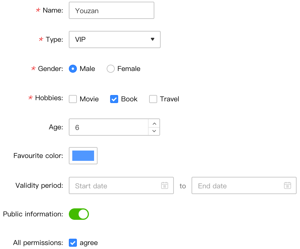
### Showcase
### Features
* High quality React components
* Builtin TypeScript support
* Supports custom themes
* Import JavaScript and styles only if they are used
* Handmade icon font
### Supported Environments
* React >= 17
* Supports server-side rendering(SSR)
### Browsers
* Firefox >= 78(ESR)
* Chrome >= 49
* Safari >= 10
* Edge
* No IE support
#### Polyfills needed for supported browsers
- `es6.object.assign`
- `es6.object.is`
- `es6.string.ends-with`
- `es6.string.starts-with`
- `es6.string.includes`
- `es7.string.trim-left`
- `es7.string.trim-right`
- `es6.array.from`
- `es6.array.of`
- `es6.array.fill`
- `es6.array.find`
- `es6.array.find-index`
- `es7.array.includes`
### Install
```bash
yarn add zent
```
### Using Components
```jsx
import { Button } from 'zent';
// Import style
import 'zent/css/index.css';
ReactDOM.render(<Button />, mountNode);
```
### Import as Necessary
[babel-plugin-zent](babel-plugin-zent) is a babel plugin that can help reduce bundle size, it does code transformations like this:
```js
import { Button } from 'zent';
// Transforms into
import Button from 'zent/es/button';
```
This plugin is useful if you are developing a library based on Zent, or if you only use a small part of Zent components.
You can find detailed instructions in its [documentation](babel-plugin-zent).
Using ESM with tree-shaking enabled bundler is also possible.
### Theme
Please refer to [Themes](theme)
<style>
img[alt="zent-components"] {
width: 523px;
height: 435px;
}
</style>