yet-another-react-lightbox
Version:
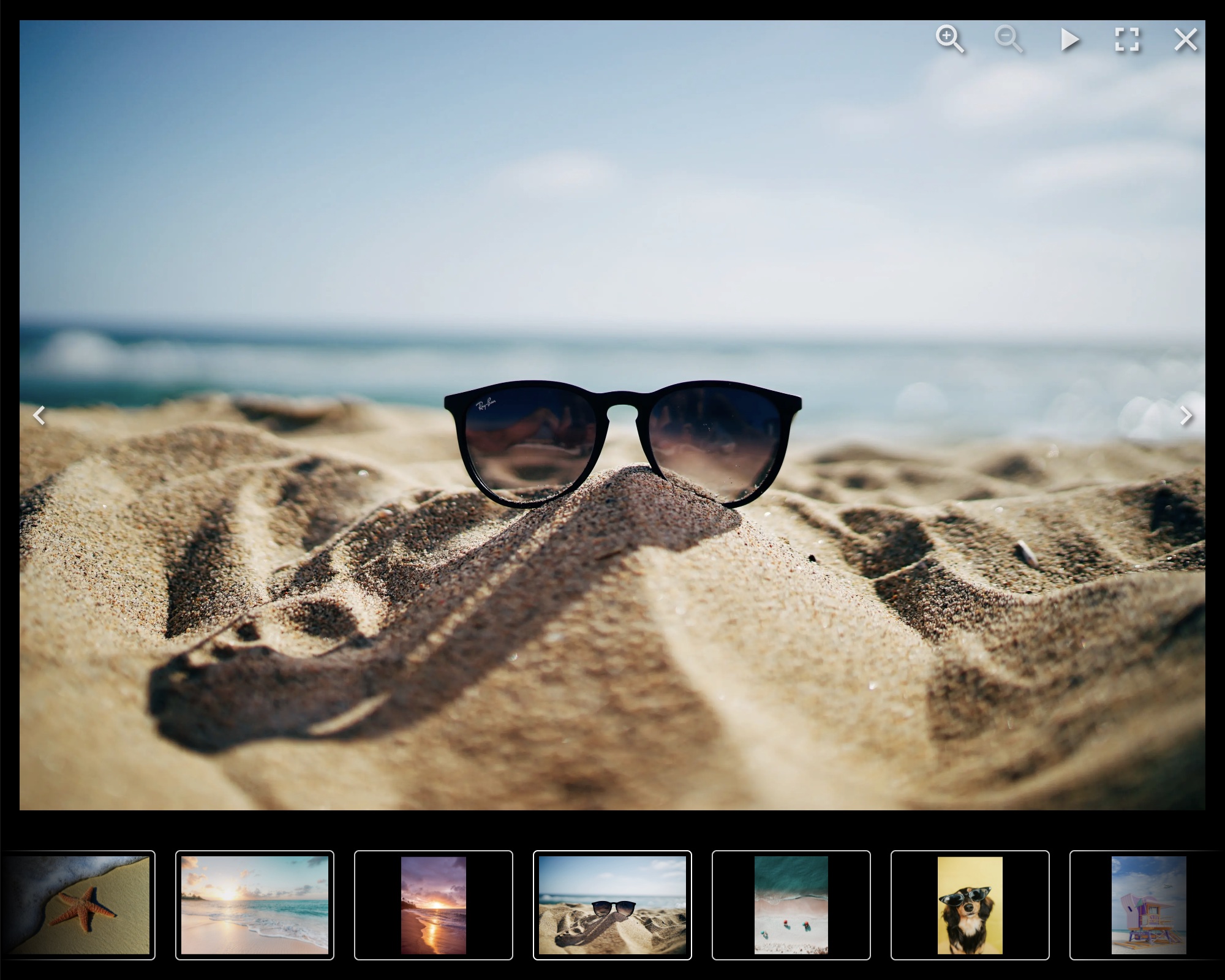
Modern React lightbox component
162 lines (130 loc) • 5.54 kB
Markdown
# Yet Another React Lightbox
Modern React lightbox component. Performant, easy to use, customizable and
extendable.
## Overview
[](https://www.npmjs.com/package/yet-another-react-lightbox)
[](https://bundlephobia.com/package/yet-another-react-lightbox)
[](https://github.com/igordanchenko/yet-another-react-lightbox/blob/main/LICENSE)
- **Built for React:** works with React 18, 17 and 16.8.0+
- **UX:** supports keyboard, mouse, touchpad and touchscreen navigation
- **Preloading:** never displays partially downloaded images
- **Performance:** preloads limited number of images without compromising
performance or UX
- **Responsive:** responsive images with automatic resolution switching are
supported out of the box
- **Video:** video slides are supported via an optional plugin
- **Zoom:** image zoom is supported via an optional plugin
- **Customization:** customize any UI element or add your own custom slides
- **No bloat:** never bundle rarely used features; add optional features via
plugins
- **TypeScript:** type definitions come built-in in the package
- **RTL:** compatible with RTL layout
## Documentation
[https://yet-another-react-lightbox.com/documentation](https://yet-another-react-lightbox.com/documentation)
## Examples
[https://yet-another-react-lightbox.com/examples](https://yet-another-react-lightbox.com/examples)
## Changelog
[https://github.com/igordanchenko/yet-another-react-lightbox/releases](https://github.com/igordanchenko/yet-another-react-lightbox/releases)
## Installation
```shell
npm install yet-another-react-lightbox
```
## Minimal Setup Example
```jsx
import * as React from "react";
import Lightbox from "yet-another-react-lightbox";
import "yet-another-react-lightbox/styles.css";
export default function App() {
const [open, setOpen] = React.useState(false);
return (
<>
<button type="button" onClick={() => setOpen(true)}>
Open Lightbox
</button>
<Lightbox
open={open}
close={() => setOpen(false)}
slides={[
{ src: "/image1.jpg" },
{ src: "/image2.jpg" },
{ src: "/image3.jpg" },
]}
/>
</>
);
}
```
## Recommended Setup
Unlike many other lightbox libraries, Yet Another React Lightbox is not limited
to just two images per slide ("thumbnail" and "original" / "full size").
Instead, we favor responsive images with automatic resolution switching and
recommend you provide multiple files of different resolutions for each image
slide. Yet Another React Lightbox automatically populates `srcset` / `sizes`
attributes and lets the user's browser decide which image is more appropriate
for its viewport size.
```jsx
import * as React from "react";
import Lightbox from "yet-another-react-lightbox";
import "yet-another-react-lightbox/styles.css";
export default function App() {
const [open, setOpen] = React.useState(false);
return (
<>
<button type="button" onClick={() => setOpen(true)}>
Open Lightbox
</button>
<Lightbox
open={open}
close={() => setOpen(false)}
slides={[
{
src: "/image1x3840.jpg",
alt: "image 1",
width: 3840,
height: 2560,
srcSet: [
{ src: "/image1x320.jpg", width: 320, height: 213 },
{ src: "/image1x640.jpg", width: 640, height: 427 },
{ src: "/image1x1200.jpg", width: 1200, height: 800 },
{ src: "/image1x2048.jpg", width: 2048, height: 1365 },
{ src: "/image1x3840.jpg", width: 3840, height: 2560 },
],
},
// ...
]}
/>
</>
);
}
```
You can also integrate 3rd-party image components (e.g., Next.js Image or Gatsby
Image) via a custom render function. See
[examples](https://yet-another-react-lightbox.com/examples) on the documentation
website.
## Plugins
Yet Another React Lightbox allows you to add optional features to your project
based on your requirements via plugins.
The following plugins are bundled in the package:
- [Captions](https://yet-another-react-lightbox.com/plugins/captions) - adds
support for slide title and description
- [Counter](https://yet-another-react-lightbox.com/plugins/counter) - adds
slides counter
- [Download](https://yet-another-react-lightbox.com/plugins/download) - adds
download button
- [Fullscreen](https://yet-another-react-lightbox.com/plugins/fullscreen) - adds
support for fullscreen mode
- [Inline](https://yet-another-react-lightbox.com/plugins/inline) - transforms
the lightbox into an image carousel
- [Share](https://yet-another-react-lightbox.com/plugins/share) - adds sharing
button
- [Slideshow](https://yet-another-react-lightbox.com/plugins/slideshow) - adds
slideshow button
- [Thumbnails](https://yet-another-react-lightbox.com/plugins/thumbnails) - adds
thumbnails track
- [Video](https://yet-another-react-lightbox.com/plugins/video) - adds support
for video slides
- [Zoom](https://yet-another-react-lightbox.com/plugins/zoom) - adds image zoom
feature
## License
MIT © 2022 [Igor Danchenko](https://github.com/igordanchenko)