wired-elements
Version:
Collection of hand-drawn sketchy web components
95 lines (74 loc) • 3.96 kB
Markdown
# wired-mat-icon
WebComponent which allows you to easily create Hand drawn version of Material Icons!
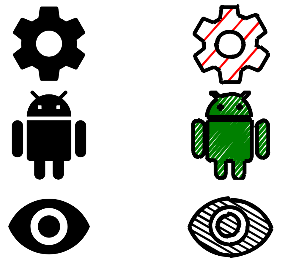
Warning: This library will likely have a big impact on your bundle. Have fun with it, and consider optimizing with wired-icon component when you ship to production :)
## Installation
Simply Add wired-mat-icon to your project:
```
npm i wired-mat-icon
```
## Wired Material Icon for fun!
As you can have a hard time finding the right svg path, we bundled almost all the material icons in an iconset, that ships with the library! You can refer to the complete list on the website of [material.io](https://material.io/resources/icons/).
### Usage
Import wired-mat-icon definition into your HTML page:
```html
<script type="module" src="wired-mat-icon/lib/wired-mat-icon.js"></script>
```
Or into your module script:
```javascript
import "wired-mat-icon";
```
Use it in your web page:
```html
<wired-mat-icon
icon="android"
config='{"fillStyle": "zigzag", "fill": "#3B5998", "hachureGap": "1.5", "fillWeight": "0.9"}'>
</wired-mat-icon>
```
### Properties / Attributes
**icon** - String representing a material icon. Refer to the complete list on [material.io](https://material.io/resources/icons/). It is also used for the aria label if the aria property is not defined. Note that if path is defined, this property will be ignored.
**config** - Optional object to configure the effect. You can refer to the complete list on [roughjs wiki](https://github.com/pshihn/rough/wiki#options). You can also see the examples for inspiration.
Default rougness is set to 0.1, which seems to be the appropriate value most of the time.
## Styling
You can define CSS width and height on the wired-mat-icon element to scale it.
To change color, use the config property.
## Extra flavours
### Material Look
You can have the material look with the following config:
```javascript
const matConfig = {stroke: "transparent", fill: "black", fillStyle: "solid"};
```
```html
<wired-mat-icon icon="laptop" config=${JSON.stringify(matConfig)}></wired-mat-icon>
```
### Use inside a wired-button
You can use Wired Material Icon inside a Wired Button \o/
```html
<wired-icon-button elevation="5">
<wired-mat-icon icon="autorenew"
config='{"strokeWidth": "0.3", "fill": "black"}'
></wired-mat-icon>
</wired-icon-button>
```
### Use with JavaScript
For example, inside a view or a custom webcomponent, you could use the properties of the wired-icon web component to handle it programatically. Property changes are reflected on the attributes.
```html
<wired-mat-icon id="modifyme"></wired-mat-icon>
```
```javascript
customElements.whenDefined('wired-mat-icon').then(() => {
const wiredMatIcon = document.getElementById('modifyme');
wiredMatIcon.icon = 'flash_on';
wiredMatIcon.config = {fill: 'red', fillWeight: 1};
});
```
## Troubleshooting
### I did everything right but the icon won't render, HELP !
1. Try to set a fixed width/height with CSS on the web component. If it's Bounding Client Rect is 0, the component won't event bother rendering ;)
2. Some few icons couldn't be included for weird technical reasons. Here is the list:
__signal_wifi_statusbar_1_bar, signal_wifi_statusbar_2_bar, signal_wifi_statusbar_3_bar, signal_wifi_statusbar_4_bar, signal_wifi_statusbar_connected_no_internet_1, signal_wifi_statusbar_connected_no_internet, signal_wifi_statusbar_connected_no_internet_2, signal_wifi_statusbar_connected_no_internet_3, signal_wifi_statusbar_connected_no_internet_4, signal_wifi_statusbar_not_connected, signal_wifi_statusbar_null, fiber_manual_record, fiber_smart_record, pets, bubble_chart, brightness_1, pool__
3. Ask for help in an issue!
## License
[MIT License](https://github.com/rough-stuff/wired-elements/blob/master/LICENSE) (c) [Preet Shihn](https://twitter.com/preetster)
#### Contributor
Adrien Pennamen