weather-icons-animated
Version:
A series of hand crafted and detailed weather icons animated with react & emotion.js
112 lines (76 loc) • 3.12 kB
Markdown
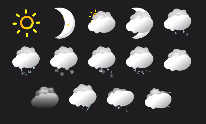
## Animated React Weather Icons
These are a series of highly detailed & crafted animations for Weather Icons to use in any smarthome project or any web application using React.
I've designed these to work with the [Home Assistant](https://www.home-assistant.io/) & my other project [ha-component-kit](https://github.com/shannonhochkins/ha-component-kit) but they can be used in any React project.
Each state will render a different SVG, to swap out the svg it's as simple as changing the attribute on the SVG.
Highly configurable animations & styles - very structured so it's easy to make changes if need be.
The SVG construction is based of SVG symbols so it's really easy to compose another "state" if you want to add another one.
## Help me out?
As you can probably tell, A lot of time has gone into this! I'd really appreciate a small donation as it will help me validate that my time is well spent and will guarantee future additional changes :) [Buy me a coffee!](https://www.buymeacoffee.com/jinglezzz)
### How can i use this in my project?
Simply install the [package](https://www.npmjs.com/package/weather-icons-animated), and then import into your react project.
```
npm install weather-icons-animated -D
```
Application usage:
```tsx
import { WeatherSvg } from "weather-icons-animated";
export function App() {
return <WeatherSvg state="sunny" />
}
```
### Resizing
By default, the svg's will scale to fit the parent div, however you can specify a width/height as a prop like so:
```tsx
<WeatherSvg state="sunny" width={100} height={100} />
```
Or you can re-style with emotion:
```tsx
import { WeatherSvg as _WeatherSvg } from "./WeatherSvg";
import styled from "@emotion/styled";
const WeatherSvg = styled(_WeatherSvg)`
width: 200px;
height: 200px;
`;
export function App() {
return <WeatherSvg state="sunny" />;
}
```
### Other Properties
Along with supporting every other svg property, you can also specify a `night` prop, which in some states will change the `sun` to a `moon`.
```tsx
import { WeatherSvg } from "./WeatherSvg";
export function App() {
return <WeatherSvg state="partly-cloudy" night />;
}
```
#### Contributors
To run locally, simply run `npm install && npm run dev` to spin up the local server with the fully demo.
By default the svg will render at a 200x200 viewport, but you can pass in a `width/height` prop to change this.
The SVG's are currently styled with emotion, which makes it very easy to make further changes to the SVG's.
There's full typescript intellisense on the available state's the SVG animations support, here's a simple example of using the component:
```tsx
import { WeatherSvg } from "weather-icons-animated";
function App() {
return (
<WeatherSvg state="sunny" />
)
}
export default App
```
#### State Support
It supports the following weather "states":
- sunny
- clear-night
- partlycloudy
- cloudy
- fog
- hail
- rainy
- snowy
- snowy-rainy
- pouring
- lightning
- lightning-rainy
- windy
- windy-variant