vuetify-dialog
Version:
Dialog helper for vuetify.js
321 lines (264 loc) • 8.98 kB
Markdown
# vuetify-dialog
### This module will help you work with `vuetify` dialogs without annoying templates
Implementation of [vuedl](https://github.com/yariksav/vuedl) dialog helper with Vuetify.js framework
This module will help you to work with modal dialogs in your project
<p align="center">
<a href="https://npmcharts.com/compare/vuetify-dialog?minimal=true">
<img src="http://img.shields.io/npm/dm/vuetify-dialog.svg">
</a>
<a href="https://www.npmjs.org/package/vuetify-dialog">
<img src="https://img.shields.io/npm/v/vuetify-dialog.svg">
</a>
<a href="https://app.fossa.io/projects/git%2Bgithub.com%2Fyariksav%2Fvuetify-dialog?ref=badge_shield" alt="FOSSA Status"><img src="https://app.fossa.io/api/projects/git%2Bgithub.com%2Fyariksav%2Fvuetify-dialog.svg?type=shield"/></a>
<a href="http://img.badgesize.io/https://unpkg.com/vuetify-dialog/dist/vuetify-dialog.min.js?compression=gzip&label=gzip">
<img src="http://img.badgesize.io/https://unpkg.com/vuetify-dialog/dist/vuetify-dialog.min.js?compression=gzip&label=gzip">
</a>
<a href="LICENSE">
<img src="https://img.shields.io/badge/License-MIT-yellow.svg">
</a>
<a href='https://coveralls.io/github/yariksav/vuetify-dialog'><img src='https://coveralls.io/repos/github/yariksav/vuetify-dialog/badge.svg' alt='Coverage Status' /></a>
<a href='https://travis-ci.org/yariksav/vuetify-dialog'><img src='https://travis-ci.org/yariksav/vuetify-dialog.svg?branch=master' /></a>
</p>
[](https://app.fossa.io/projects/git%2Bgithub.com%2Fyariksav%2Fvuetify-dialog?ref=badge_large)
## Vuedl module documentation
This module uses vuedl to automatically work with dialogs and DOM
[See docs here](https://github.com/yariksav/vuedl#readme)
## Setup
Install the package from npm
> IMPORTANT: After version 0.4.0 css and js were split and therefore you have to import css manually
## Vuetify 2
For Vuetify 2 please use the latest version of vuetify-dialog@2.X.X
### Demo with Vuetify 2
[Demo in CodeSandbox](https://iwdcf.csb.app/),
[Demo source](https://codesandbox.io/s/vuetify-2-dialog-example-iwdcf)
```npm
npm install vuetify-dialog
```
```javascript
// need instance of vuetify, for example
import vuetify from '@/plugins/vuetify'
import VuetifyDialog from 'vuetify-dialog'
import 'vuetify-dialog/dist/vuetify-dialog.css'
Vue.use(VuetifyDialog, {
context: {
vuetify
}
})
```
## Vuetify 1
For Vuetify 1 you need to use vuetify-dialog@0.4.0-beta.2
### Demo with Vuetify 1
[Demo with Vuetify 1 CodeSandbox](https://ppx57r3nnj.codesandbox.io/),
[Demo source](https://codesandbox.io/s/ppx57r3nnj)
```npm
npm install vuetify-dialog@0.4.0-beta.2
```
```javascript
import VuetifyDialog from 'vuetify-dialog'
import 'vuetify-dialog/dist/vuetify-dialog.css'
Vue.use(VuetifyDialog)
```
or use with extra configuration
```javascript
import VuetifyDialog from 'vuetify-dialog'
import 'vuetify-dialog/dist/vuetify-dialog.css'
Vue.use(VuetifyDialog, {
context,
property,
confirm: {
actions: {
false: 'No',
true: {
text: 'Yes',
color: 'primary'
}
},
icon: false, // to disable icon just put false
width: 500
},
warning: {},
error: {},
prompt: {}
})
```
+ `context` - the context of your application, such as store, axios, router etc.
+ `property` - the property, which will integrate to Vue. Default is `$dialog`
+ `confirm` - confirm dialog params
+ `warning` - warning dialog params
+ `error` - error dialog params
+ `prompt` - prompt dialog params
Where:
+ `actions` - dialog buttons config
+ `icon` - dialog icon in String, example 'warning'. Note, if you want to hide icon, just set parameter to false
+ `width` - dialog max width
## ♻️ Usage with Nuxt.js
Add `vuetify-dialog/nuxt` to modules section of `nuxt.config.js`
Module automatically add to dialog nuxt context data, such as router, route, i18n, $axios, etc
```js
{
modules: [
// Simple usage
'vuetify-dialog/nuxt'
// Optionally passing options in module configuration
['vuetify-dialog/nuxt', { property: '$dialog' }]
],
// Optionally passing options in module top level configuration
vuetifyDialog: {
property: '$dialog'
confirm: {}
// ...
}
}
```
### If you using Typescript + Nuxt.js
Add `vuetify-dialog/types` to the `compilerOptions.types` section of your project's `tsconfig.json` file:
```json
{
"compilerOptions": {
"types": [
"vuetify-dialog/types"
]
}
}
```
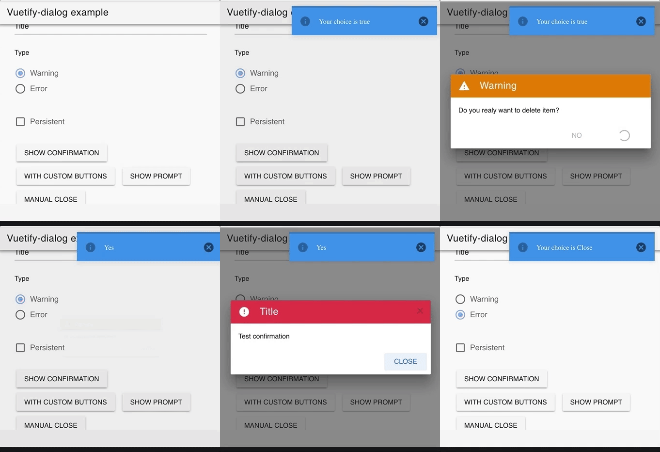
### Simple confirm dialog
```js
const res = await this.$dialog.confirm({
text: 'Do you really want to exit?',
title: 'Warning'
})
```
### Info dialog
```js
const res = await this.$dialog.info({
text: 'File copied successfully',
title: 'Info'
})
```
### Warning dialog
```js
const res = await this.$dialog.warning({
text: 'Do you really want to exit?',
title: 'Warning'
})
```
### Error dialog
```js
this.$dialog.error({
text: 'Cannot delete this item',
title: 'Error'
})
```
### Prompt dialog
```js
let res = await this.$dialog.prompt({
text: 'Your name',
title: 'Please input your name',
})
```
### Prompt dialog with password
```js
let res = await this.$dialog.prompt({
title: 'Password balidation',
text: 'Enter your password',
rules: [(v) => v.length >= 6 || 'Password must be at least 6 characters long'], // vuetify's v-text-field rules prop
textField: {
// Any addtional props/attrs that will be binded to v-text-field component
type: 'password',
}
})
```
<!--  -->
### Programmatically close dialog
If property `waitForResult` set to false, then functions will return dialog instance
Actually waitForResult = true make two steps
1) dialogInstance = $dialog.show(component) // Show dialog
2) return dialogInstance.wait() // Return promise
Therefore to perform programmatically close dialog you have to set waitForResult to false and work with dialogInstance directly
```js
const dialogInstance = await this.$dialog.warning({
title: this.title,
text: this.text,
waitForResult: false
});
setTimeout(() => {
dialogInstance.close()
} , 3000)
// then you can wait for user reaction
const userChoice = await dialogInstance.wait()
// after idle 3000 sec - userChoice will be undefined
this.$dialog.notify.info(userChoice)
```
### Notifications
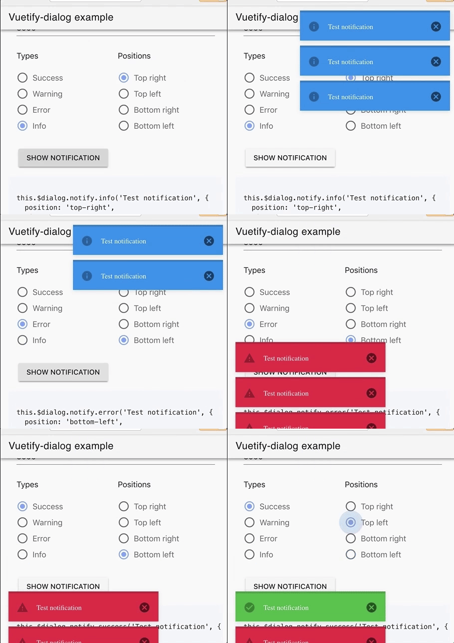
The notification component is used to convey important information to the user.
Notification support positioning, removal delay and callbacks. It comes in 4 variations, **success**, **info**, **warning** and **error**. These have default icons assigned which can be changed and represent different actions
<!--  -->
Notification uses [v-alert](https://vuetifyjs.com/en/components/alerts) component
Props:
* **text** - _the text fo your message_
- type: String
* options:
- type: Object
- properties:
- position: one of _top-left_, _top-right_, _bottom-left_, _bootom-right_
- timeout: timer to hide message. Default 5000. If set to 0 - message will not closes automatically
- actions
```js
this.$dialog.notify.info('Test notification', {
position: 'top-right',
timeout: 5000
})
```
### Toasts
The toast component is used to display a quick message to a user. Toasts support positioning, removal delay and callbacks. It comes in 4 variations, **success**, **info**, **warning** and **error**. These have default icons assigned which can be changed and represent different actions
Toast uses [v-snackbar](https://vuetifyjs.com/en/components/snackbars) component
Props:
* **text** - _the text fo your message_
- type: String
* options:
- type: Object
- properties:
- position: one of _top-left_, _top-right_, _bottom-left_, _bootom-right_
- timeout: timer to hide message. Default 5000. If set to 0 - message will not closes automatically
- actions: - see below
``` javascript
this.$dialog.message.info('Test', {
position: 'top-left'
})
```
### Actions
To all dialogs you can put your own buttons
Props:
* **key** - _the text fo your message_
- type: String
* options:
- type: Object
- properties:
- position: one of _top-left_, _top-right_, _bottom-left_, _bootom-right_
- timeout: timer to hide message. Default 5000. If set to 0 - message will not closes automatically
- actions: - see below
```js
{
...
actions: {
false: 'No',
true: 'Yes'
}
}
// result will be true, false, or undefined
{
...
actions: ['No', 'Yes']
}
// result will be 'No', 'Yes', or undefined
```
You can also send full button options
```js
{
actions: [{
text: 'Yes', color: 'blue', key: true
}]
}
```
[npm-image]: https://img.shields.io/npm/v/vuetify-dialog.svg?style=flat-square
[npm-url]: https://npmjs.org/package/vuetify-dialog