vue3-tree-vue
Version:
A Simple vue3 project for rendering items in a tree.
220 lines (187 loc) • 8.1 kB
Markdown
A Simple vue3 project for rendering items in a tree.
`npm i vue3-tree-vue`
```html
<template>
<vue3-tree-vue :items="items"
:isCheckable="false" //Set to true if you want to get checkable items
:hideGuideLines="false"
="onItemChecked"
="onBeforeItemDropped"
="onItemSelected"
="onItemExpanded"
="onItemCheckedChanged"
="onItemUnchecked"
>
<!-- Applying some simple styling to tree-items -->
<template v-slot:item-prepend-icon="treeViewItem" >
<img src="./assets/folder.svg"
alt="folder"
v-if="treeViewItem.type === 'folder'"
height="20" width="20" />
</template>
</vue3-tree-vue>
</template>
```
```ts
import 'vue3-tree-vue/dist/style.css'; // remember to add this in your component or maint.[ts/js]
setup() {
const onItemChecked = (checkedItems: TreeViewItem[]) => console.log(checkedItems);
const onItemSelected = (item: TreeViewItem) => console.log(item);
const onItemCheckedChanged = (checkedItem: TreeViewItem) => console.log('Item checked:', checkedItem);
const onItemUnchecked = (uncheckedItem: TreeViewItem) => console.log('Item unchecked:', uncheckedItem);
// How to handle drag and drop logic
const onBeforeItemDropped = (droppedItem: TreeViewItem, destinationNode: TreeViewItem | undefined) => {
// destinationNode == undefined means dropping at the root of the tree.
// Here you can specify any kind of drop validation you will like.
// this function should return true if the drop operation is valid.
return new Promise((resolve, _) => {
resolve(droppedItem !== destinationNode) // Replace this logic with your logic.
});
}
const onItemExpanded = (expandedItem: TreeViewItem) => {
//to use this feature properly you need to set lazyLoad property as true
//fetch data
const lazyLoadedItems = fetchFromApi(...);
expandedItem.children.push(...lazyLoadedItems)
}
const items = ref<TreeViewItem[]>([]); // define your tree items here.
return {
onItemChecked,
onItemSelected,
onBeforeItemDropped,
onItemExpanded,
items
}
}
```
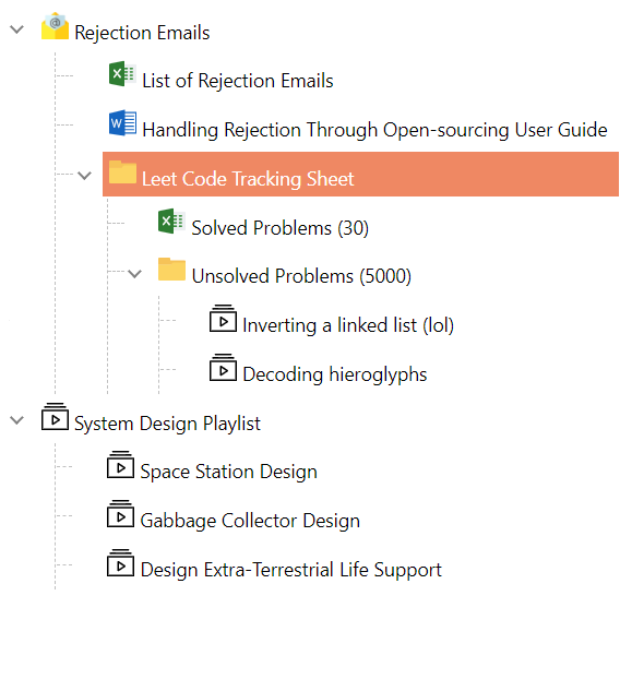
## Selectable Tree Items
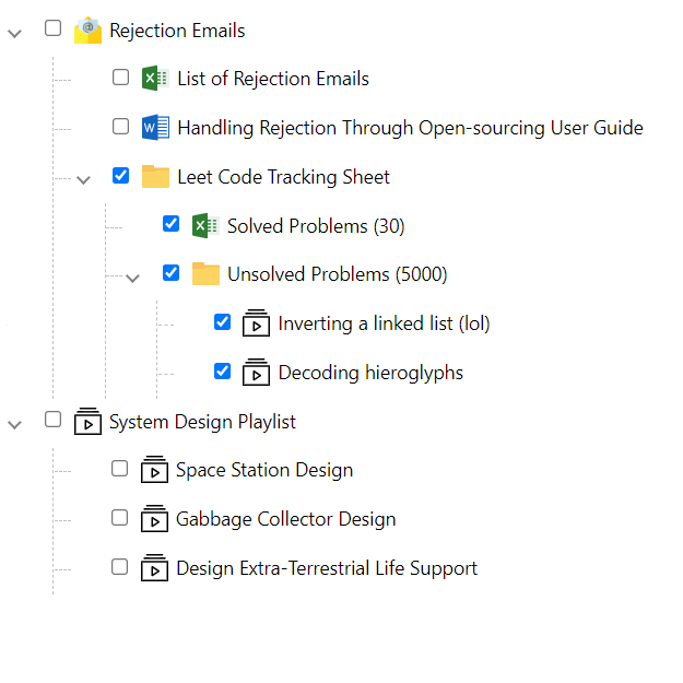
## Checkable Tree Items
## Drag and Drop

## Properties of the TreeView
| Property | Default | Description |
| ----------- | ----------- |-------------
| items | Empty array | An array of `TreeViewItem`. |
| hideGuideLines | `false` | Determines the visibility of the guidelines
| lazyLoad | `false` | Determines if the tree supports lazy-loading
| isCheckable | `false` | Defines if items can be selected (one at a time) or selected (using a checkbox)
| checkboxStyle | undefined | Defines the style to be applied to the checkboxes on the tree.
| dropValidator | undefined | Specifies a callback of drag and drop rules.
## Basic properties of each tree-node.
```ts
export interface TreeViewItem {
name: string;
id?: string | number;
children?: TreeViewItem[];
checked?: boolean;
selected?: boolean;
expanded?: boolean;
disableDragAndDrop?: boolean; // Disable drag and drop for a specific node.
collapsible?: boolean; // When set to false, item can not be collapsed (children always visible)
disabled?: boolean;// When disabled, an item can neither be selected nor checked
styles?: string[]; // Add the .css styles for a given item
meta?: any;// provides meta-data of any type per node.
}
```
## Event Handlers
| Events | Description |
| ----------- | -------------
| onSelect | Callback function when an item is selected from the tree .Returns an `ItemEventArgs`.
| onCheck | Callback function when an item is checked/unchecked from the tree. All checked nodes are fired as an object array.
| onCheckedChanged | Callback function when an item is checked from the tree. The specific checked node is fired as an object. (Replaces the legacy `onCheck` behavior)
| onUnchecked | Callback function when an item is unchecked from the tree. The specific unchecked node is fired as an object.
| onExpand | Callback function when an item is expanded (Can be used for lazy-loading)
| onCollapse | Callback function when an item is collapsed
<blockquote> The `onCheck` event may be fired more than once to show the change in state of deep hierachies. </blockquote>
## Styles
| Class | Description |
| ----------- |-------------
| selected-tree-item | Defines the style for the `selectedItem`
## Slots
The Vue3 Tree Vue component provides several slots for customizing the appearance and behavior of tree nodes:
| Name | Description |
| ----------- |-------------
| item-prepend-icon | Defines the node's prepend icon.
| item-prepend | Defines a slot to house content before the node's label.
| item-expander | Defines a slot for custom expander implementations
| item-name | Defines a slot for customizing the node's name/label display
| item-append | Defines a slot for adding custom content after the item name
| child-append | Defines a slot that shows at the bottom of the child nodes for adding custom content
### Slot Examples
#### Custom Icons (`item-prepend-icon`)
```vue
<template>
<vue3-tree-vue :items="items">
<template v-slot:item-prepend-icon="treeViewItem">
<img src="./assets/folder.svg" alt="folder"
v-if="treeViewItem.type === 'folder'"
height="20" width="20">
<img src="./assets/word.svg"
v-if="treeViewItem.type === '.doc'"
height="20" width="20">
<img src="./assets/excel.svg"
v-if="treeViewItem.type === '.excel'"
height="20" width="20">
<img src="./assets/playlist.svg"
v-if="treeViewItem.type === '.playlist'"
height="20" width="20">
<img src="./assets/email.png"
v-if="treeViewItem.type === 'emails'"
height="20" width="20">
</template>
</vue3-tree-vue>
</template>
```
#### Custom Expander (`item-expander`)
```vue
<template>
<vue3-tree-vue :items="items">
<template v-slot:item-expander="item">
<span>{{ item.expanded ? '-' : '+' }}</span>
</template>
</vue3-tree-vue>
</template>
```
#### Custom Node Names (`item-name`)
```vue
<template>
<vue3-tree-vue :items="items">
<template v-slot:item-name="treeViewItem">
<span style="color: red" v-if="treeViewItem.name.includes('Sheet')">
{{ treeViewItem.name }}
</span>
</template>
</vue3-tree-vue>
</template>
```
#### Append Content (`item-append`)
```vue
<template>
<vue3-tree-vue :items="items">
<template v-slot:item-append="treeViewItem">
<span class="on-item-hover">
<button title="New Email">Action</button>
</span>
</template>
</vue3-tree-vue>
</template>
```
#### Child Append (`child-append`)
```vue
<template>
<vue3-tree-vue :items="items">
<template v-slot:child-append="treeViewItem">
<span v-if="treeViewItem.id === 6">
<button>Add New Item</button>
</span>
</template>
</vue3-tree-vue>
</template>
```
## Classes
| Name | Description |
| -------------|-------------
| on-item-hover | Use in `child-append` and `item-append` slots to only show when the cursor is hovering on the node
<blockquote>The `on-item-hover` class is used within slots to conditionally display elements only when a user hovers over a tree node. This provides a clean interface by hiding secondary actions until they're needed.</blockquote>