vue3-mycalendar
Version:
A calendar and scheduling package for Vue 3
219 lines (163 loc) • 9.4 kB
Markdown
# vue3-mycalendar
vue3-mycalendar is a powerful and customisable calendar component for Vue 3 that provides an easy way to view and manage calendar events and supports custom fields and customisable labels and styles.
## Installation
Install with npm
```bash
npm install vue3-mycalendar
```
## Quick Start:
```typescript
<template>
<ScheduleForm
:schedules="schedules"
:additional-fields="additionalFields"
custom-class="customize-schedule-form"
:labels-and-settings="labelsAndSettings"
:popup-fields="popupFields"
@handleDelete="handleEventDelete"
/>
</template>
<script setup>
import { ref, computed } from 'vue';
import ScheduleForm from 'vue3-mycalendar';
const schedules = ref([
// Array containing the list of events to be displayed on the calendar
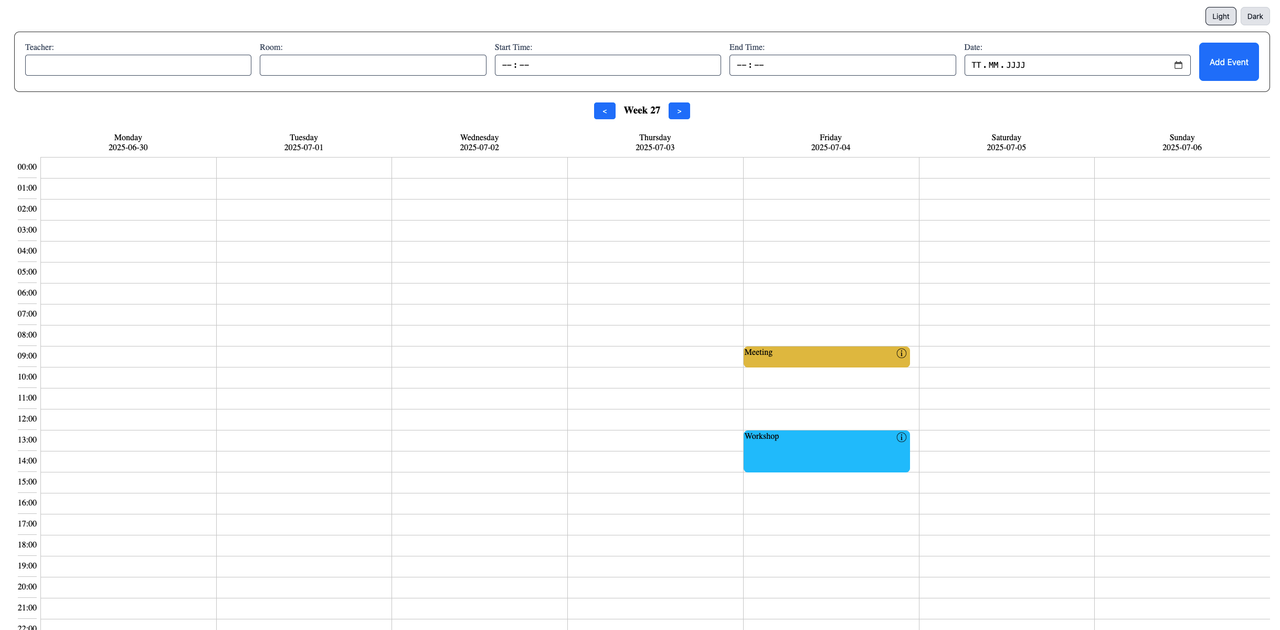
{ id: 1, title: 'Meeting', date: '2024-10-01', start: '09:00', end: '10:00', color: '#ff0000', teacher: 'Malika Heaney', room: 'Room 1' },
{ id: 2, title: 'Workshop', date: '2024-10-02', start: '13:00', end: '15:00', color: '#ff0000', teacher: 'John Doe', room: 'Room 2' },
]);
const popupFields = ref([
// Array defining which fields should be displayed in the event details popup
'title', 'date', 'start', 'end', 'teacher', 'room'
]);
const additionalFields = ref([
// Array of additional fields to be included in the event form for customization
{ id: 'teacher', label: 'Teacher', type: 'text', model: 'teacher' },
{ id: 'room', label: 'Room', type: 'select', model: 'room', options: [{ id: 1, name: 'Room 1' }, { id: 2, name: 'Room 2' }] },
]);
const labelsAndSettings = computed(() => ({
// Object containing custom labels and settings for the calendar component
startTimeLabel: 'Start Time',
endTimeLabel: 'End Time',
dateLabel: 'Date',
submitButtonText: 'Add Event',
calendarWeekLabel: 'Week',
}));
// Handle the delete event action
const handleEventDelete = (id) => {
schedules.value = schedules.value.filter(event => event.id !== id);
console.log(`Event with ID ${id} deleted successfully`);
};
</script>
<style scoped lang="scss">
.customize-schedule-form {
--form-bg-color: #F2F2F2;
--button-bg-color: #009688;
--label-color: #123456;
}
</style>
```
## Props
| Prop | Typ | Description |
|-------------------|--------|------------------------------------------------------------------------------------------------------|
| schedules | Array | A list of events that are displayed in the calendar. |
| additionalFields | Array | A list of additional fields for the event form. |
| customClass | String | A custom CSS class to customise the component layout. |
| customStyles | Record<string, any> | Inline-Styles für das Root-Element der Komponente. |
| weekdays | string[] | Custom weekday names. |
| labelsAndSettings | Object | An object for customising the labels and text settings of the calendar component. |
| popupFields | Array | An array of fields to be displayed in the popup for event details, if the default Popup would be use |
| eventTitleColor | string | Color for the event title text. |
| eventTitleSize | string | Font size for the event title. |
| popupVisible | boolean | Controlled: show/hide popup from the parent. |
| popupEvent | EventInfo | null | Controlled: current event shown in the popup. |
| placeholderSettings | { todo?: string; participant?: string } | Custom placeholder texts inside the popup. |
## Emitted Events
| Event Name | Payload | Description |
| ------------------|-----------------------| ----------------------------------------------------------|
| submit-event | EventInfo | Triggered when a new event is added via the form. |
| handle-delete | EventInfo | Is triggered when an event is deleted via the popup in the default popup. |
| update-event | EventInfo | Fired when an event is updated (drag & drop or editing in the popup) |
| show-info | EventInfo | Fired when the user opens event details. |
| close-popup | | Fired when the popup is closed. |
| update:todos | { todos: string[]; eventId: number } | Fired when To-Dos are changed in the popup. |
| update:participants | { participants: string[]; eventId: number } | Fired when participants are changed in the popup. |
## Slots
The `popup-calendar` slot provides a way to define your custom popup design for viewing and interacting with event details. This slot is especially useful if you want to personalize the popup display with additional data, styles, or actions.
| Name | Parameters | Description |
| ------------------|-----------------------| ----------------------------------------------------------|
| default | None | Custom content template for the default slot. |
| popup-calendar | `Number | String` | Triggered when an event is deleted via the popup. |
## Required Fields in schedules
Each event object within the schedules array must include the following standard fields:
| Field | Typ | Description |
| ------------------|--------| --------------------------------------------------------|
| id | Number | A unique identifier for the event. |
| title | String | The title or name of the event. |
| date | String | The date of the event (format: YYYY-MM-DD). |
| start | String | The start time of the event (format: HH:MM). |
| end | String | The end time of the event (format: HH:MM). |
| color | String |A required background color for the event (e.g., #a4d8ff). |
## Styling
You can style the calendar with CSS variables and switch Light/Dark manually.
1) Style with CSS variables (per instance)
Add a custom class via custom-class and override variables:
`<ScheduleForm custom-class="my-calendar" ... />`
```css
/* Scoped or global */
.my-calendar {
--form-bg-color: #f5f7fa;
--label-color: #334155;
--button-bg-color: #10b981;
--button-color: #111827;
/* more: --input-bg-color, --calendar-primary-color, --event-border-radius, … */
}
```
```
Common variables you can override:
--form-bg-color, --label-color, --input-bg-color, --input-color,
--button-bg-color, --button-hover-bg-color, --button-color,
--calendar-primary-color, --grid-border-color, --event-border-radius.
```
2) Dark & Light mode (manual)
There are two ways. Use one or combine them.
A) Per component (recommended for isolated theming)
Add dark next to your custom class:
`<ScheduleForm custom-class="my-calendar dark" ... />`
The component ships with built-in dark overrides (e.g. high-contrast text, #121212 background, #D2F7D8 accents).
Remove dark to go back to Light.
B) Global page theme (affects the whole site)
Toggle the dark class on <html>:
```typescript
document.documentElement.classList.add('dark') // Dark
document.documentElement.classList.remove('dark') // Light
```
3) Minimal toggle example
```typescript
<script setup>
import { ref, computed, onMounted } from 'vue'
const isDark = ref(false)
function syncRoot() {
document.documentElement.classList.toggle('dark', isDark.value) // optional global
}
function setLight() { isDark.value = false; syncRoot() }
function setDark() { isDark.value = true; syncRoot() }
onMounted(syncRoot)
const scheduleFormClass = computed(() =>
isDark.value ? 'my-calendar dark' : 'my-calendar'
)
</script>
<template>
<button @click="setLight">Light</button>
<button @click="setDark">Dark</button>
<ScheduleForm :custom-class="scheduleFormClass" ... />
</template>
```
## Screenshots
## Upcoming Features
This project is actively maintained, and I plan to add exciting new features in the future.
Stay tuned for regular updates and feature releases!
## 🚀 About Me
I am a motivated junior developer looking to grow through hands-on experience in various projects. I work as a full-stack developer in the cloud department of a cybersecurity product vendor, where I am dedicated to developing secure and robust applications. My goal is to continuously expand my skills and make a significant contribution to the tech industry.
## License
[MIT](https://choosealicense.com/licenses/mit/)