vue2-otp-input
Version:
A fully customizable, one-time password input component for the web built with Vue 2.x.
179 lines (155 loc) • 4.07 kB
Markdown
# vue2-otp-input (This is the fork of @bachdgvn/vue-otp-input with extra support for OTP autofill in iOS chrome)
> A fully customizable, OTP(one-time password) input component built with Vue 2.x.
[Live Demo](https://zlx025mxpp.codesandbox.io/)
## Installation
To install the latest stable version:
```
npm install --save vue2-otp-input
```
Import to main.js:
```javascript
import OtpInput from "vue2-otp-input";
Vue.component("v-otp-input", OtpInput);
```
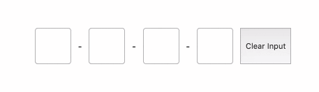
Code example:
```javascript
<template>
<div style="display: flex; flex-direction: row;">
<v-otp-input
ref="otpInput"
input-classes="otp-input"
separator="-"
:num-inputs="4"
:should-auto-focus="true"
:is-input-num="true"
@on-change="handleOnChange"
@on-complete="handleOnComplete"
/>
<button @click="handleClearInput()">Clear Input</button>
</div>
</template>
<script>
export default {
name: 'App',
methods: {
handleOnComplete(value) {
console.log('OTP completed: ', value);
},
handleOnChange(value) {
console.log('OTP changed: ', value);
},
handleClearInput() {
this.$refs.otpInput.clearInput();
},
},
};
</script>
<style lang="less">
.otp-input {
width: 40px;
height: 40px;
padding: 5px;
margin: 0 10px;
font-size: 20px;
border-radius: 4px;
border: 1px solid rgba(0, 0, 0, 0.3);
text-align: center;
&.error {
border: 1px solid red ;
}
}
.otp-input::-webkit-inner-spin-button,
.otp-input::-webkit-outer-spin-button {
-webkit-appearance: none;
margin: 0;
}
</style>
```
## Props
<table>
<tr>
<th>Name<br></th>
<th>Type</th>
<th>Required</th>
<th>Default</th>
<th>Description</th>
</tr>
<tr>
<td>num-inputs</td>
<td>number</td>
<td><strong>true</strong></td>
<td>4</td>
<td>Number of OTP inputs to be rendered.</td>
</tr>
<tr>
<td>separator</td>
<td>component<br></td>
<td>false</td>
<td></td>
<td>Provide a custom separator between inputs by passing a component. For instance, <code><span>-</span></code> would add <code>-</code> between each input</td>
</tr>
<tr>
<td>input-classes</td>
<td>className (string)</td>
<td>false</td>
<td>none</td>
<td>Style applied or class passed to each input.</td>
</tr>
<tr>
<td>input-type</td>
<td>string</td>
<td>false</td>
<td>"tel"</td>
<td>Input type. Optional value: "password", "number", "tel".</td>
</tr>
<tr>
<td>input-mode</td>
<td>string</td>
<td>false</td>
<td>"text"</td>
<td>Input type. Optional value: "text", "numeric", "decimal", "none".</td>
</tr>
<tr>
<td>should-auto-focus</td>
<td>boolean</td>
<td>false</td>
<td>false</td>
<td>Auto focuses input on initial page load.</td>
</tr>
</table>
## Methods
<table>
<tr>
<th>Name<br></th>
<th>Description</th>
</tr>
<tr>
<td>clearInput()</td>
<td>Use with $refs for clearing all otp inputs, see code example section.</td>
</tr>
</table>
## Events
<table>
<tr>
<th>Name<br></th>
<th>Description</th>
</tr>
<tr>
<td>on-change</td>
<td>Return OTP code was changing when we made a change in inputs.</td>
</tr>
<tr>
<td>on-complete</td>
<td>Return OTP code typed in inputs.</td>
</tr>
</table>
## Changelog
* **v1.0.17** - Support autofill OTP in iOS
* **v1.0.8** - Fix #30: Support input type: "password"
* **v1.0.7** - Fix #23: Not accepting numbers from numeric keypad in external keyboard
* **v1.0.6** - Add feature to disallow certain characters like "." or "e".
* **v1.0.5** - Support clearInput() methods for clearing all otp inputs.
* **v1.0.4** - Support @on-change event and fix bug for firing @on-complete every time we press keyboard.
* **v1.0.3** - Fix first and last character not being modified and pasting OTP codes.
* **v1.0.2** - Update first stable version.