vue-treeselectjs
Version:
Treeselect Vue Component
262 lines (228 loc) • 12.1 kB
Markdown
# Treeselect JS Vue component
It is a wrapper for https://www.npmjs.com/package/treeselectjs
A multi-select js component with nested options.
- Full key support (ArrowUp, ArrowDown, Space, ArrowLeft, ArrowRight, Enter)
- Screen sensitive direction
- Typescript support
Build data:
- vue-treeselectjs.mjs 6.14 kB │ gzip: 1.82 kB
- vue-treeselectjs.umd.js 4.23 kB │ gzip: 1.54 kB
- vue-treeselectjs.css 7.14 kB │ gzip: 1.42 kB
**Live Demo:** https://dipson88.github.io/treeselectjs/
### Getting Started
```bash
npm install --save vue-treeselectjs
```
Import vue-treeselectjs (ES)
```
import Treeselect from 'vue-treeselectjs'
import 'vue-treeselectjs/dist/vue-treeselectjs.css'
```
Import treeselectjs (UMD)
```
<html>
<head>
<script src="https://unpkg.com/vue@3/dist/vue.global.js"></script>
<script src="https://cdn.jsdelivr.net/npm/treeselectjs@0.13.0/dist/treeselectjs.umd.js"></script>
<script src="https://cdn.jsdelivr.net/npm/vue-treeselectjs@0.8.0/dist/vue-treeselectjs.umd.js"></script>
<link rel="stylesheet" href="https://cdn.jsdelivr.net/npm/vue-treeselectjs@0.8.0/dist/vue-treeselectjs.css" />
</head>
<body>
<div id="app">
<vue-treeselect />
</div>
<script>
const { createApp } = Vue
const Treeselect = window.VueTreeselect;
createApp({
components: {
VueTreeselect: Treeselect,
}
}).mount('#app')
</script>
</body>
</html>
```
All Available Imports
```
import Treeselect, { DirectionType, IconsType, OptionType, TreeselectValue, ... } from 'vue-treeselectjs'
```
Example
```
<template>
<div class="App">
<!-- Option 1 -->
<Treeselect
:model-value="modelValue"
:options="options"
@update:modelValue="onInput"
>
<div>Slot Content</div>
</Treeselect>
<!-- Option 2 -->
<Treeselect
v-model="modelValue"
:options="options"
>
<div>Slot Content</div>
</Treeselect>
<!-- Option 3 -->
<Treeselect
:model-value="modelValue"
:options="options"
@input="onInput"
>
<div>Slot Content</div>
</Treeselect>
</div>
</template>
<script lang="ts">
import { defineComponent, ref } from 'vue'
import Treeselect, { TreeselectValue } from 'vue-treeselectjs'
import 'vue-treeselectjs/dist/vue-treeselectjs.css'
export default defineComponent({
name: 'App',
components: {
Treeselect
},
setup() {
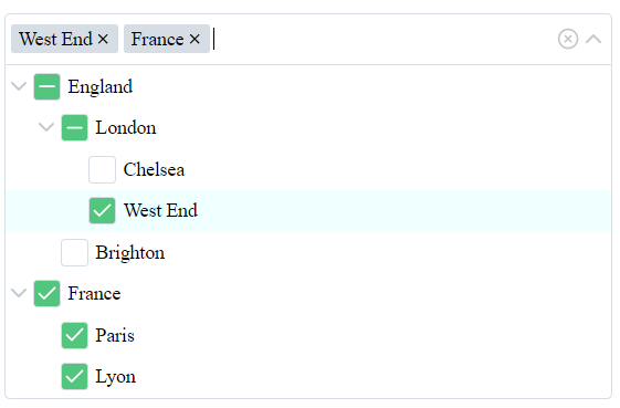
const options = ref([
{
name: 'England',
value: 1,
children: [
{
name: 'London',
value: 2,
children: [
{
name: 'Chelsea',
value: 3,
children: []
},
{
name: 'West End',
value: 4,
children: []
}
]
},
{
name: 'Brighton',
value: 5,
children: []
}
]
},
{
name: 'France',
value: 6,
children: [
{
name: 'Paris',
value: 7,
children: []
},
{
name: 'Lyon',
value: 8,
children: []
}
]
}
])
const value = ref<TreeselectValue>([3])
// Also for value type, you can use value: string | number | (string | number)[] | null
const onInput = (value: TreeselectValue) => {
console.log('onInput', value)
}
return {
onInput,
options,
value
}
}
})
</script>
```
---
### Props
#### Core props
Name | Type (default) | Description
------------- | ------------- | -------------
**model-value** | Array[String \| Number] ([]) | An array of `value` from `options` prop. This value will be selected on load of the treeselect. The `value` changes if you check/uncheck checkboxes or remove tags from the input.
**options** | Array[Object] ([]) | It is an array of objects ```{name: String, value: String \| Number, disabled?: Boolean, htmlAttr?: object, isGroupSelectable?: boolean, children: [] }```, where children are the same array of objects. Do not use duplicated `value` field. But you can use duplicated names. [Read more](#option-description).
**disabled** | Boolean (false) | List will be disabled.
**id** | String ('') | id attribute for the accessibility.
**ariaLabel** | String ('') | aria-label attribute for the accessibility.
**isSingleSelect** | Boolean (false) | Converts multi-select to the single value select. Checkboxes will be removed. You should pass only one id instead of array of values. Also you can set **showTags** to false. It helps to show treeselect as a dropdown.
**isGroupedValue** | Boolean (false) | Return groups if they selected instead of separate ids. Treeselect returns only leaves ids by default.
**isIndependentNodes** | Boolean (false) | All nodes in treeselect work as an independent entity. Check/uncheck action ignore children/parent updates workflow. Disabled nodes ignore children/parent workflow as well.
**rtl** | Boolean (false) | RTL mode.
**isBoostedRendering** | Boolean (false) | ***Experimental*** - Improves list rendering performance by using visibility-based optimizations and IntersectionObserver. Useful for efficiently rendering large lists.
#### List settings props
Name | Type (default) | Description
------------- | ------------- | -------------
**disabledBranchNode** | Boolean (false) | It is impossible to select groups. You can select only leaves.
**openLevel** | Number (0) | All groups will be opened to this level.
**appendToBody** | Boolean (false) | List will be appended to the body instead of the input container.
**alwaysOpen** | Boolean (false) | List will be always opened. You can use it for comfortable style changing. If you what to use it as an opened list, turn `staticList` to `true`.
**staticList** | Boolean (false) | Add the list as a static DOM element. List doesn't overlap content. This prop will be ignored if you use `appendToBody`.
**emptyText** | String ('No results found...') | A empty list text.
**direction** | String (auto) | A force direction for the list. Supported values: `auto`, `top`, `bottom`.
**expandSelected** | Boolean (false) | All groups which have checked values will be expanded on the init.
**saveScrollPosition** | Boolean (true) | The list saves the last scroll position before close. If you open the list your scroll will be on the previous position. If you set the value to `false` - the scroll will have position 0 and the first item will be focused every time.
**listClassName** | String ('') | A class name for list. Useful to change styles for `appendToBody` mode.
#### Input settings props
Name | Type (default) | Description
------------- | ------------- | -------------
**showTags** | Boolean (true) | Selected values look like tags. The false value shows results as '{count} elements selected'. You can change text if you use `tagsCountText` prop. For one selected element, you will see a name of this element.
**tagsCountText** | String ('elements selected') | This text will be shown if you use 'showTags'. This text will be inserted after the count of the selected elements - ```'{count} {tagsCountText}'```.
**tagsSortFn** | `(a: TagsSortItem, b: TagsSortItem) => number` \| `null` (null) | Defines the sorting order for tags in the input field.<br>`TagsSortItem` - `{ value: ValueOptionType, name: string }`.
**showCount** | Boolean (false) | Shows count of children near the group's name.
**clearable** | Boolean (true) | Clear icon is available.
**searchable** | Boolean (true) | Search is available.
**placeholder** | String ('Search...') | Placeholder text.
**grouped** | Boolean (true) | Show groups in the input and group leafs if all group selected.
#### Emits
Name | Type (default) | Description
------------- | ------------- | -------------
**input** | (value) => void (undefined) | Returns selected values, action is triggered on change the list value.
**open** | (value) => void (undefined) | Returns selected values, action is triggered on opening the list.
**close** | (value) => void (undefined) | Returns selected values, action is triggered on closing the list.
**name-change** | (name) => void (undefined) | Returns selected name inside the input, action is triggered on on change the list.
**search** | (value) => void (undefined) | Returns entered search value, action is triggered on change search value during the typing. You can try create something like autocomplete with help of this emit.
**open-close-group** | ({ groupId, isClosed }: { groupId: ValueOptionType, isClosed: boolean }) => void (undefined) | Returns groupId and closed/open status of this group, action is triggered on open/close group in the list.
#### Additional props
Name | Type (default) | Description
------------- | ------------- | -------------
**iconElements** | Object({ arrowUp, ... }) | Object contains all svg icons. You can use HTMLElement or a String to reset values from the default Object. Object: ```iconElements: { arrowUp, arrowDown, arrowRight, attention, clear, cross, check, partialCheck }```. After reset of icon you have to update styles if it is necessary, use `alwaysOpen` prop for more comfortable work with styles changes.
---
#### Slots
Name | Type (default) | Description
------------- | ------------- | -------------
**default** | undefined | The slot's content will be mounted at the end of the list.
---
### Option description
Is is description of the one option of the [`options`](#core-props) prop:
Name | Type | Description
------------- | ------------- | -------------
**value** | String \| Number (required!) | It is a value of the node. **It should be unique!**
**name** | String (required!) | It is the name of the node. **Can be duplicated.**
**disabled** | Boolean (optional) | The node will be disabled. It is an optional field, you can skip it if no need to work with disabled values.
**htmlAttr** | Object (optional) | The object of the HTML attributes, the value of the object should be a String type. These attributes will be merged into the node HTML tag.
**isGroupSelectable** | Boolean (optional - true) | Determines whether groups are selectable. This behavior is similar to the disabledBranchNode prop but applies specifically to groups. It does not affect regular (non-group) items.
**children** | {name: String, value: String, disabled?: Boolean, htmlAttr?: object, children: [] }[] | Children are the same array of objects.
---
### Notes
1) If you want to change the padding of the element you can use CSS selector. I've added **'group'** and **'level'** attributes, but you have to use **!important**.
2) Do not use **duplicated** values for the options. You will see a error with duplicated values. But you can use duplicated names.
3) **Value** prop inside the **options** prop should be a **String** or **Number**.
4) If you use **isSingleSelect** prop, you should pass only a single **value** without an array.
5) If you use **isSingleSelect** prop, you can set **showTags** to false. It helps to show treeselect as a dropdown. Also you can disable selecting of group's nodes with help of **disabledBranchNode**.
6) If you use a large list of options and see a problem with performance, try to use **isBoostedRendering** prop.
### Support
You can buy me a coffee if you want to support my work. Thank you!
<a href="https://www.buymeacoffee.com/dipson88" target="_blank"><img src="https://cdn.buymeacoffee.com/buttons/v2/default-yellow.png" alt="Buy Me A Coffee" style="height: 60px !important;width: 217px !important;" ></a>