vue-tag-maker
Version:
A customizable tag input component for Vue 3
125 lines (93 loc) • 3.86 kB
Markdown
# GloomyTags
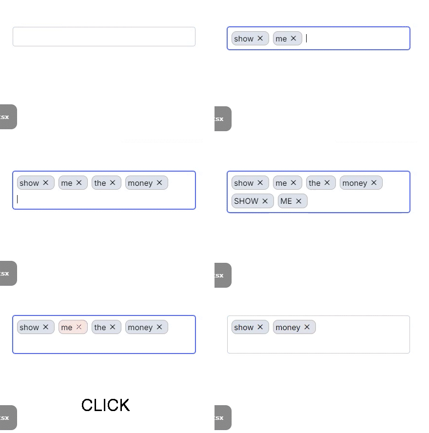
`GloomyTags` is a Vue.js component for adding and removing tags. It allows users to add or remove tags in an input field, with support for customizable styling and input control.
## Installation
To add the `GloomyTags` component to your Vue project, install it using either npm or yarn:
```bash
npm install vue-tag-maker
```
or
```bash
yarn add vue-tag-maker
```
## Usage

1. **Component Registration**
Register the component in the Vue file where you want to use it:
```vue
<script>
import GloomyTags from 'vue-tag-maker'
export default {
components: { GloomyTags },
data() {
return {
tags: [] // initial state
}
},
methods: {
updateTags(newTags) {
this.tags = newTags
}
}
}
</script>
<template>
<GloomyTags :state="tags" :setState="updateTags" />
</template>
```
2. **Component Properties**
The `GloomyTags` component supports the following properties:
- **`name`**: The name of the input field.
- **`placeHolder`**: The placeholder text for the input field.
- **`state`**: The current array of tags.
- **`setState`**: A function to update the array of tags.
- **`onChange`**: A callback function that is called when tags are changed.
- **`onBlur`**: A callback function that is called when the input field loses focus.
- **`separators`**: An array of keys that separate tags. Defaults to `[]`.
- **`disableBackspaceRemove`**: If true, prevents tags from being removed with the backspace key. Defaults to `false`.
- **`onExisting`**: A callback function that is called when an existing tag is entered.
- **`onRemoved`**: A callback function that is called when a tag is removed.
- **`disabled`**: Disables the input field if true. Defaults to `false`.
- **`isEditOnRemove`**: If true, switches to edit mode when a tag is removed. Defaults to `false`.
- **`beforeAddValidate`**: A validation function that is called before adding a tag.
- **`onKeyUp`**: A callback function that is called when a key is released in the input field.
- **`classNames`**: An object with customized CSS class names.
- **`throttleTime`**: The throttle time (ms) for tag addition requests. Defaults to `300`.
3. **Component Methods**
The `GloomyTags` component includes the following methods:
- **`cursorToInput`**: Focuses the input field when the `gloomy-tag--container` is clicked.
- **`handleKeyDown`**: Handles key input events to add or remove tags.
- **`handleTagRemove`**: Removes a specific tag.
4. **Styling**
The `GloomyTags` component uses scoped CSS for styling. The CSS includes the following elements:
- `.gloomy-tag--container`: The default style for the tag input container.
- `.gloomy-tag--input`: The default style for the input field.
- `.gloomy-tag--tag`: The default style for each tag.
- `.gloomy-tag--focus`: The style for a focused tag.
- `.gloomy-tag--tag.disappearing`: The style for a tag that is being removed.
## Example
```vue
<template>
<div id="app">
<GloomyTags
:state="tags"
:setState="updateTags"
name="tags"
placeHolder="Type and press enter"
:separators="['Enter', ',']"
:classNames="{ tag: 'custom-tag-class', input: 'custom-input-class' }"
/>
</div>
</template>
<script setup lang="ts">
import { ref } from 'vue'
import GloomyTags from 'vue-tag-maker'
const tags = ref<string[]>([])
function updateTags(newTags: string[]) {
tags.value = newTags
}
</script>
```
## Contributing
For those who wish to contribute, please refer to the [CONTRIBUTING.md](CONTRIBUTING.md) file.
## License
This project is licensed under the MIT License. For more details, please refer to the [LICENSE](LICENSE) file.