vue-materialize-datatable
Version:
Datatable for VueJS with Materialize
437 lines (388 loc) • 8.36 kB
Markdown
# vue-materialize-datatable [](https://badge.fury.io/js/vue-materialize-datatable)
> A fancy Materialize CSS datatable VueJS component
<!-- -->
> BTC donations: `16dt5DdjGvduZ3KZcFrwsBA82qqfrcbeUQ`
## Demo
https://microdroid.github.io/vue-materialize-datatable/
## Features
- Sorting, with numerical sorting
- Pagination
- Localization
- Fuzzy searching
- Server searching
- Excel export
- Printing
- Custom topbar buttons
- Flexible data-from-row extractor
- Follows the Material Design spec
- Really, really efficient.. handles thousands of rows flawlessly
- And much more..
## Requirements
- [`materialize-css`](https://www.npmjs.com/package/materialize-css) (and **NOT** any other MD library!)
- VueJS 2
## Installation
```bash
npm i vue-materialize-datatable --save
```
**You also need to include Material Design icons.** You have two ways of doing this:
The first and the recommended way is loading via Google's CDN, by adding this tag to your HTML
```HTML
<link href="https://fonts.googleapis.com/icon?family=Material+Icons" rel="stylesheet">
```
Or this in your CSS/Sass files:
```CSS
@import url(http://fonts.googleapis.com/icon?family=Material+Icons);
```
**Alternatively**, you can use the NPM package and add the font to your bundle by:
```
npm i material-design-icons-iconfont -S
```
and then include it in your Sass/CSS files
```CSS
@import "~material-design-icons-iconfont/dist/material-design-icons";
```
## Usage
Include the component,
```javascript
import DataTable from "vue-materialize-datatable";
```
Then, register the component, however you like:
```javascript
{
...
components: {
...
"datatable": DataTable
}
}
```
And then.. use the component:
```xml
<datatable></datatable>
```
Of course, code above will render garbage. Here are the props it accepts to render some sensible data:
<table>
<tr>
<th>
Prop name
</th>
<th>
Description
</th>
<th>
Example
</th>
</tr>
<tr>
<td>
<code>title</code>
</td>
<td>
The title of the datatable
</td>
<td>
<pre>
"Todos" // Name in top
</pre>
</td>
</tr>
<tr>
<td>
<code>columns</code>
</td>
<td>
Columns
</td>
<td>
<pre>
<code>
[ // Array of objects
{
label: "Name", // Column name
field: "name", // Field name from row
// Use dot for nested props
// Can be function with row as 1st param
numeric: false,// Affects sorting
html: false // Escapes output if false.
}
];
</code>
</pre>
</td>
</tr>
<tr>
<td>
<code>rows</code>
</td>
<td>
Rows
</td>
<td>
<pre>
<code>
[ // Array of objects
{
name: 'test', // Whatever
...
}
];
</code>
</pre>
</td>
</tr>
<tr>
<td>
<code>perPage</code>
</td>
<td>
Numbers of rows per page
</td>
<td>
<pre>
[10, 20, 30, 40, 50] (default) // Results per page
</pre>
</td>
</tr>
<tr>
<td>
<code>defaultPerPage</code>
</td>
<td>
Default rows per page
</td>
<td>
<pre>
10 (default) // Default results per page, otherwise it will be the
first value of perPage
</pre>
</td>
</tr>
<tr>
<td>
<code>initSortCol</code>
</td>
<td>
Default column for sorting on component initialization
</td>
<td>
<pre>
-1 (default) // By default table is not sorted by any column
</pre>
</td>
</tr>
<tr>
<td>
<code>onClick</code>
</td>
<td>
Function to execute on click
</td>
<td>
<pre>
console.log('hey') // Function, row 1st param
</pre>
</td>
</tr>
<tr>
<td>
<code>clickable</code>
</td>
<td>
Clickable rows. Will fire row-click event
</td>
<td>
<pre>
true (default) // Row is passed in the event payload
</pre>
</td>
</tr>
<tr>
<td>
<code>sortable</code>
</td>
<td>
Cause column-click to sort
</td>
<td>
<pre>
true (default) // Whether sortable
</pre>
</td>
</tr>
<tr>
<td>
<code>searchable</code>
</td>
<td>
Add fuzzy search functionality
</td>
<td>
<pre>
true (default) // Whether searchable
</pre>
</td>
</tr>
<tr>
<td>
<code>exactSearch</code>
</td>
<td>
Disable fuzzy search
</td>
<td>
<pre>
true (default) // Whether only exact matches are returned
</pre>
</td>
</tr>
<tr>
<td>
<code>serverSearch</code>
</td>
<td>
Server search is used to fetch data from server
</td>
<td>
<pre>
false (default) // If you wanna do server search then searchable and
serverSearch must be true and use serverSearchFunc as callback.
</pre>
</td>
</tr>
<tr>
<td>
<code>serverSearchFunc</code>
</td>
<td>
Function for search search
</td>
<td>
<pre>
function // For this searchSearch criteria is must.
</pre>
</td>
</tr>
<tr>
<td>
<code>paginate</code>
</td>
<td>
Add footer next/prev. buttons
</td>
<td>
<pre>
true (default) // Whether paginated
</pre>
</td>
</tr>
<tr>
<td>
<code>exportable</code>
</td>
<td>
Add button to export to Excel
</td>
<td>
<pre>
true (default) // Whether exportable
</pre>
</td>
</tr>
<tr>
<td>
<code>printable</code>
</td>
<td>
Add printing functionality
</td>
<td>
<pre>
true (default) // Whether printable
</pre>
</td>
</tr>
<tr>
<td>
<code>customButtons</code>
</td>
<td>
Custom buttons thingy
</td>
<td>
<pre>
<code>
// Array of objects
[
{
hide: false, // Whether to hide the button
icon: "search", // Materialize icon
onclick: aFunc() // Click handler
}
];
</code>
</pre>
</td>
</tr>
</table>
### Localization
You can use the property `locale` to set the display language. Available languages:
- `en` (English, default)
- `ar` (Arabic)
- `es` (Spanish)
- `cat` (Catalan)
- `br` (Brazilian Portuguese)
- `nl` (Netherlands)
- `fr` (French)
- `de` (German)
> You can very easily contribute a locale. Just clone `locales/en.json` and `require` in `locales/index.js`
### React to click on row
The datatable will emit the `row-click` event if `clickable` is set to `true` (default).
The events payload will contain the `row object`, you can bind to the event like this:
```html
<datatable v-on:row-click="onRowClick"></datatable>
<script>
var app = new Vue({
el: '#app',
...
methods: {
onRowClick: function (row) {
//row contains the clicked object from `rows`
console.log(row)
}
},
})
</script>
...
```
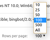
### Rows per page
You can specify the options of rows per page with the `perPage` prop. The first value will be the default value and the array will be sorted, so you can put whatever number you want.
```html
<!-- The default value will be 100 -->
<datatable :perPage="[100, 10, 25, 50, 500]"></datatable>
```
The options will be rendered as `[10, 20, 50, 100, 500]`
Otherwise, you can specify the default rows per page with the `defaultPerPage` prop.
```html
<!-- The default value will be 100 -->
<datatable :perPage="[10, 25, 50, 100, 500]" :defaultPerPage="100"></datatable>
```
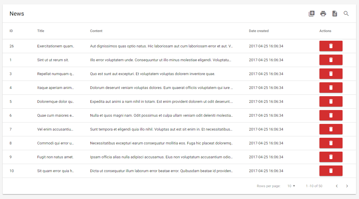
### Row buttons
Alright actually this is a hack. We probably should've implemented actual support for this but for now, here's an example on how to achieve something similar to the screenshot above:
```HTML
<datatable title="News" ...>
<th slot="thead-tr">
Actions
</th>
<template slot="tbody-tr" scope="props">
<td>
<button class="btn red darken-2 waves-effect waves-light compact-btn"
@click="(e) => deleteItem(props.row, e)">
<i class="material-icons white-text">delete</i>
</button>
</td>
</template>
</datatable>
```
Feel free to copy paste the code above, heh.