vue-dropdown-advanced
Version:
A seriously advanced Vue Dropdown tool with many custom options.
282 lines (213 loc) • 10.8 kB
Markdown
# An advanced Vue Dropdown Component
An advanced pure Vue Dropdown control with many customisable options.
## Key features
* caters for different types of dropdown items (action, checkbox, radio, header, seperator)
* lazily calls back for dropdown items (synchronously or asynchronously!)
* images are supported on left and on the right (multiple)
* dropdown items are removed from the markup when dropdown is closed
* dropdown location is configurable (left/right/up/down)
* the dropdown can be created through code using any html element as source
* and much more!
## Demo
Check it out at [demo-page](http://www.vuedropdown.marcelheeremans.com)!
## Typescript
The code snippets below are extracts from the demo project. An `index.d.ts` file providing intellisense will be included soon.
# Setup
```javascript
import Vue from 'vue';
import { DropDownMenu, DropDownInfo, DropDownItemBase, HeaderItem, ActionItem, CheckboxItem, RadioboxItem, SeperatorItem } from "vue-dropdown-advanced";
import 'vue-dropdown-advanced/dist/vue-dropdown-advanced.css';
import '/font/css/materialdesignicons.css';
```
### _**include the vue-dropdown-advanced.css**_
Make sure you include the vue-dropdown-advanced.css file in your main imports.
`import 'vue-dropdown-advanced/dist/vue-dropdown-advanced.css`
### _**include the materialdesignicons.css**_
If you wish to use images then also include the scoped /font/css/materialdesignicons.css (you must have '@mdi/font' as a dependency in your project)
`import '@mdi/font/css/materialdesignicons.css'`
# Using the Vue DropDown
## A basic 'fixed' dropdown items
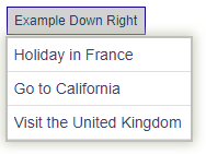
We 'attach' a DropDownMenu menu to the 'Example Down Right' div simply by nesting it within its parent element as shown in the Vue template below. This is imporant since a 'click' handler is attached to this parent so the dropdown can be toggled when clicked.
There is also a [programmatic way](#how-to-use-this-programmatically) of attaching this dropdown to any DOM element - more on this later.
```javascript
/// The 'template' part of the Vue file
<div class='button example-dr'>
Example Down Right
<drop-down-menu :items="fixedItems" ="this.onClick"> </drop-down-menu>
</div>
```
Notice we have bound the 'items' property to the 'fixedItems' data property of the vue model. When the parent is 'clicked' the onClick handler is called with the item itself but also any other dropdown state.
```javascript
/// The 'javascript' part of the Vue file
export default Vue.extend({
name: "app",
data: () => {
const fixedItems: DropDownItemBase[] = [];
return {
fixedItems
}
},
methods: {
onClick(info: DropDownInfo) {
let msg = `Item '${info.item.text}' was clicked. [key: ${info.item.key}] `;
console.log(msg);
},
},
components: {
DropDownMenu
},
created() {
this.fixedItems.push(new ActionItem("A", "Holiday in France", "", false, _ => alert(_.key)));
this.fixedItems.push(new ActionItem("B", "Go to California"));
this.fixedItems.push(new ActionItem("C", "Visit London"));
}
});
```
Bit boring, let's see what else we can do.
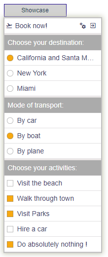
## Show-casing the dropddown advanced
That is more like it!
Again, we 'attach' a DropDownMenu menu to the 'Example Down Right' div by nesting it within its div as shown in the Vue template below.
```javascript
/// The 'template' part of the Vue file
<div class='button example-dr'>
Showcase
<drop-down-menu :items="fixedItems" ="this.onClick"> </drop-down-menu>
</div>
```
Again, we are binding the 'items' property to the 'fixedItems' data property of the vue model. When the parent is 'clicked' the onClick handler is called with the item itself but also any other dropdown state.
```javascript
/// The 'javascript' part of the Vue file
var item = new ActionItem("booknow", "Book now!", "mdi-airplane-takeoff");
item.data = { pos: context }; // save some random data with this item..
item.addRightImage("mdi-cogs", "settings");
item.addRightImage("mdi-exit-to-app", "exit the application");
fixedItems.push(item);
fixedItems.push(new SeperatorItem());
fixedItems.push(new HeaderItem("Choose your destination:"));
fixedItems.push(new RadioboxItem("california", "California and Santa Monica", "A"));
fixedItems.push(new RadioboxItem("newyork", "New York", "A"));
fixedItems.push(new RadioboxItem("miami", "Miami", "A"));
fixedItems.push(new SeperatorItem());
fixedItems.push(new HeaderItem("Mode of transport:"));
fixedItems.push(new RadioboxItem("car", "By car", "B"));
fixedItems.push(new RadioboxItem("boat", "By boat", "B", true));
fixedItems.push(new RadioboxItem("plane", "By plane", "B"));
fixedItems.push(new SeperatorItem());
fixedItems.push(new HeaderItem("Choose your activities:"));
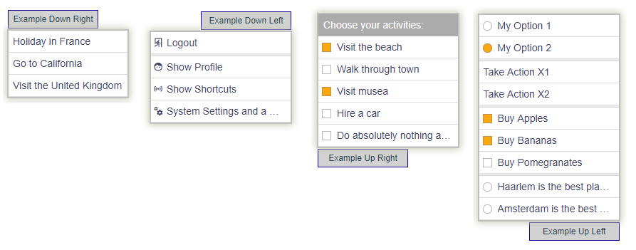
fixedItems.push(new CheckboxItem("beach", "Visit the beach"));
fixedItems.push(new CheckboxItem("town", "Walk through town"));
fixedItems.push(new CheckboxItem("park", "Visit Parks"));
fixedItems.push(new CheckboxItem("hirecar", "Hire a car"));
fixedItems.push(new CheckboxItem("nothing", "Do absolutely nothing !"));
```
```javascript
onClick(info: DropDownInfo) {
// info.item -> the selected item
// info.items -> all the source items that are shown
// info.imageOnRight -> (RightImageInfo) details regarding the right image if it was clicked
},
```
Note the `groupBy` property available on Radiobox items. Identical `groupBy` values will force a mutually exclusive group to be created, ie only a single radiobox can be 'checked' within a group. Hence in the example above we have two groups; one with groupBy marker 'A', the other with value 'B'. These identifiers could be any unique string.
### Right placed Images
Images placed on the right of the text are selectable and therefore can be 'listened' for.
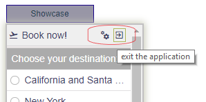
Use the `addRightImage` method to add a 'right aligned' image to an ActionItem. The first param is a [materialdesignicons](https://cdn.materialdesignicons.com/3.6.95/) identifier, the second is an optional tooltip.
```javascript
...
var item = new ActionItem("booknow", "Book now!", "mdi-airplane-takeoff");
item.data = { pos: context }; // save some random data with this item..
item.addRightImage("mdi-cogs", "settings");
item.addRightImage("mdi-exit-to-app", "exit the application");
...
```
## Dropdown Direction
The dropdown doesn't necessarily has to go 'down' :) It can also go up as well as be left or right aligned.
This is controlled through the `direction` property.
The default is `down-right` but it can be set to `down-left`, `up-left` or `up-right` - see examples below.
```javascript
/// The 'template' part of the Vue file (NOTE the 'direction' property)
<div class='button'>
Example Up Left
<drop-down-menu :items="myitems_ul" ="this.onClick" direction="up-left"></drop-down-menu>
</div>
```
## Retrieving dropdown items asynchronously
An asynchronous request for data can be made by binding a function to the itemsAsync prop of the DropDownMenu. This function is expected to return an array of DropDown items. This is **_extremely_** useful when dropdown items can only be determined at runtime.
```javascript
/// The 'template' part of the Vue file
<div class='button'>
Example Up Left
<drop-down-menu :itemsAsync="getAsyncItems" ="this.onClick"> </drop-down-menu>
</div>
```
```javascript
methods: {
onClick(info: DropDownInfo) {
...
},
async getAsyncItems() {
await delay(1000); // call an api for (dropdown) data (async)
// .. convert the data to DropDownItems ...
return this.myitems_dr; // return these items
},
},
```
## Max/Min dropdown sizing
A certain minimum or maximum of the dropdown can be enforced by providing a `min-width`, `max-width` or `max-height` property as shown below. Specify the value including the unit ('px' in this case).
```javascript
/// The 'template' part of the Vue file
<div class='button'>
Example Up Left
<drop-down-menu :itemsAsync="getAsyncItems" ="this.onClick" min-width="240px"> </drop-down-menu>
</div>
```
# How to use this programmatically
In cases where you just want to attach the dropdown to an DOM existing element anywhere on your form without altering your template you can use the `DropDownControl` class.
1. Simply create a new `DropDownControl` object passing in the element you wish to attach the dropdown to. This could be **any** html element.
2. Assign the dropdown items to show
3. Attach an event handler(s)
4. Set some specific properties (like minWidth or OpenOnCreate)
5. Once configured call 'createMenu()' which will create and prepare the dropdown control
### In its simplest form it would look something like this:
```javascript
static demo1 = () => {
let el = document.getElementsByClassName("example-programmatically");
// specify the dropdown items
let items = [];
items.push(new ActionItem("logout", "Logout", "mdi-exit-run", false, _ => alert(_.key)));
items.push(new SeperatorItem());
items.push(new ActionItem("profile", "Show Profile", "mdi-face"));
items.push(new ActionItem("shortcuts", "Show Shortcuts", "mdi-access-point"));
items.push(new ActionItem("setting", "System Settings and a whole lot more and stuff", "mdi-cogs"));
// 1. create a new DropDownControl for this element
var dd: DropDownControl = new DropDownControl(el[0]);
// 2. assign the items to diplay when clicked
dd.items = items;
// 3. set a handler when the user selects an item
dd.onClick = (info: DropDownInfo) => {
debugger;
console.log(info.item.key); // etc...
}
// 4. set some more specific properties
dd.openOnCreate = true;
dd.minWidth = "300px"
dd.maxHeight = "150px";
// 5. create the vue dropdown control
dd.createMenu();
}
```
# History
|version | Notes |
| ---- | ------ |
v 0.1.4 | security risk package updates
v 0.1.3 | css updates
v 0.1.2 | introduction of the DropDownControl allowing full programmatic control
v 0.1.1 | dropdown now supports min-width, max-width and max-height properties
v 0.1.0 | introduced event handler in addition to :click callback
v 0.0.11 | cleaned package - separated css and materialdesignicons.css
v 0.0.10 | exporting more helper objects (like getTestItems, delay, createGuidRight5)
v 0.0.9 | small fixes
v 0.0.1..8 | Initial release - work in progress