vue-circle-counter
Version:
Vue compoment to create a circular counter or progress bar in SVG
53 lines (40 loc) • 1.97 kB
Markdown
# VUE CIRCLE COUNTER
This Vue component creates a circular counter. The angle, colors, strokewidth, spacing between dashes and
direction can all be controlled through properties.
## Examples
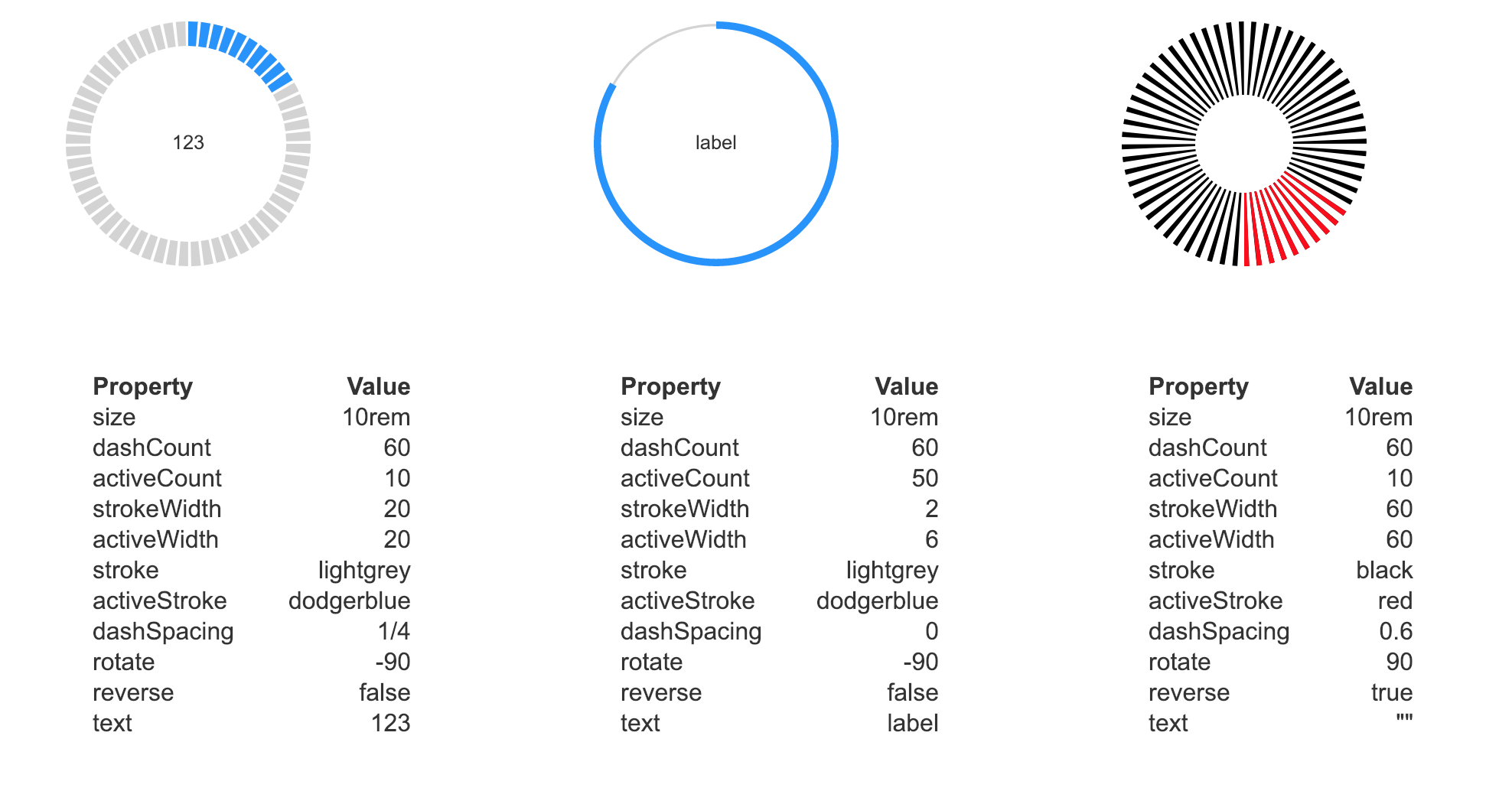
[Sample code on codesandbox](https://codesandbox.io/s/github/snirp/vue-circle-counter)
[Browser example on Codepen](https://codepen.io/snirp/pen/PXXpvW)
## Project setup
With a package manager
```
# npm
$ npm install vue-circle-counter
#yarn
$ yarn add vue-circle-counter
```
For the browser
```
<script src="unpkg.com/vue-circle-counter@latest/dist/circleCounter.umd.min.js"></script>
```
## How it works
The component generates an `SVG` element with default width and height of 100% (outer diameter of the counter).
Two dashed strokes are overlayed: the bottom one controlled by `stroke` and `dashCount` and the top one by
`activeStroke` and `activeCount`. You can `reverse` the direction to counter-clockwise and `rotate` the start
angle (default is right / 3 o'clock).
## Properties
|prop|description|default|options|
|:---|---|---|---|
|`size`|width and height of element|`10rem`|String|
|`dashCount`|Total number of dashes|`60`|Natural number|
|`activeCount`|Number of dashes on top|`10`|Natural number|
|`strokeWidth`|Bottom stroke as a percentage of the radius|`20`|`0` to `100`|
|`activeWidth`|Top stroke as a percentage of the radius|`20`|`0` to `100`|
|`stroke`|Stroke color of the bottom dashes|`lightgrey`|`color`|
|`activeStroke`|Stroke color of the top dashes|`dodgerblue`|`color`|
|`dashSpacing`|Fraction of width taken up by space between dashes|`1/4`|`0` to `1`|
|`rotate`|Degrees rotation for start angle (0 = right)|`-90`|`-360` to `360`|
|`reverse`|Reverse the direction of counting (true = counter-clockwise)|`false`|`false` or `true`|
|`text`|Text string to display inside SVG|`""`|String|
## License
MIT Open Source License