vue-basic-alert
Version:
Basic Vue Alert Component for basic use cases.
106 lines (76 loc) • 3.22 kB
Markdown
# vue-basic-alert
Basic Vue Alert Component for basic use cases.
## Demo
Go to [Our demo page](https://jasonanger.github.io/vuebasicalert/) to check out.
## Installation
Use the node package manager [npm](https://www.npmjs.com/package/vue-basic-alert) to install vue-basic-alert.
```bash
npm i --save vue-basic-alert
```
## Usage
Import Vue Basic Alert Component first.
```javascript
import VueBasicAlert from 'vue-basic-alert'
export default defineComponent({
...
components: {
VueBasicAlert
}
...
});
```
Or ``app.use(VueBasicAlert)``.
```javascript
import { createApp } from 'vue';
import App from 'App.vue';
import VueBasicAlert from 'vue-basic-alert'
const app = createApp(App);
app.use(VueBasicAlert)
app.mount('#app');
```
Add ``<vue-basic-alert ref="alert" />`` to your ``app``.
To interact with ``vue-basic-alert``, you can use ``$ref.alert``.
There are 2 methods: ``showAlert(alertType: string, iconSize: number, iconType: string ,alertHeader: string, alertMessage: string)`` and ``closeAlert()``
```javascript
<template>
<div id="app">
<button
@click="
$refs.alert.showAlert(
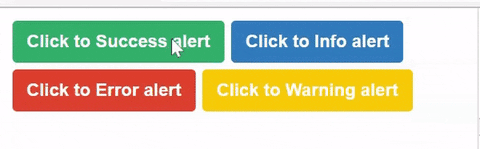
'success', // There are 4 types of alert: success, info, warning, error
'This is the information of something you may know Success.', // Message of the alert
'Success 200', // Header of the alert
{ iconSize: 35, // Size of the icon (px)
iconType: 'solid', // Icon styles: now only 2 styles 'solid' and 'regular'
position: 'top right' } // Position of the alert 'top right', 'top left', 'bottom left', 'bottom right'
)"
>
Click to Success alert
</button>
<vue-basic-alert
:duration="300" // duration of transistions (ms)
:closeIn="300" // if you dont have this, you can close the alert manually
ref="alert" />
</div>
</template>
```
``vue-basic-alert`` props:
- ``position``: position of the alert ``type: String``, default value is ``top right``
- ``duration``: duration of transistions (ms)
- ``closeIn``: Automatically close the alert in ``closeIn`` (ms). If you dont have this, you can close the alert manually
## Contributing
Pull requests are welcome. For major changes, please open an issue first to discuss what you would like to change.
Please make sure to update tests as appropriate.
## Project Status
Ready for production. We will update more styles in the ``2.0.0``.
- ``1.0.4`` : 4 types of alert in just 1 style. ``readme.md``, ``vue-basic-alert`` is really basic.
- ``1.0.5`` : Fixed bugs
- ``1.0.6`` : Update ``entry.esm.ts`` for import, Animations, more position
- ``1.0.8`` : Fixed bugs
- ``1.0.9`` : New demo page at ``https://jasonanger.github.io/vuebasicalert/`` [page](https://jasonanger.github.io/vuebasicalert/)
- ``1.1.0`` : Long-Term Support
- ``2.0.0`` : ``To-do`` 2 more styles and customizable icons, etc.
## License
[MIT](https://choosealicense.com/licenses/mit/)
Copyright (c) 2022-present, Jason Anger (An Do)