utquidem
Version:
The meta-framework suite designed from scratch for frontend-focused modern web development.
84 lines (66 loc) • 2.36 kB
Markdown
title: 管理 Design System
在前两个小节中,我们了解了 Utility Class 以及使用了 Modern.js 已经集成的 Utility Class 工具库 [Tailwind CSS](https://tailwindcss.com/),
默认提供的设计系统生成的样式可以满足实际开发中的部分需求。
然而实际开发中,我们可能需要修改默认的设计系统规范。为此,Modern.js 提供了
[`source.designSystem`](/docs/apis/config/source/design-system) 配置来管理项目的设计系统。
## 覆盖默认配置
要覆盖默认的设计系统配置,请在 `modern.config.js` 的 `source.designSystem` 中添加要覆盖的键。
```js title="modern.config.js"
export default defineConfig({
source: {
designSystem: {
opacity: {
0: '0',
20: '0.2',
40: '0.4',
60: '0.6',
80: '0.8',
100: '1',
},
},
},
});
```
这将完全替换默认键配置,因此在上面的示例中,不会生成默认的 opacity utilities。
所有未覆盖的键都将从默认主题继承,因此在上面的示例中,将保留颜色,间距,边框圆角,背景位置等内容的默认主题配置。
## 扩展默认配置
如果您想保留主题选项的默认值,但又要添加新值,请在 `designSystem.extend` 下添加扩展的内容。
例如,如果我们想添加一个额外的断点但保留现有的断点,则可以扩展 `screens` 属性:
```js title="modern.config.js"
export default defineConfig({
source: {
designSystem: {
opacity: {
0: '0',
20: '0.2',
40: '0.4',
60: '0.6',
80: '0.8',
100: '1',
},
extend: {
screens: {
'2xl': '1440px',
},
},
},
},
});
```
修改 `src/Item/index.tsx` 的 button 组件代码
```js
<button
type="button"
disabled={archived}
className={`bg-blue-500 text-white font-bold
py-2 px-4 rounded-full hover:bg-blue-700 2xl:bg-red-500`}
>
Archive
</button>
```
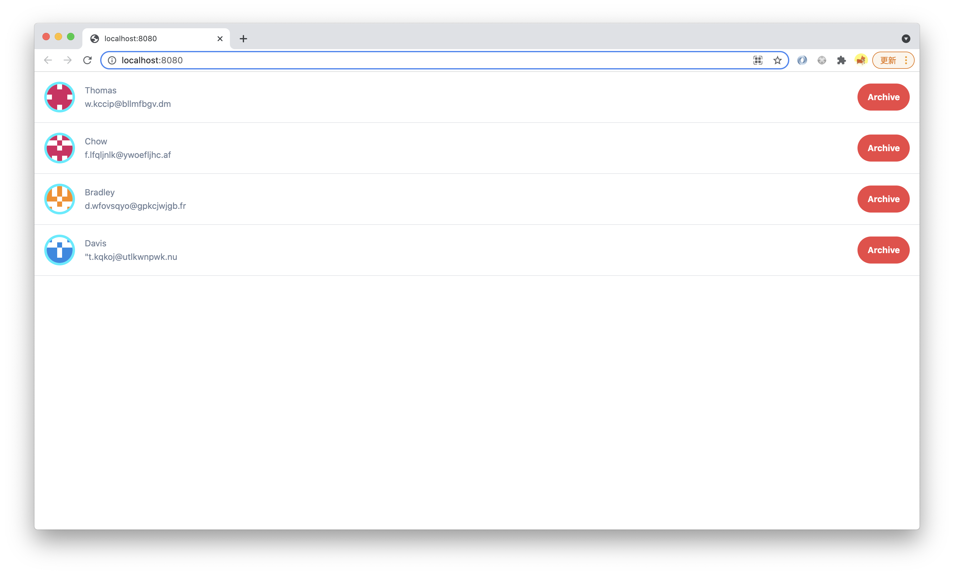
执行 `pnpm run dev` 后,增加页面宽度超过 1440px 可以看到 button 颜色变化:
> 本小节的代码可以在[这里查看](https://github.com/modern-js-dev/modern-js-examples/tree/main/tutorials/c06/hello-modern-4)。