uni-module-common
Version:
Common library for universal modules of twigis.
1,364 lines (1,259 loc) • 207 kB
Markdown
# uni-module-common
uni-module-common is a private library.
## Installation
Use the package manager [npm](https://www.npmjs.com/) to install uni-module-common.
```bash
npm install uni-module-common
```
## Example usage
```javascript
import { MultilineTextField } from 'uni-module-common'
render() {
return (
<MultilineTextField label="MyMultiLine" value="Lorem Ipsum">
</MultilineTextField>
);
}
```
## Components
- [Action](#action)
- [ActionBookmark](#actionbookmark)
- [ActionCell](#actioncell)
- [ActionDetail](#actiondetail)
- [ActionFileInput](#actionfileinput)
- [ActionMenu](#actionmenu)
- [ActionSelect](#actionselect)
- [ActionSeparator](#actionseparator)
- [AlertBox](#alertbox)
- [AppLink](#applink)
- [BodyCell](#bodycell)
- [CheckBox](#checkbox)
- [ClearableInput](#clearableinput)
- [CollapseCell](#collapsecell)
- [Color](#color)
- [ColorSelect](#colorselect)
- [ColumnFilter](#columnfilter)
- [ColumnFilterDate](#columnfilterdate)
- [ColumnFilterEnum](#columnfilterenum)
- [ColumnFilterNumber](#columnfilternumber)
- [ColumnFilterText](#columnfiltertext)
- [ConfirmBox](#confirmbox)
- [DataGrid](#datagrid)
- [DateCell](#datecell)
- [DateField](#datefield)
- [DateInput](#dateinput)
- [Dropdown](#dropdown)
- [DropdownExtended](#dropdownextended)
- [DropdownTab](#dropdowntab)
- [EditRelationControl](#editrelationcontrol)
- [ExtendedCheckBox](#extendedcheckbox)
- [Field](#field)
- [FileImage](#fileimage)
- [FileInput](#fileinput)
- [FulltextInput](#fulltextinput)
- [FurtherDetailList](#furtherdetaillist)
- [GridFulltextSearch](#gridfulltextsearch)
- [HeaderActions](#headeractions)
- [HeaderCell](#headercell)
- [HierarchicalSelectField](#hierarchicalselectfield)
- [Icon](#icon)
- [Image](#image)
- [MultilineTextField](#multilinetextfield)
- [MultilineTextFieldCountIndicator](#multilinetextfieldcountindicator)
- [NavIcon](#navicon)
- [NumberCell](#numbercell)
- [NumberField](#numberfield)
- [ObjectCard](#objectcard)
- [OrderableList](#orderablelist)
- [Overlay](#overlay)
- [Paginator](#paginator)
- [ProgressBar](#progressbar)
- [Property](#property)
- [PropertyAppLink](#propertyapplink)
- [RadioButton](#radiobutton)
- [RelationControl](#relationcontrol)
- [RoundSwitch](#roundswitch)
- [RowToolsCell](#rowtoolscell)
- [SearchField](#searchfield)
- [searchFieldSelect](#searchfieldselect)
- [SearchSelect](#searchselect)
- [SelectField](#selectfield)
- [SelectorCell](#selectorcell)
- [SelectorHeaderCell](#selectorheadercell)
- [Spinner](#spinner)
- [TextCell](#textcell)
- [TextField](#textfield)
- [TextHighlight](#texthighlight)
- [ToolsButton](#toolsbutton)
- [TriconField](#triconfield)
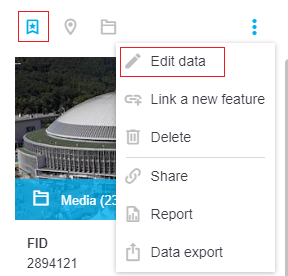
## Action
**Description**: Action icon with a hover effect based on application theme. Can be used either by itself or as a child of an action menu (three dots menu).
**Props**:
```
Action.propTypes = {
selected: PropTypes.bool,
disabled: PropTypes.bool,
label: PropTypes.bool,
icon: PropTypes.string,
onClick: PropTypes.func,
children: PropTypes.any,
condition: PropTypes.any,
toolTip: PropTypes.string,
className: PropTypes.string,
title: PropTypes.string,
style: PropTypes.object
}
```
- **selected** - if true, an icon is colored all the time (and not just if hovered), which can be useful for toggle-like effect
- **disabled** - if true, action is visible, but grayed-out and unable to be clicked
- **label** - if true, a text of the action will be showed
- **icon** - name of the icon, see [Icon](#icon) for possible choices
- **onClick**
- **children** - voluntary collection of html elements to be displayed inside an action
- **condition** - boolean or function value, that can indicate if the action should be displayed at all
- **toolTip**
- **className** - additional class that appends the default "Action" class
- **title** - text of the action, useful mainly in the action menu ("Edit data" text in the image above)
- **style** - additional style object to be applied to the "Action" element
**Usage**:
``` javascript
render() {
return (
<div>
<div className="Panel-toolbar">
<div className="Panel-toolbarContent">
<Action onClick={this.handleShowItemMediaClick.bind(this)}
disabled={false}
title="Media"
icon="folder" />
</div>
<div className="Panel-toolbarActions">
<ActionMenu hybridMenu={false}
anchor="right"
translator={this.props.appInterface.tree.select('workspace', 'localization', 'root').get()}>
<Action title="Edit"
condition={canUserEditItem}
onClick={this.handleEditItemClick.bind(this)}
icon="edit" />
</ActionMenu>
</div>
</div>
<div className="Panel-content">
...
</div>
</div>
)
}
```
[Back](#components)
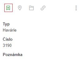
#### ActionBookmark
**Description**: Specialized kind of action for bookmarking certain objects.
**Props**:
```
ActionBookmark.propTypes = {
type: PropTypes.number.isRequired,
data: PropTypes.object.isRequired,
bookmarks: PropTypes.any,
localization: PropTypes.object.isRequired,
bookmarkActions: PropTypes.shape({
bookmarked: PropTypes.func.isRequired,
removeBookmark: PropTypes.func.isRequired,
addBookmark: PropTypes.func.isRequired
}).isRequired,
refreshFunc: PropTypes.func
}
```
- **type** - one of numeric values representing type of bookmarked object: FULLTEXT: 1, PARCEL: 2, ADDRESS: 3, SELECTION: 4, COORDINATES: 5, DRAWING: 6, GRID: 7, MODULE: 8. Recommended value is 1 (FULLTEXT) in most cases
- **data** - object to be bookmarked. It should have a unique *id* propery to be identified by
- **bookmarks** - object representing the bookmark cache
- **localization** - object with localized strings. At least *localization.bookmarks.tooltip* should be accessible
- **bookmarkActions** - functions to process the bookmark requests
- **refreshFunc** - function to be called after operations with bookmarks are finished
**Usage**:
``` javascript
render() {
let localization = this.props.appInterface.tree.select('workspace', 'localization').get();
let bookmarks = this.props.appInterface.tree.select('bookmarks').get();
return (
<div>
<div className="Panel-toolbar">
<div className="Panel-toolbarContent">
<ActionBookmark
data={this.state.currentItem}
type={1}
bookmarks={bookmarks}
localization={localization}
bookmarkActions={this.props.appInterface.actions}
refreshFunc={this.refreshFunction.bind(this)}
/>
</div>
<div className="Panel-toolbarActions">
...
</div>
</div>
<div className="Panel-content">
...
</div>
</div>
)
}
```
[Back](#components)
#### ActionCell
**Description**: Table cell for hyperlinks.
**Props**:
```
ActionCell.propTypes = {
data: PropTypes.object,
column: PropTypes.string,
router: PropTypes.object,
grid: PropTypes.object,
localization: PropTypes.object,
onClick: PropTypes.func,
relation: PropTypes.object,
isActionCellDisabled: PropTypes.bool,
getEntityNameFunction: PropTypes.func.isRequired,
fetchEntityDescriptionFunction: PropTypes.func.isRequired,
getAliasesFunction: PropTypes.func.isRequired,
resolveActionFunction: PropTypes.func.isRequired,
replaceParamsFunction: PropTypes.func.isRequired,
gridFetchSpecsForEntityFunction: PropTypes.func.isRequired,
appLinkTypes: PropTypes.shape({
EXTERNAL_URI: PropTypes.string.isRequired,
SHOW_GRID: PropTypes.string.isRequired,
SHOW_MODULE: PropTypes.string.isRequired,
SHOW_DETAIL: PropTypes.string.isRequired
}),
relationRoles: PropTypes.shape({
CHILD: PropTypes.string.isRequired,
PARENT: PropTypes.string.isRequired,
MULTI: PropTypes.string.isRequired
}),
dataTypes: PropTypes.shape({
BLOB: PropTypes.string.isRequired,
CLOB: PropTypes.string.isRequired,
DATE: PropTypes.string.isRequired,
ENUM: PropTypes.string.isRequired,
GEOM: PropTypes.string.isRequired,
NUMBER: PropTypes.string.isRequired,
UNKNOWN: PropTypes.string.isRequired,
VARCHAR: PropTypes.string.isRequired,
ACTION: PropTypes.string.isRequired,
}),
filterTypes: PropTypes.shape({
EQUALS: PropTypes.string.isRequired,
NOTEQUALS: PropTypes.string.isRequired,
CONTAINS: PropTypes.string.isRequired,
NOTCONTAINS: PropTypes.string.isRequired,
GREATERTHAN: PropTypes.string.isRequired,
GREATERTHANOREQUALS: PropTypes.string.isRequired,
LESSERTHAN: PropTypes.string.isRequired,
LESSERTHANOREQUALS: PropTypes.string.isRequired,
BETWEEN: PropTypes.string.isRequired,
ISNULL: PropTypes.string.isRequired,
ISNOTNULL: PropTypes.string.isRequired,
STARTSWITH: PropTypes.string.isRequired,
ENDSWITH: PropTypes.string.isRequired,
UNSPECIFIED: PropTypes.string.isRequired,
IN: PropTypes.string.isRequired,
NOTIN: PropTypes.string.isRequired
}),
isPhoneCompactView: PropTypes.bool
}
```
- **data** - object representing the table row. It must at least have a property corresponding to the *column* prop
- **column** - name of the value property of the data object
- **router** - router object for managing browser navigation. Value passed by the DataGrid parent object
- **grid** - object representing current grid settings. Value passed by the DataGrid parent object
- **localization** - object with localized strings. At least *localization.actionColumnDefaultText* should be accessible
- **onClick** - function to be called after the hyperlink click
- **relation** - object representing relation to other entity. Only for specialized usage inside twigis
- **isActionCellDisabled** - if true, the hyperlink is disabled
- **getEntityNameFunction** - function for parsing an entity name from a dataendpoint. Value passed by the DataGrid parent object
- **fetchEntityDescriptionFunction** - function for reading the description of a certain entity. Value passed by the DataGrid parent object
- **getAliasesFunction** - function for parsing captions for entity properties from entity description. Value passed by the DataGrid parent object
- **resolveActionFunction** - function for managing the default behavior of the action defined via twigis administration. Value passed by the DataGrid parent object
- **replaceParamsFunction** - helper function for *resolveActionFunction*. Value passed by the DataGrid parent object
- **gridFetchSpecsForEntityFunction** - function for reading the specs of a certain entity. Value passed by the DataGrid parent object
- **appLinkTypes**
- **relationRoles**
- **dataTypes**
- **filterTypes**
- **isPhoneCompactView** - if true, the component will be better mobile adapted
[Back](#components)
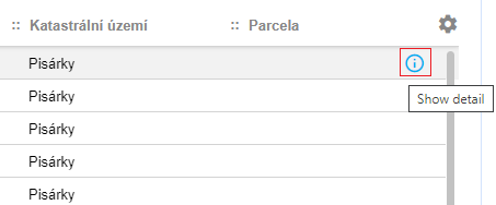
#### ActionDetail
**Description**: Action icon for opening detail from grid.
**Props**:
```
ActionDetail.propTypes = {
icon: PropTypes.string,
grid: PropTypes.object,
router: PropTypes.object,
data: PropTypes.object,
onClick: PropTypes.func,
onOpenEditPanel: PropTypes.func,
onCloseEditPanel: PropTypes.func,
localization: PropTypes.shape({
showDetail: PropTypes.string.isRequired
}).isRequired,
openPanelFunction: PropTypes.func.isRequired,
resolveActionFunction: PropTypes.func.isRequired,
replaceParamsFunction: PropTypes.func.isRequired
}
```
- **icon** - name of the icon, see [Icon](#icon) for possible choices. Default value is 'info'
- **grid** - object representing current grid settings. Value passed by the DataGrid parent object
- **router** - router object for managing browser navigation. Value passed by the DataGrid parent object
- **data** - underlaying object (representation of the grid row)
- **onClick** - additional function to be called after an icon is clicked, to be performed right before the data detail is shown
- **onOpenEditPanel** - handler for managing DataGrid workflow. Value passed by the DataGrid parent object
- **onCloseEditPanel** - handler for managing DataGrid workflow. Value passed by the DataGrid parent object
- **localization** - object with localized strings
- **openPanelFunction** - function for opening new twigis panel. Value passed by the DataGrid parent object
- **resolveActionFunction** - function for managing the default behavior of the action defined via twigis administration. Value passed by the DataGrid parent object
- **replaceParamsFunction** - helper function for *resolveActionFunction*. Value passed by the DataGrid parent object
[Back](#components)
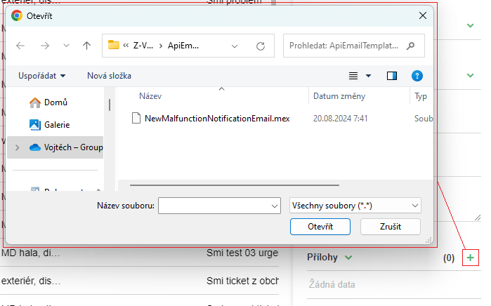
#### ActionFileInput
**Description**: Action icon with a built-in functionality for selecting files from the file system.
**Props**:
```
ActionFileInput.propTypes = {
selected: PropTypes.bool,
disabled: PropTypes.bool,
label: PropTypes.bool,
icon: PropTypes.string,
onFilesChosen: PropTypes.func,
children: PropTypes.any,
condition: PropTypes.any,
toolTip: PropTypes.string,
className: PropTypes.string,
title: PropTypes.string
}
```
- **selected** - if true, an icon is colored all the time (and not just if hovered), which can be useful for toggle-like effect
- **disabled** - if true, action is visible, but grayed-out and unable to be clicked
- **label** - if true, a text of the action will be showed
- **icon** - name of the icon, see [Icon](#icon) for possible choices
- **onFilesChosen** - function to be called when files are chosen
- **children** - voluntary collection of html elements to be displayed inside an action
- **condition** - boolean or function value, that can indicate if the action should be displayed at all
- **toolTip**
- **className** - additional class that appends the default "Action" class
- **title** - text of the action, useful mainly in the action menu
**Usage**:
``` javascript
handleFilesChosenAction(files) {
// TODO
}
render() {
return (
<div>
<div className="Panel-toolbar">
...
</div>
<div className="Panel-content">
<ActionFileInput
title={"Add file"}
condition={true}
disabled={false}
onFilesChosen={this.handleFilesChosenAction.bind(this)}
icon="add"
/>
</div>
</div>
)
}
```
[Back](#components)
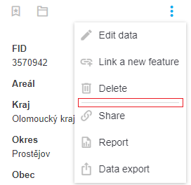
#### ActionMenu
**Description**: Dropdown three dots list of actions.
**Props**:
```
ActionMenu.propTypes = {
opened: PropTypes.bool,
onMenuToggle: PropTypes.func,
children: PropTypes.any,
anchor: PropTypes.string,
orientation: PropTypes.string,
hybridMenu: PropTypes.bool,
onOpenOutsideWindow: PropTypes.func,
translator: PropTypes.shape({
menuToolTip: PropTypes.string.isRequired
}).isRequired,
isIconDisabled: PropTypes.bool
}
```
- **opened** - opened state can be influenced by this property or internally by user manipulation
- **onMenuToggle** - function to be called after dropdown menu is toggled
- **children** - items to be displayed in the dropdown. [Action](#action) or [ActionSeparator](#actionseparator) are recommended to be used
- **anchor** - 'right' or 'left' alignment of the menu. Default value is 'left'
- **orientation** - 'up' or 'down' popup orientation. Default is 'down'
- **hybridMenu** - if true and there is only one child, menu is displayed as a single [Action](#action)
- **onOpenOutsideWindow** - function for handling scrolling if the popup would be opened outside of window view
- **translator** - object with localized strings
- **isIconDisabled** - if true, three dots icon is grayed-out and unable to be clicked
**Usage**:
``` javascript
render() {
return (
<div>
<div className="Panel-toolbar">
<div className="Panel-toolbarContent">
...
</div>
<div className="Panel-toolbarActions">
<ActionMenu hybridMenu={false}
anchor="right"
translator={this.props.appInterface.tree.select('workspace', 'localization', 'root').get()}>
<Action title={"Edit"}
condition={canUserEdit}
onClick={this.handleEditItemClick.bind(this)}
icon="edit" />
<Action title={"Delete"}
condition={canUserDelete}
onClick={this.handleDeleteItemClick.bind(this)}
icon="delete" />
<ActionSeparator/>
<Action title={"Add"}
condition={canUserAddItem}
onClick={this.handleAddItemClick.bind(this)}
icon="add" />
</ActionMenu>
</div>
</div>
<div className="Panel-content">
...
</div>
</div>
)
}
```
[Back](#components)
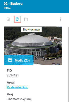
#### ActionSelect
**Description**: Action icon for showing an item in a map.
**Props**:
```
ActionSelect.propTypes = {
data: PropTypes.any,
type: PropTypes.any,
onClick: PropTypes.func,
localization: PropTypes.shape({
selectTitle: PropTypes.string.isRequired
}).isRequired,
hidePanelsFunction: PropTypes.func.isRequired,
setFixedPanelsFunction: PropTypes.func.isRequired,
setClickObjectFunction: PropTypes.func.isRequired
}
```
`+` [Action](#action) `props`
- **data** - underlaying object with at least one non-empty property of the following: *geometry*, *polygonCoordinates* or *x* and *y*
- **type** - type of the object (FULLTEXT: 1, PARCEL: 2, ADDRESS: 3, SELECTION: 4, COORDINATES: 5, DRAWING: 6, GRID: 7, MODULE: 8)
- **onClick** - additional function to be called after an icon is clicked, to be performed right after the geometry is shown in map
- **localization** - object with localized strings
- **hidePanelsFunction** - function for hiding twigis panels
- **setFixedPanelsFunction** - function for manipulation with panels in PanelManager
- **setClickObjectFunction** - function for showing an object in a map
**Usage**:
``` javascript
render() {
let localization = this.props.appInterface.tree.select('workspace', 'localization', 'actionsButtons').get();
return (
<div>
<div className="Panel-toolbar">
...
</div>
<div className="Panel-content">
<ActionSelect type={1}
data={this.item}
icon="point2"
localization={localization}
hidePanelsFunction={this.props.appInterface.actions.hidePanels}
setFixedPanelsFunction={this.props.appInterface.actions.setFixedPanels}
setClickObjectFunction={this.props.appInterface.actions.setClickObject}
/>
</div>
</div>
)
}
```
[Back](#components)
#### ActionSeparator
**Description**: Horizontal line for separating items. Mainly for usage within [ActionMenu](#actionmenu).
**Props**:
```
ActionSeparator.propTypes = {
className: PropTypes.string,
condition: PropTypes.oneOfType([
PropTypes.bool,
PropTypes.func
])
}
```
- **className** - additional class that appends the default "Action-separator" class
- **condition** - boolean or function value, that can indicate if the separator should be displayed at all
**Usage**:
``` javascript
render() {
return (
<div>
<div className="Panel-toolbar">
<div className="Panel-toolbarContent">
...
</div>
<div className="Panel-toolbarActions">
<ActionMenu hybridMenu={false}
anchor="right"
translator={this.props.appInterface.tree.select('workspace', 'localization', 'root').get()}>
<Action title={"Edit"}
condition={canUserEdit}
onClick={this.handleEditItemClick.bind(this)}
icon="edit" />
<Action title={"Delete"}
condition={canUserDelete}
onClick={this.handleDeleteItemClick.bind(this)}
icon="delete" />
<ActionSeparator/>
<Action title={"Add"}
condition={canUserAddItem}
onClick={this.handleAddItemClick.bind(this)}
icon="add" />
</ActionMenu>
</div>
</div>
<div className="Panel-content">
...
</div>
</div>
)
}
```
[Back](#components)
#### AlertBox
**Description**: Twigis replacement for modal "alert" dialog.
**Props**:
```
AlertBox.propTypes = {
onClick: PropTypes.func.isRequired,
text: PropTypes.string,
btnText: PropTypes.string
}
```
- **onClick** - function to be called after the confirmation button is clicked
- **text** - message of the dialog
- **btnText** - text of the confirmation button
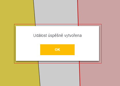
**Usage 1 - standalone**:
``` javascript
hideAlertBox() {
this.setState({
showAlertBox: false
});
}
render() {
return (
<div>
{this.state.showAlertBox && <AlertBox
onClick={this.hideAlertBox.bind(this)}
text={"Item saved succesfully"}
btnText={"OK"}
/>}
</div>
)
}
```
**Usage 2 - twigis module**:
``` javascript
let callback = () => {
// TODO
};
this.props.appInterface.actions.showAlert("Item saved succesfully", callback, "OK");
```
or simply
``` javascript
this.props.appInterface.actions.showAlert("Item saved succesfully");
```
[Back](#components)
#### AppLink
**Description**: Theme-styled hyperlink. Can be configured to perform certain special twigis actions.
**Props**:
```
AppLink.propTypes = {
router: PropTypes.shape({
push: PropTypes.func.isRequired
}).isRequired,
settings: PropTypes.shape({
action: PropTypes.string.isRequired,
parameters: PropTypes.object.isRequired
}).isRequired,
label: PropTypes.oneOfType([
PropTypes.string,
PropTypes.number
]).isRequired,
routerCopy: PropTypes.object,
gridCopy: PropTypes.object,
gridSettings: PropTypes.object,
title: PropTypes.string,
params: PropTypes.object,
onClick: PropTypes.func,
appLinkTypes: PropTypes.shape({
EXTERNAL_URI: PropTypes.string.isRequired,
SHOW_GRID: PropTypes.string.isRequired,
SHOW_MODULE: PropTypes.string.isRequired,
SHOW_DETAIL: PropTypes.string.isRequired
}),
getEntityNameFunction: PropTypes.func.isRequired,
gridFetchSpecsForEntityFunction: PropTypes.func.isRequired,
resolveActionFunction: PropTypes.func.isRequired,
replaceParamsFunction: PropTypes.func.isRequired,
data:PropTypes.object
}
```
- **router** - router object for managing browser navigation. Value passed by the DataGrid parent object
- **settings** - special object that can define behavior of the hyperlink (corresponds to the settings via twigis administration). It should have *action* and *parameters*
- **label** - hyperlink text
- **routerCopy** - for internal use only
- **gridCopy** - for internal use only
- **gridSettings** - for internal use only
- **title** - hyperlink tooltip
- **params** - object with additional information about an action (defined via *settings*). Should be in form of {panel: string}
- **onClick** - function to be called after the hyperlink was clicked and after an action (defined via *settings*) was performed
- **appLinkTypes**
- **getEntityNameFunction** - function for parsing an entity name from a dataendpoint
- **gridFetchSpecsForEntityFunction** - function for reading the specs of a certain entity
- **resolveActionFunction** - function for managing the default behavior of the action defined via twigis administration
- **replaceParamsFunction** - helper function for *resolveActionFunction*
- **data** - object upon which the action is to be performed
**Usage 1 - self handling**:
``` javascript
render() {
return (
<div>
<div className="Panel-toolbar">
...
</div>
<div className="Panel-content">
<AppLink label={"Open contracts"}
settings={{action: '', parameters: {}}}
onClick={this.handleDisplayContractsClick.bind(this)}
getEntityNameFunction={this.props.appInterface.api.getEntityName}
gridFetchSpecsForEntityFunction={this.props.appInterface.actions.gridFetchSpecsForEntity}
resolveActionFunction={this.props.appInterface.utils.resolveAction}
replaceParamsFunction={this.props.appInterface.utils.replaceParams}
appLinkTypes={this.props.appInterface.constants.AppLinkTypes} />
</div>
</div>
)
}
```
**Usage 2 - open filtered grid**:
``` javascript
render() {
let openMyOpenedTicketsSettings = {
action: 'ShowGrid',
parameters: {
dataentity: 'DS/TICKETS',
filter: `@FID_USER eq ${this.myUserId} and @STATE ne 'closed'`
}
};
return (
<div>
<div className="Panel-toolbar">
...
</div>
<div className="Panel-content">
<AppLink label={"Open my tickets"}
settings={openMyOpenedTicketsSettings}
getEntityNameFunction={this.props.appInterface.api.getEntityName}
gridFetchSpecsForEntityFunction={this.props.appInterface.actions.gridFetchSpecsForEntity}
resolveActionFunction={this.props.appInterface.utils.resolveAction}
replaceParamsFunction={this.props.appInterface.utils.replaceParams}
appLinkTypes={this.props.appInterface.constants.AppLinkTypes} />
</div>
</div>
)
}
```
[Back](#components)
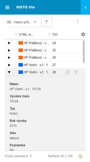
#### BodyCell
**Description**: One cell in a [DataGrid](#datagrid).
**Props**:
```
BodyCell.propTypes = {
type: PropTypes.string,
data: PropTypes.array,
rowIndex: PropTypes.number,
columnKey: PropTypes.string,
router: PropTypes.object,
grid: PropTypes.object,
localization: PropTypes.object,
selectionSettings: PropTypes.object,
onActionClick: PropTypes.func,
isActionCellDisabled: PropTypes.bool,
relation: PropTypes.object,
formatDateTime: PropTypes.func.isRequired,
getEntityNameFunction: PropTypes.func.isRequired,
fetchEntityDescriptionFunction: PropTypes.func.isRequired,
getAliasesFunction: PropTypes.func.isRequired,
resolveActionFunction: PropTypes.func.isRequired,
replaceParamsFunction: PropTypes.func.isRequired,
gridFetchSpecsForEntityFunction: PropTypes.func.isRequired,
appLinkTypes: PropTypes.shape({
EXTERNAL_URI: PropTypes.string.isRequired,
SHOW_GRID: PropTypes.string.isRequired,
SHOW_MODULE: PropTypes.string.isRequired,
SHOW_DETAIL: PropTypes.string.isRequired
}),
relationRoles: PropTypes.shape({
CHILD: PropTypes.string.isRequired,
PARENT: PropTypes.string.isRequired,
MULTI: PropTypes.string.isRequired
}),
dataTypes: PropTypes.shape({
BLOB: PropTypes.string.isRequired,
CLOB: PropTypes.string.isRequired,
DATE: PropTypes.string.isRequired,
ENUM: PropTypes.string.isRequired,
GEOM: PropTypes.string.isRequired,
NUMBER: PropTypes.string.isRequired,
UNKNOWN: PropTypes.string.isRequired,
VARCHAR: PropTypes.string.isRequired,
ACTION: PropTypes.string.isRequired,
}),
filterTypes: PropTypes.shape({
EQUALS: PropTypes.string.isRequired,
NOTEQUALS: PropTypes.string.isRequired,
CONTAINS: PropTypes.string.isRequired,
NOTCONTAINS: PropTypes.string.isRequired,
GREATERTHAN: PropTypes.string.isRequired,
GREATERTHANOREQUALS: PropTypes.string.isRequired,
LESSERTHAN: PropTypes.string.isRequired,
LESSERTHANOREQUALS: PropTypes.string.isRequired,
BETWEEN: PropTypes.string.isRequired,
ISNULL: PropTypes.string.isRequired,
ISNOTNULL: PropTypes.string.isRequired,
STARTSWITH: PropTypes.string.isRequired,
ENDSWITH: PropTypes.string.isRequired,
UNSPECIFIED: PropTypes.string.isRequired,
IN: PropTypes.string.isRequired,
NOTIN: PropTypes.string.isRequired
}),
columnName: PropTypes.string,
customCellRendering: PropTypes.object,
scale: PropTypes.number,
precision: PropTypes.number,
customRowToolsCellRenderer: PropTypes.func,
customRowHighlighted: PropTypes.object,
customRowClassName: PropTypes.string
}
```
**Usage**:
`As a component designated for` [DataGrid](#datagrid) `complex type, it is not described in further detail. In case of need, reach out for Arkance Czech development team for help.`
[Back](#components)
#### CheckBox
**Description**: Theme-styled checkbox for twigis.
**Props**:
```
CheckBox.propTypes = {
name: PropTypes.string,
suffix: PropTypes.any,
active: PropTypes.bool,
checked: PropTypes.bool,
disabled: PropTypes.bool,
value: PropTypes.any,
onChange: PropTypes.func,
title: PropTypes.string
}
```
- **name** - voluntary identifier of the input. Unique name is composed as '{name}-{suffix}'
- **suffix** - voluntary identifier of the input. Unique name is composed as '{name}-{suffix}'
- **active** - if false, checkbox is visibly grayed-out, however can be checked normally. Purely visual indication
- **checked** - state of the checkbox
- **disabled** - if true, checkebox is visible, but grayed-out and unable to be changed
- **value** - background representation of the checkbox value (important for multiple checkboxes at the same place)
- **onChange**
- **title** - tooltip of the checkbox
**Usage**:
``` javascript
toggleChecked(args) {
this.setState({
layerChecked: !this.state.layerChecked
});
}
render() {
return (
<div>
<div className="Panel-toolbar">
...
</div>
<div className="Panel-content">
<CheckBox name="layer-checkbox"
suffix='online'
checked={this.state.layerChecked}
active={this.state.layerActive}
onChange={this.toggleChecked.bind(this)} />
</div>
</div>
)
}
```
[Back](#components)
#### ClearableInput
**Description**: Text field with a button for clearing the input text. Quite similar to [SearchField](#searchfield)
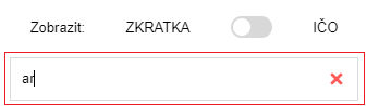
**Props**:
```
ClearableInput.propTypes = {
value: PropTypes.string,
inputType: PropTypes.string,
onChange: PropTypes.func.isRequired,
placeholder: PropTypes.string
}
```
- **value** - the input text
- **inputType** - type of input. Can be 'text' or 'number'. Default value is 'text'
- **onChange**
- **placeholder** - placeholder (text for empty value) of the input
**Usage**:
``` javascript
handleCurrentSearchTextChanged(args) {
if(!args || !args.length) {
args = '';
}
this.setState({
currentSearchText: args
});
}
render() {
return (
<div>
<div className="Panel-toolbar">
...
</div>
<div className="Panel-content">
<ClearableInput value={this.state.currentSearchText}
onChange={this.handleCurrentSearchTextChanged.bind(this)}
placeholder={"Enter text to be searched"}
/>
</div>
</div>
)
}
```
[Back](#components)
#### CollapseCell
**Description**: One cell in a [DataGrid](#datagrid) designed for collapsing/expanding rows on mobile devices.
**Props**:
```
CollapseCell.propTypes = {
data: PropTypes.array,
selectionSettings: PropTypes.object,
rowIndex: PropTypes.number,
highlightedRow: PropTypes.number,
expandedSettings: PropTypes.array,
onClick: PropTypes.func
}
```
**Usage**:
`As a component designated for` [DataGrid](#datagrid) `complex type, it is not described in further detail. In case of need, reach out for Arkance Czech development team for help.`
[Back](#components)
#### Color
**Description**: Component displaying a single color.
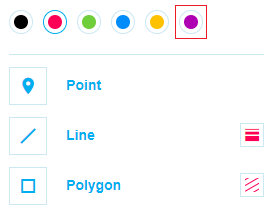
**Props**:
```
Color.propTypes = {
color: PropTypes.string,
onClick: PropTypes.func,
selected: PropTypes.bool
}
```
- **color** - color (html/css format)
- **onClick**
- **selected** - graphical indication of whether color is selected
**Usage**:
``` javascript
handleColorClick(color) {
this.setState({
color: color
});
}
render() {
return (
<div>
<div className="Panel-toolbar">
...
</div>
<div className="Panel-content">
<Color
key={'red'}
color={'red'}
selected={this.state.color == 'red'}
onClick={this.handleColorClick.bind(this, 'red')}
/>
</div>
</div>
)
}
```
[Back](#components)
#### ColorSelect
**Description**: Component for choosing a single color of a few.
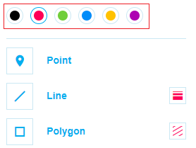
**Props**:
```
ColorSelect.propTypes = {
colors: PropTypes.arrayOf(PropTypes.string),
selected: PropTypes.string,
onChange: PropTypes.func
}
```
- **colors** - array of colors (html/css format)
- **selected** - selected color (html/css format)
- **onChange** - function to be called when color is selected
**Usage**:
``` javascript
selectColor(color) {
this.setState({
color: color
});
}
render() {
return (
<div>
<div className="Panel-toolbar">
...
</div>
<div className="Panel-content">
<ColorSelect
selected={this.state.color}
colors={['#000000', '#fe0056', '#70ce3b', '#008cf9', '#ffc200', '#ae00b2']}
onChange={this.selectColor.bind(this)}
/>
</div>
</div>
)
}
```
[Back](#components)
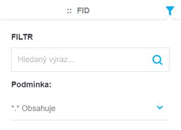
#### ColumnFilter
**Description**: Component for defining filter criteria. Based on props can be transformed into [ColumnFilterDate](#columnfilterdate), [ColumnFilterEnum](#columnfilterenum), [ColumnFilterNumber](#columnfilternumber) or [ColumnFilterText](#columnfiltertext)
**Props**:
```
ColumnFilter.propTypes = {
column: PropTypes.object,
filter: PropTypes.object,
localization: PropTypes.object,
onChange: PropTypes.func,
onScrollToEndItemList: PropTypes.func,
onChangeFilterValue: PropTypes.func,
tableHeight: PropTypes.number,
relationRoles: PropTypes.shape({
CHILD: PropTypes.string.isRequired,
PARENT: PropTypes.string.isRequired,
MULTI: PropTypes.string.isRequired
}),
dataTypes: PropTypes.shape({
BLOB: PropTypes.string.isRequired,
CLOB: PropTypes.string.isRequired,
DATE: PropTypes.string.isRequired,
ENUM: PropTypes.string.isRequired,
GEOM: PropTypes.string.isRequired,
NUMBER: PropTypes.string.isRequired,
UNKNOWN: PropTypes.string.isRequired,
VARCHAR: PropTypes.string.isRequired,
ACTION: PropTypes.string.isRequired,
DATETIME: PropTypes.string.isRequired
}),
filterTypes: PropTypes.shape({
EQUALS: PropTypes.string.isRequired,
NOTEQUALS: PropTypes.string.isRequired,
CONTAINS: PropTypes.string.isRequired,
NOTCONTAINS: PropTypes.string.isRequired,
GREATERTHAN: PropTypes.string.isRequired,
GREATERTHANOREQUALS: PropTypes.string.isRequired,
LESSERTHAN: PropTypes.string.isRequired,
LESSERTHANOREQUALS: PropTypes.string.isRequired,
BETWEEN: PropTypes.string.isRequired,
ISNULL: PropTypes.string.isRequired,
ISNOTNULL: PropTypes.string.isRequired,
STARTSWITH: PropTypes.string.isRequired,
ENDSWITH: PropTypes.string.isRequired,
UNSPECIFIED: PropTypes.string.isRequired,
IN: PropTypes.string.isRequired,
NOTIN: PropTypes.string.isRequired
}),
enumTypes: PropTypes.shape({
SIMPLE: PropTypes.string.isRequired,
HIERARCHICAL: PropTypes.string.isRequired,
PHYSICAL: PropTypes.string.isRequired,
VIRTUAL: PropTypes.string.isRequired
}),
dateFormats: PropTypes.shape({
DATE: PropTypes.string.isRequired,
TIME: PropTypes.string.isRequired,
DATE_TIME: PropTypes.string.isRequired,
ISO: PropTypes.string.isRequired,
ISO_DATE: PropTypes.string.isRequired,
ISO_TIME: PropTypes.string.isRequired,
VARIABLE_DATE: PropTypes.string.isRequired
}),
devices: PropTypes.object.isRequired,
viewports: PropTypes.object.isRequired,
focusSearchSelectFunction: PropTypes.func.isRequired,
translator: PropTypes.object.isRequired,
fieldValidator: PropTypes.func.isRequired,
configLocalization: PropTypes.string.isRequired,
isMobile: PropTypes.oneOfType([
PropTypes.bool,
PropTypes.func
]),
customColumnFilterFunction: PropTypes.func
}
```
**Usage**: `Since usage of ` [ColumnFilter](#columnfilter) ` is not trivial and requires twigis-specific props settings, we recommend using one of these directly: ` [ColumnFilterDate](#columnfilterdate), [ColumnFilterNumber](#columnfilternumber) or [ColumnFilterText](#columnfiltertext)
[Back](#components)
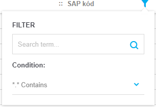
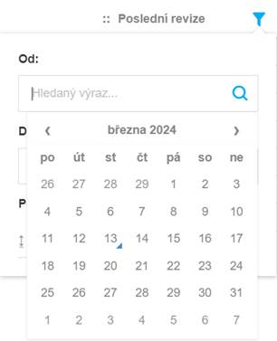
#### ColumnFilterDate
**Description**: Component for defining filter criteria of 'DateTime' values
**Props**:
```
ColumnFilterDate.propTypes = {
value: PropTypes.string,
value2: PropTypes.string,
type: PropTypes.string,
onChange: PropTypes.func.isRequired,
localization: PropTypes.object.isRequired,
dateFormats: PropTypes.shape({
DATE: PropTypes.string.isRequired,
TIME: PropTypes.string.isRequired,
DATE_TIME: PropTypes.string.isRequired,
ISO: PropTypes.string.isRequired,
ISO_DATE: PropTypes.string.isRequired,
ISO_TIME: PropTypes.string.isRequired,
VARIABLE_DATE: PropTypes.string.isRequired
}),
filterTypes: PropTypes.shape({
EQUALS: PropTypes.string.isRequired,
NOTEQUALS: PropTypes.string.isRequired,
CONTAINS: PropTypes.string.isRequired,
NOTCONTAINS: PropTypes.string.isRequired,
GREATERTHAN: PropTypes.string.isRequired,
GREATERTHANOREQUALS: PropTypes.string.isRequired,
LESSERTHAN: PropTypes.string.isRequired,
LESSERTHANOREQUALS: PropTypes.string.isRequired,
BETWEEN: PropTypes.string.isRequired,
ISNULL: PropTypes.string.isRequired,
ISNOTNULL: PropTypes.string.isRequired,
STARTSWITH: PropTypes.string.isRequired,
ENDSWITH: PropTypes.string.isRequired,
UNSPECIFIED: PropTypes.string.isRequired,
IN: PropTypes.string.isRequired,
NOTIN: PropTypes.string.isRequired
}),
devices: PropTypes.object.isRequired,
viewports: PropTypes.object.isRequired,
focusSearchSelectFunction: PropTypes.func.isRequired,
configLocalization: PropTypes.any.isRequired,
isMobile: PropTypes.oneOfType([
PropTypes.bool,
PropTypes.func
])
}
```
- **value** - first DateTime argument for filtering (being used in most filter types)
- **value2** - second DateTime argument for filtering (being used only for 'between' filter type)
- **type** - current type of filtering - one of values from *filterTypes* prop - 'between', 'equals', 'notequals', 'greaterthan', 'greaterthanorequals', 'lesserthan', 'lesserthanorequals', 'isnull' or 'isnotnull'. Default value is 'between'
- **onChange** - function called after any change (type change, value change)
- **localization** - object with localized strings
- **dateFormats**
- **filterTypes**
- **devices** - collection of available device types ('PC', 'MOBIL', 'TABLET')
- **viewports** - object defining width thresholds between different device types
- **focusSearchSelectFunction** - twigis function for focusing combos
- **configLocalization** - locality identifier ('en', 'cz' ..). Default value is 'cz'
- **isMobile** - if true, a component is formatted for optimized mobile view
**Usage**:
``` javascript
state = {
filterType: null,
filterValue1: null,
filterValue2: null
}
const objects = [
{date: new Date(2024, 0, 1), name: 'January 1st 2024'},
{date: new Date(2024, 1, 1), name: 'February 1st 2024'},
{date: new Date(2024, 2, 1), name: 'March 1st 2024'},
{date: new Date(2024, 3, 1), name: 'April 1st 2024'},
{date: new Date(2024, 4, 1), name: 'May 1st 2024'},
{date: new Date(2024, 5, 1), name: 'June 1st 2024'},
{date: new Date(2024, 6, 1), name: 'July 1st 2024'},
{date: new Date(2024, 7, 1), name: 'August 1st 2024'},
{date: new Date(2024, 8, 1), name: 'September 1st 2024'},
{date: new Date(2024, 9, 1), name: 'October 1st 2024'},
{date: new Date(2024, 10, 1), name: 'November 1st 2024'},
{date: new Date(2024, 11, 1), name: 'December 1st 2024'}
];
handleFilterChanged(filter) {
this.setState({
filterType: filter.type,
filterValue1: (filter.param1 && filter.param1.length) ? filter.param1 : null,
filterValue2: (filter.param2 && filter.param2.length) ? filter.param2 : null
});
}
render() {
let filteredObjects = objects.filter(x => {
if(!this.state.filterType) {
return true;
}
if(this.state.filterType == 'between') {
if(this.state.filterValue1 && this.state.filterValue2) {
let dateFrom = new Date(this.state.filterValue1);
let dateTo = new Date(this.state.filterValue2);
return x.date >= dateFrom && x.date <= dateTo;
}
else {
if(this.state.filterValue1) {
let dateFrom = new Date(this.state.filterValue1);
return x.date >= dateFrom;
}
else if(this.state.filterValue2) {
let dateTo = new Date(this.state.filterValue2);
return x.date <= dateTo;
}
}
}
else if(this.state.filterType == 'equals') {
// TODO
}
else if(this.state.filterType == 'notequals') {
// TODO
}
else if(this.state.filterType == 'greaterthan') {
// TODO
}
else if(this.state.filterType == 'greaterthanorequals') {
// TODO
}
else if(this.state.filterType == 'lesserthan') {
// TODO
}
else if(this.state.filterType == 'lesserthanorequals') {
// TODO
}
else if(this.state.filterType == 'isnull') {
// TODO
}
else if(this.state.filterType == 'isnotnull') {
// TODO
}
});
return (
<div>
<div className="Panel-toolbar">
...
</div>
<div className="Panel-content">
<ColumnFilterDate type={this.state.filterType}
value={this.state.filterValue1}
value2={this.state.filterValue2}
onChange={this.handleFilterChanged.bind(this)}
localization={localization}
devices={this.props.appInterface.constants.MapControlTypes.Devices}
viewports={this.props.appInterface.constants.MapControlTypes.VIEWPORTS}
focusSearchSelectFunction={this.props.appInterface.actions.focusSearchSelect}
configLocalization={'en'}
isMobile={false}
/>
<ul>
{filteredObjects.map((item, index) => {
return (
<li key={index} style={{margin: '8px'}}>{item.name}</li>
)
})}
</ul>
</div>
</div>
)
}
```
[Back](#components)
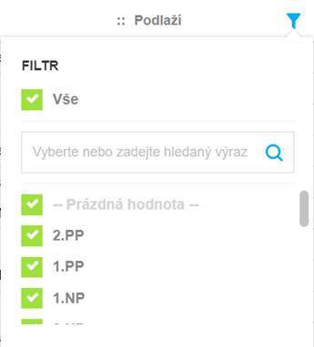
#### ColumnFilterEnum
**Description**: Component for defining filter criteria of 'Enum' values.
**Props**:
```
ColumnFilterEnum.propTypes = {
values: PropTypes.object,
items: PropTypes.array,
onChange: PropTypes.func.isRequired,
onScrollToEndItemList: PropTypes.func,
onChangeFilterValue: PropTypes.func,
column: PropTypes.object,
tableHeight: PropTypes.number,
itemsBeforeFilteringFromInput: PropTypes.array,
localization: PropTypes.object.isRequired,
translator: PropTypes.object.isRequired,
fieldValidator: PropTypes.func.isRequired,
enumTypes: PropTypes.shape({
SIMPLE: PropTypes.string.isRequired,
HIERARCHICAL: PropTypes.string.isRequired,
PHYSICAL: PropTypes.string.isRequired,
VIRTUAL: PropTypes.string.isRequired
}),
focusSearchSelectFunction: PropTypes.func,
loadedItems: PropTypes.array
}
```
**Usage**:
`As a component designated for` [DataGrid](#datagrid) `complex type, it is not described in further detail. In case of need, reach out for Arkance Czech development team for help.`
[Back](#components)
#### ColumnFilterNumber
**Description**: Component for defining filter criteria of 'Number' values
**Props**:
```
ColumnFilterNumber.propTypes = {
value: PropTypes.string,
value2: PropTypes.string,
type: PropTypes.string,
onChange: PropTypes.func.isRequired,
localization: PropTypes.object,
filterTypes: PropTypes.shape({
EQUALS: PropTypes.string.isRequired,
NOTEQUALS: PropTypes.string.isRequired,
CONTAINS: PropTypes.string.isRequired,
NOTCONTAINS: PropTypes.string.isRequired,
GREATERTHAN: PropTypes.string.isRequired,
GREATERTHANOREQUALS: PropTypes.string.isRequired,
LESSERTHAN: PropTypes.string.isRequired,
LESSERTHANOREQUALS: PropTypes.string.isRequired,
BETWEEN: PropTypes.string.isRequired,
ISNULL: PropTypes.string.isRequired,
ISNOTNULL: PropTypes.string.isRequired,
STARTSWITH: PropTypes.string.isRequired,
ENDSWITH: PropTypes.string.isRequired,
UNSPECIFIED: PropTypes.string.isRequired,
IN: PropTypes.string.isRequired,
NOTIN: PropTypes.string.isRequired
}),
devices: PropTypes.object.isRequired,
viewports: PropTypes.object.isRequired,
focusSearchSelectFunction: PropTypes.func.isRequired
}
```
- **value** - first Number argument for filtering (being used in most filter types)
- **value2** - second Number argument for filtering (being used only for 'between' filter type)
- **type** - current type of filtering - one of values from *filterTypes* prop - 'between', 'equals', 'notequals', 'greaterthan', 'greaterthanorequals', 'lesserthan', 'les