ts.photographer
Version:
Take pictures and manage them in a Titanium app.
140 lines (102 loc) • 5.72 kB
Markdown
# Photographer [](http://www.appcelerator.com/titanium/) [](http://www.appcelerator.com/alloy/) [](http://choosealicense.com/licenses/apache-2.0/)
This widget for the [Appcelerator](http://www.appcelerator.com) Titanium Alloy MVC framework
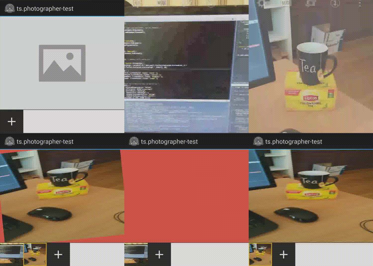
provides a full autonomous photo manager. It gives the user a way to take picture and browse
previously taken pictures through thumbnails. A user may also discard a picture and take new one.
## Preview
**iOS**

**Android**
## Quick Start
### Get it [](http://gitt.io/component/ts.photographer) [](http://badge.fury.io/js/ts.photographer)
Download this repository and install it:
* In your application's config.json file, include the following line in your dependencies:
```json
"dependencies": {
"ts.photographer": "1.0"
}
```
* Copy the `ts.photographer` folder into your `app/widgets` directory.
* Be sure to check and install all dependencies.
**Or use your favorite package manager**
- [gitTio](http://gitt.io/cli): `gittio install ts.photographer`
- [npm](https://npmjs.com): `npm install ts.photographer`
### Use it
* Require the widget in a view:
**file1.xml**
```xml
<Widget id="photographer" src="ts.photographer" />`
```
Which create a reference in your controller, accessible via: `$.photographer`
* Or, require it directly in a controller :
```javascript
var blurryView = Alloy.createWidget("ts.photographer");
```
Do not forget to initialize the widget; Before opening your window, call the widget's *init* method. For instance:
```
$.photographer.init({
previewBackgroundColor: "#1DB7FF",
addBackgroundColor: "#1DB7FF",
resolution: 1.5,
fadeDuration: $.photographer.SLOW,
fadeIntensity: $.photographer.NORMAL,
rotateIntensity: $.photographer.HIGH,
animations: {
$.photographer.DISCARD_SWIPE_HORIZONTAL,
$.photographer.DISCARD_ROTATE,
$.photographer.DISCARD_FADEOUT,
$.photographer.ADD_SMOOTH,
$.photographer.CHANGE_FADEOUT
}
});
```
Here is the list of available methods and options:
#### retrievePictures : `<Image[]>`
Retrieve all pictures taken by the user as an array of Image.
#### init `(options <Object>)`
Initialize the widget.
- `noPreviewBackgroundColor <String>`: The background color to display on initialisation.
- `noPreviewIcon <String | Image>`: The icon to display on initialisation.
- `previewHeight <Number>`: The height of the preview image. The preview will be full-width.
- `thumbnailSize <Number>`: The size (height and width) of each thumbnail; This is also the size of
the add button.
- `thumbnailSelectedBorderColor <String>`: The border color of a selected thumbnail.
- `thumbnailBarBackgroundColor <String>`: The background color of the thumbnail bar. Do not use
transparent.
- `addIcon <String | Image>`: The add icon.
- `addBackgroundColor <String>`: The add button background color.
- `delimiterColor <String>`: Color of the delimiter below the preview.
- `discardBackgroundColor <String>`: The color use behind the preview when the user perform a
discard gesture.
- `discardIcon <String | Image>`: The discard icon shown when discarding.
- `undoIcon <String | Image>`: The undo icon shown after a discard.
- `discardConfirmTitle <String>`: Title of the alert shown when discarding.
- `discardConfirmMessage <String>`: Content of the alert shown when discarding.
- `discardConfirmButtonDiscard <String>`: Value of the alert button corresponding to the 'discard'
action.
- `discardConfirmButtonCancel <String>`: Value of the alert button corresponding to the 'cancel'
action.
- `maxResolution <Number>`: Max resolution of the picture taken, in megapixel.
- `fadeDuration <SLOW | NORMAL | QUICK>`: Duration in milliseconds of the fade when changing a picture.
- `scaleIntensity <LOW | NORMAL | HIGH>`: Intensity of the scaling down effect on discard gesture.
- `rotateIntensity <LOW | NORMAL | HIGH>`: Intensity of the rotation effect on discard gesture.
- `fadeIntensity <LOW | NORMAL | HIGH>`: Intensity of the fade effect on discard gesture.
- `shiftDuration <SLOW | NORMAL | QUICK>`: Duration of the smooth shift effect on Android.
- `animations <Array>`: All animation to perform :
- `DISCARD_SWIPE_HORIZONTAL`: Allow the user to translate horizontally the picture on swipe.
- `DISCARD_SWIPE_VERTICAL`: Allow the user to translate vertically the picture on swipe.
- `DISCARD_ROTATE`: Rotate the picture during the swipe.
- `DISCARD_SCALEDOWN`: Scale-down the picture during the swipe.
- `DISCARD_FADEOUT`: Fadeout the picture during the swipe.
- `ADD_SMOOTH`: Android only, resize smoothly the thumbnail bar when a picture is added /
removed.
- `CHANGE_FADEOUT`: Fadeout the preview when changing to another.
## Changelog
* 1.0 First version
## TODO
- Tests coming soon.
- Enhance documentation.
[](http://wearesmiths.com)
Appcelerator, Appcelerator Titanium and associated marks and logos are trademarks of Appcelerator, Inc.
Titanium is Copyright (c) 2008-2015 by Appcelerator, Inc. All Rights Reserved.
Titanium is licensed under the Apache Public License (Version 2).