timeline-calendar-react
Version:
A timeline calendar component for React, built with TypeScript and Vite.
233 lines (184 loc) • 7.45 kB
Markdown
# Timeline Calendar React
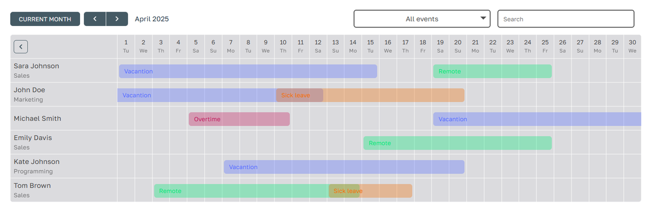
`timeline-calendar-react` is a customizable React library for displaying timeline-based calendars. It supports features like user ranges, events, statuses, and more, with a flexible and responsive design.
[Demo on vercel](https://timeline-calendar-react-demo.vercel.app/)
## Installation
Install the library using npm:
```bash
npm install timeline-calendar-react
```
[npm package](https://www.npmjs.com/package/timeline-calendar-react)
## Usage
Here is an example of how to use the `TimelineCalendar` component in your project:
```tsx
import TimelineCalendar from 'timeline-calendar-react';
// ....
export const mockUsers = [
{ id: 1, name: 'John Doe', department: 'Sales' },
{ id: 2, name: 'Jane Smith', department: undefined },
];
export const mockRanges = [
{
id: 1,
userId: 1,
eventType: 1,
statusType: 1,
startDate: '2025-04-01',
endDate: '2025-04-05',
},
{
id: 2,
userId: 2,
eventType: 2,
statusType: 2,
startDate: '2025-04-10',
endDate: '2025-04-15',
},
];
export const mockEvents = [
{ id: 1, label: 'Vacation' },
{ id: 2, label: 'Sick leave' },
];
export const mockStatuses = [
{ id: 1, label: 'Approved' },
{ id: 2, label: 'Pending' },
];
const App = () => {
return (
<TimelineCalendar
ranges={mockRanges}
users={mockUsers}
events={mockEvents}
statuses={mockStatuses}
/>
);
};
export default App;
```
## Props
### `TimelineCalendarProps`
| Prop Name | Type | Required | Default | Description |
|------------------|-------------------------------|----------|---------------|-----------------------------------------------------------------------------|
| `ranges` | `RangeType[]` | Yes | - | Array of ranges to display on the calendar. |
| `users` | `User[]` | Yes | - | Array of users to display in the sidebar. |
| `departments` | `Department[]` | No | `undefined` | Array of departments to display under user names. |
| `events` | `EventType[] or string[]` | No | `undefined` | Array of events to display with custom labels and colors. |
| `statuses` | `StatusType[] or string[]` | No | `undefined` | Array of statuses to display with custom labels and colors. |
| `options` | `TimelineOptions` | No | `undefined` | render Options |
### `TimelineOptions`
| Prop Name | Type | Required | Default | Description |
|-----------------|--------------------------------|----------|---------------|-----------------------------------------------------------------------------|
| `theme` | `"dark" or "light"` | No | `"light"` | Theme of the calendar. |
| `cellSize` | `string` | No | undefined | Size of each calendar cell (e.g., `'40px'`). If undefined is Flexible |
| `accentColor` | `string` | No | `'#a7bac3'` | Accent color for buttons and highlights. |
| `sidebarWidth` | `number` | No | `200` | Width of the sidebar in pixels. |
| `lang` | `"en" or "ru"` | No | `"en"` | Language for the calendar (English or Russian). |
| `currentDate` | `string (format "YYYY-MM-DD")` | No | `today` | Current date to display (e.g., `'2025-04-01'`). |
| `openedSidebar` | `boolean` | No | `true` | Whether the sidebar is open by default. |
| `hideFilters` | `boolean` | No | `false` | Whether to hide the filters section. |
## Types
### `TimelineCalendarProps`
```typescript
type TimelineCalendarProps = {
ranges: RangeType[];
users: User[];
// if specified, then displayed under the user name
departments?: Department[];
// if specified, then displayed instead of the base colors with the specified labels
events?: EventType[] | string[];
// if specified, then displayed instead of the base colors with the specified labels
statuses?: StatusType[] | string[];
options: {
theme?: Theme; // 'dark' | 'light' [default: 'light']
cellSize?: string; // f.e. '40px' [default: flexible]
accentColor?: string; // f.e. '#FF0000' [default: '#a7bac3']
sidebarWidth?: number; // f.e. 240 [default: 200]
lang: Locale; // 'en' | 'ru' [default: 'en']
currentDate?: string; // f.e. '2020-12-30' [default: today]
openedSidebar: boolean; // true | false [default: true]
hideFilters: boolean; // true | false [default: false]
} as TimelineOptions;
};
```
### `RangeType`
```typescript
type RangeType = {
id: number | string;
startDate: string;
endDate?: string;
userId: number | string;
eventType?: string | number;
statusType?: string | number;
comment?: string;
};
```
### `User`
```typescript
type User = {
id: number;
name: string;
department?: string | number;
};
```
### `Department`
```typescript
type Department = {
id: number;
manager?: string;
name: string;
};
```
### `EventType`
```typescript
type EventType = {
id: number;
label: string;
// TODO: will appear in the future
icon?: JSX.Element | string;
color?: string;
};
```
### `StatusType`
```typescript
type StatusType = {
id: number;
label: string;
// TODO: will appear in the future
icon?: JSX.Element | string;
color?: string;
};
```
### `TimelineOptions`
```typescript
type TimelineOptions = {
theme?: Theme;
cellSize?: string;
lang?: Locale;
accentColor?: string;
sidebarWidth?: number;
openedSidebar?: boolean;
currentDate?: string;
hideFilters?: boolean;
}
```
## Features
- **Customizable Themes**: Choose between light and dark themes.
- **Event and Status Management**: Display events and statuses with custom labels and colors.
- **Responsive Design**: Adjust cell sizes and sidebar widths for different screen sizes.
- **Localization**: Supports English (`en`) and Russian (`ru`) languages.
## License
This project is licensed under the MIT License. See the [LICENSE](LICENSE) file for details.
## Contributing
Contributions are welcome! Please open an issue or submit a pull request for any improvements or bug fixes.
## Support
If you encounter any issues, feel free to open an issue on the [GitHub repository](https://github.com/shinenkov/timeline-calendar-react).