tailwindcss-react-datepicker
Version:
A modern React Datepicker using Tailwind CSS 3
226 lines (165 loc) • 6.52 kB
Markdown
# Tailwindcss React Datepicker
[](https://www.npmjs.com/package/tailwindcss-react-datepicker)
[](https://www.npmjs.com/package/tailwindcss-react-datepicker)
### This is extended version of [react-tailwindcss-datepicker](https://react-tailwindcss-datepicker.vercel.app)
Added features:
- `isStaticPosition` - disable position absolute for Calendar (can be usefulul when you want to
build in your calendar in your own popup);
- `renderHeader` - render custom component on the top of a calender popover;
- `renderFooter` - render custom component on the bottom of a calender popover;
- `disableAutoHide` - disable autohide for calendar when user select date or date range. can be
usefule when you want to control popup closin in `renderHeader` or `renderFooter` function. _It
will not work with isStaticPosition._
#### Example:
```jsx
import React, { useState } from "react";
import Datepicker from "tailwindcss-react-datepicker";
const App = () => {
const [value, setValue] = useState({
startDate: new Date(),
endDate: new Date().setMonth(11)
});
const handleValueChange = newValue => {
console.log("newValue:", newValue);
setValue(newValue);
};
return (
<div>
<Datepicker
renderFooter={context => <button onClick={context.hideDatepicker()}>Ok</button>}
value={value}
onChange={handleValueChange}
/>
</div>
);
};
export default App;
```
if you dont need this extra features feel free to use original datepicker from
[onesite](https://react-tailwindcss-datepicker.vercel.app/)
## Contents
- [Tailwindcss React Datepicker](#tailwindcss-react-datepicker)
- [This is extended version of react-tailwindcss-datepicker](#this-is-extended-version-of-react-tailwindcss-datepicker)
- [Example:](#example)
- [Contents](#contents)
- [Features](#features)
- [Documentation](#documentation)
- [Installation](#installation)
- [Install via npm](#install-via-npm)
- [Install via yarn](#install-via-yarn)
- [Simple Usage](#simple-usage)
- [Tailwindcss Configuration](#tailwindcss-configuration)
- [Theming options](#theming-options)
- [**Light Mode**](#light-mode)
- [**Dark Mode**](#dark-mode)
- [**Supported themes**](#supported-themes)
- [**Teal themes example**](#teal-themes-example)
- [PlayGround](#playground)
- [Contributing](#contributing)
- [Thanks to](#thanks-to)
- [Like it?](#like-it)
- [License](#license)
## Features
- ✅ Theming options
- ✅ Dark mode
- ✅ Single Date
- ✅ Single date use Range
- ✅ Shortcuts
- ✅ TypeScript support
- ✅ Localization(i18n)
- ✅ Date formatting
- ✅ Disable specific dates
- ✅ Minimum Date and Maximum Date
- ✅ Custom shortcuts
## Documentation
Go to [full documentation](https://react-tailwindcss-datepicker.vercel.app/)
## Installation
⚠️ React Tailwindcss Datepicker uses Tailwind CSS 3 (with the
[@tailwindcss/forms](https://github.com/tailwindlabs/tailwindcss-forms) plugin) &
[Dayjs](https://day.js.org/en/) under the hood to work.
### Install via npm
```sh
npm install tailwindcss-react-datepicker
```
### Install via yarn
```sh
yarn add tailwindcss-react-datepicker
```
Make sure you have installed the peer dependencies as well with the below versions.
```sh
"dayjs": "^1.11.6",
"react": "^17.0.2 || ^18.2.0"
```
## Simple Usage
### Tailwindcss Configuration
Add the datepicker to your tailwind configuration using this code
```javascript
// in your tailwind.config.js
module.exports = {
// ...
content: [
"./src/**/*.{js,jsx,ts,tsx}",
"./node_modules/tailwindcss-react-datepicker/dist/index.esm.js"
]
// ...
};
```
Then use tailwindcss-react-datepicker in your app:
```jsx
import React, { useState } from "react";
import Datepicker from "tailwindcss-react-datepicker";
const App = () => {
const [value, setValue] = useState({
startDate: new Date(),
endDate: new Date().setMonth(11)
});
const handleValueChange = newValue => {
console.log("newValue:", newValue);
setValue(newValue);
};
return (
<div>
<Datepicker value={value} onChange={handleValueChange} />
</div>
);
};
export default App;
```
## Theming options
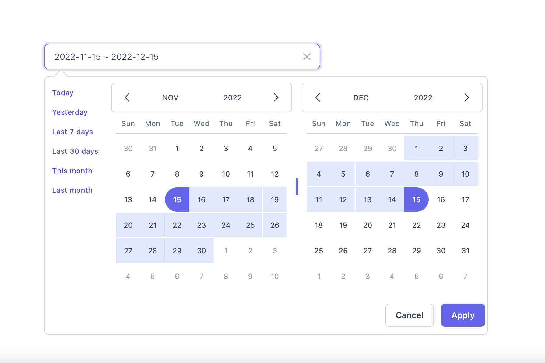
### **Light Mode**
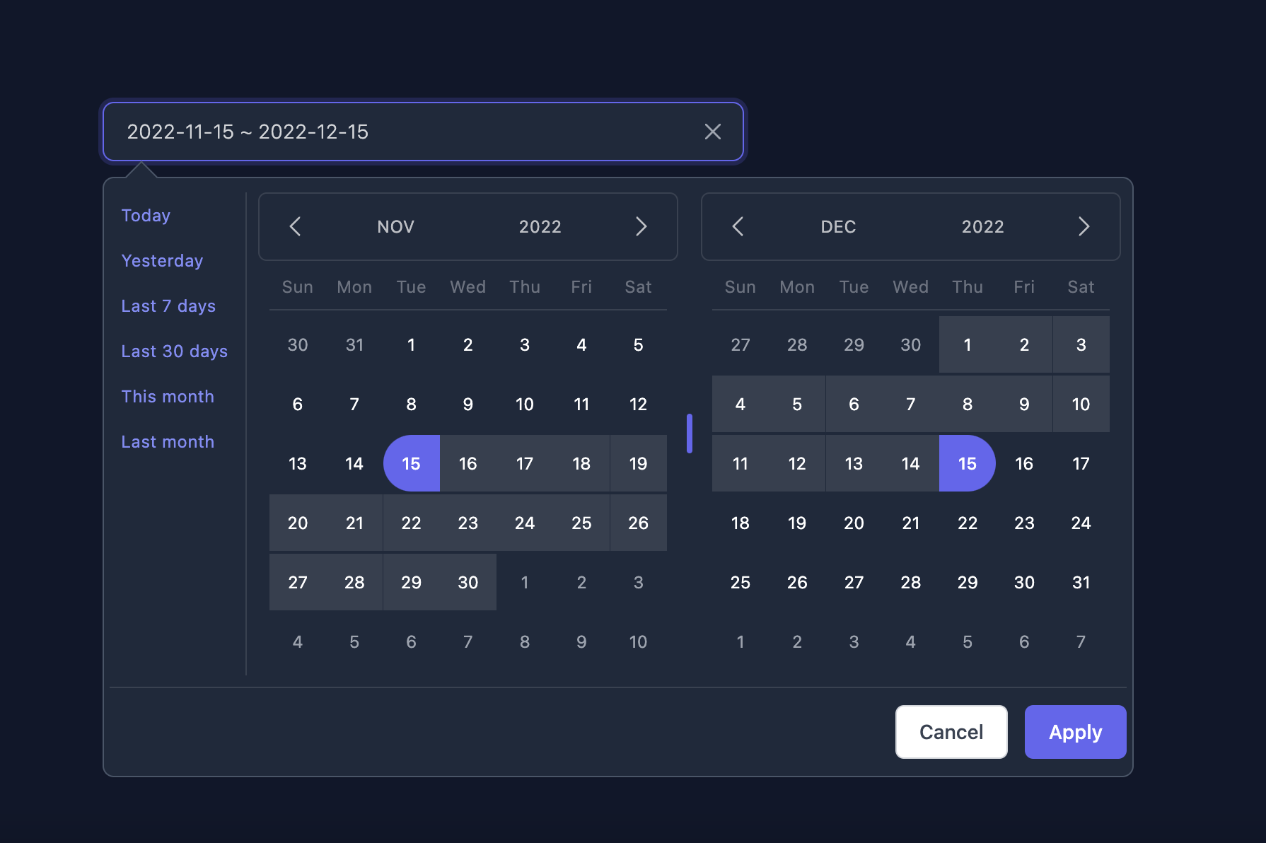
### **Dark Mode**
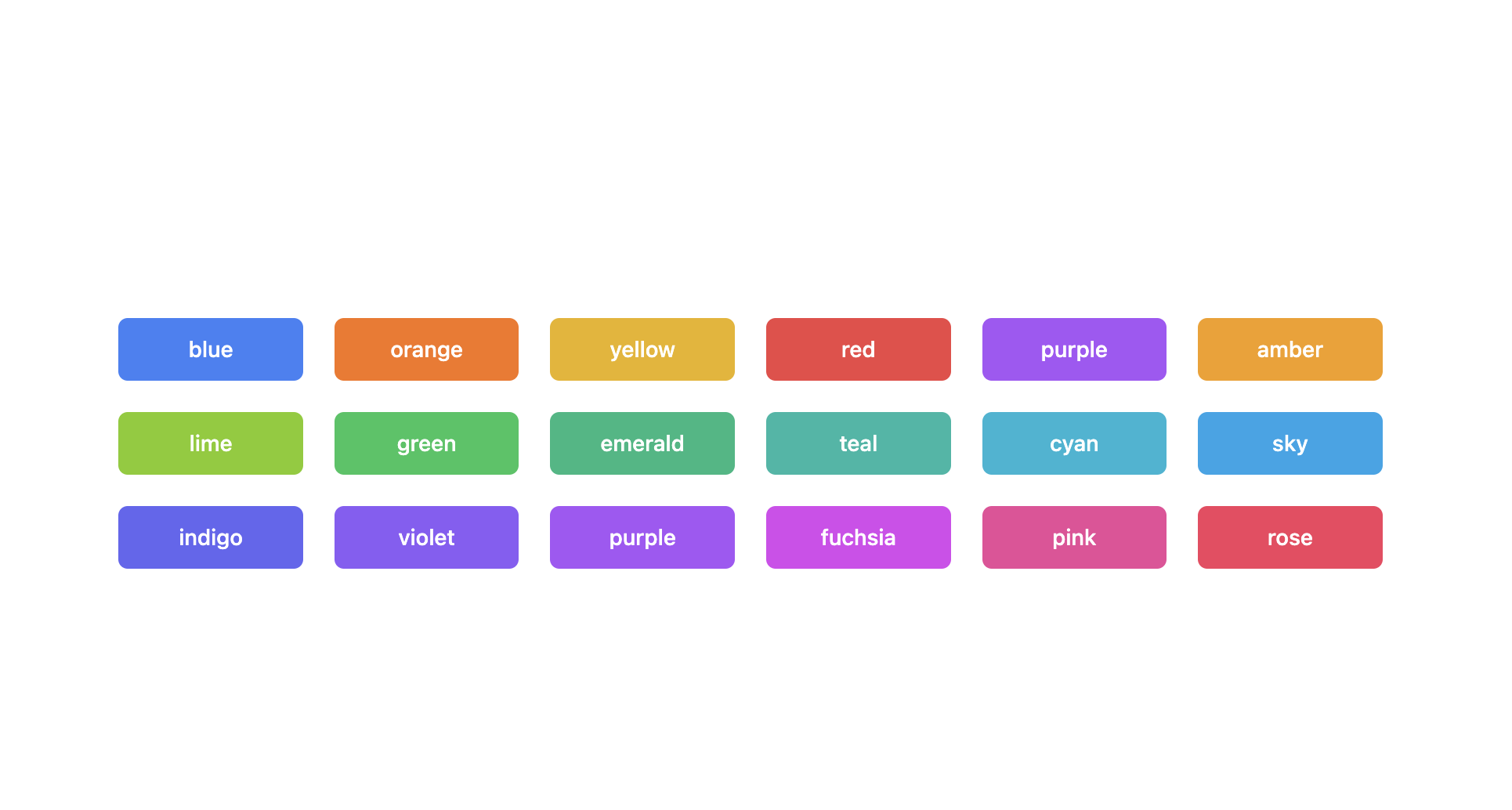
### **Supported themes**
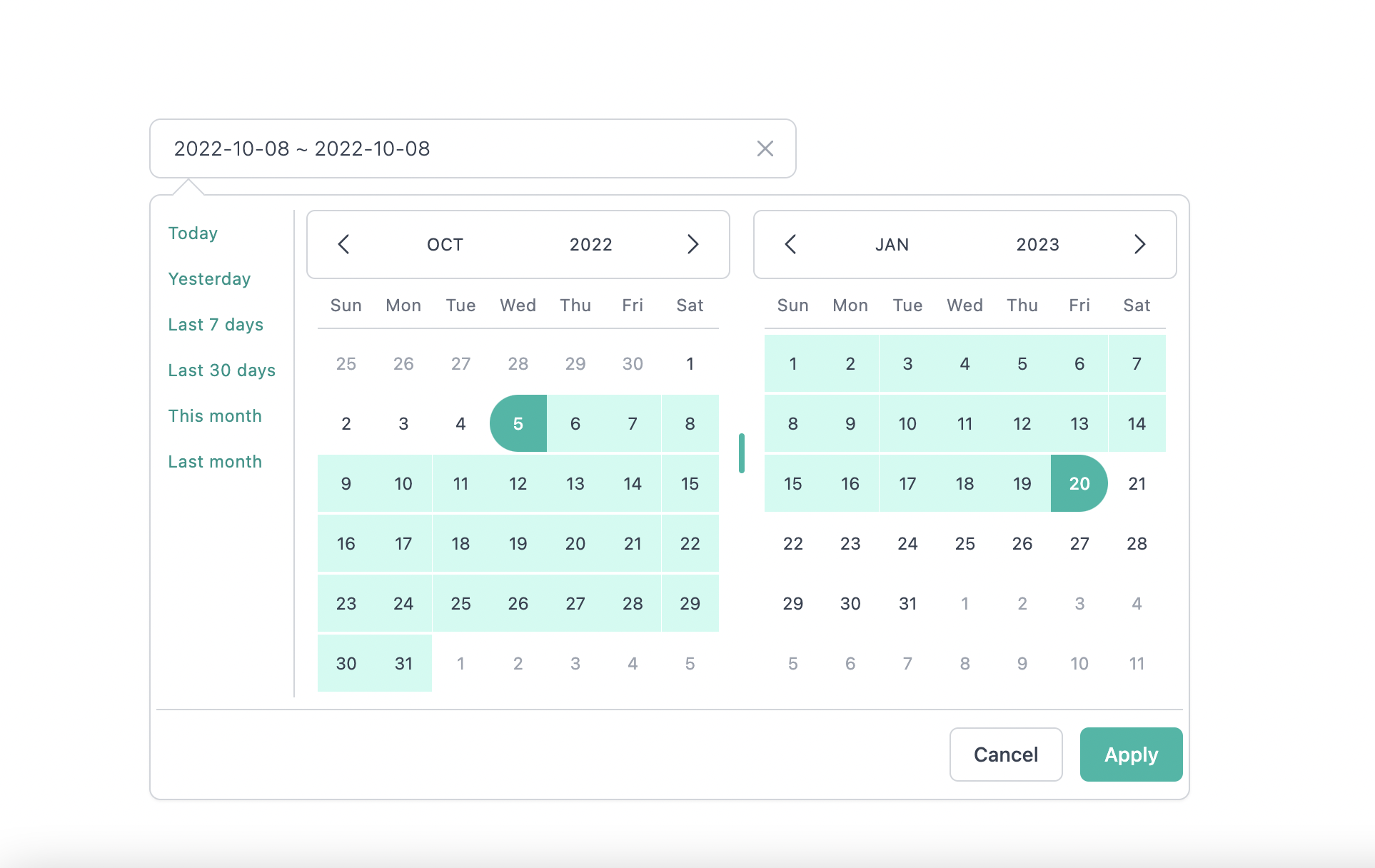
### **Teal themes example**
You can find the demo at [here](https://react-tailwindcss-datepicker.vercel.app/demo)
> **Info**
>
> 👉 To discover the other possibilities offered by this library, you can consult the
> [full documentation](https://react-tailwindcss-datepicker.vercel.app/).
## PlayGround
Clone the `master` branch and run commands:
```sh
# Using npm
npm install && npm dev
# Using yarn
yarn install && yarn dev
```
Open a browser and navigate to `http://localhost:8888`
## Contributing
See
[CONTRIBUTING.md](https://github.com/vivitali/tailwindcss-react-datepicker/blob/master/CONTRIBUTING.md)
## Thanks to
- [Lewhe Onesine](https://github.com/onesine)
- [Vue Tailwind Datepicker](https://vue-tailwind-datepicker.com/)
- [React](https://reactjs.org/)
- [Tailwind CSS](https://tailwindcss.com/)
- [dayjs](https://day.js.org/)
## Like it?
- :star: [this repo](https://github.com/vivitali/tailwindcss-react-datepicker)
- [Buy me a :coffee: :coffee: :coffee:](https://www.buymeacoffee.com/vaviQ) or
- become a sponsor on [Github Sponsors 🤝 ](https://github.com/sponsors/vivitali)
## License
[MIT](LICENSE) Licensed.