tag-search
Version:
search and list html tags like named anchor links
314 lines (284 loc) • 9.72 kB
Markdown
# tag-search
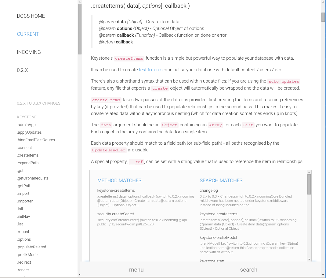
Add a html tag search box to your page. Uses ES6 ReactJS classes to produce a component you can consume into your react app. View [Screencaps](#screencaps)
Typical use case is to look for named anchors and generate a menu. Works well for mobile display.
There are standalone builds available in the [examples](https://github.com/snowkeeper/tag-search/tree/master/examples) directory.
There are also fully functional builds for System.js and browserify in the [examples](https://github.com/snowkeeper/tag-search/tree/master/examples) directory with full source examples.
`npm i -g live-server` and run `live-server ./examples` to view the output of different setups.
#### Install
##### jspm
```bash
jspm i npm:tag-search
```
##### npm
```
npm i tag-search
```
#### Example
Assuming your html looks like this:
```html
<a name="classreference"></a>
<h3>Class Refence</h3>
... content ...
<a name="endpoints"></a>
<h3>Endpoint Api</h3>
```
Create your component.
All options are the default unless otherwise noted, with exception of styles and classes which are explained below.
```javascript
import { render } from 'react-dom'
import SearchTags from 'tag-search'
import {Emitter} from 'events'
let emitter = new Emitter();
// add the options
let tagOpts = {
wrapperLeftText: 'menu',
wrapperRightText: 'search',
mainHeader: 'Anchor',
apiHeader: 'Method',
searchBar: 'searchBar',
placeholder: "quick find",
searchList: 'searchList',
topLink: true,
topLinkAnchor: 'name',
topLinkText: 'Top',
tagSelector: 'a[name]',
nameFromTagAttr: 'innerHTML', //default name
linkFromTagAttr: 'name',
contextTextUntilTag: "a[name]",
nameFromNextTag: true,
nameFromTag: ["H2", "H3", "H4", "H5"],
nameFromTagSaveChildren: ':not("em, code")',
useLocation: true,
skipHistory: false,
forceSearch: 2000,
noclasses: false,
nostyles: false,
styles: {
'searchBar': {},
'input': {},
'inputDiv': {},
'searchList': {},
'ul': {},
'li': {},
'li:a': {},
'li:heading': {},
'context': {}
},
classes: {
'searchBar': ' col-sm-offset-3 col-sm-9 ',
'input': ' form-control clearable',
'ul': ' sidebar-nav ',
}
}
let tag = {
tag: '.create-anchor-links :header',
where: 'after', //default is before
class: 'anchor'
}
render( <SearchTags reset={true} options={tagOpts} events={emitter} tag={tag} {...this.props} />, document.getElementById('anchor-search'));
```
## reset
Resets the config instead of merge after mount.
For events add `reset:true` to your configuration object.
## options
> **wrapperLeftText** - *{String}* - the "menu" text
> **wrapperRightText** - *{String}* - the "search" text
> **mainHeader** - *{String}* - the header text for normal pages
> **apiHeader** - *{String}* - the header text for api type pages
> **searchBar** - *{String}* - ID of main div
> **placeholder** - *{String}* - placeholder text
> **searchList** - *{String}* - ID of search list div
> **topLink** - *{Boolean}* - Show a link on top of the list
> **topLinkText** - *{String}* - text of link
> **topLinkAnchor** - *{String}* - anchor href to scroll to
> **tagSelector** - *{String}* - selector of tags to use for search list
> **nameFromTagAttr** - *{String}* - the attribute to grab the name from
> **linkFromTagAttr** - *{String}* - the a href links will be generated from this attribute in each `tagSelector`
> **contextTextUntilTag** - *{String}* - use the text until this tag is reached for the context string
> **nameFromNextTag** - *{Boolean}* - get the display name from the next tag
> **useLocation** - *{Boolean}* - Use `window.location` in place of `$(document).scrollTop`. Defaults to `true` except for mobile.
> **skipHistory** - *{Boolean}* - if you provided a history object already and need to skip using for any reason
> **noclasses** - *{Boolean}* - do **not** include **any** classes
> **nostyles** - *{Boolean}* - do **not** include **any** styles
> **classes** - *{Object}* - object of classes
> **styles** - *{Object}* - object of styles
> **forceSearch** - *{Number}* - The amount of time to allow for user input before the search is performed. The user input is cached until done typing. The default is to force a render at 2 seconds and start the cache over until typing is finished.
**if `nameFromNextTag == true` || `nameFromPrevTag == true`**
> > **nameFromTag** - *{Array}* - name of the tag the get display name from. first tag found wins
> > **nameFromTagSaveChildren** - *{String}* - if you use `innerHTML` you may want to include some children. It should be an acceptable JQuery selector for `$(nameFromNextTag).clone().children(nameFromTagSaveChildren)`
## events
You can pass an event emitter as the `events` prop and event listeners will be attached to re-render the menu at any time. Pass any new options as the data object and they will be merged into the configuration. The new configuration is emitted back.
```javascript
emitter.emit('tag-search:update', {
nameFromPrevTag: true,
nameFromTag: ["H2", "H3", "H4", "H5"],
linkFromTagAttr: 'data-link',
contextTextUntilTag: 'h*',
useLocation: true,
reset: true // creates a fresh config object
});
emitter.once('tag-search:options', (options) => {
debug('new tag-search options', options)
})
```
Available **`emit`** events for you to use
```javascript
// return emits tag-search:options
events.emit('tag-search:update', configObject);
// get the current configuration object
// return emits tag-search:options
events.emit('tag-search:config');
// return emits tag-search:tagged
events.emit('tag-search:tag', configObject);
```
Listen for results
```javascript
events.once('tag-search:options', (configObject) => {})
events.once('tag-search:tagged', (results) => {})
```
## tag
Send a `tag` prop to add name tags to your page via jquery. This will add a named anchor either before or after your selected tags.
```javascript
let tag = {
tag: '.create-anchor-links :header', //jquery selector
where: 'after', //default is before
class: 'anchor' //class for the anchor
}
```
There is also an event to add tags:
```javascript
events.emit('tag-search:tag', {
tag: '.create-anchor-links :header', //jquery selector
where: 'after', //default is before
class: 'anchor' //class for the anchor
});
```
And a response event:
```javascript
events.once('tag-search:tagged', (tags) => {
tags.success // true or false
tags.tags // jquery array to selected elements
});
```
##### NOTE
> If you pass a **react-router** `history` object as `history={this.props.history}` or `{...this.props}` then the history will be pushed as well.
## Listeners
> Adds `document` listeners for clicks and to hide the menu. Will look for selector `.catchMenuClick a`.
```javascript
// catch menu clicks
$(document).on('click', '.catchMenuClick a', function(e) {
thisComponent.catchMenuClick(e)
});
// hide the results when clicked outside
$(document).on('mouseup','body', function (e)
{
thisComponent.hideSearchList(e)
})
// jump to first anchor on page that matches and give a list of matches
$(document).on('click input focus', '#' + thisComponent.state.Anchored.searchBar + ' input', function(e) {
thisComponent.wordWait(e.target.value);
});
// open menu on single click
$(document).on('click', '#TSWrapperLeft', function(e) {
thisComponent.checkMenu()
});
// show search on click
$(document).on('click', '#TSWrapperRight', function(e) {
thisComponent.checkTyping()
});
```
#### Default inline styles
The component will render with these inline styles by default. Add your style properties with camelCase. They will be transformed when appropriate.
```javascript
exports.styles = {
'searchBar': {
'height': '50px',
'position': 'fixed',
'bottom': 0,
'right': 0,
'zIndex': 1002,
'padding': 0,
'width': '100%'
},
'input': {
'width': '100%',
'fontSize': '1.4em',
'fontWeight': 'bold',
'color': '#555',
'backgroundColor': '#f7f7f7',
'border': 'none',
'height': '50px',
'zIndex': 1003,
},
'inputDiv': {
'paddingTop': 0,
'paddingRight': 0,
'paddingBottom': 0,
'paddingLeft': 8,
'height': '50px',
},
'searchList': {
'height': '300px',
'margin': '-350px 15px 0 15px',
'border': '1px solid #ccc',
'borderBottom': 'none',
'overflowY': 'auto',
'backgroundColor': '#fbfbfb',
'padding': '10px 20px',
'display': 'none'
},
'ul': {
'fontSize': '13px',
'listStyle': 'none',
'lineHeight': 1.2,
'margin': '0',
'padding': 0,
'position': 'relative',
'zIndex': 2,
},
'li': {
'padding': '5px 5px',
'color': '#348dd9',
},
'li:a': {
'color': '#333',
'display': 'block',
'padding': '5px 5px 5px 0',
},
'li:heading': {
'fontSize': '1.25em',
'textTransform': 'uppercase',
'padding': '5px 5px',
'color': '#348dd9',
},
'context': {
'color': '#7a7a7a',
'fontSize': '.9em',
'display': 'block',
'marginTop': 0,
'height': 'auto',
}
}
```
#### Default classes
No stylesheet is included by default.
```javascript
exports.classes = {
'searchBar': '',
'input': '',
'inputDiv': '',
'searchList': '',
'ul': '',
'li': '',
'li:a': '',
'li:heading': '',
'context': ''
}
```
**CAUTION**
If you plan on using your own classes, either through stylesheet or object, you **must** send `nostyles: true` or a modified `styles` object with the styles you want removed (or a blank for each property). If you do not then an inline style **will** take precedence.
## Screencaps
##### Desktop
##### Mobile
