svelte-aria-dialog
Version:
A tiny svelte component that provides a mostly unstyled, WAI-ARIA accessible modal dialog with a few simple options.
141 lines (105 loc) • 4.67 kB
Markdown
# svelte-aria-dialog
Yet another Svelte dialog component.
## Why?
While there are plenty of packages out there that provide modals or dialogs in Svelte, most fall short in at least one these aspects:
- They are not accessible to users of assistive technologies, or are not [ARIA-compliant](https://www.w3.org/TR/wai-aria-practices/#dialog_modal).
- Their APIs are overengineered and not especially intuitive. Some are not declarative, others abuse the Context API for showing/hiding.
- They take opinions on styling and layout, making them difficult to adapt to the needs of a particular project.
This project aims to fill these gaps. `svelte-aria-dialog` is a tiny svelte component that provides a mostly unstyled, WAI-ARIA accessible modal dialog with a few simple options.
> Focus trapping is provided by the lightweight [focus-trap](https://github.com/focus-trap/focus-trap) module.
## Installation
#### npm
```bash
npm install svelte-aria-dialog
```
#### pnpm
```bash
pnpm install svelte-aria-dialog
```
#### yarn
```bash
yarn add svelte-aria-dialog
```
## Usage
To open a dialog, bind the `open` prop to a boolean value.
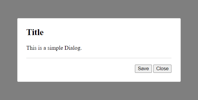
#### Basic 2-Button Dialog
```tsx
<script>
import { Dialog } from "svelte-aria-dialog";
let open = false;
function save() {
alert("Saved");
open = false;
}
</script>
<button on:click={() => open = true}>Open Dialog</button>
<Dialog bind:open title="Title">
This is a simple Dialog.
<svelte:fragment slot="footer">
<button on:click={save}>Save</button>
<button on:click={() => open = false}>Close</button>
</svelte:fragment>
</Dialog>
```
#### Non-closable Dialog
```tsx
<script>
import { Dialog } from "svelte-aria-dialog";
let open = false;
</script>
<button on:click={() => open = true}>Open Dialog</button>
<Dialog bind:open closable={false} title="Title">
I can't be closed!
</Dialog>
```
#### Custom DOM Target (Portal)
```tsx
<script>
import { Dialog } from "svelte-aria-dialog";
let open = false;
</script>
<button on:click={() => open = true}>Open Dialog</button>
<Dialog bind:open title="Title" append={document.body}>
This dialog will be appended to <body>.
</Dialog>
```
#### Dialog Events - `on:open` and `on:close`
```tsx
<script>
import { Dialog } from "svelte-aria-dialog";
let open = false;
function handleOpen() {
alert("Opened!");
}
function handleClose() {
alert("Closed!");
}
</script>
<button on:click={() => open = true}>Open Dialog</button>
<Dialog bind:open title="Title" on:open={handleOpen} on:close={handleClose}>
This dialog will emit events when opened and closed.
<button slot="footer" on:click={() => open = false}>Close</button>
</Dialog>
```
## API
All unused props are passed to the inner dialog element through [$$restProps](https://svelte.dev/docs#template-syntax-attributes-and-props).
#### Props
| Property | Type | Default | Description |
| ---------- | ------------- | ----------- | ------------------------------------------------------------------------------------------------ |
| `open` | `boolean` | `false` | Determines whether the dialog is open or not |
| `title` | `string` | `""` | Title text displayed as the dialog header |
| `closable` | `boolean` | `true` | Determines whether the dialog can be conventially closed using the escape key or backdrop click. |
| `append` | `HTMLElement` | `undefined` | Determines the node the dialog should be appended to |
| `class` | `string` | `""` | Specifies a custom class name for the dialog |
#### Slots
| Name | Description |
| --------- | ------------------------------------------------------------ |
| `default` | Content of the dialog. |
| `footer` | Elements inserted at the bottom of the dialog in the footer. |
| `outer` | Elements inserted outside of the inner dialog. |
#### Events (Dispatched)
| Name | Description |
| ------- | --------------------------------------------------- |
| `open` | Dispatched when the dialog is mounted into the DOM. |
| `close` | Dispatched when the dialog is removed from the DOM. |