svelisy
Version:
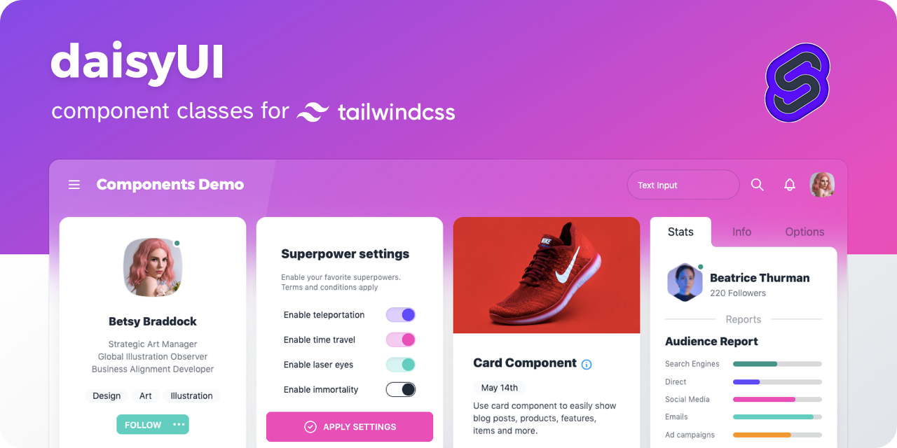
svelisy - DaisyUI components built with Svelte 🌼
160 lines (117 loc) • 3.28 kB
Markdown
# Svelisy 1.0
<div align="center">
<img src="https://raw.githubusercontent.com/brilyyy/svelisy/main/media/logo.png" width="150" alt="Svelisy Logo" >
**daisyUI components built with Svelte & Typescript**
</div>
<div align="center">
༼ つ ◕_◕ ༽つ Please share
[![][tweet]][tweet-url]
</div>
[![][npm]][npm-url] [![][license]][license-url]
- [Official daisyUI website →](https://daisyui.com/)
- Svelisy docs is in progress (I'm also confused with my own library xD)
🙋♂️ Issues? [Go to here](https://github.com/brilyyy/svelisy/issues)
## ⚡️ Quick Start
Import svelisy component to your Svelte Component
```svelte
<script lang="ts">
import { Button } from 'svelisy';
</script>
<Button color="primary">Click Here</Button>
```
## 🌼 Components
<details>
<summary>Show/Hide</summary>
- Actions
- [x] Button
- [x] Dropdown
- [x] Modal
- [x] Swap
- Data display
- [x] Alert
- [x] Avatar
- [x] Badge
- [x] Card
- [x] Carousel
- [x] Chat bubble
- [x] Collapse
- [x] Countdown
- [x] Kbd
- [x] Progress
- [x] Radial progress
- [x] Stat
- [x] Table
- [x] Toast
- [x] Tooltip
- Data input
- [x] Checkbox
- [x] Text input
- [x] Radio
- [x] Range
- [x] Rating
- [x] Select
- [x] Textarea
- [x] Toggle
- Layout
- [x] Artboard
- [x] Button group
- [x] Divider
- [x] Drawer
- [x] Footer
- [x] Hero
- [x] Indicator
- [x] Input group
- [x] Mask
- [x] Stack
- Navigation
- [x] Bottom Navigation
- [x] Breadcrumbs
- [x] Link
- [x] Menu
- [x] Navbar
- [x] Pagination
- [x] Steps
- [x] Tab
- Mockup
- [x] Code
- [x] Phone
- [x] Window
</details>
## 🌈 Themes
To apply / select theme use SvelisyProvider & ThemeChanger
```svelte
<script lang="ts">
import { SvelisyProvider, SvelisyThemeChanger } from 'svelisy/provider';
</script>
<SvelisyProvider>
<SvelisyThemeChanger />
<slot />
</SvelisyProvider>
```
Use tools like the official <a href="https://daisyui.com/theme-generator/">daisyUI Theme Generator</a> or <a href="https://themes.ionevolve.com/">daisyUI Theme Builder</a> to easily create your own themes.
## ⚙️ Configuration
Configure tailwindcss to not purging component class
```js
// tailwind.config.cjs
module.exports = {
content: [
'./src/**/*.{html,js,svelte,ts}',
'node_modules/daisyui/dist/**/*.js',
'node_modules/svelisy/**/*.svelte'
],
...
};
```
### License
This project is licensed under the MIT License - see the [LICENSE.md](https://github.com/brilyyy/svelisy/blob/main/LICENSE) file for details.
<div align="center">
༼ つ ◕_◕ ༽つ Please share
[![][tweet]][tweet-url]
</div>
[npm]: https://badgen.net/github/tag/brilyyy/svelisy?label=version&color=green
[license]: https://badgen.net/github/license/brilyyy/svelisy?color=green
[npm-url]: https://www.npmjs.com/package/svelisy
[license-url]: https://github.com/brilyyy/svelisy/blob/main/LICENSE
[tweet-url]: https://twitter.com/intent/tweet?text=Svelisy%20%0D%0AdaisyUI%20Components%20for%20Svelte%20%0D%0Ahttps://github.com/brilyyy/svelisy
[tweet]: https://img.shields.io/twitter/url?style=social&url=https%3A%2F%2Fgithub.com%2Fbrilyyy%2Fsvelisy