smartart
Version:
A lightweight, responsive CSS library for creating beautiful chevron-style progress indicators and flowcharts
295 lines (226 loc) • 8.55 kB
Markdown
# Smart Art CSS Library
[](https://www.npmjs.com/package/smartart)
[](https://github.com/sanand0/smartart/blob/main/LICENSE)
[](https://bundlephobia.com/package/smartart)
A lightweight, responsive CSS library for creating smart-art. Pure CSS implementation with no JavaScript dependencies.
- [x] **Chevron** - Process flows showing sequential elements
- [ ] **Cycle** - Circular flow diagrams for cyclical processes
- [ ] **Pyramid** - Hierarchical structures and organizational charts
- [ ] **Funnel** - Process flows showing narrowing stages
## Installation
From CDN:
```html
<link rel="stylesheet" href="https://cdn.jsdelivr.net/npm/smartart@1/dist/chevron.css" />
```
Using npm:
```bash
npm install smartart
```
... then import in your CSS:
```css
@import "smartart/dist/chevron.css";
```
## Usage
### Basic Example
Create a chevron flow with semantic HTML:
```html
<ul class="chevron-list">
<li>
<div>Planning</div>
<ul>
<li>Define requirements</li>
<li>Create timeline</li>
<li>Assign resources</li>
</ul>
</li>
<li>
<div>Development</div>
<ul>
<li>Write code</li>
<li>Code review</li>
<li>Unit testing</li>
</ul>
</li>
<li>
<div>Testing</div>
<ul>
<li>Integration tests</li>
<li>User acceptance</li>
<li>Performance tests</li>
</ul>
</li>
<li>
<div>Deployment</div>
<ul>
<li>Production release</li>
<li>Monitor systems</li>
<li>User training</li>
</ul>
</li>
</ul>
```
[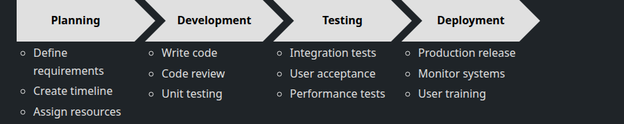](docs/chevron-basic.html ":include height=300px")
[See the Basic example](docs/chevron-basic.html ":ignore")
### Minimal Example
For simple step indicators without detailed content:
```html
<ul class="chevron-list">
<li><div>Step 1</div></li>
<li><div>Step 2</div></li>
<li><div>Step 3</div></li>
</ul>
```
[](docs/chevron-minimal.html ":include height=200px")
[See the Minimal example](docs/chevron-minimal.html ":ignore")
### Single Chevron
For standalone elements:
```html
<ul class="chevron-list">
<li>
<div>Important Notice</div>
<ul>
<li>Read all instructions</li>
<li>Complete forms</li>
</ul>
</li>
</ul>
```
[](docs/chevron-single.html ":include height=200px")
[See the Single chevron example](docs/chevron-single.html ":ignore")
### Long Text Handling
The library automatically handles text wrapping:
```html
<ul class="chevron-list">
<li>
<div>Initial Phase with Very Long Description That Will Wrap</div>
<ul>
<li>This is a very long list item that demonstrates how the library handles text wrapping automatically</li>
<li>Short item</li>
</ul>
</li>
<li>
<div>Next Phase</div>
<ul>
<li>Regular content</li>
</ul>
</li>
</ul>
```
[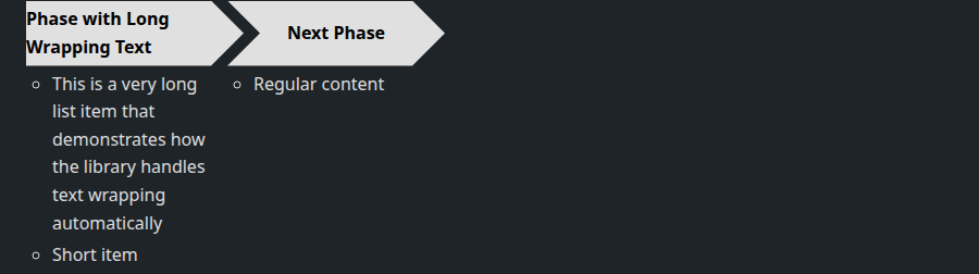](docs/chevron-long-text.html ":include height=250px")
[See the Long text example](docs/chevron-long-text.html ":ignore")
### Custom Styling
Customize the appearance using CSS custom properties:
```css
:root {
/* Dimensions */
--chevron-width: 250px;
--chevron-height: 80px;
--chevron-tip-width: 40px;
/* Colors */
--chevron-bg-color: #3498db;
--chevron-content-bg-color: #ecf0f1;
--chevron-text-color: white;
--chevron-bullet-color: #2c3e50;
/* Typography */
--chevron-font-family: "Roboto", sans-serif;
--chevron-font-size: 20px;
--chevron-font-weight: 600;
/* Spacing */
--chevron-content-padding: 20px;
--chevron-padding-right: 25px;
--chevron-padding-left: 35px;
--chevron-padding-left-first: 15px;
}
```
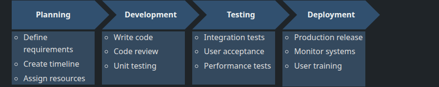
### Theme Examples
#### Default Theme
The standard appearance with clean, professional styling:
[](docs/chevron-default.html ":include height=300px")
[See the Default theme example](docs/chevron-default.html ":ignore")
#### Dark Theme
```css
:root {
--chevron-bg-color: #31506f;
--chevron-content-bg-color: #34495e;
--chevron-text-color: #ecf0f1;
--chevron-bullet-color: #bdc3c7;
}
```
[](docs/chevron-dark-theme.html ":include height=300px")
[See the Dark theme example](docs/chevron-dark-theme.html ":ignore")
#### Colorful Theme
```css
.chevron-list > li:nth-child(1) > div {
--chevron-bg-color: #e74c3c;
}
.chevron-list > li:nth-child(2) > div {
--chevron-bg-color: #f39c12;
}
.chevron-list > li:nth-child(3) > div {
--chevron-bg-color: #27ae60;
}
.chevron-list > li:nth-child(4) > div {
--chevron-bg-color: #3498db;
}
```
[](docs/chevron-colorful.html ":include height=300px")
[See the Colorful theme example](docs/chevron-colorful.html ":ignore")
#### Compact Size
```css
:root {
--chevron-width: 150px;
--chevron-height: 40px;
--chevron-tip-width: 20px;
--chevron-font-size: 14px;
--chevron-content-padding: 10px;
}
```
[](docs/chevron-compact.html ":include height=250px")
[See the Compact size example](docs/chevron-compact.html ":ignore")
#### Large Size
```css
:root {
--chevron-width: 300px;
--chevron-height: 100px;
--chevron-tip-width: 50px;
--chevron-font-size: 24px;
--chevron-content-padding: 25px;
}
```
[](docs/chevron-large.html ":include height=400px")
[See the Large size example](docs/chevron-large.html ":ignore")
### Available CSS Variables
| Variable | Default | Description |
| ------------------------------ | ------------------- | ------------------------------- |
| `--chevron-width` | `200px` | Width of each chevron shape |
| `--chevron-height` | `60px` | Height of chevron headers |
| `--chevron-tip-width` | `30px` | Width of pointed tips |
| `--chevron-gap` | `20px` | Gap between sections |
| `--chevron-overlap` | `-10px` | Overlap for seamless connection |
| `--chevron-bg-color` | `#e0e0e0` | Chevron background color |
| `--chevron-content-bg-color` | `#f5f5f5` | Content box background |
| `--chevron-text-color` | `#000` | Text color |
| `--chevron-bullet-color` | `#666` | Bullet point color |
| `--chevron-font-family` | `Arial, sans-serif` | Font family |
| `--chevron-font-size` | `18px` | Chevron header font size |
| `--chevron-font-weight` | `bold` | Chevron header font weight |
| `--chevron-content-padding` | `15px` | Content box padding |
| `--chevron-padding-right` | `20px` | Right padding for text |
| `--chevron-padding-left` | `30px` | Left padding (with tip) |
| `--chevron-padding-left-first` | `10px` | Left padding (no tip) |
| `--chevron-list-item-spacing` | `8px` | Space between list items |
| `--chevron-bullet-indent` | `15px` | Bullet indentation |
## Development
```bash
git clone https://github.com/sanand0/smartart.git
cd smartart
npm install
npm run lint && npm run build && npm test
npm publish
git commit . -m"$COMMIT_MSG"; git tag $VERSION; git push --follow-tags
```
## Release notes
- [1.1.0](https://npmjs.com/package/smartart/v/1.1.0): 30 Jul 2025. Standardized package.json & README.md, switch to ESM
- [1.0.0](https://npmjs.com/package/smartart/v/1.0.0): 29 Jul 2025. Initial release
## License
[MIT](LICENSE)