slim-select
Version:
Slim advanced select dropdown
351 lines (275 loc) • 9.45 kB
Markdown
# Slim Select
**The select dropdown, reimagined.**
A lightweight, dependency-free replacement for the native `<select>` — single and multi-select, search, optgroups,
remote data, modal mode on mobile, and full theming through CSS variables. Drop it into any stack, or use the official
Vue and React wrappers.
## [slimselectjs.com](https://slimselectjs.com)
[](https://www.npmjs.com/package/slim-select)


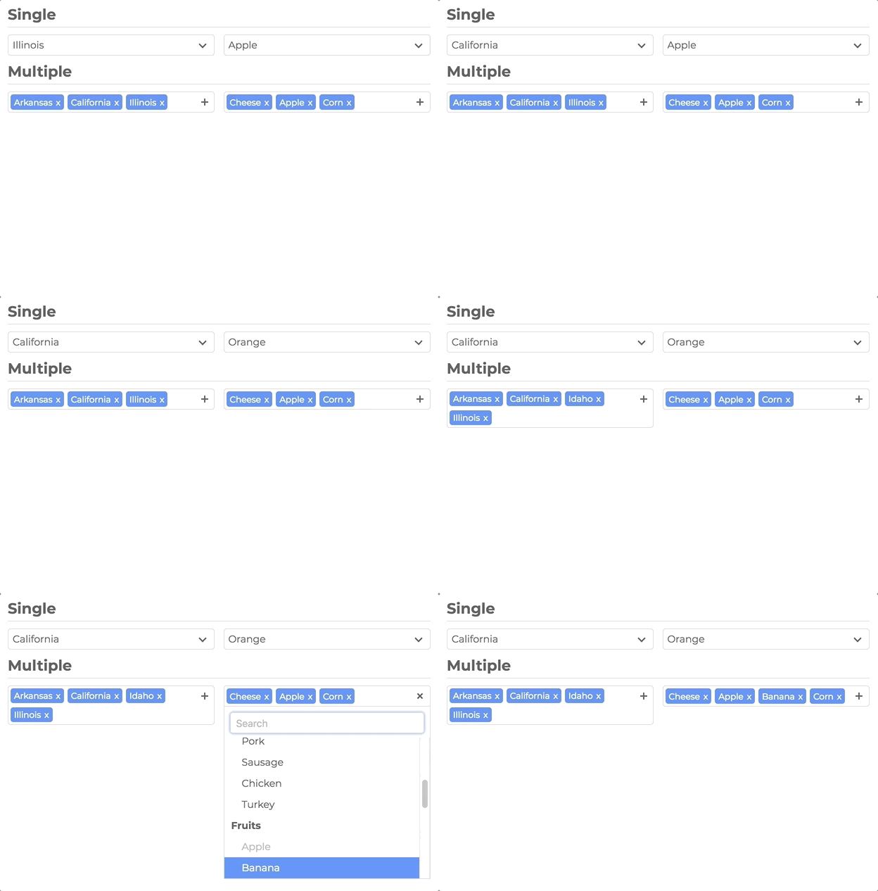
## Documentation
Full docs, live demos, and copy-paste examples: **[slimselectjs.com](https://slimselectjs.com)**
- [Get started](https://slimselectjs.com/get-started)
- [Settings](https://slimselectjs.com/settings)
- [Methods](https://slimselectjs.com/methods)
- [Events](https://slimselectjs.com/events)
- [Styling](https://slimselectjs.com/style)
## Features
**Select, upgraded**
- Single and multi-select with tags, placeholders, and deselect
- Search with highlighting, remote/API search, and user-addable options
- Optgroups with select-all and closable accordion groups
- HTML options, tooltips, min/max selection limits, and disabled options
- Modal mode (`off` | `on` | `mobile`) — centered panel with backdrop; mobile-friendly by default
**Looks like your product**
- Theme entirely with `--ss-*` CSS custom properties — no fighting class specificity
- Import plain CSS or SCSS; inherit styles and classes from the native `<select>`
**Built to ship**
- Zero dependencies
- ~66KB JS (~16KB gzip) · ~12KB CSS (~2KB gzip)
- TypeScript types included
- WCAG 2.1 Level AA accessibility (ARIA, keyboard, screen reader support)
- `prefers-reduced-motion` respected
- 477 unit tests + 46 Playwright E2E tests
**Framework ready**
- Vanilla JS
- [Vue 3](#vue) component with `v-model`
- [React](#react) component with hooks and ref access
## Installation
```bash
npm install slim-select
```
### CDN
```html
<script src="https://unpkg.com/slim-select@latest/dist/slimselect.js"></script>
<link rel="stylesheet" href="https://unpkg.com/slim-select@latest/dist/slimselect.css" />
```
## Quick start
```javascript
import SlimSelect from 'slim-select'
import 'slim-select/styles' // or: import 'slim-select/scss'
new SlimSelect({
select: '#selectElement'
})
```
```html
<select id="selectElement">
<option value="value1">Value 1</option>
</select>
```
## Styling
Slim Select is styled with CSS variables. Set them on a wrapper around your select (or on `:root` for a global theme):
```css
.my-form {
--ss-primary-color: #2563eb;
--ss-bg-color: #ffffff;
--ss-font-color: #1e293b;
--ss-border-color: #e2e8f0;
--ss-border-radius: 8px;
--ss-main-height: 44px;
}
```
See the full token list and live themes on the [Style docs](https://slimselectjs.com/style).
## Data
Pass an array of options and optgroups instead of (or in addition to) native `<option>` elements:
```javascript
new SlimSelect({
select: '#selectElement',
data: [
{ text: 'Value 1', value: 'value1' },
{
label: 'Group label',
options: [
{ text: 'Value 2', value: 'value2' },
{ text: 'Value 3', value: 'value3' }
]
}
]
})
```
### Data types
```javascript
// <optgroup>
const optgroup = {
label: 'label', // Required
selectAll: false, // Optional — default false
closable: 'off', // Optional — 'off' | 'open' | 'close'
options: [] // Required — array of options
}
// <option>
const option = {
text: 'text', // Required
value: 'value', // Optional — defaults to text
html: '<b>Html</b>', // Optional — used for display when set
selected: false,
display: true,
disabled: false,
mandatory: false,
placeholder: false,
class: '',
style: '',
data: {} // Plain object for data-* attributes
}
```
## Settings
All fields are optional. Values shown are defaults.
[Full settings documentation](https://slimselectjs.com/settings)
```javascript
new SlimSelect({
select: '#selectElement',
settings: {
disabled: false,
alwaysOpen: false,
showSearch: true,
focusSearch: true,
keepSearch: false,
ariaLabel: 'Combobox',
searchPlaceholder: 'Search...',
searchText: 'No Results',
searchingText: 'Searching...',
resultsText: '{count} results available',
deselectText: 'Clear',
removeText: 'Remove',
searchHighlight: false,
closeOnSelect: true,
contentLocation: document.body,
contentPosition: 'absolute', // 'absolute' | 'relative' | 'fixed'
contentWidth: '', // e.g. '500px', '>500px', '<500px'
openPosition: 'auto', // 'auto' | 'up' | 'down'
placeholderText: 'Select Value',
allowDeselect: false,
hideSelected: false,
multiString: false,
keepOrder: false,
showOptionTooltips: false,
minSelected: 0,
maxSelected: 1000,
timeoutDelay: 200,
maxValuesShown: 20,
maxValuesMessage: '{number} selected',
addableText: 'Press "Enter" to add {value}',
modal: 'mobile', // 'off' | 'on' | 'mobile'
modalTitle: '' // Header above the option list in modal view
}
})
```
## Events
[Full events documentation](https://slimselectjs.com/events)
```javascript
new SlimSelect({
select: '#selectElement',
events: {
// Remote/API search — return a Promise or data array
// searchValue: current input text
// selected: currently selected Option[]
// catalog: baseline list restored when search clears
search: (
searchValue: string,
selected: Option[],
catalog?: (Option | Optgroup)[]
) =>
Promise<(Partial<Option> | Partial<Optgroup>)[]> |
(Partial<Option> | Partial<Optgroup>)[],
// Local filter when events.search is not set
searchFilter: (option: Option, search: string) => boolean,
// User-added options — return the new option or an Error
addable: (value: string) => Promise<Partial<Option> | string> | Partial<Option> | string | Error,
beforeChange: (newVal: Option[], oldVal: Option[]) => boolean | void,
afterChange: (newVal: Option[]) => void,
beforeOpen: () => void,
afterOpen: () => void,
// Return false to cancel close. info.source is why close was requested
// ('select' | 'deselect' | 'outside' | 'toggle' | 'escape' | 'tab' | 'modal' | 'api').
// info.selectionChanged is true when the selection is changing in this action.
// info.option is the clicked option when source is 'select' (undefined otherwise).
beforeClose: (info: CloseInfo) => boolean | void,
afterClose: () => void,
error: (err: Error) => void
}
})
```
## Methods
[Full methods documentation](https://slimselectjs.com/methods)
```javascript
const slim = new SlimSelect({ select: '#selectElement' })
slim.enable()
slim.disable()
slim.getData()
slim.setData(data)
slim.getSelected() // string[]
slim.setSelected(['value1', 'value2'])
slim.addOption(option)
slim.open()
slim.close()
slim.search('searchValue')
slim.destroy()
```
## Vue
Official Vue 3 component with `v-model` and full TypeScript support.
[Vue documentation](https://slimselectjs.com/vue)
```bash
npm install slim-select
```
```vue
<script lang="ts">
import SlimSelect from 'slim-select/vue'
import 'slim-select/styles'
export default {
components: { SlimSelect },
data() {
return {
selected: 'value2',
options: [
{ text: 'Value 1', value: 'value1' },
{ text: 'Value 2', value: 'value2' },
{ text: 'Value 3', value: 'value3' }
]
}
}
}
</script>
<template>
<SlimSelect v-model="selected" :data="options" />
</template>
```
> **Note:** Pass options via the `:data` prop. Native `<option>` slot children are not supported in the Vue wrapper.
## React
Official React component with hooks and ref access to the underlying instance.
[React documentation](https://slimselectjs.com/react)
```bash
npm install slim-select
```
```tsx
import { useState } from 'react'
import SlimSelect from 'slim-select/react'
import 'slim-select/styles'
function MyComponent() {
const [selected, setSelected] = useState('value2')
const options = [
{ text: 'Value 1', value: 'value1' },
{ text: 'Value 2', value: 'value2' },
{ text: 'Value 3', value: 'value3' }
]
return <SlimSelect data={options} value={selected} onChange={setSelected} />
}
```
> **Note:** Pass options via the `data` prop. Native `<option>` children are not supported in the React wrapper.
### Ref access
```tsx
import { useRef } from 'react'
import SlimSelect, { SlimSelectRef } from 'slim-select/react'
import 'slim-select/styles'
function MyComponent() {
const slimRef = useRef<SlimSelectRef>(null)
return (
<>
<SlimSelect ref={slimRef} data={options} />
<button onClick={() => slimRef.current?.slimSelect?.open()}>Open</button>
</>
)
}
```
## Support
[](https://github.com/sponsors/brianvoe)
<a href="https://www.buymeacoffee.com/brianvoe" target="_blank"><img src="https://www.buymeacoffee.com/assets/img/custom_images/orange_img.png" alt="Buy Me A Coffee" style="height: auto !important;width: auto !important;" ></a>