simple-wind-indicator
Version:
Universal wind direction and speed indicator component for React
838 lines (702 loc) • 24.5 kB
Markdown
# SimpleWindIndicator - Documentation
## Overview
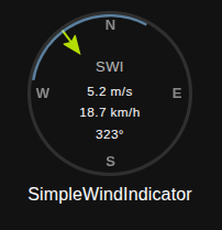
SimpleWindIndicator is a universal React component for displaying wind direction and speed as a circular indicator. Built on Material-UI and D3, it provides extensive customization options for appearance and behavior.
## Key Features
- 🧭 Wind direction display with arrow indicator
- 💨 Wind speed visualization through arrow length
- 🎨 13 predefined themes (dark, light, ocean, sunset, blur, neon, forest, arctic, volcano, evil, vintage, mint, cherry)
- 📐 Direction segment for displaying angle ranges with intelligent behavior
- 🔄 Two segment modes: auto-expand (connects to arrow) or fixed (independent)
- 🎯 Raw arc mode for drawing full arcs without smart optimization
- 🎬 Smooth animations with individual control for arrow, segment, and text
- 🔤 Customizable compass labels (N, S, E, W)
- 📱 Responsive design with various size options
- ⚡ Advanced animations with optimized performance
- 🎛️ Three display variants (standard, compact, detailed)
## Installation
```bash
npm install simple-wind-indicator
```
## Basic Usage
```jsx
import SimpleWindIndicator from './SimpleWindIndicator';
function App() {
return (
<SimpleWindIndicator
direction={45}
speed={15.2}
title="Wind Direction"
subtitle="Current"
/>
);
}
```
## Props Reference
### Core Data Props
| Prop | Type | Default | Description |
|------|------|---------|-------------|
| `direction` | `number` | - | Wind direction in degrees (0-360) |
| `speed` | `number` | - | Wind speed value |
### Segment Configuration
| Prop | Type | Default | Description |
|------|------|---------|-------------|
| `minDirection` | `number` | - | Minimum direction for blue segment (degrees) |
| `maxDirection` | `number` | - | Maximum direction for blue segment (degrees) |
| `autoExpandSegment` | `boolean` | `true` | If true, segment automatically expands to include arrow; if false, segment stays fixed |
| `enableRawArc` | `boolean` | `false` | When autoExpandSegment=false, if true, always draws full arc between min/max without choosing shorter path |
### Arrow Configuration
| Prop | Type | Default | Description |
|------|------|---------|-------------|
| `maxSpeed` | `number` | `32` | Maximum speed value for arrow length calculation |
| `minArrowLength` | `number` | `0` | Minimum arrow length as percentage (0-1) |
| `maxArrowLength` | `number` | `1.35` | Maximum arrow length as percentage (0-2) |
| `arrowColor` | `string` | - | Custom arrow color (hex/rgb/theme color) |
| `arrowThickness` | `string\|number` | `2` | Arrow tail thickness in pixels |
| `arrowHeadSize` | `string\|number` | - | Arrow head size multiplier |
| `arrowOpacity` | `number` | `1` | Arrow opacity (0-1) |
| `arrowShadow` | `string` | - | Arrow shadow CSS value |
### Visual Customization
| Prop | Type | Default | Description |
|------|------|---------|-------------|
| `segmentColor` | `string` | - | Custom segment color |
| `subtitleColor` | `string` | - | Custom subtitle text color |
| `title` | `string` | - | Main title text |
| `subtitle` | `string` | - | Subtitle text |
| `titleColor` | `string` | - | Title text color |
| `titleSize` | `string\|number` | `16` | Title font size (CSS value) |
| `titleWeight` | `string` | `'normal'` | Title font weight (normal/bold/100-900) |
| `subtitleSize` | `string` | `13` | Subtitle font size (CSS value) |
| `subtitleWeight` | `string` | `'bold'` | Subtitle font weight |
| `valuesColor` | `string` | - | Speed/direction values text color |
| `valuesSize` | `string\|number` | `11.5` | Values font size (CSS value) |
| `valuesWeight` | `string` | `'normal'` | Values font weight |
| `compassColor` | `string` | - | Compass directions (N,S,E,W) text color |
| `backgroundColor` | `string` | - | Background color of the circle |
### Border Styling
| Prop | Type | Default | Description |
|------|------|---------|-------------|
| `borderColor` | `string` | - | Border color of the circle |
| `borderWidth` | `string\|number` | `3` | Border width in pixels |
| `borderStyle` | `string` | `'solid'` | Border style (solid, dashed, dotted) |
### Segment Styling
| Prop | Type | Default | Description |
|------|------|---------|-------------|
| `segmentOpacity` | `number` | `0.8` | Segment opacity (0-1) |
| `segmentThickness` | `string\|number` | `8` | Segment thickness in pixels |
### Compass Styling
| Prop | Type | Default | Description |
|------|------|---------|-------------|
| `compassSize` | `string\|number` | - | Compass labels font size |
| `compassWeight` | `string` | `'bold'` | Compass labels font weight |
| `compassOpacity` | `number` | `0.5` | Compass labels opacity (0-1) |
| `customCompassLabels` | `Array` | - | Custom compass labels [N, E, S, W] |
### Animation and Interaction
| Prop | Type | Default | Description |
|------|------|---------|-------------|
| `animationDuration` | `string\|number` | `'1.0s'` | Animation duration |
| `animationType` | `string` | `'ease-out'` | Animation timing function |
| `enableArrowAnimation` | `boolean` | `true` | Enable arrow direction and length animation |
| `enableSegmentAnimation` | `boolean` | `true` | Enable segment boundaries animation |
| `enableTextAnimation` | `boolean` | `true` | Enable speed and direction text animation |
| `enableHoverEffects` | `boolean` | `false` | Enable hover effects |
| `onClick` | `Function` | - | Click handler function |
| `onHover` | `Function` | - | Hover handler function |
| `tooltip` | `string` | - | Tooltip text |
### Data Display
| Prop | Type | Default | Description |
|------|------|---------|-------------|
| `hideNullValues` | `boolean` | `false` | Hide null values instead of showing "--" |
### Themes and Variants
| Prop | Type | Default | Description |
|------|------|---------|-------------|
| `preset` | `string` | - | Predefined theme preset |
| `variant` | `string` | `'standard'` | Display variant (standard, compact, detailed) |
### Units and Display
| Prop | Type | Default | Description |
|------|------|---------|-------------|
| `speedUnit` | `string` | `'m/s'` | Primary speed unit |
| `secondarySpeedUnit` | `string` | `'km/h'` | Secondary speed unit |
| `speedUnitMultiplier` | `number` | `3.6` | Multiplier for secondary unit |
### Visibility Controls
| Prop | Type | Default | Description |
|------|------|---------|-------------|
| `showCompass` | `boolean` | `true` | Show compass directions (N,S,E,W) |
| `showSegment` | `boolean` | `true` | Show blue direction segment |
| `showSpeed` | `boolean` | `true` | Show speed values |
| `showDirection` | `boolean` | `true` | Show direction degrees |
| `showTitle` | `boolean` | `true` | Show title below component |
| `showSubtitle` | `boolean` | `true` | Show subtitle inside component |
### Size and Styling
| Prop | Type | Default | Description |
|------|------|---------|-------------|
| `circleSize` | `number` | `150` | Component size in pixels |
| `customStyles` | `Object` | `{}` | Custom styling overrides |
## Advanced Animation System
SimpleWindIndicator features a comprehensive animation system with individual controls for each element:
### Animation Controls
#### Arrow Animation (`enableArrowAnimation`)
Controls both direction and length animations:
- **Direction**: Smooth rotation using shortest path (350° → 20° goes through 0°, not 330°)
- **Length**: Proportional to speed with smooth transitions
#### Segment Animation (`enableSegmentAnimation`)
Controls segment boundary movements:
- **Expansion/Contraction**: Smooth segment resizing
- **Boundary Shifts**: Intelligent path calculations for optimal visual flow
#### Text Animation (`enableTextAnimation`)
Controls numerical value transitions:
- **Speed Values**: Both primary (m/s) and secondary (km/h) units
- **Direction Degrees**: Synchronized with arrow direction using shortest path
### Animation Examples
```jsx
// Full animation (default)
<SimpleWindIndicator
direction={45}
speed={15}
enableArrowAnimation={true} // Arrow rotates and resizes smoothly
enableSegmentAnimation={true} // Segment expands/contracts smoothly
enableTextAnimation={true} // Numbers change smoothly
animationDuration="1.5s"
/>
// Only arrow animation
<SimpleWindIndicator
direction={45}
speed={15}
enableArrowAnimation={true} // Arrow animates
enableSegmentAnimation={false} // Segment snaps instantly
enableTextAnimation={false} // Numbers change instantly
/>
// Only text animation
<SimpleWindIndicator
direction={45}
speed={15}
enableArrowAnimation={false} // Arrow snaps to position
enableSegmentAnimation={false} // Segment snaps instantly
enableTextAnimation={true} // Only numbers animate smoothly
/>
// No animation (maximum performance)
<SimpleWindIndicator
direction={45}
speed={15}
enableArrowAnimation={false}
enableSegmentAnimation={false}
enableTextAnimation={false}
// All changes happen instantly
/>
```
### Shortest Path Animation
The animation system automatically calculates the shortest rotational path:
```jsx
// Example: 350° → 20° transition
<SimpleWindIndicator
direction={350} // Starting position
// Change to direction={20}
// Animation path: 350° → 360° → 0° → 20° (30° total)
// NOT: 350° → 330° → 310° → ... → 20° (330° total)
/>
```
## Intelligent Segment Behavior
SimpleWindIndicator features three distinct segment modes to handle different use cases for wind direction visualization.
### Segment Modes
#### 1. Auto-Expand Segment Mode (Default)
When `autoExpandSegment={true}`, the segment automatically expands to always include the wind arrow:
```jsx
<SimpleWindIndicator
direction={80}
speed={12}
minDirection={30}
maxDirection={60}
autoExpandSegment={true} // Default
// Segment expands from 30°-80° to include the arrow
/>
```
**How it works:**
- Original segment: 30°-60°
- Arrow at 80° (outside segment)
- Segment automatically expands to: 30°-80°
- Arrow is always connected to the segment
**Smart expansion logic:**
- Uses shortest path algorithm to minimize segment size
- Handles segments crossing 0° correctly
- Smooth animations during expansion/contraction
- **Fallback system**: If primary algorithm fails to include arrow, uses alternative expansion logic
#### 2. Fixed Segment Mode
When `autoExpandSegment={false}`, the segment stays exactly as defined, regardless of arrow position:
```jsx
<SimpleWindIndicator
direction={80} // Arrow outside of segment
speed={12}
minDirection={30}
maxDirection={60}
autoExpandSegment={false}
// Segment stays fixed at 30°-60°, arrow independent
/>
```
**Use cases:**
- Displaying fixed "optimal" or "safe" wind ranges
- Showing predefined sectors or zones
- Weather alerts for specific direction ranges
#### 3. Raw Arc Mode
When `autoExpandSegment={false}` AND `enableRawArc={true}`, draws the full arc without optimization:
```jsx
<SimpleWindIndicator
direction={80}
speed={12}
minDirection={30}
maxDirection={260}
autoExpandSegment={false}
enableRawArc={true}
// Draws full 230° arc from 30° to 260° (not optimized shorter path)
/>
```
**Normal behavior vs Raw Arc:**
- **Normal**: 30°-260° becomes optimized 260°-30° arc (130°)
- **Raw Arc**: 30°-260° draws full 230° arc as specified
### Enhanced Segment Expansion Algorithm
The auto-expand mode features a two-stage algorithm for maximum reliability:
**Stage 1: Primary Algorithm**
- Uses shortest path optimization
- Minimizes segment size while including arrow
- Handles complex cases with segments crossing 0°
**Stage 2: Fallback Algorithm**
- Activates if arrow still not included after Stage 1
- Uses simple expansion without shortest path optimization
- Guarantees arrow inclusion in all scenarios
```jsx
// Example of fallback system in action:
<SimpleWindIndicator
direction={220} // Arrow position
minDirection={300} // Segment start
maxDirection={60} // Segment end (crosses 0°)
autoExpandSegment={true}
// Stage 1: Tries shortest path optimization
// Stage 2: If needed, uses direct expansion
// Result: Arrow is ALWAYS included
/>
```
### Comparison Table
| Mode | autoExpandSegment | enableRawArc | Behavior |
|------|------------------|--------------|----------|
| **Auto-Expand** | `true` | any | Segment expands to include arrow (with fallback) |
| **Fixed Smart** | `false` | `false` | Fixed segment with optimized arc |
| **Fixed Raw** | `false` | `true` | Fixed segment with full arc |
## Predefined Themes
The component includes 13 predefined themes that you can use with the `preset` prop:
### Available Presets
- **`dark`** - Dark theme with cyan accents
- **`light`** - Light theme with gray tones
- **`ocean`** - Ocean-inspired blue-green theme
- **`sunset`** - Warm orange sunset theme
- **`blur`** - Glassmorphism effect with blur
- **`neon`** - Cyberpunk neon colors
- **`forest`** - Nature-inspired green theme
- **`arctic`** - Cool blue arctic theme
- **`volcano`** - Fiery red-orange theme
- **`evil`** - Dark theme with purple accents
- **`vintage`** - Retro brown-gold theme
- **`mint`** - Fresh mint green theme
- **`cherry`** - Pink cherry blossom theme
### Theme Usage Examples
```jsx
// Dark theme
<SimpleWindIndicator
direction={270}
speed={12.5}
preset="dark"
title="Wind Status"
/>
// Ocean theme with custom title
<SimpleWindIndicator
direction={180}
speed={8.3}
preset="ocean"
title="Sea Breeze"
subtitle="Current"
/>
// Neon theme for cyberpunk UI
<SimpleWindIndicator
direction={90}
speed={20.1}
preset="neon"
title="WIND_SYS.EXE"
circleSize={200}
/>
```
## Display Variants
### Standard (default)
```jsx
<SimpleWindIndicator
variant="standard"
direction={45}
speed={15}
/>
```
### Compact
Smaller size with hidden compass labels:
```jsx
<SimpleWindIndicator
variant="compact"
direction={45}
speed={15}
/>
```
### Detailed
Larger size with enhanced text:
```jsx
<SimpleWindIndicator
variant="detailed"
direction={45}
speed={15}
/>
```
## Advanced Examples
### Performance-Optimized Display
Disable animations for high-frequency updates:
```jsx
<SimpleWindIndicator
direction={185}
speed={12.8}
minDirection={170}
maxDirection={120}
autoExpandSegment={true}
enableArrowAnimation={false} // No arrow animation
enableSegmentAnimation={false} // No segment animation
enableTextAnimation={false} // No text animation
title="High-Frequency Data"
subtitle="Real-time"
/>
```
### Smooth Animated Display
Full animation for dashboard displays:
```jsx
<SimpleWindIndicator
direction={185}
speed={12.8}
minDirection={170}
maxDirection={120}
autoExpandSegment={true}
enableArrowAnimation={true} // Smooth arrow rotation
enableSegmentAnimation={true} // Smooth segment expansion
enableTextAnimation={true} // Smooth number transitions
animationDuration="2.0s"
animationType="ease-out"
title="Dashboard Display"
subtitle="Animated"
/>
```
### Mixed Animation Control
Different animation settings for different elements:
```jsx
<SimpleWindIndicator
direction={95}
speed={25.4}
minDirection={80}
maxDirection={100}
autoExpandSegment={false}
enableArrowAnimation={true} // Arrow animates
enableSegmentAnimation={false} // Fixed segment (no animation)
enableTextAnimation={true} // Text animates
title="Mixed Animation"
subtitle="Arrow + Text Only"
/>
```
### Smart Wind Range Monitoring
Auto-expanding segment that always includes current wind:
```jsx
<SimpleWindIndicator
direction={185} // Current wind direction
speed={12.8}
minDirection={170} // Favorable range start
maxDirection={120} // Favorable range end (through North)
autoExpandSegment={true} // Always include current wind in segment
title="Sailing Conditions"
subtitle="Auto-Expand Range"
preset="ocean"
segmentThickness={12}
animationDuration="2s"
/>
```
### Fixed Wind Zone Display
Showing fixed optimal zones without modification:
```jsx
<SimpleWindIndicator
direction={95} // Current wind
speed={25.4}
minDirection={80} // Fixed optimal range
maxDirection={100}
autoExpandSegment={false} // Keep zone fixed
title="Turbine #07"
subtitle="Optimal Zone"
preset="forest"
speedUnit="m/s"
secondarySpeedUnit="mph"
speedUnitMultiplier={2.237}
/>
```
### Raw Arc Visualization
Drawing exact arc segments without optimization:
```jsx
<SimpleWindIndicator
direction={45}
speed={15.2}
minDirection={30}
maxDirection={300} // Large range
autoExpandSegment={false}
enableRawArc={true} // Draw full 270° arc
title="Coverage Area"
subtitle="Full Range"
preset="volcano"
segmentOpacity={0.3}
/>
```
### Weather Station Display
```jsx
<SimpleWindIndicator
direction={45}
speed={12.8}
minDirection={30}
maxDirection={60}
autoExpandSegment={true}
title="Weather Station"
subtitle="Live"
preset="arctic"
showCompass={true}
showSegment={true}
enableHoverEffects={true}
animationDuration="1.0s"
/>
```
### Comparison: All Three Modes
```jsx
// Mode 1: Auto-expanding (default)
<SimpleWindIndicator
direction={80}
minDirection={30}
maxDirection={60}
autoExpandSegment={true}
title="Auto-Expand Mode"
subtitle="Connects to arrow"
/>
// Mode 2: Fixed optimized
<SimpleWindIndicator
direction={80}
minDirection={30}
maxDirection={260}
autoExpandSegment={false}
enableRawArc={false}
title="Fixed Smart Mode"
subtitle="Optimized arc (130°)"
/>
// Mode 3: Fixed raw
<SimpleWindIndicator
direction={80}
minDirection={30}
maxDirection={260}
autoExpandSegment={false}
enableRawArc={true}
title="Fixed Raw Mode"
subtitle="Full arc (230°)"
/>
```
### Custom Styling
```jsx
<SimpleWindIndicator
direction={180}
speed={25.4}
arrowColor="#ff4444"
backgroundColor="#f0f0f0"
borderColor="#333"
borderWidth={5}
circleSize={200}
segmentThickness={15}
customStyles={{
container: { margin: '20px' },
title: { fontFamily: 'Arial' }
}}
/>
```
### Interactive Component
```jsx
<SimpleWindIndicator
direction={315}
speed={18.7}
enableHoverEffects={true}
onClick={() => console.log('Wind indicator clicked')}
onHover={() => console.log('Hovering over wind indicator')}
tooltip="Click for details"
animationDuration="0.5s"
/>
```
### Multiple Units Display
```jsx
<SimpleWindIndicator
direction={120}
speed={10}
speedUnit="m/s"
secondarySpeedUnit="mph"
speedUnitMultiplier={2.237}
title="Wind Speed"
/>
```
### Custom Compass Labels
```jsx
<SimpleWindIndicator
direction={0}
speed={5.5}
customCompassLabels={["Nord", "Est", "Sud", "Ouest"]}
title="Vent (French)"
/>
```
### Hidden Elements
```jsx
<SimpleWindIndicator
direction={270}
speed={null}
hideNullValues={true}
showCompass={false}
showSegment={false}
showDirection={false}
title="Speed Only"
/>
```
## Use Cases
### 1. Wind Sports Applications
- **Sailing**: Monitor wind direction with auto-expanding optimal ranges
- **Kitesurfing**: Track wind conditions with fixed safety zones
- **Paragliding**: Display wind information with raw arc coverage areas
### 2. Industrial Applications
- **Wind Turbines**: Monitor wind direction with fixed optimal zones
- **Construction**: Track wind conditions with expandable safety ranges
- **Aviation**: Display wind information with raw arc runway coverage
### 3. Weather Monitoring
- **Weather Stations**: Real-time wind with smart segment behavior
- **Marine Weather**: Coastal monitoring with fixed warning zones
- **Agricultural**: Wind monitoring with seasonal optimal ranges
### 4. Smart Home Integration
- **IoT Dashboards**: Display outdoor conditions with adaptive ranges
- **Garden Monitoring**: Track wind with plant-specific safety zones
- **Energy Monitoring**: Wind data with efficiency range visualization
### 5. Real-time vs Dashboard Applications
- **Real-time Systems**: Use `enableTextAnimation={false}` for instant updates
- **Dashboard Displays**: Use full animation for smooth visual appeal
- **Mixed Requirements**: Selective animation control for optimal UX
## Styling with customStyles
The `customStyles` prop allows you to override default styles for different parts of the component:
```jsx
<SimpleWindIndicator
direction={90}
speed={15}
customStyles={{
container: {
margin: '20px',
boxShadow: '0 4px 8px rgba(0,0,0,0.1)'
},
paper: {
background: 'linear-gradient(45deg, #FE6B8B 30%, #FF8E53 90%)'
},
arrow: {
filter: 'drop-shadow(0 2px 4px rgba(0,0,0,0.3))'
},
title: {
fontFamily: 'Roboto, sans-serif',
textTransform: 'uppercase'
},
subtitle: {
fontStyle: 'italic'
},
speedText: {
backgroundColor: 'rgba(255,255,255,0.8)',
borderRadius: '4px',
padding: '4px 8px'
}
}}
/>
```
## Error Handling
The component gracefully handles invalid or missing data:
```jsx
// Null values
<SimpleWindIndicator
direction={null}
speed={null}
hideNullValues={false} // Shows "--" for null values
/>
// Invalid direction (will be normalized)
<SimpleWindIndicator
direction={450} // Becomes 90 degrees
speed={15}
/>
// Speed exceeding maxSpeed (arrow will be clamped)
<SimpleWindIndicator
direction={180}
speed={50}
maxSpeed={30} // Arrow length will be at maximum
/>
```
## Performance Considerations
- **Individual Animation Control**: Disable specific animations for better performance
- **requestAnimationFrame**: Used for smooth 60fps animations
- **CSS Transforms**: Hardware-accelerated positioning and rotation
- **SVG Optimization**: Efficient rendering for compass and segments
- **Smart Calculations**: Arrow and segment computations are optimized
- **Memory Management**: No memory leaks in animation cycles
- **Shortest Path Algorithm**: Minimizes unnecessary rotations
- **Fallback System**: Ensures reliable behavior without performance cost
### Performance Recommendations
```jsx
// High-frequency updates (every 100ms)
<SimpleWindIndicator
enableArrowAnimation={false} // Instant updates
enableSegmentAnimation={false} // No segment animation
enableTextAnimation={false} // Instant text updates
direction={direction}
speed={speed}
/>
// Standard dashboard (updates every 1-5 seconds)
<SimpleWindIndicator
enableArrowAnimation={true} // Smooth transitions
enableSegmentAnimation={true} // Smooth segment
enableTextAnimation={true} // Smooth text
animationDuration="1.0s" // Standard timing
direction={direction}
speed={speed}
/>
// Presentation mode (smooth, impressive)
<SimpleWindIndicator
enableArrowAnimation={true}
enableSegmentAnimation={true}
enableTextAnimation={true}
animationDuration="2.0s" // Slower, more visible
animationType="ease-out"
direction={direction}
speed={speed}
/>
```
## Browser Support
- Modern browsers with CSS3 transform support
- SVG support required for compass and segments
- requestAnimationFrame support for smooth animations
- Material-UI theme support required
## Dependencies
- `@mui/material` - Material-UI components
- `@mui/icons-material` - Navigation icon
- `d3-shape` - Arc calculations for segments
- `react` - React framework
## License
MIT License
Copyright (c) 2025 Uliankin Yehor
Permission is hereby granted, free of charge, to any person obtaining a copy
of this software and associated documentation files (the "Software"), to deal
in the Software without restriction, including without limitation the rights
to use, copy, modify, merge, publish, distribute, sublicense, and/or sell
copies of the Software, and to permit persons to whom the Software is
furnished to do so, subject to the following conditions:
The above copyright notice and this permission notice shall be included in all
copies or substantial portions of the Software.
THE SOFTWARE IS PROVIDED "AS IS", WITHOUT WARRANTY OF ANY KIND, EXPRESS OR
IMPLIED, INCLUDING BUT NOT LIMITED TO THE WARRANTIES OF MERCHANTABILITY,
FITNESS FOR A PARTICULAR PURPOSE AND NONINFRINGEMENT. IN NO EVENT SHALL THE
AUTHORS OR COPYRIGHT HOLDERS BE LIABLE FOR ANY CLAIM, DAMAGES OR OTHER
LIABILITY, WHETHER IN AN ACTION OF CONTRACT, TORT OR OTHERWISE, ARISING FROM,
OUT OF OR IN CONNECTION WITH THE SOFTWARE OR THE USE OR OTHER DEALINGS IN THE
SOFTWARE.