scrollbar-gui-react
Version:
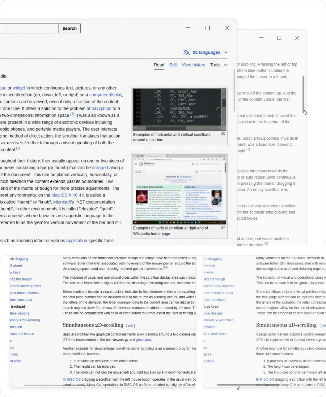
A custom scrollbar React component
136 lines (101 loc) • 2.84 kB
Markdown
# Scrollbar Gui
A minimalist, modern, and lightweight React component for implementing custom
scrollbars with a sleek and clean design. Perfect for projects that prioritize simplicity and elegance and create no gaps and spaces
## View
## Features
- Minimalist and modern scrollbar design
- Clean UI without creating unwanted gaps or spaces
- Auto-hide UI functionality for the scrollbar when not in use
- Supports both X and Y axis scrollbars
- Lightweight and easy to implement
- Seamless integration with React applications
- Customizable to fit different design needs and preferences
## Usage
Below is a simple example of how to implement the `ScrollbarGui` component into your React app.
### Basic Example
1. **Install the package** via npm:
```bash
npm install scrollbar-gui-react
```
2. **Import and Use the Component** in your React application:
```jsx
import React from 'react';
import { ScrollbarGUI } from 'scrollbar-gui-react/dist/ScrollBar' // Import the ScrollbarGui component
const App = () => {
return (
<div style={{ width: '100%', height: '100dvh' }}>
<ScrollbarGUI>
<div style={{ height: '100%' }}>
{/* Your content goes here */}
</div>
</ScrollbarGUI>
</div>
);
};
export default App;
```
### Custom CSS Styling
You can customize the styles of the scrollbar by modifying the `scrollbar-gui-react` component. Here’s an example of custom styling:
```css
/* Custom CSS */
.thumb-y,
.thumb-x {
background-color: rgba(192, 192, 192, 0.6);
}
.thumb-y.dragging,
.thumb-x.dragging {
background-color: #c0c0c0;
}
.thumb-y.hover,
.thumb-x.hover {
background-color: #c0c0c0;
}
```
### Advaced CSS Styling
```css
/* Custom Spacing */
.thumb-x{
margin-bottom: 5px;
}
.thumb-y {
margin-right: 5px;
}
/* Custom Height */
/* Scroll Area */
.scrollbar-x {
height: 12px;
}
.scrollbar-y {
width: 12px;
}
/* Scroll Unactive */
.thumb-x{
height: 2px;
}
.thumb-y {
width: 2px;
}
/* Scroll Active */
.scrollbar-y:hover .thumb-y,
.scrollbar-y.dragging .thumb-y,
.thumb-y:hover,
.thumb-y.dragging {
width: 6px ;
}
.scrollbar-x:hover .thumb-x,
.scrollbar-x.dragging .thumb-x,
.thumb-x:hover,
.thumb-x.dragging {
height: 6px ;
}
/* Auto Hide Scrollbar */
.scroll-container:hover .scrollbar-y,
.scroll-container:hover .scrollbar-x {
opacity: 1;
}
.scrollbar-y,
.scrollbar-x{
/* opacity: 0; */
/* Adding opacity 0 auto hides scrollbar when cusror not over scroll area */
}