santycss
Version:
Utility-first CSS with plain-English class names. No build step required (optional build for customization).
218 lines (156 loc) • 12.7 kB
Markdown
# SantyCSS
**Utility-first CSS with plain-English class names. No build step required.**
[](https://www.npmjs.com/package/santycss)
[](https://www.npmjs.com/package/santycss)
[](#sizes)
[](https://github.com/Santy-Labs/santyCSS/actions/workflows/ci.yml)
[](LICENSE)
[](https://github.com/Santy-Labs/santyCSS)
**Why SantyCSS:** for people who want to read their markup without a cheat sheet and get a finished design without building one. Every class is whole words and literal pixels (`padding-24` is 24px), and it ships with its own look, Persimmon, plus components that work in plain HTML.
Class names follow one grammar, `property-[modifier]-value`: `padding-24`, `radius-12`, `display-flex`. You can read the markup without a cheat sheet, and so can AI tools.
📖 [Docs](https://santycss.santy.in/docs.html) · 🔎 [Class reference](https://santycss.santy.in/classes.html) · 🎮 [Playground](https://santycss.santy.in/playground.html) · 🧩 [Templates](https://santycss.santy.in/templates.html) · 📝 [Changelog](CHANGELOG.md) · 🤝 [Contributing](CONTRIBUTING.md)
> **New in v2.10**
> - **One naming grammar.** `property-[modifier]-value`, with no verbs: `make-flex` → `display-flex`, `add-padding-24` → `padding-24`. The old names still work. See [NAMING.md](NAMING.md).
> - **A look of its own.** The Persimmon theme and nine components (button, card, navbar, input, badge, alert, modal, tabs, pricing), in `santy-next.css`. See [THEME.md](THEME.md).
> - `npx santycss migrate` rewrites old class names in HTML, JSX, TSX and Vue.
>
> [Full changelog →](CHANGELOG.md)
---
## Quick start
**CDN:** paste this into `<head>`:
```html
<!-- New projects: Persimmon theme + components + utilities, one file -->
<link rel="stylesheet" href="https://cdn.jsdelivr.net/npm/santycss@2/dist/santy-next.css">
<!-- Existing sites: the classic build, old and new class names -->
<link rel="stylesheet" href="https://cdn.jsdelivr.net/npm/santycss@2/dist/santy-start.css">
```
**npm:**
```bash
npm i santycss
```
```js
import 'santycss/css/next'; // or 'santycss/css/start' for the classic build
```
**Use it:**
```html
<article class="card">
<span class="badge badge-primary">Most popular</span>
<h3 class="card-title">Pro plan</h3>
<p class="card-text">Unlimited projects and priority support.</p>
<button class="button button-primary button-lg">Upgrade</button>
</article>
<div class="display-flex align-center gap-16 padding-24 background-white radius-12 shadow-md">
<h3 class="text-size-20 text-bold color-gray-900">Built from utilities</h3>
</div>
```
That's it. `npx santycss init` scaffolds a starter page. For full pages, see the [SaaS landing](examples/saas-landing.html) and [dashboard](examples/dashboard.html) examples, which are built with nothing but `santy-next.css`.
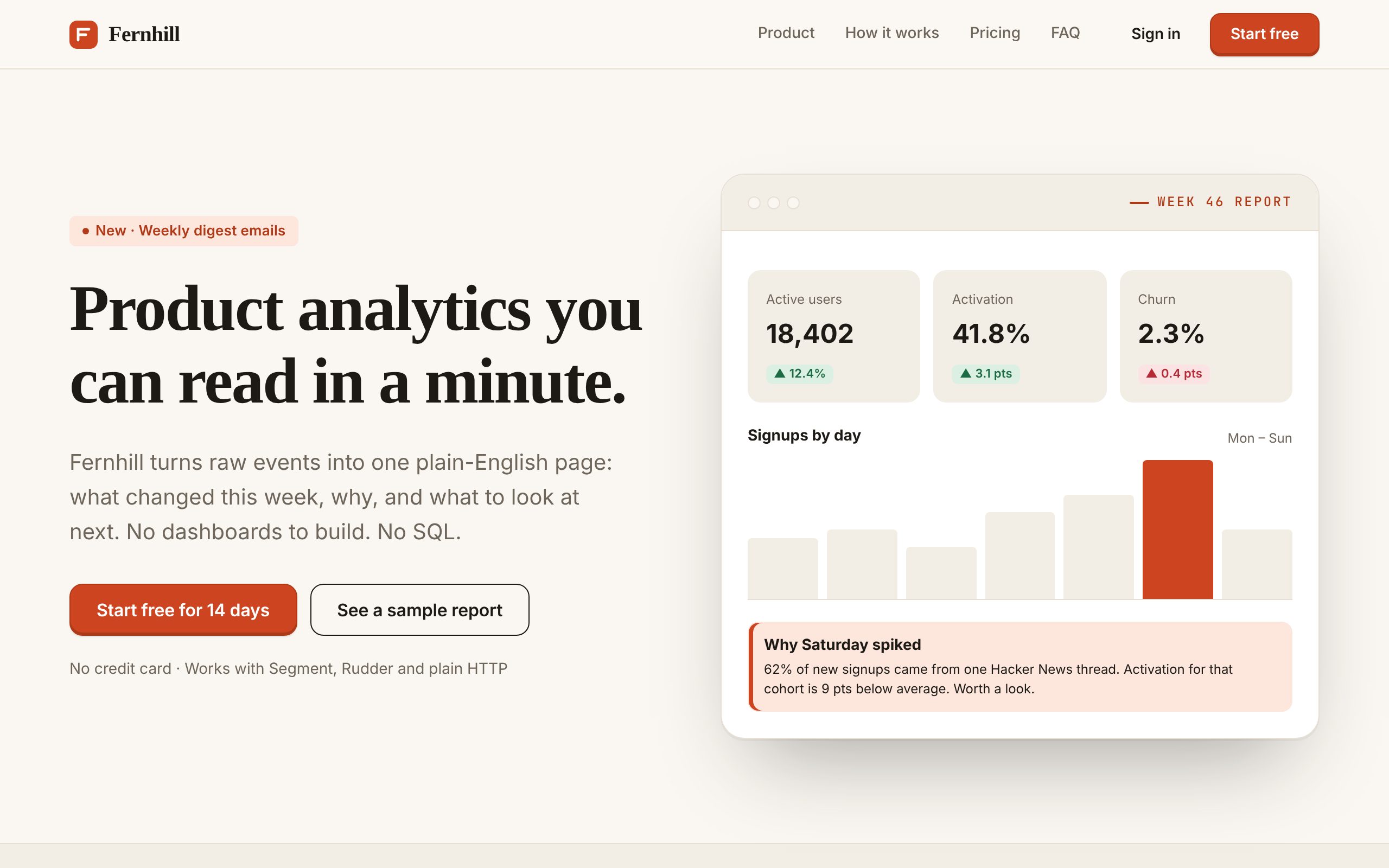
*A [SaaS landing page](https://santycss.santy.in/examples/saas-landing.html) built with nothing but `santy-next.css`. See also the [dashboard](https://santycss.santy.in/examples/dashboard.html), [every component](https://santycss.santy.in/examples/components.html) and the [template gallery](https://santycss.santy.in/templates.html).*
---
## Read it like a sentence
```html
<div class="display-flex align-center gap-16 padding-24 background-white radius-12 shadow-md on-hover:scale-105">
```
| Class | Says |
|---|---|
| `display-flex` | display: flex |
| `align-center` | align items to the centre |
| `gap-16` | 16px gap |
| `padding-24` | 24px padding |
| `background-white` | white background |
| `radius-12` | 12px corner radius |
| `shadow-md` | medium shadow |
| `on-hover:scale-105` | grow to 105% on hover |
The number in a class is the pixel value, so there's no scale to memorise and no cheat sheet to keep open.
---
## What's included
- **Utilities.** Layout, spacing, typography, 20 colour families, borders, shadows, transforms. Responsive, state, `dark:`, `:has()`, ARIA and RTL variants.
- **Components.** The Persimmon layer has button, card, navbar, input, badge, alert, modal, tabs and pricing, each with `primary` / `secondary` / `outline` / `ghost` and `sm` / `md` / `lg`: `button button-primary button-lg`. They work in plain HTML with no JS. The classic set (drawers, toasts, data tables and more) is still in `santy-start.css`.
- **santy.js.** A dependency-free behaviour layer. `data-santy-toggle="modal"` gives you focus trapping, Esc to close, scroll lock and ARIA wiring.
- **Framework adapters.** Custom elements (`<santy-modal>`), React hooks (`santycss/react`), Vue composables (`santycss/vue`).
- **Icons.** 2,100+ SVG icons as CSS classes: `<span class="icon icon-house"></span>`. [Browse them →](https://santycss.santy.in/icons.html)
- **Animations.** 120+, including scroll-triggered effects and creature animations (`animation-butterfly`). [See them →](https://santycss.santy.in/animations.html)
- **Themes.** Persimmon by default (warm paper, ink, serif headlines), with light and dark modes. Every value is a `--santy-*` variable, and there are 5 prebuilt presets.
- **Config and plugins.** `santy.config.json` for colours, spacing, breakpoints and a prefix; a plugin API; `@apply` via `santycss/postcss`.
- **Migrator.** `npx santycss migrate` updates pre-2.10 SantyCSS names to the current grammar. `--from=tailwind` and `--from=bootstrap` convert other frameworks.
- **Tooling.** Prettier class sorting (`santycss/prettier`), a [VS Code extension](vscode-santycss/) and a Figma plugin.
---
## At a glance
| | SantyCSS |
|---|---|
| Build step | None needed. The CDN file works in production; a build is only for customising |
| Class names | Whole words, `property-modifier-value`, literal pixels |
| Look | Its own theme (Persimmon), light and dark, all CSS variables |
| Components | Button, card, navbar, input, badge, alert, modal, tabs, pricing, plus the classic set |
| JS behaviour | Optional `santy.js` for focus traps, Esc-to-close and ARIA. The new components need no JS |
| Icons | 2,100+ included |
| AI tools | Readable without a lookup table; [`santycss.context.md`](santycss.context.md) is a ready-made prompt |
| CSS shipped | 65KB gz for `santy-next.css`, ~15KB gz purged on a real page |
### Trade-offs
- **Longer class names mean larger HTML.** Gzip removes most of the difference, but the source is wordier.
- **The full bundles are large.** Use `santy-next.css`, `santy-start.css` or `santy-core.css`, or purge (see below).
- **Not the best fit** if most of your styling is one-off arbitrary values (the JIT, `santy-jit.js`, covers occasional ones), or if your design system needs a Sass pipeline.
---
## Install options
```html
<!-- Drop-in: base utilities + components -->
<link rel="stylesheet" href="https://cdn.jsdelivr.net/npm/santycss@2/dist/santy-start.css">
<!-- Extended variants: xl:, peer-*, group-*, print:, motion-*, RTL -->
<link rel="stylesheet" href="https://cdn.jsdelivr.net/npm/santycss@2/dist/santy-variants.css">
<!-- Icons -->
<link rel="stylesheet" href="https://cdn.jsdelivr.net/npm/santycss@2/dist/santy-icons.css">
<!-- Behaviour layer -->
<script src="https://cdn.jsdelivr.net/npm/santycss@2/dist/santy.js" defer></script>
```
With npm: `import 'santycss/css'` (everything), `'santycss/css/core'`, `'santycss/css/icons'`, and so on. PostCSS, Vite and every module import are in the [docs](https://santycss.santy.in/docs.html).
### Sizes
| File | Raw | Gzipped |
|---|---|---|
| `santy-next.css` (new projects: theme + components + utilities) | 494KB | 65KB |
| `santy-ui.css` (theme + components only) | 45KB | 9KB |
| `santy-core.css` | 445KB | 56KB |
| `santy-start.css` | 805KB | 115KB |
| `santy.min.css` (everything) | 1.6MB | 192KB |
| `santy-icons.css` | 1.3MB | 247KB |
| `santy.js` | 71KB | 18KB |
| Purged, real page ([portfolio template](https://santycss.santy.in/template-portfolio.html)) | 102KB | **15KB** |
The classic bundles carry both old and new class names until v3. Set `"legacyNames": false` in `santy.config.json` to build them with new names only.
Purge to the classes you use:
```bash
npx santycss purge --input=src --css=node_modules/santycss/dist/santy.min.css --out=dist/santy.css
```
---
## Naming rules
Every class reads `property-[modifier]-value`. The full rationale and the scoring of the alternatives are in [NAMING.md](NAMING.md).
1. **Property first, then modifier, then value. No verbs.** `padding-top-24`, `border-left-2`, `md:display-flex`.
2. **Properties are whole words**, either the CSS name or one short word (`text`, `radius`, `shadow`, `background`): `radius-12`, `z-index-10`.
3. **Numbers are literal and whole.** Lengths are px, and unitless ratios are %. `gap-16`, `opacity-50`, `line-height-150`, `margin-top-minus-8`, `width-1-of-3`, `aspect-16-by-9`.
4. **A word means one thing.** There is one size scale (`xs sm md lg xl 2xl`). `text-bold` is fine, but numbers keep their modifier: `text-size-18`, `text-weight-600`.
5. **Components are nouns, and their options are suffixes:** `button button-primary button-lg`.
**Class count.** There are 5,100+ base classes, about 22,700 with every responsive, state and dark variant. That count leaves out the deprecated aliases. The [classmap](https://cdn.jsdelivr.net/npm/santycss@2/dist/santy-classmap.json) lists every name and maps each old one to its replacement under `deprecated`.
### Deprecated names
**v2.10 renamed 1,632 classes** to fit the grammar (`make-flex` → `display-flex`, `add-padding-24` → `padding-24`, `round-corners-12` → `radius-12`, and so on). The old names are aliases with identical CSS in every classic bundle and stay until v3. They are left out of `santy-next.css`. `npx santycss migrate src/` rewrites them for you, and the full map is in [`dist/santy-renames.json`](dist/santy-renames.json).
Older docs also used these spellings:
| Old | Current |
|---|---|
| `make-rounded-lg`, `make-rounded-*` | `radius-8`, `radius-{n}` |
| `make-rounded-full` | `radius-pill` |
| `tablet:make-block` | `md:display-block` (768px+) or `on-tablet:display-block` (640–1023px) |
| `bg-surface` | `background-surface` |
| `text-primary` (semantic) | `color-text` |
| `text-muted` | `color-text-muted` |
| `npx santycss-migrate` | `npx santycss migrate` |
`bg-surface`, `text-primary` and `text-muted` still work. The others were documented but never shipped; `npx santycss migrate --from=tailwind` now outputs the current names.
---
## AI integration
- **[`santycss.context.md`](https://cdn.jsdelivr.net/npm/santycss@2/santycss.context.md)** is a ready-made system prompt. Paste it into your AI tool and it writes SantyCSS with the current class names.
- **[`santy-classmap.json`](https://cdn.jsdelivr.net/npm/santycss@2/dist/santy-classmap.json)** lists every class name. It's also importable as `santycss/classmap`, for linters, autocomplete and validating AI output.
---
## Links
- 📖 [Website](https://santycss.santy.in) · [docs](https://santycss.santy.in/docs.html) · [classes](https://santycss.santy.in/classes.html) · [components](https://santycss.santy.in/components.html) · [icons](https://santycss.santy.in/icons.html) · [browser support](https://santycss.santy.in/docs.html#browser-support)
- 🎮 [Playground](https://santycss.santy.in/playground.html) · [templates](https://santycss.santy.in/templates.html) · [Webflow guide](https://santycss.santy.in/webflow.html)
- 📝 [Changelog](CHANGELOG.md) · 🤝 [Contributing](CONTRIBUTING.md) · 🐛 [Issues](https://github.com/Santy-Labs/santyCSS/issues) · 💬 [Discussions](https://github.com/Santy-Labs/santyCSS/discussions)
---
## License and credits
MIT © [Santy](https://github.com/ChintuSanty). Made in India 🇮🇳.
Icons are adapted from [Bootstrap Icons](https://icons.getbootstrap.com/) (MIT, © The Bootstrap Authors) and [Font Awesome Free](https://fontawesome.com/) (CC BY 4.0, © Fonticons, Inc.). See [LICENSE](LICENSE) for the third-party notices. Brand icons are trademarks of their owners and are included only to identify those brands. Their inclusion does not imply endorsement.