sanity-plugin-simpler-color-input
Version:
308 lines (230 loc) • 8.61 kB
Markdown
<div align="center">
<h1>
Simpler Color Input 🎨
</h1>
<p>A simpler color input for Sanity studio.</p>
<p>Created by <a href="https://github.com/AlyssaKirstine">@AlyssaKirstine</a></p>
</div>
## 🤩 Features
✓ Sanity v5 support (React 19)
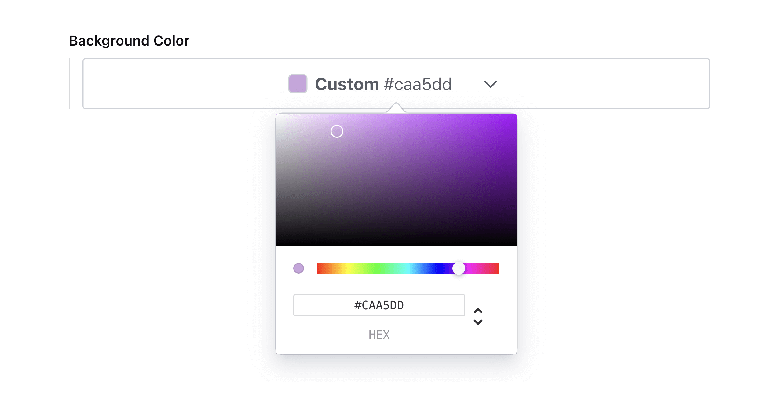
✓ Select a custom color using a color picker or HEX values
✓ Select a color from a predefined theme
✓ Use in the Portable Text editor to color or highlight text
✓ Dark mode support
## ⚠️ Version Compatibility
| Plugin Version | Sanity Studio Version | React Version |
| -------------- | --------------------- | ------------- |
| 4.x | 5.x | 19.x |
| 3.x | 3.x - 4.x | 18.x |
> **Note:** For Sanity Studio v3/v4 with React 18, use version 3.x of this plugin.
## 🔌 Install
```sh
npm install sanity-plugin-simpler-color-input
```
or
```sh
yarn add sanity-plugin-simpler-color-input
```
## 💡 How to Use
Add it as a plugin in `sanity.config.ts` (or .js):
```ts
import { defineConfig } from 'sanity'
import { simplerColorInput } from 'sanity-plugin-simpler-color-input'
export default defineConfig({
//...
plugins: [
simplerColorInput({
// Note: These are all optional
defaultColorFormat: 'rgba',
defaultColorList: [
{ label: 'Light', value: '#ffffff' },
{ label: 'Dark', value: '#333333' },
{ label: 'Brand', value: '#ca786d' },
{ label: 'Accent', value: '#626754' },
{ label: 'Custom...', value: 'custom' },
],
enableSearch: true,
showColorValue: true,
})
],
})
```
Learn more about the `colorList` and `colorFormat` properties in the [Options](#color-list) section.
### Use as a Standalone Field
You can use the `simplerColor` type in your schema types:
```js
// [...]
{
fields: [
// [...]
{
name: 'backgroundColor',
title: 'Background color',
type: 'simplerColor',
},
]
}
```
### Use in Portable Text editor
Or you can use the `textColor` and `highlightColor` types to annotate text in the Portable Text editor:
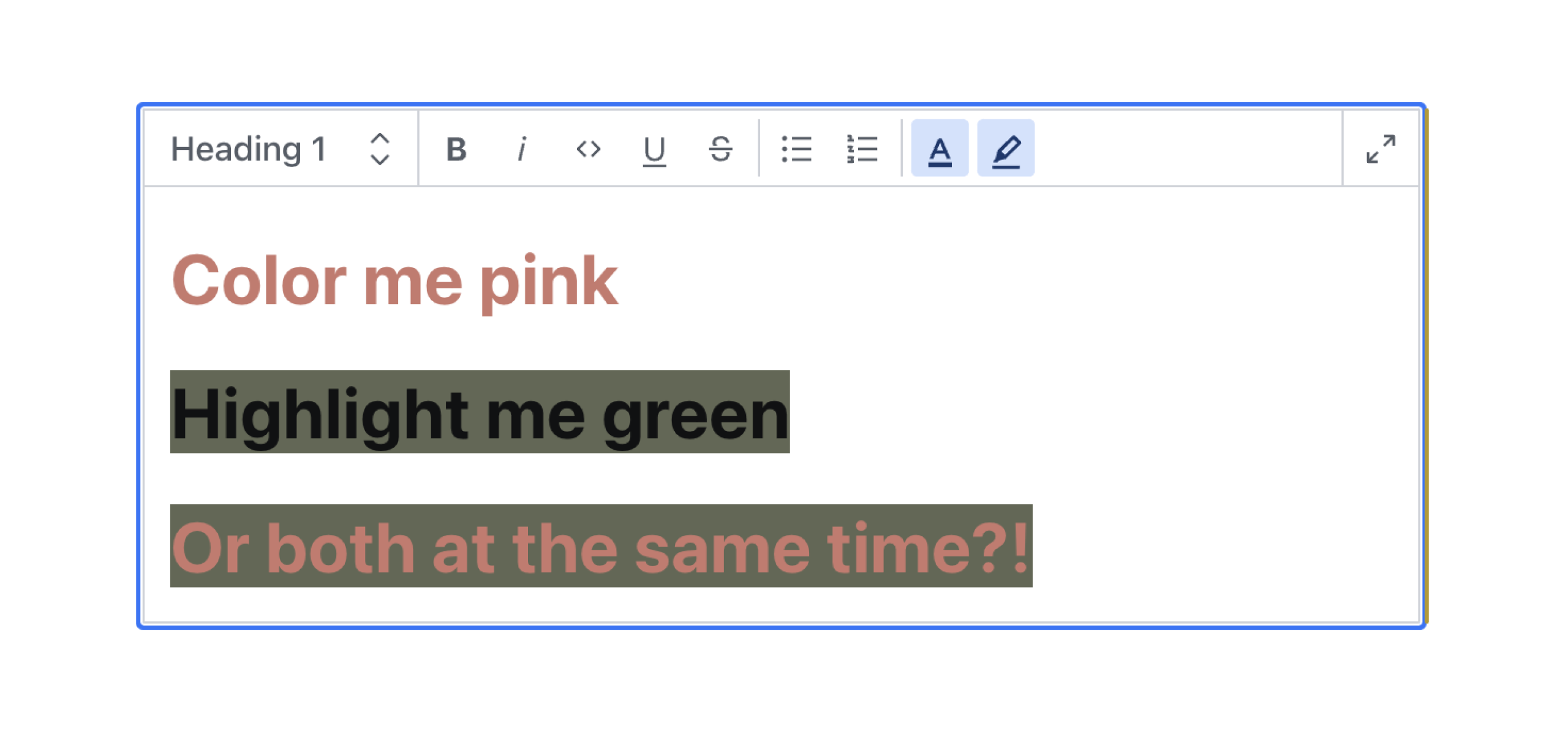
#### Text Color
```js
{
type: 'block',
marks: {
// ...,
annotations: [
// ...,
{
type: 'textColor',
},
],
}
}
```
#### Highlight Color
```js
{
type: 'block',
marks: {
// ...,
annotations: [
// ...,
{
type: 'highlightColor',
},
],
}
}
```
#### Render in Frontend
If you're using the [`@portabletext/react`](https://www.npmjs.com/package/@portabletext/react) package, you can pass the following code into the custom components property to render these colors in your frontend.
```js
const myPortableTextComponents = {
// ...,
marks: {
textColor: ({children, value}) => <span style={{color: value.value}}>{children}</span>,
highlightColor: ({children, value}) => (
<span style={{background: value.value}}>{children}</span>
),
},
}
```
This can be adapted to fit the framework you're using. You just need to know that the `textColor` and `highlightColor` color values are stored in the `value` property.
### A Note on Sanity's Visual Editing Experience
If you are using Sanity's Visual Editing experience, specifically their [overlays](https://www.sanity.io/docs/visual-editing-overlays) and [Stega-encoding](https://www.sanity.io/docs/stega), you will need to clean the color values before using them in your CSS. See how to do this in the discussion [here](https://github.com/cositehq/sanity-plugin-simpler-color-input/issues/11#issuecomment-2341777670).
## ⚙️ Options
### Color list
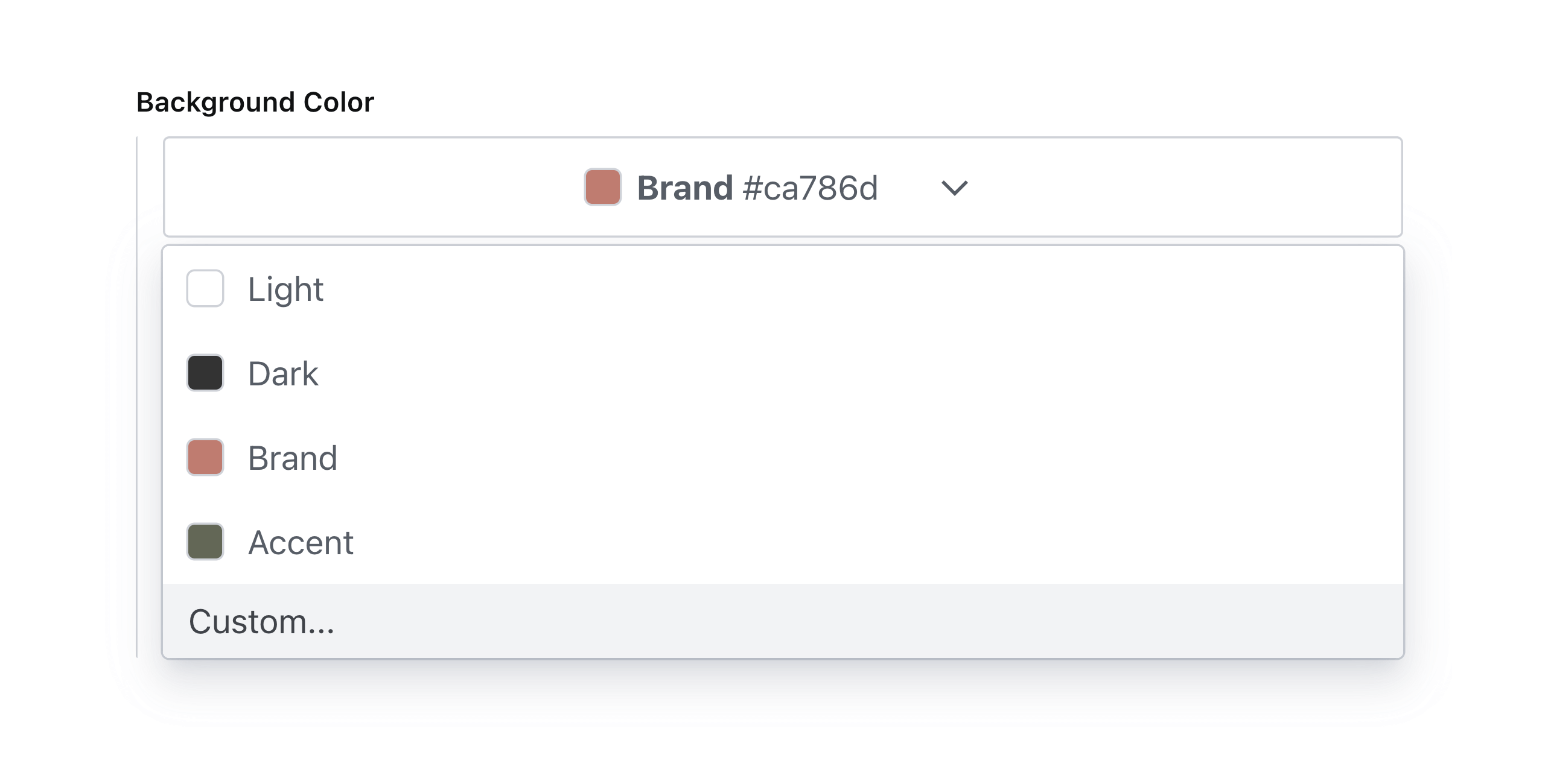
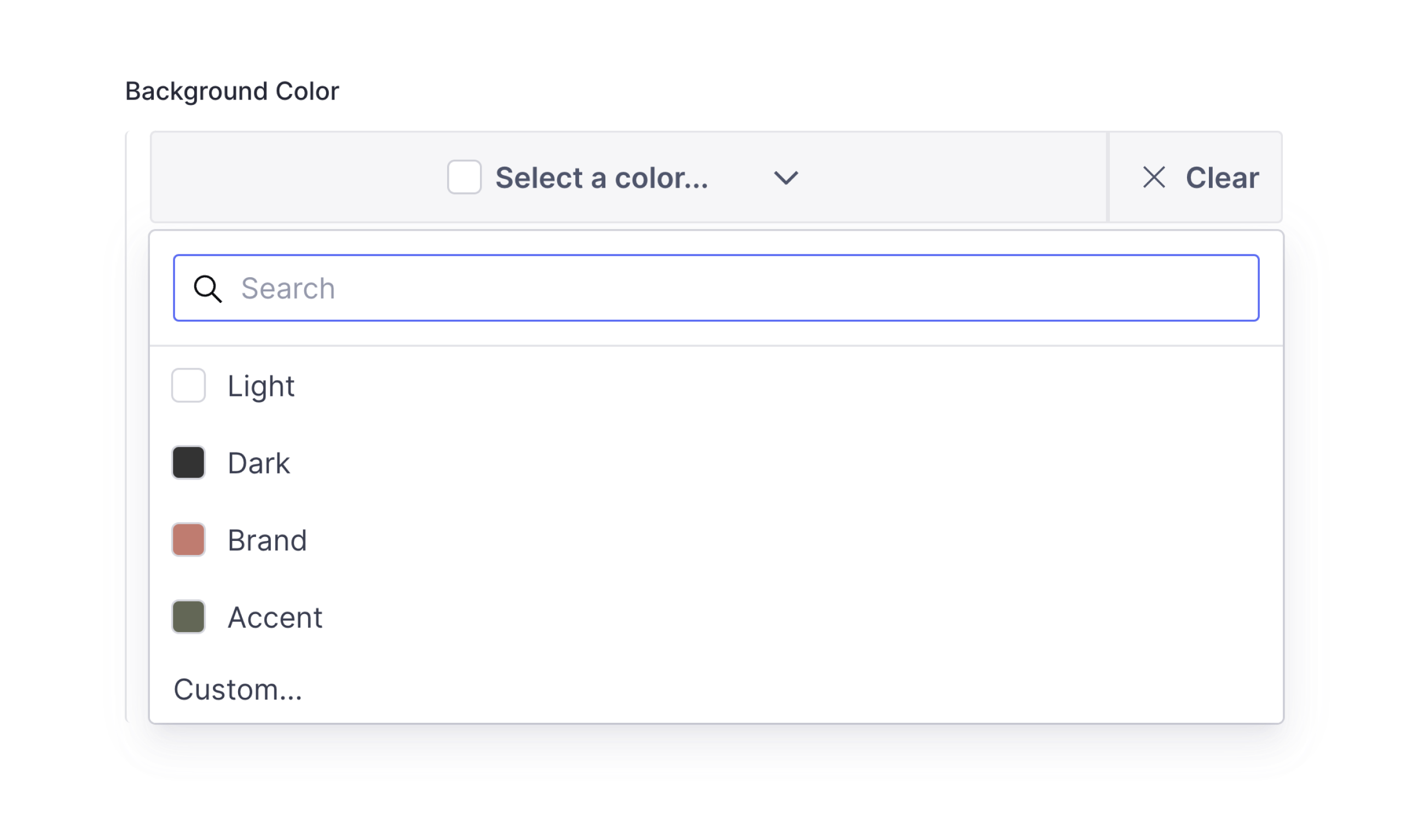
To add a list of predefined selectable color swatches for the user to choose from use `colorList`. Supports hexadecimal, RGB, or HSL color values. See [legal CSS color values](https://www.w3schools.com/cssref/css_colors_legal.php) for specification.
**Note:** this will take precedence over the value of `defaultColorList` in the plugin options.
```js
// ...fields...
{
name: 'backgroundColor',
title: 'Background Color with List',
type: 'simplerColor', // or textColor or highlightColor
options: {
colorList: [
{ label: 'Light', value: '#ffffff' },
{ label: 'Dark', value: '#333333' },
{ label: 'Brand', value: '#ca786d' },
{ label: 'Accent', value: '#626754' },
]
}
}
```
Which will render accordingly:
### Allow Custom Values
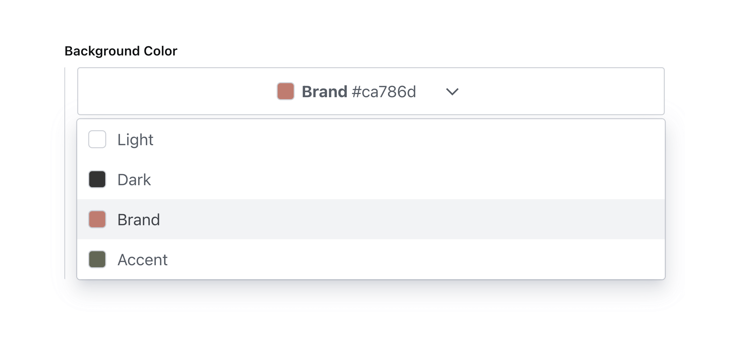
To allow custom color values, add an array item to `colorList` with its value set to `custom`.
```js
// ...fields...
{
name: 'backgroundColor',
title: 'Background Color with Custom Values',
type: 'simplerColor', // or textColor or highlightColor
options: {
colorList: [
{ label: 'Light', value: '#ffffff' },
{ label: 'Dark', value: '#333333' },
{ label: 'Brand', value: '#ca786d' },
{ label: 'Accent', value: '#626754' },
{ label: 'Custom...', value: 'custom' },
],
}
}
```
Which will render accordingly:

**Note:** custom color values will automatically be enabled if no color list is specified.
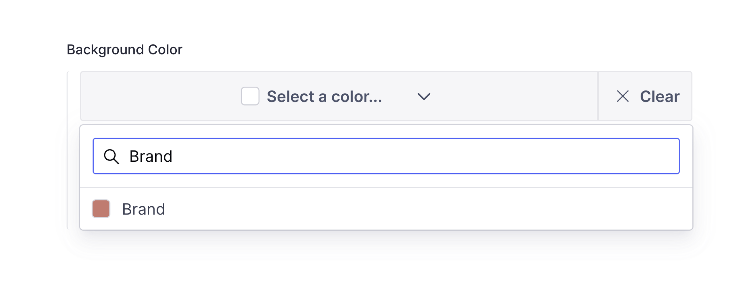
### Enable Search
To enable search in the color picker, set `enableSearch` to `true`.
```js
// ...fields...
{
name: 'backgroundColor',
title: 'Background Color with Search',
type: 'simplerColor', // or textColor or highlightColor
options: {
enableSearch: true,
}
}
```
Which will render accordingly:
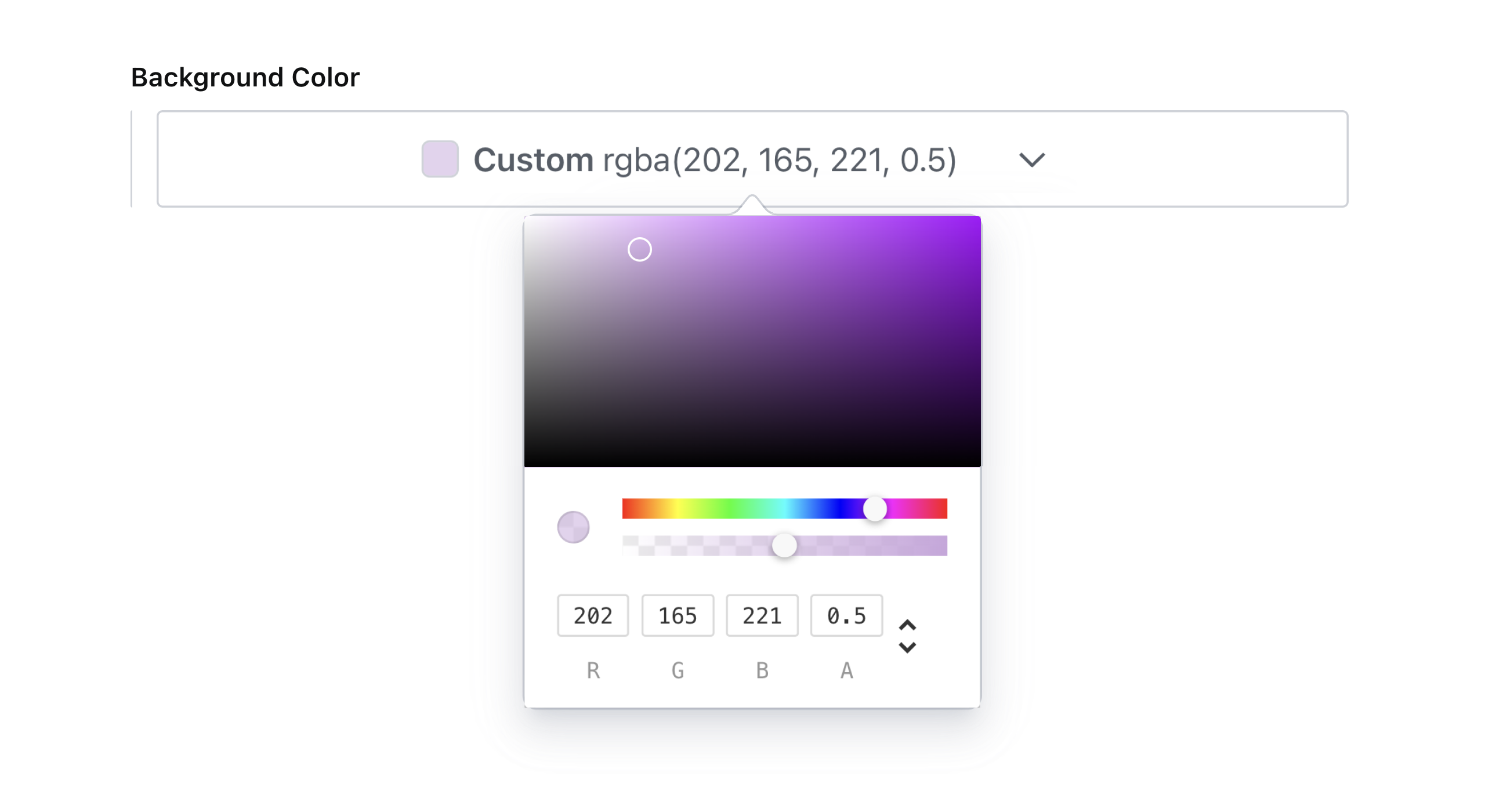
### Custom Color Format
The default color format that will be outputted by the color picker is `hex`. To change this, set `colorFormat` to any of the following values: `hex`, `hexa`, `rgb`, `rgba`, `hsl`, or `hsla`.
**Note:** this will take precedence over the value of `defaultColorFormat` in the plugin config.
```js
// ...fields...
{
name: 'backgroundColor',
title: 'Background Color with RGBA Format',
type: 'simplerColor', // or textColor or highlightColor
options: {
colorFormat: 'rgba',
}
}
```
Which will render accordingly:
**What happened to the `enableAlpha` option?**
This option was removed in favor of the more precise `colorFormat` setting. The alpha slider will be enabled when the `colorFormat` is set to `hexa`, `rgba` or `hsla`.
### Color Value Showing
By default, the library shows the color value in the input field. If you want to hide it, you can set `showColorValue` to `false`.
```js
// ...fields...
{
name: 'backgroundColor',
title: 'Background Color with Search',
type: 'simplerColor', // or textColor or highlightColor
options: {
showColorValue: false,
}
}
```
## 📚 Data model
```js
{
_type: 'simplerColor', // or textColor or highlightColor
label: 'Brand',
value: '#ca786d',
}
```
## 💜 License
Created by [@AlyssaKirstine](https://github.com/AlyssaKirstine)
[MIT](LICENSE) © Cosite LLC
_Thank you to [@theostrahlen](https://github.com/theostrahlen) for parts of the code for the Portable Text annotations addition!_
## 🧪 Develop & test
This plugin uses [@sanity/plugin-kit](https://github.com/sanity-io/plugin-kit)
with default configuration for build & watch scripts.
See [Testing a plugin in Sanity Studio](https://github.com/sanity-io/plugin-kit#testing-a-plugin-in-sanity-studio)
on how to run this plugin with hotreload in the studio.
### Release new version
Run ["CI & Release" workflow](https://github.com/cositehq/sanity-plugin-simpler-color-input/actions/workflows/main.yml).
Make sure to select the main branch and check "Release new version".
Semantic release will only release on configured branches, so it is safe to run release on any branch.