respinner
Version:
React SVG spinner components
173 lines (122 loc) • 3.65 kB
Markdown
# Respinner

> react components for spinners or loaders. Each loader was combined css animation and render dom as svg.
easily controlled by react porps.
You could change the count of spinner's children by props `count`, also the `color` of themselves. All of them built with SVG, so you can easily scale them with `width` and `height`.
### Examples
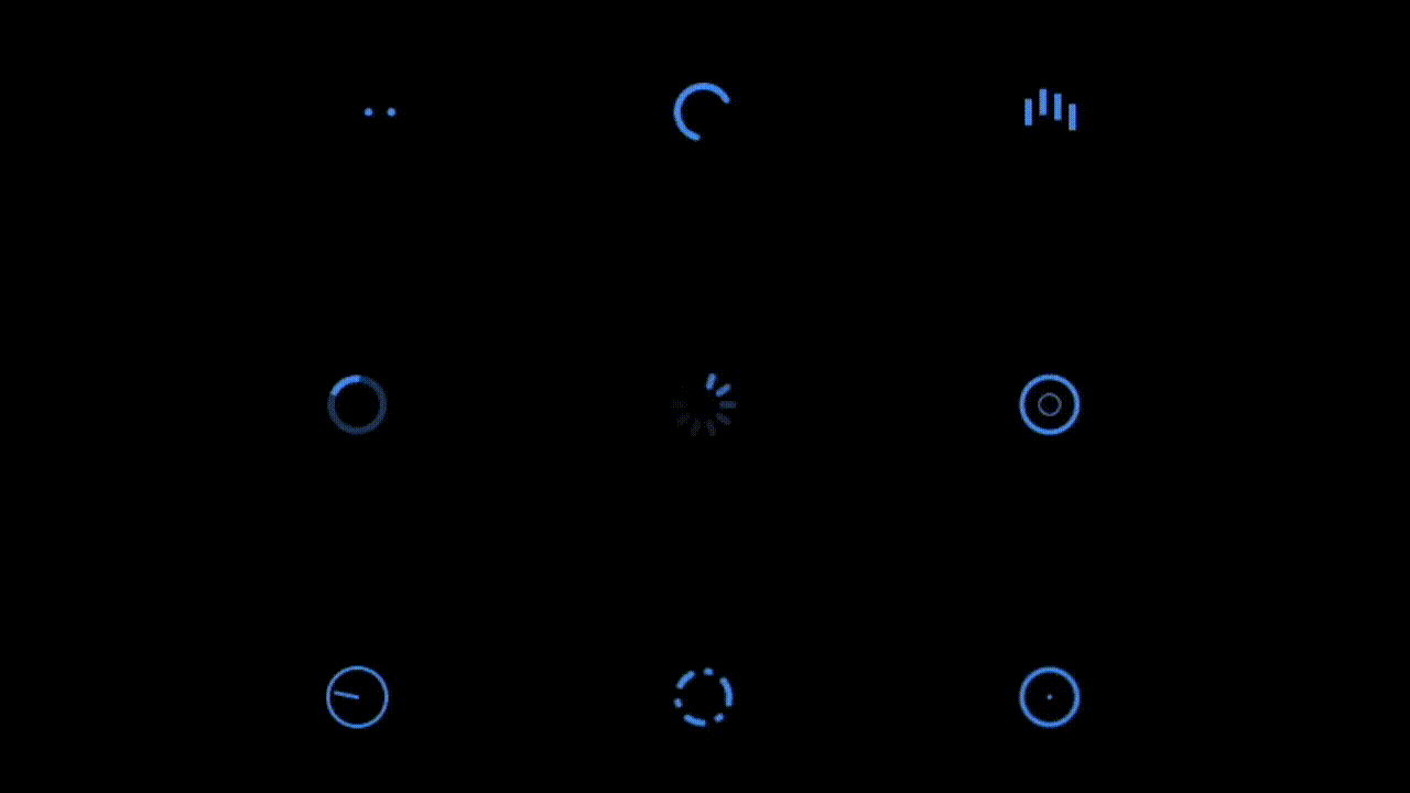
See more details in `demo` directory or visit [website](https://respinner.vercel.app/)
### Usage
```sh
npm install --save respinner
```
Just import it when use with react. Issues go to [issues](https://github.com/huozhi/respinner/issues).
#### Basic
```tsx
import React from 'react'
import {
BeatLoading, BounceLoading, CircularLoading,
ClockLoading, RotateLoading, SpinLoading,
WaveLoading, DashLoading, CopperLoading
} from 'respinner'
function LoadingComponents() {
<div className="spinners">
<SpinLoading color="#777" borderRadius={4} count={12} /> // use with color prop
<CircularLoading color="#3b82f6" /> // color sets both fill and stroke
<BeatLoading fill="#999" /> // or use fill/stroke directly
</div>
}
```
#### Use with SVG `use`
```tsx
// pre-define a spinner
<SpinLoading borderRadius={2} count={10} id="spin" />
// reuse them
<svg width="40"><use href="#spin" fill="#fff" /></svg>
<svg width="40"><use href="#spin" fill="#fff" /></svg>
```
### API
Any SVG props could be used in these components. All components support a `color` prop that sets both `fill` and `stroke` properties. If `color` is specified, it takes precedence over `fill` or `stroke` props.
The following are the default props for these components:
<details>
<summary>1. BeatLoading</summary>
- `gap`: `6`
- `size`: `8`
- `count`: `6`
- `duration`: `0.8`
- `color`: Sets `fill` (prefers `color` over `fill`)
</details>
<details>
<summary>2. CircularLoading</summary>
- `size`: `40`
- `strokeWidth`: `4`
- `linecap`: `'round'`
- `color`: Sets `stroke` (prefers `color` over `stroke`)
</details>
<details>
<summary>3. BounceLoading</summary>
- `gap`: `6`
- `count`: `4`
- `barWidth`: `4`
- `barHeight`: `16`
- `duration`: `0.8`
- `color`: Sets `fill` (prefers `color` over `fill`)
</details>
<details>
<summary>4. RotateLoading</summary>
- `size`: `40`
- `opacity`: `0.2`
- `strokeWidth`: `4`
- `color`: Sets `stroke` (prefers `color` over `stroke`)
</details>
<details>
<summary>5. SpinLoading</summary>
- `size`: `40`
- `count`: `8`
- `barWidth`: `4`
- `duration`: `1`
- `barHeight`: `10`
- `borderRadius`: `1`
- `color`: Sets `fill` (prefers `color` over `fill`)
</details>
<details>
<summary>6. WaveLoading</summary>
- `size`: `40`
- `count`: `3`
- `duration`: `1.5`
- `strokeWidth`: `2`
- `color`: Sets `stroke` (prefers `color` over `stroke`)
</details>
<details>
<summary>7. ClockLoading</summary>
- `size`: `40`
- `duration`: `2`
- `strokeWidth`: `2`
- `color`: Sets `stroke` (prefers `color` over `stroke`)
</details>
<details>
<summary>8. DashLoading</summary>
- `size`: `40`
- `duration`: `1.8`
- `strokeWidth`: `4`
- `color`: Sets `stroke` (prefers `color` over `stroke`)
</details>
<details>
<summary>9. CopperLoading</summary>
- `size`: `40`
- `strokeWidth`: `4`
- `color`: Sets both `fill` and `stroke` (prefers `color` over `fill`/`stroke`)
</details>
### Development
```sh
pnpm install
pnpm dev
# see demo in http://localhost:3000
```
### Build
```sh
pnpm run build # build lib
pnpm run build:docs # build docs
```
### License
MIT