reanimated-bottom-tabs
Version:
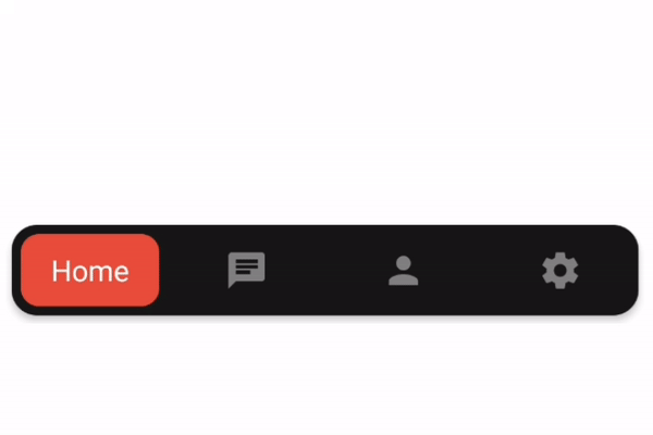
Bottom Tabs for react-navigation using reanimated
72 lines (58 loc) • 2.13 kB
Markdown
`npm i reanimated-bottom-tabs`
**This package uses react-native-reanimated 2 so make sure you have it installed as well**
[](https://docs.swmansion.com/react-native-reanimated/docs/installation#installing-the-package).
Please notice that it is version 2.
**also you need to have react-navigation v5.**
Simply import the component and use it as the tabBar property of the bottom tab navigator.
```
import ReanimatedBottomTabs from 'reanimated-bottom-tabs';
const Tab = createBottomTabNavigator();
const TabNavigator = () => (
// notice you need to pass props to the component like so:
<Tab.Navigator tabBar={props => <ReanimatedBottomTabs {...props} />}>
<Tab.Screen
options={{
title: 'Home',
// for icon you should set your custom icon for each screen using tabBarIcon:
tabBarIcon: () => <Icon name="home" size={24} color="gray" />,
}}
name="Home"
component={HomeScreen}
/>
<Tab.Screen
name="Chat"
options={{
title: 'Home',
tabBarIcon: () => <Icon name="chat" size={24} color="gray" />,
}}
component={ChatScreen}
/>
</Tab.Navigator>
);
```
- **activeColor**: color for the text | defaults to `'white'`,
- **margin**: the margin for the bottomTabBar from corners, applies for top, left, right, bottom | defaults to `8`,
- **moverPadding**: padding for the container of the red box in demo | defaults to `5`,
- **moverStyle**: style object for the moving element | defaults to
```
{
backgroundColor: "#e74c3c",
borderRadius: 10,
}
```
- **contentContainerStyle**: style object for the bottom tab bar | defaults to
```
{
backgroundColor: "#181818",
borderRadius: 14,
elevation: 3,
}
```
- **itemLabelStyle**: label style of each item.
**how to add icons?**
in order to add icon, render your custom icon for each screen using the options > tabBarIcon property similar to the example