reactjs-bottom-navigation
Version:
A flexible bottom navigation component for React applications
126 lines (93 loc) • 5.49 kB
Markdown
# reactjs-bottom-navigation
> React bottom navigation component
[](https://standardjs.com)
[](https://www.npmjs.com/package/reactjs-bottom-navigation)

## Table of Contents
- [Introduction](#introduction)
- [Installation](#installation)
- [Props](#props)
- [Item Structure](#item-structure)
- [Usage](#usage)
- [Customization](#customization)
- [License](#license)
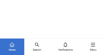
## Introduction
"ReactJS Bottom Navigation" is a lightweight and flexible component that provides a customizable bottom navigation experience for your React applications. This component has been fully re-implemented in TypeScript in version 2, providing a more robust and type-safe development experience. With a range of options to customize it.
## Installation
```bash
npm install --save reactjs-bottom-navigation
```
## Props
| Props | Type | Default | Description |
|------------------|--------------------------|-----------|-----------------------------------------------------------------------------|
| items | BottomNavigationItem[] | - | The array of items to display in the navigation |
| selected | number | null | (optional) The index of the currently selected item |
| onItemClick | function | - | (optional) Triggered when an item is clicked, returns the clicked item |
| activeBgColor | string | - | (optional) Custom active background color code |
| activeTextColor | string | black | (optional) Custom active text color code |
| hideOnScroll | boolean | false | (optional) Hides the navigation bar when scrolling |
| style | React.CSSProperties | {} | (optional) Custom styles for the navigation container |
| className | string | "" | (optional) Custom class name for the navigation container |
### Item Structure
All item properties are optional. If no property is provided, the item will occupy space but remain empty.
| Prop | Type | Description |
|------------|-------------------------------|-----------------------------------------------------------------------------|
| title | string | (optional) Item title |
| icon | JSX.Element | (optional) Item icon |
| activeIcon | JSX.Element | (optional) Item active icon |
| onClick | function | (optional) Triggered when the item is clicked, returns the clicked item |
| render | ({ isActive: boolean; id: number }) => JSX.Element | (optional) Custom render function for the item |
| active | boolean | (optional) Custom active state control. If not provided, falls back to selected index behavior |
## Usage
To use the component, provide an array of `items` representing the navigation options in the bar. Each item can include a `title`, an `icon`, or custom content using the `render` function.
Example:
```jsx
import React, { useState } from "react";
import { BottomNavigation } from "reactjs-bottom-navigation";
function App() {
const bottomNavItems = [
{
title: "Home",
onClick: ({ id }) => alert("Menu clicked " + id),
icon: <HomeIcon />,
activeIcon: <HomeIcon color="#fff" />
},
{
title: "Search",
},
{
render: ({ isActive, id }) => isActive ? <strong>{id}</strong> : <span>{id}</span>,
},
];
return (
<div>
<BottomNavigation
items={bottomNavItems}
selected={0}
onItemClick={(item) => console.log(item)}
activeBgColor="slateBlue"
activeTextColor="white"
hideOnScroll={true}
className="custom-bottom-nav"
style={{ position: "fixed", bottom: 0, width: "100%" }}
/>
</div>
);
}
export default App;
```
## Customization
The component offers multiple ways to customize:
### Styles and Classes
- Navigation container: `bottom-nav`
- Navigation items: `bottom-nav-item`
- Item titles: `bottom-nav-item-title`
- Active items: Add `active` class to `bottom-nav-item`
You can use `activeBgColor`, `activeTextColor`, and the `className` prop to further customize the appearance.
### Hide on Scroll
Use the `hideOnScroll` prop to automatically hide the navigation bar when scrolling down.
### Custom Content
Use the `render` method in `items` to define custom content for each navigation item.
## License
MIT © [hoseinhamzei](https://github.com/hoseinhamzei)