react-trophies
Version:
Comprehensive achievement and trophy system for React apps with sound effects, notifications, theming, and visual components. Uses React, React-DOM, Sonner (toast notifications), Howler (sound effects), Zustand (state management), React-Confetti (celebrat
427 lines (347 loc) • 15.4 kB
Markdown
# 🏆 React Trophies
A comprehensive achievement and trophy system for React applications with sound effects, notifications, theming, and visual components.
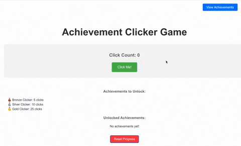
Try it out: [StackBlitz Demo](https://stackblitz.com/edit/vitejs-vite-rymmutrx)
> **v2.2.0 Update**: Enhanced TrophyModal component with achievement icons, customizable styling, and improved UI! Unlocked achievements now display with celebratory styling and full Tailwind CSS customization. See the [TrophyModal](#trophymodal-component) documentation for details.
> **v2.1.0 Update**: Improved toast architecture! React-trophies now uses a render prop pattern with Sonner, automatically disabling its internal toast handling when detecting a global Toaster component. This eliminates conflicts when multiple parts of your application use Sonner.
## Features
- 🔔 **Toast Notifications** using Sonner with automatic conflict resolution
- 🔊 **Sound Effects** using Howler.js
- 🎊 **Confetti Celebrations** using react-confetti
- 🏆 **Achievement Badges** with customizable icons
- 💾 **Persistent Storage** for unlocked achievements
- 🎯 **Flexible Metrics** for tracking user progress
- 🎨 **Customizable Theming** for all components
- 📱 **Responsive Design** for all screen sizes
- 🔄 **Automatic Integration** with existing toast implementations
- 🖼️ **Achievement Showcase** with TrophyModal component
## Installation
```bash
# Install the package
npm install react-trophies
# Install core peer dependencies
npm install howler sonner zustand react-confetti react-use
```
Or with a single command:
```bash
npm install react-trophies howler sonner zustand react-confetti react-use
```
## Quick Start
```jsx
import { AchievementProvider, useAchievement, AchievementToastContent } from 'react-trophies';
import { Toaster, toast } from 'sonner';
import type { AchievementConfiguration } from 'react-trophies';
// 1. Define achievements
const achievementConfig = {
score: [{
isConditionMet: (value) => typeof value === 'number' && value >= 100,
achievementDetails: {
achievementId: 'high-score',
achievementTitle: 'High Score!',
achievementDescription: 'Score 100 points',
achievementIconKey: 'trophy'
}
}]
};
// 2. Wrap your app with the provider and add Toaster component
function App() {
return (
<AchievementProvider
config={achievementConfig}
storageKey="my-app-achievements" // Optional: for persistence
achievementSoundUrl="/achievement-sound.mp3" // Optional: sound effect
badgesButtonPosition="top-right" // Optional: position of the badges button
enableToasts={true} // Optional: enable toast notifications (default: true)
toastTitle="Achievement Unlocked!" // Optional: customize toast title
>
<YourApp />
<Toaster position="bottom-right" richColors /> {/* Required for toast notifications */}
</AchievementProvider>
);
}
// 3. Use the hook to update metrics
function GameComponent() {
const { updateMetrics, unlockedAchievements, notifications } = useAchievement();
const handleScoreChange = (newScore) => {
// IMPORTANT: All metrics must be arrays
updateMetrics({ score: [newScore] });
};
// Rest of your component
}
// 4. Add a sound file to your public directory
// Create a file at: public/achievement-sound.mp3
```
## API Reference
### AchievementProvider Props
| Prop | Type | Description |
|------|------|-------------|
| `config` | `AchievementConfiguration` | Required. Configuration object defining all achievements |
| `initialState` | `object` | Optional. Initial metrics and previously awarded achievements |
| `storageKey` | `string` | Optional. Key for localStorage persistence |
| `badgesButtonPosition` | `'top-left'\|'top-right'\|'bottom-left'\|'bottom-right'` | Optional. Position of the badges button |
| `styles` | `object` | Optional. Custom styles for components |
| `icons` | `Record<string, string>` | Optional. Custom icons for achievements |
| `achievementSoundUrl` | `string` | Optional. URL to sound effect MP3 file |
| `enableSound` | `boolean` | Optional. Controls whether achievement sound effects play (default: true) |
| `enableConfetti` | `boolean` | Optional. Controls whether confetti celebration displays (default: true) |
| `enableToasts` | `boolean` | Optional. Controls whether toast notifications are triggered (default: true) |
| `toastTitle` | `string` | Optional. Customize the title for achievement toast notifications (default: "Achievement Unlocked!") |
| `toastStyles` | `React.CSSProperties` | Optional. Custom styles for toast notifications (merged with default styles) |
| `useDefaultToastStyles` | `boolean` | Optional. When true, uses Sonner's default toast styling instead of the custom achievement toast component (default: false) |
### useAchievement Hook
The `useAchievement` hook returns:
| Property | Type | Description |
|----------|------|-------------|
| `metrics` | `Record<string, any[]>` | Current metrics values |
| `unlockedAchievements` | `AchievementDetails[]` | List of unlocked achievements |
| `notifications` | `AchievementDetails[]` | Recent achievement notifications |
| `updateMetrics` | `(metrics: Record<string, any[]>) => void` | Function to update metrics |
| `resetStorage` | `() => void` | Function to reset all stored achievements |
| `enableSound` | `boolean` | Optional. Toggle sound effects on/off. Default: `true` |
| `enableConfetti` | `boolean` | Optional. Toggle confetti celebrations on/off. Default: `true` |
| `enableToasts` | `boolean` | Optional. Toggle toast notifications on/off. Default: `true` |
## TrophyModal Component
The TrophyModal component provides a beautiful way to showcase achievements with progress bars, sorted with unlocked achievements first. It displays unlocked achievements with celebratory styling and includes achievement icons for better visual distinction. The component is highly customizable with full Tailwind CSS support.
### Installation
The TrophyModal component requires Shadcn UI components. You can either install individual Radix UI primitives or use Shadcn UI's CLI for a complete setup (recommended):
#### Option 1: Individual Radix UI primitives
```bash
npm install -ui/react-dialog @radix-ui/react-progress -ui/react-scroll-area
```
#### Option 2: Shadcn UI (Recommended)
```bash
npx shadcn-ui init
npx shadcn-ui add dialog progress scroll-area button
```
### Usage
```jsx
import { TrophyModal } from 'react-trophies';
import { AchievementProvider, useAchievement } from 'react-trophies';
function App() {
// Your achievement configuration
const achievementConfig = {
clicks: [
{
isConditionMet: (value) => value >= 10,
achievementDetails: {
achievementId: 'click-master',
achievementTitle: 'Click Master',
achievementDescription: 'Click 10 times',
achievementIconKey: 'trophy', // Icon key that displays as emoji in the card
targetValue: 10 // Used for progress calculation
}
}
// More achievements...
]
};
// Your current metrics
const currentMetrics = {
clicks: [5] // User has clicked 5 times (50% progress)
};
return (
<AchievementProvider config={achievementConfig}>
{/* Rest of your app */}
{/* Basic usage - requires config and metrics as props */}
<TrophyModal
config={achievementConfig}
metrics={currentMetrics}
buttonPosition="bottom-right" // Optional: position of the trigger button
modalTitle="Achievement Collection" // Optional: custom title
// New customization options in v2.2.0
modalClassName="bg-slate-900 text-white" // Custom modal styling
cardClassName="bg-slate-800 border-slate-600" // Base card styling
unlockedCardClassName="border-green-500 bg-green-500/10" // Unlocked card styling
iconClassName="text-amber-400 text-2xl" // Achievement icon styling
/>
</AchievementProvider>
);
}
// With a custom trigger element
function AppWithCustomTrigger() {
const achievementConfig = { /* ... */ };
const currentMetrics = { /* ... */ };
return (
<div>
<TrophyModal
config={achievementConfig}
metrics={currentMetrics}
customTrigger={
<button className="flex items-center gap-2 bg-indigo-600 text-white px-4 py-2 rounded-lg">
<span>🏆</span> Custom Achievements Button
</button>
}
// Style customizations work with custom triggers too
modalClassName="bg-indigo-950 text-white border-indigo-800"
cardClassName="bg-indigo-900 border-indigo-700"
unlockedCardClassName="border-yellow-500 bg-yellow-500/10"
/>
</div>
);
}
```
### Props
| Prop | Type | Description |
|------|------|-------------|
| `config` | `AchievementConfiguration` | Required. The same achievement configuration used in AchievementProvider |
| `metrics` | `Record<string, number\|string\|number[]>` | Required. Current metrics values for progress calculation |
| `trigger` | `React.ReactNode` | Optional. Custom element to trigger the modal |
| `modalTitle` | `string` | Optional. Custom title for the modal (default: 'Your Trophies') |
| `className` | `string` | Optional. Additional class names for the trigger button |
| `buttonPosition` | `'top-left'\|'top-right'\|'bottom-left'\|'bottom-right'` | Optional. Position of the trigger button (default: 'bottom-right') |
## Available Icons
The package includes these default icons that can be referenced by key:
- 🏆 `trophy` - Classic achievement symbol
- ⭐ `star` - General achievement
- 🥉 `bronze` - Bronze tier achievement
- 🥈 `silver` - Silver tier achievement
- 🥇 `gold` - Gold tier achievement
- 💎 `diamond` - Diamond tier achievement
- 🚀 `rocket` - Progress achievement
- 🔥 `fire` - Streak achievement
## Understanding the Toast Architecture
React Trophies has been designed to work seamlessly with your existing toast infrastructure. Here's what you need to know:
> ⚠️ **WARNING: AVOIDING DUPLICATE TOASTS**
>
> If your application already uses Sonner, follow these guidelines to avoid multiple toast instances:
>
> 1. **ALWAYS add only ONE `<Toaster />` component** in your application root
> 2. **DO NOT** nest multiple `<Toaster />` components at different levels
> 3. Make sure the `<Toaster />` component is a sibling to your main app wrapped with `<AchievementProvider>`
>
> ```jsx
> // CORRECT SETUP ✅
> <>
> <AchievementProvider config={achievementConfig}>
> <YourApp />
> </AchievementProvider>
> <Toaster /> {/* Single Toaster outside the provider */}
> </>
>
> // INCORRECT SETUP ❌
> <AchievementProvider config={achievementConfig}>
> <YourApp />
> <Toaster /> {/* Don't put Toaster inside provider */}
> {/* Don't add multiple Toaster components */}
> </AchievementProvider>
> ```
### Automatic Conflict Resolution
The library automatically detects if a Sonner `<Toaster />` component is present in your DOM. If found, it will use that component to display achievement notifications, ensuring no conflicts occur.
### Manual Control
You can explicitly control toast behavior with these options:
```jsx
// In your app root
function App() {
return (
<>
<AchievementProvider
config={achievementConfig}
enableToasts={true} // Set to false to disable all toast notifications
toastTitle="You've Earned an Achievement!" // Customize the toast title
>
<YourApp />
</AchievementProvider>
{/* This Toaster will be automatically used by react-trophies */}
<Toaster position="bottom-right" richColors />
</>
);
}
```
### Custom Achievement Toasts Outside the Provider
You can also create custom achievement toast notifications outside the provider:
```jsx
import { toast } from 'sonner';
import { AchievementToastContent } from 'react-trophies';
// Somewhere in your code
function showCustomAchievementToast(achievement) {
toast.custom(
<AchievementToastContent
achievement={achievement}
title="Custom Achievement!"
/>
);
}
```
## Peer Dependencies
This package relies on the following peer dependencies:
- `howler` (^2.2.4): For sound effects
- `sonner` (^1.4.41): For toast notifications
- `zustand` (^4.0.0 || ^5.0.0): For state management
- `react-confetti` (^6.0.0): For celebration effects
- `react-use` (^17.0.0): For utility hooks
For the TrophyModal component (optional):
- `-ui/react-dialog` (^1.0.0): For dialog functionality
- `-ui/react-progress` (^1.0.0): For progress bars
- `-ui/react-scroll-area` (^1.0.0): For scrollable content
- `lucide-react` (optional): For icons
These dependencies are marked as optional peers, so they are only required if you use the TrophyModal component.
## Example Implementation
Here's a complete example of a click counter game with achievements:
```jsx
import { useState } from 'react';
import { AchievementProvider, useAchievement } from 'react-trophies';
import type { AchievementConfiguration } from 'react-trophies';
// Component that uses the achievement system
function ClickGame() {
const [clicks, setClicks] = useState(0);
const { updateMetrics } = useAchievement();
// Handle click and update the 'clicks' metric
const handleClick = () => {
const newClickCount = clicks + 1;
setClicks(newClickCount);
// Update the achievement metric - must be an array for each metric
updateMetrics({ clicks: [newClickCount] });
};
return (
<div>
<p>Total Clicks: {clicks}</p>
<button onClick={handleClick}>Click Me!</button>
</div>
);
}
function App() {
// Define achievement configuration
const achievementConfig: AchievementConfiguration = {
// The 'clicks' metric will trigger these achievements
clicks: [
{
// Achievement for first click
isConditionMet: (value) => typeof value === 'number' && value >= 1,
achievementDetails: {
achievementId: 'first-click',
achievementTitle: 'First Click!',
achievementDescription: 'You made your first click',
achievementIconKey: 'trophy'
}
},
{
// Achievement for 5 clicks
isConditionMet: (value) => typeof value === 'number' && value >= 5,
achievementDetails: {
achievementId: 'getting-started',
achievementTitle: 'Getting Started',
achievementDescription: 'Click 5 times',
achievementIconKey: 'star'
}
}
]
};
return (
<AchievementProvider
config={achievementConfig}
storageKey="click-game-achievements"
badgesButtonPosition="top-right"
achievementSoundUrl="/achievement-sound.mp3"
>
<ClickGame />
</AchievementProvider>
);
}
```
## Building and Publishing
All the components and utilities in this package are properly included in the build output. When you run `npm build` and publish the package, all the following will be included:
- The `AchievementToastContent` component
- Updated `AchievementProvider` with new toast architecture
- All utility functions for toast handling
- TypeScript type definitions
## License
MIT © 2025