react-transition-state
Version:
Zero dependency React transition state machine.
263 lines (186 loc) • 10.9 kB
Markdown
# React-Transition-State
> Zero dependency React transition state machine
**[Live Demo](https://szhsin.github.io/react-transition-state/)**
[](https://www.npmjs.com/package/react-transition-state) [](https://www.npmjs.com/package/react-transition-state) [](https://bundlejs.com/?q=react-transition-state&treeshake=%5B%7B+useTransitionState+%7D%5D&config=%7B%22esbuild%22%3A%7B%22external%22%3A%5B%22react%22%5D%7D%7D)
## Features
Inspired by the [React Transition Group](https://github.com/reactjs/react-transition-group), this tiny library helps you easily perform animations/transitions of your React component in a [fully controlled](https://reactjs.org/blog/2018/06/07/you-probably-dont-need-derived-state.html#common-bugs-when-using-derived-state) manner, using a Hook API.
- 🍭 Working with both CSS animation and transition.
- 🔄 Moving React components in and out of DOM seamlessly.
- 🚫 Using no [derived state](https://reactjs.org/blog/2018/06/07/you-probably-dont-need-derived-state.html).
- 🚀 Efficient: each state transition results in at most one extract render for consuming component.
- 🤏 Tiny: [650B](https://bundlejs.com/?q=react-transition-state&treeshake=%5B%7B+useTransitionState+%7D%5D&config=%7B%22esbuild%22%3A%7B%22external%22%3A%5B%22react%22%5D%7D%7D)(post-treeshaking) and no dependencies, ideal for both component libraries and applications.
🤔 Not convinced? [See a comparison with _React Transition Group_](#comparisons-with-react-transition-group)
<br/>
## State diagram
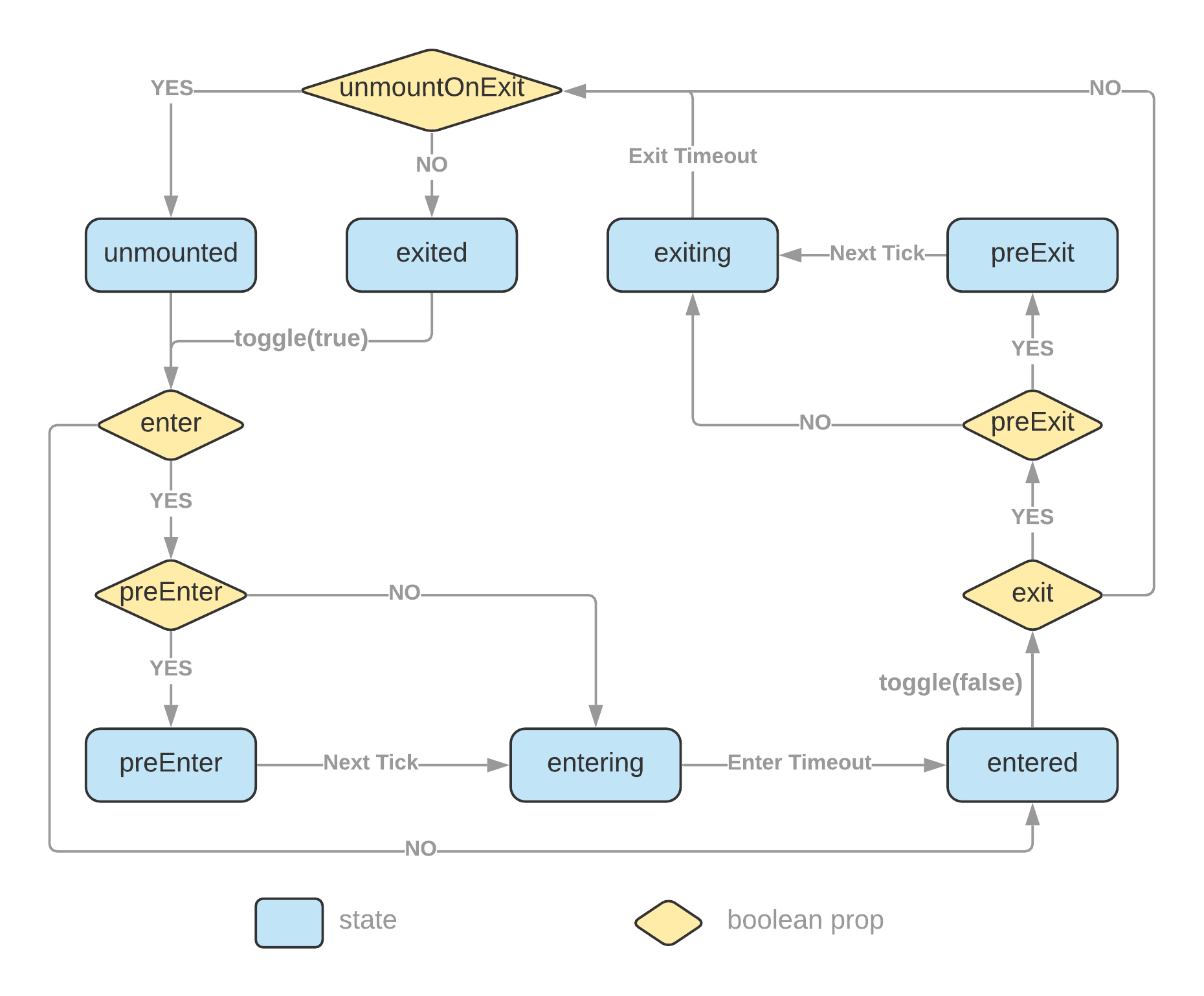 The `initialEntered` and `mountOnEnter` props are omitted from the diagram to keep it less convoluted. [Please read more details at the API section](#usetransitionstate-hook).
<br/>
## Install
```bash
# with npm
npm install react-transition-state
# with Yarn
yarn add react-transition-state
```
<br/>
## Usage
### CSS example
```jsx
import { useTransitionState } from 'react-transition-state';
function Example() {
const [state, toggle] = useTransitionState({ timeout: 750, preEnter: true });
return (
<div>
<button onClick={() => toggle()}>toggle</button>
<div className={`example ${state.status}`}>React transition state</div>
</div>
);
}
export default Example;
```
```css
.example {
transition: all 0.75s;
}
.example.preEnter,
.example.exiting {
opacity: 0;
transform: scale(0.5);
}
.example.exited {
display: none;
}
```
**[Edit on CodeSandbox](https://codesandbox.io/s/react-transition-state-100io)**
<br/>
### styled-components example
```jsx
import styled from 'styled-components';
import { useTransitionState } from 'react-transition-state';
const Box = styled.div`
transition: all 500ms;
${({ $status }) =>
($status === 'preEnter' || $status === 'exiting') &&
`
opacity: 0;
transform: scale(0.9);
`}
`;
function StyledExample() {
const [{ status, isMounted }, toggle] = useTransitionState({
timeout: 500,
mountOnEnter: true,
unmountOnExit: true,
preEnter: true
});
return (
<div>
{!isMounted && <button onClick={() => toggle(true)}>Show Message</button>}
{isMounted && (
<Box $status={status}>
<p>This message is being transitioned in and out of the DOM.</p>
<button onClick={() => toggle(false)}>Close</button>
</Box>
)}
</div>
);
}
export default StyledExample;
```
**[Edit on CodeSandbox](https://codesandbox.io/s/react-transition-styled-3id7q)**
<br/>
### tailwindcss example
**[Edit on CodeSandbox](https://codesandbox.io/s/react-transition-tailwindcss-21nys)**
<br/>
### Switch transition
You can create switch transition effects using one of the provided hooks,
- `useTransitionState` if the number of elements participating in the switch transition is static.
- `useTransitionMap` if the number of elements participating in the switch transition is dynamic and only known at runtime.
**[Edit on CodeSandbox](https://codesandbox.io/p/sandbox/react-switch-transition-x87jt8)**
<br/>
### Perform appearing transition when page loads or a component mounts
You can toggle on transition with the `useEffect` hook.
```js
useEffect(() => {
toggle(true);
}, [toggle]);
```
**[Edit on CodeSandbox](https://codesandbox.io/s/react-transition-appear-9kkss3)**
<br/>
## Comparisons with _React Transition Group_
| | React Transition Group | This library |
| --- | --- | --- |
| Use derived state | _Yes_ – use an `in` prop to trigger changes in a derived transition state | _No_ – there is only a single state which is triggered by a toggle function |
| Controlled | _No_ – <br/>Transition state is managed internally.<br/>Resort to callback events to read the internal state. | _Yes_ – <br/>Transition state is _lifted_ up into the consuming component.<br/>You have direct access to the transition state. |
| DOM updates | _Imperative_ – [commit changes into DOM imperatively](https://github.com/reactjs/react-transition-group/blob/5aa3fd2d7e3354a7e42505d55af605ff44f74e2e/src/CSSTransition.js#L10) to update `classes` | _Declarative_ – you declare [what the `classes` look like](https://github.com/szhsin/react-transition-state/blob/2ab44c12ac5d5283ec3bb997bfc1d5ef6dffb0ce/example/src/components/BasicExample.js#L31) and DOM updates are taken care of by `ReactDOM` |
| Render something in response to state updates | _Resort to side effects_ – rendering based on [state update events](https://codesandbox.io/s/react-transition-state-vs-group-p45iy?file=/src/App.js:1010-1191) | _Pure_ – rendering based on [transition state](https://codesandbox.io/s/react-transition-state-vs-group-p45iy?file=/src/App.js:2168-2342) |
| Working with _styled-components_ | Your code looks like – <br/>`&.box-exit-active { opacity: 0; }`<br/>`&.box-enter-active { opacity: 1; }` | Your code looks like – <br/>`opacity: ${({ state }) => (state === 'exiting' ? '0' : '1')};` <br/> It's the way how you normally use the _styled-components_ |
| Bundle size | [](https://bundlephobia.com/package/react-transition-group) | ✅ [](https://bundlephobia.com/package/react-transition-state) |
| Dependency count | [](https://www.npmjs.com/package/react-transition-group?activeTab=dependencies) | ✅ [](https://www.npmjs.com/package/react-transition-state?activeTab=dependencies) |
This [CodeSandbox example](https://codesandbox.io/s/react-transition-state-vs-group-p45iy) demonstrates how the same transition can be implemented in a simpler, more declarative, and controllable manner than _React Transition Group_.
<br/>
## API
### `useTransitionState` Hook
```typescript
function useTransitionState(
options?: TransitionOptions
): [TransitionState, (toEnter?: boolean) => void, () => void];
```
#### Options
| Name | Type | Default | Description |
| --- | --- | --- | --- |
| `enter` | boolean | true | Enable or disable enter phase transitions |
| `exit` | boolean | true | Enable or disable exit phase transitions |
| `preEnter` | boolean | | Add a 'preEnter' state immediately before 'entering', which is necessary to change DOM elements from unmounted or `display: none` with CSS transition (not necessary for CSS animation). |
| `preExit` | boolean | | Add a 'preExit' state immediately before 'exiting' |
| `initialEntered` | boolean | | Beginning from 'entered' state |
| `mountOnEnter` | boolean | | State will be 'unmounted' until hit enter phase for the first time. It allows you to create lazily mounted component. |
| `unmountOnExit` | boolean | | State will become 'unmounted' after 'exiting' finishes. It allows you to transition component out of DOM. |
| `timeout` | number \| <br />{ enter?: number; exit?: number; } | | Set timeout in **ms** for transitions; you can set a single value or different values for enter and exit transitions. |
| `onStateChange` | (event: { current: TransitionState }) => void | | Event fired when state has changed. <br/><br/>Prefer to read state from the hook function return value directly unless you want to perform some side effects in response to state changes. <br/><br/>_Note: create an event handler with `useCallback` if you need to keep `toggle` or `endTransition` function's identity stable across re-renders._ |
#### Return value
The `useTransitionState` Hook returns a tuple of values in the following order:
1. state:
```js
{
status: 'preEnter' |
'entering' |
'entered' |
'preExit' |
'exiting' |
'exited' |
'unmounted';
isMounted: boolean;
isEnter: boolean;
isResolved: boolean;
}
```
2. toggle: `(toEnter?: boolean) => void`
- If no parameter is supplied, this function will toggle state between enter and exit phases.
- You can set a boolean parameter to explicitly switch into one of the two phases.
3. endTransition: `() => void`
- Call this function to stop a transition which will turn the state into 'entered' or 'exited'.
- You don't need to call this function explicitly if a timeout value is provided in the hook options.
- You can call this function explicitly in the `onAnimationEnd` or `onTransitionEnd` event.
<br/>
### `useTransitionMap` Hook
It's similar to the `useTransitionState` Hook except that it manages multiple states in a [Map](https://developer.mozilla.org/en-US/docs/Web/JavaScript/Reference/Global_Objects/Map) structure instead of a single state.
#### Options
It accepts all options as `useTransitionState` and the following ones:
| Name | Type | Default | Description |
| --- | --- | --- | --- |
| `allowMultiple` | boolean | | Allow multiple items to be in the enter phase at the same time. |
#### Return value
The Hook returns an object of shape:
```js
interface TransitionMapResult<K> {
stateMap: ReadonlyMap<K, TransitionState>;
toggle: (key: K, toEnter?: boolean) => void;
toggleAll: (toEnter?: boolean) => void;
endTransition: (key: K) => void;
setItem: (key: K, options?: TransitionItemOptions) => void;
deleteItem: (key: K) => boolean;
}
```
`setItem` and `deleteItem` are used to add and remove items from the state map.
## License
[MIT](https://github.com/szhsin/react-transition-state/blob/master/LICENSE) Licensed.