react-tierlist
Version:
A lightweight, customizable React Tier List Maker & Viewer component package with drag-and-drop support and theming.
130 lines (94 loc) • 3.77 kB
Markdown
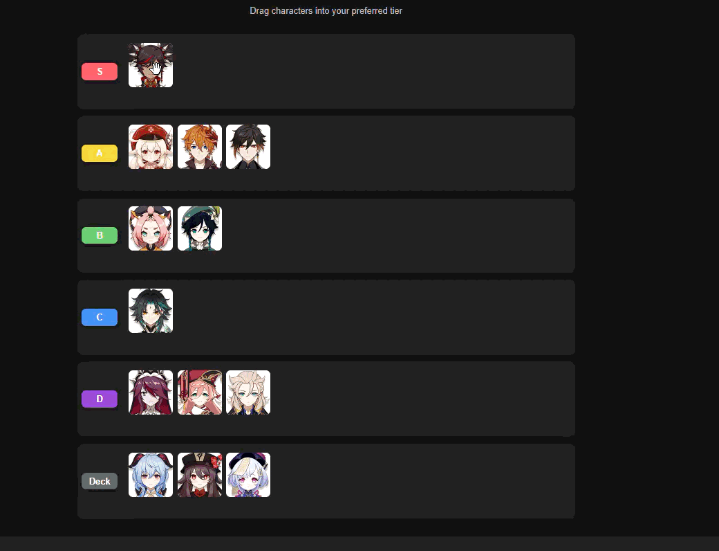
# React TierList
**React TierList** is a highly customizable React library for creating **drag-and-drop tier lists**. It allows users to rank **any type of items** (images, text, or custom elements) into customizable tiers. It supports both editable and viewer modes, making it suitable for games, productivity tools, or interactive ranking applications.
[](https://www.npmjs.com/package/react-tierlist)
[](LICENSE)
[](https://github.com/sakthilkv/react-tierlist/issues)
## Installation
```bash
npm install react-tierlist
```
or
```bash
yarn add react-tierlist
```
## Features
- **Drag & Drop**: Rearrange items between tiers with smooth drag-and-drop.
- **Custom Tiers**: Add, remove, or rename tiers.
- **Deck Support**: Keep unranked items in a dedicated "deck" tier.
- **Viewer Mode**: Display tier lists in a read-only format.
- **Highly Customizable**:
- Row height
- Tier colors
- Dark/light themes
- **Works with Any Content**: Images, text, or other React components.
## Usage
### Editable TierList
```tsx
import React from 'react';
import { TierListMaker, type Tier } from 'react-tierlist';
const images = [
'https://example.com/item1.png',
'https://example.com/item2.png',
'https://example.com/item3.png',
];
export default function App() {
const [tiers, setTiers] = React.useState<Tier[]>([
{ name: 'S', items: images.slice(0, 1) },
{ name: 'A', items: images.slice(1, 2) },
{ name: 'Deck', items: images.slice(2) },
]);
return (
<div style={{ minHeight: '100vh', padding: '2rem', background: '#181818', color: '#fff' }}>
<TierListMaker
data={tiers}
onChange={setTiers}
config={{ rowHeight: 120, colors: ['#FF6B6B', '#FFD93D', '#6BCB77', '#4D96FF'] }}
/>
</div>
);
}
```
### Viewer TierList
```tsx
import React from 'react';
import { TierListViewer, type Tier } from 'react-tierlist';
const tiers: Tier[] = [
{ name: 'S', items: ['https://example.com/item1.png'] },
{ name: 'A', items: ['https://example.com/item2.png'] },
{ name: 'Deck', items: ['https://example.com/item3.png'] },
];
export default function App() {
return (
<div style={{ minHeight: '100vh', padding: '2rem', background: '#181818', color: '#fff' }}>
<TierListViewer data={tiers} config={{ rowHeight: 120 }} />
</div>
);
}
```
## Props
### `TierListMakerProps`
| Prop | Type | Description |
| ---------- | ------------------------------------------- | ------------------------------- |
| `data` | `Tier[]` | Array of tiers and their items |
| `onChange` | `(tiers: Tier[]) => void` | Callback when tier data changes |
| `config` | `{ rowHeight?: number; colors?: string[] }` | Customization options |
### `TierListViewerProps`
| Prop | Type | Description |
| -------- | ------------------------------------------- | ------------------------------ |
| `data` | `Tier[]` | Array of tiers and their items |
| `config` | `{ rowHeight?: number; colors?: string[] }` | Customization options |
### `Tier`
```ts
export type Tier = {
name: string;
items: string[];
};
```
## License
MIT