react-simple-image-zoom
Version:
Simple image zoom/magnification component for react, using react portals
75 lines (57 loc) • 3.01 kB
Markdown
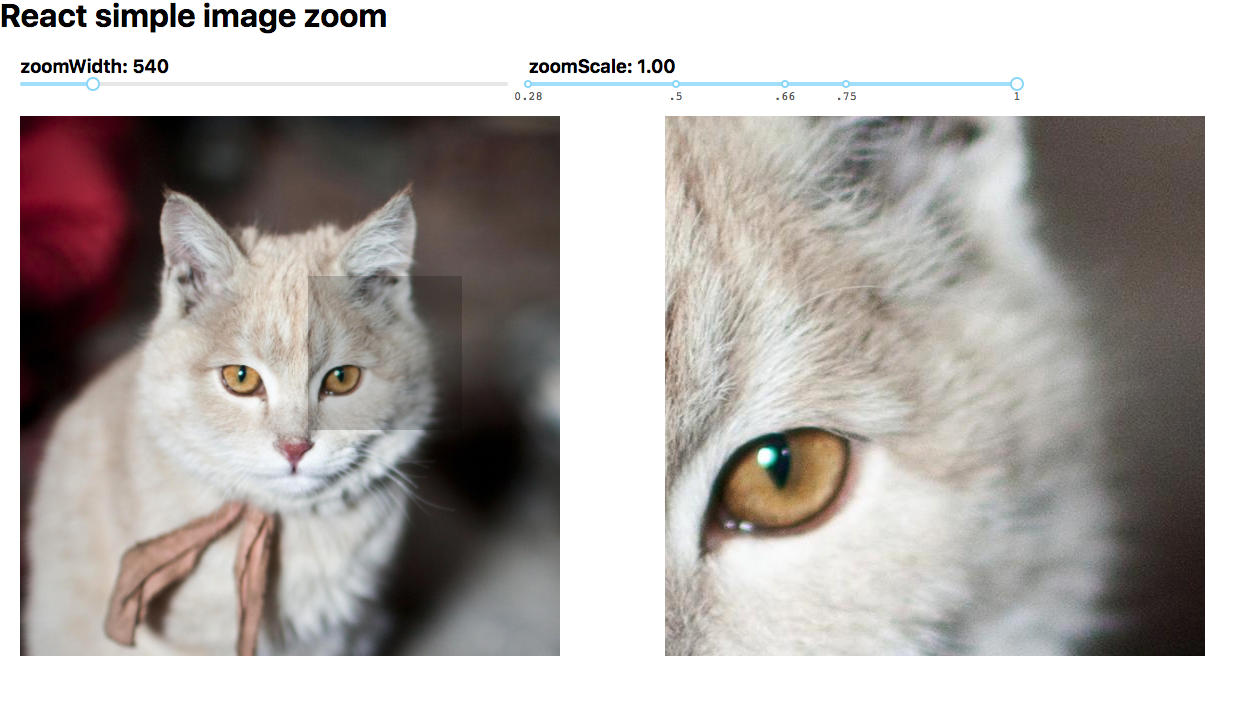
## React simple image zoom
A simple image zoom component
### Demo
- [https://aaronlifton2.github.io/react-simple-image-zoom/](https://aaronlifton2.github.io/react-simple-image-zoom/)
[](https://badge.fury.io/js/react-simple-image-zoom)
### Install
| mgr | cmd |
|--|---|
|npm|`npm install --save react-simple-image-zoom`|
|yarn|`yarn add react-simple-image-zoom`|
### Usage
```tsx
import { ImageZoom } from 'react-simple-image-zoom';
const largeCatImg = 'https://www.nationalgeographic.com/content/dam/animals/thumbs/rights-exempt/mammals/d/domestic-cat_thumb.ngsversion.1472140774957.adapt.1900.1.jpg';
const App = () =>
<div id="app">
<div style={{width: "540px", marginLeft: "20px", overflow: "hidden"}}>
<ImageZoom portalId="portal" largeImgSrc={largeCatImg}
imageWidth={540} imageHeight={540} zoomContainerWidth={540} activeClass="my-active"
portalStyle={Object.assign({...ImageZoom.defaultPortalStyle}, {top: "140px"}))}
zoomScale={1} responsive={true}
>
<img src={largeCatImg} alt="Cat image" width="100%"/>
</ImageZoom>
</div>
<div id="portal" />
</div>
ReactDOM.render(<App />, document.getElementById('myAppContainer'));
```
See `./demo` for a more detailed example.
### Props
| prop | required | type | description |
| ------------- |----------|--------|-----|
| children |yes| any | pass the source image in as a child element |
| portalId |yes| string | ID of the target portal element |
| largeImgSrc |no| string | optional high-res source to use for the zoom container |
| imageWidth |yes| number | width of the original image on the screen |
| imageHeight |no| number | optional, pass in an image height to use for calculations. otherwise this component will figure it out.|
| zoomContainerWidth |yes| number | width of the portal zoom |
| zoomContainerHeight |no| number | height of the portal zoom |
| activeClass |no| string | optional, default is 'active'. applies this class to the image container when zooming is active |
| portalStyle |no| React.CSSProperties | optional, override the style of the portal. To extend the default style, use `ImageZoom.defaultPortalStyle` |
| portalClassName |no| string | optional, sets className on the portal element |
| zoomScale |no| number | optional, default is 1. Determines the amount of zoom. |
| responsive |no| boolean | optional, default is null. Component will listen for window resize and adjust accordingly|
### Usage with react-slick
- For the magnifying glass to work, make sure you style `.slick-side` like this:
```css
.slick-side {
position: relative;
}
```
### Todo
- get component to work on mobile devices
### License
Copyright © 2018 Aaron Lifton