react-simple-device-emulator
Version:
Simple React device emulator component for design display purposes
70 lines (48 loc) • 2.36 kB
Markdown
# React Simple Device Emulator
Simple React device emulator component for design display purposes.
## How to use
### Install
Installation: `npm install react-simple-device-emulator`
### Usage
Import the package into your app:
`import { DeviceComponent } from "react-simple-device-emulator";`
#### Component options:
```
<DeviceComponent
deviceType={'mobile'}
deviceWidth={400}
deviceHeight={600}
scaleDesktop={1}
scaleTablet={.6}
scaleMobile={.8}
mobileBreakPoint={450}
tabletBreakPoint={768}
desktopBreakPoint={1024}
>
<iframe src="https://react.dev" height="100%" width="100%" title="Iframe Example" ></iframe>
</DeviceComponent>
The <DeviceComponent> can accept any element beteen the opening and closing tab to display in the viewport, but the default stlying only accomodates iframes and images.
- deviceType={'mobile'}
Options: 'mobile', 'tablet', 'desktop'
- deviceWidth={400}
Sets device pixel width - Requires number.
- deviceHeight={600}
Sets device pixel height - Requires number.
- scaleDesktop={1}
Used to set the scale for desktop - This keeps the device dimensions, but scales down the size.
- scaleTablet={.6}
Used to set the scale for tablet - This keeps the device dimensions, but scales down the size.
- scaleMobile={.8}
Used to set the scale for mobile - This keeps the device dimensions, but scales down the size.
- mobileBreakPoint={450}
Sets breakpoint - Used for responsive, set to your sites resonsive breakpoints
- tabletBreakPoint={768}
Sets breakpoint - Used for responsive, set to your sites resonsive breakpoints
- desktopBreakPoint={1024}
Sets breakpoint - Used for responsive, set to your sites resonsive breakpoints
```
## Example
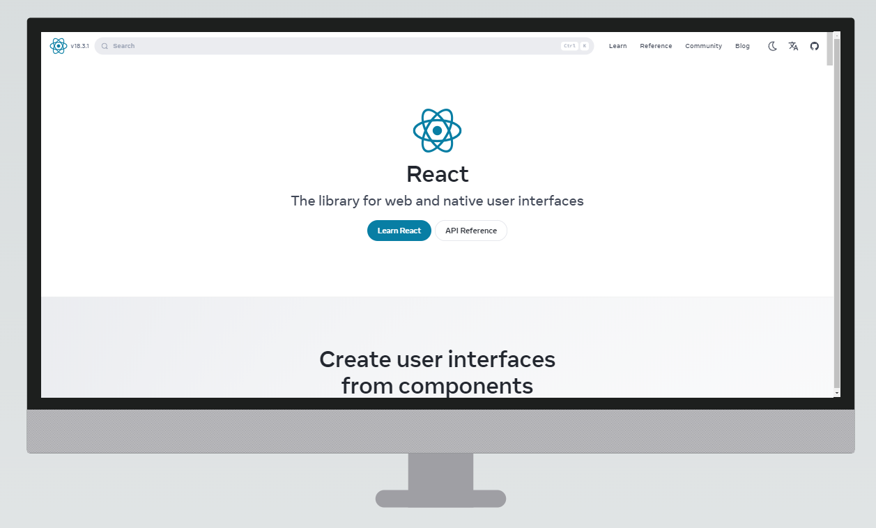
### Desktop example (1900px x 1000px)
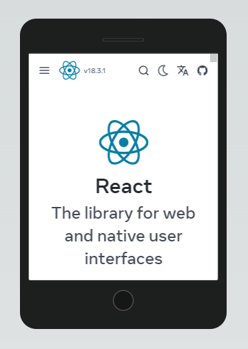
### Mobile example (450px x 600px)