react-shimmer-effects
Version:
Shimmer effects for React
572 lines (434 loc) • 20.2 kB
Markdown
# react-shimmer-effects
Customizable shimmer effects for React.
### [**Live Demo**](https://imshafikul.github.io/react-shimmer-effects/)
## Install
```bash
npm install react-shimmer-effects --save
```
or
```bash
yarn add react-shimmer-effects
```
## Elements
### Shimmer Button
```jsx
import React from "react";
import { ShimmerButton } from "react-shimmer-effects";
class Example extends Component {
render() {
return <ShimmerButton size="md" />;
}
}
```

#### Properties
| Property | Type | Required | Default value | Description |
| :------- | :----- | :------- | :------------ | :----------------------------------------- |
| `size` | string | yes | md | Three options available ["sm", "md", "lg"] |
---
### Shimmer Badge
```jsx
import React from "react";
import { ShimmerBadge } from "react-shimmer-effects";
class Example extends Component {
render() {
return <ShimmerBadge width={120} />;
}
}
```
#### Properties
| Property | Type | Required | Default value | Description |
| :------- | :----- | :------- | :------------ | :---------------------------- |
| `width` | number | no | | Width of the badge in px unit |
---
### Shimmer Title
```jsx
import React from "react";
import { ShimmerTitle } from "react-shimmer-effects";
class Example extends Component {
render() {
return <ShimmerTitle line={2} gap={10} variant="primary" />;
}
}
```

#### Properties
| Property | Type | Required | Default value | Description |
| :---------- | :----- | :------- | :------------ | :------------------------------------------------------------ |
| `line` | number | yes | 2 | Number of line |
| `gap` | number | yes | 10 | Gap between of lines. Four options available [10, 15, 20, 30] |
| `variant` | string | yes | primary | Tow options available ["primary", "secondary"] |
| `className` | string | no | | Additonal style classes |
---
### Shimmer Text
```jsx
import React from "react";
import { ShimmerText } from "react-shimmer-effects";
class Example extends Component {
render() {
return <ShimmerText line={5} gap={10} />;
}
}
```

#### Properties
| Property | Type | Required | Default value | Description |
| :---------- | :----- | :------- | :------------ | :------------------------------------------------------------ |
| `line` | number | yes | 5 | Number of line |
| `gap` | number | yes | 10 | Gap between of lines. Four options available [10, 15, 20, 30] |
| `className` | string | no | | Additonal style classes |
---
### Circular Image
```jsx
import React from "react";
import { ShimmerCircularImage } from "react-shimmer-effects";
class Example extends Component {
render() {
return <ShimmerCircularImage size={150} />;
}
}
```

#### Properties
| Property | Type | Required | Default value | Description |
| :---------- | :----- | :------- | :------------ | :---------------------- |
| `size` | number | no | 80 | Size of Image |
| `center` | bool | no | false | Center alignment |
| `className` | string | no | | Additonal style classes |
---
### Thumbnail Image
```jsx
import React from "react";
import { ShimmerThumbnail } from "react-shimmer-effects";
class Example extends Component {
render() {
return <ShimmerThumbnail height={250} rounded />;
}
}
```

#### Properties
| Property | Type | Required | Default value | Description |
| :----------- | :----- | :------- | :------------ | :--------------------------------------------------------- |
| `width` | number | no | | Width of Thumbnail. By default 100% width |
| `height` | number | yes | 250 | Height of Thumbnail. |
| `center` | bool | no | false | Center alignment |
| `className` | string | no | | Additonal style classes |
| `rounded` | bool | no | false | Border radius option enable/disable |
| `fitOnFrame` | bool | no | false | Adjust height of parent. Will block 100% of parent element |
---
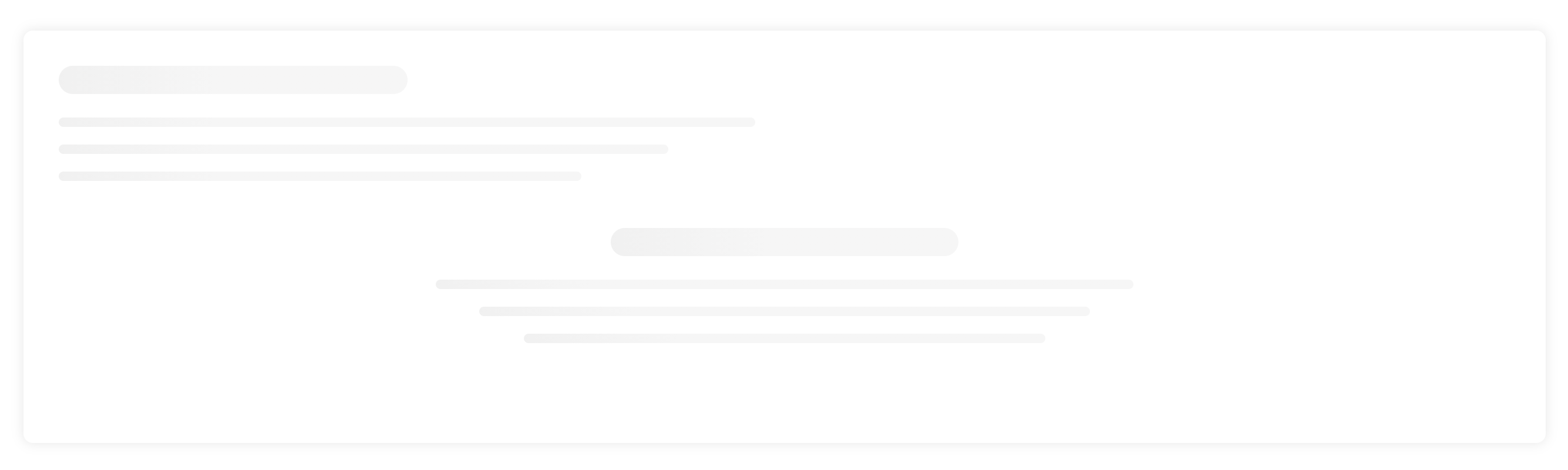
## Section Header
```jsx
import React from "react";
import { ShimmerSectionHeader } from "react-shimmer-effects";
class Example extends Component {
render() {
return (
<div>
<ShimmerSectionHeader />
<ShimmerSectionHeader center />
</div>
);
}
}
```
#### Properties
| Property | Type | Required | Default value | Description |
| :--------- | :--- | :------- | :------------ | :----------------------- |
| `title` | bool | no | true | Section Header title |
| `subTitle` | bool | no | true | Section Header subTitle |
| `center` | bool | no | true | Content center alignment |
---
## Gallery
### Simple Gallery
```jsx
import React from "react";
import { ShimmerSimpleGallery } from "react-shimmer-effects";
class Example extends Component {
render() {
return (
<>
<ShimmerSimpleGallery imageType="circular" imageHeight={200} caption />
<ShimmerSimpleGallery card imageHeight={300} />
<ShimmerSimpleGallery card imageHeight={300} caption />
</>
);
}
}
```

#### Properties
| Property | Type | Required | Default value | Description |
| :------------ | :----- | :------- | :------------ | :----------------------------------------------------------- |
| `card` | bool | no | false | Card Style enable/disable |
| `row` | number | yes | 3 | Number of row in your gallery |
| `col` | number | yes | 3 | Number of column in a row. Three options available [2, 3, 4] |
| `gap` | number | yes | 20 | Gap between columns. Two options only [20, 30] |
| `imageType` | string | yes | thumbnail | Image Type. Two options only ["thumbnail", "circular"] |
| `imageHeight` | number | | | Image Height |
| `caption` | bool | no | false | Image Caption |
| `fitOnFrame` | bool | no | false | Adjust height of parent. Will block 100% of parent element |
---
### Featured Gallery
```jsx
import React from "react";
import { ShimmerFeaturedGallery } from "react-shimmer-effects";
class Example extends Component {
render() {
return <ShimmerFeaturedGallery row={2} col={2} card frameHeight={600} />;
}
}
```

#### Properties
| Property | Type | Required | Default value | Description |
| :------------ | :----- | :------- | :------------ | :----------------------------------------------------------- |
| `card` | bool | no | false | Card Style enable/disable |
| `row` | number | yes | 2 | Number of row in your gallery |
| `col` | number | yes | 2 | Number of column in a row. Three options available [2, 3, 4] |
| `gap` | number | yes | 20 | Gap between columns. Two options only [20, 30] |
| `frameHeight` | number | yes | 600 | Height of full frame |
---
## Table
```jsx
import React from "react";
import { ShimmerTable } from "react-shimmer-effects";
class Example extends Component {
render() {
return <ShimmerTable row={5} col={5} />;
}
}
```

#### Properties
| Property | Type | Required | Default value | Description |
| :------- | :----- | :------- | :------------ | :-------------------------- |
| `row` | number | yes | 5 | Number of row in your Table |
| `col` | number | yes | 5 | Number of column in a row |
---
## Content Block
```jsx
import React from "react";
import { ShimmerContentBlock } from "react-shimmer-effects";
class Example extends Component {
render() {
return (
<ShimmerContentBlock
title
text
cta
thumbnailWidth={370}
thumbnailHeight={370}
/>
);
}
}
```

#### Properties
| Property | Type | Required | Default value | Description |
| :---------------- | :----- | :------- | :------------ | :---------------------------- |
| `card` | bool | no | true | Card Style enable/disable |
| `title` | bool | no | false | Title |
| `text` | bool | no | false | Content Text |
| `cta` | bool | no | false | Call to Action |
| `thumbnailWidth` | number | yes | | Width of the thumbnail image |
| `thumbnailHeight` | number | yes | | Height of the thumbnail image |
| `reverse` | bool | no | false | Alternate Style option |
---
## Category
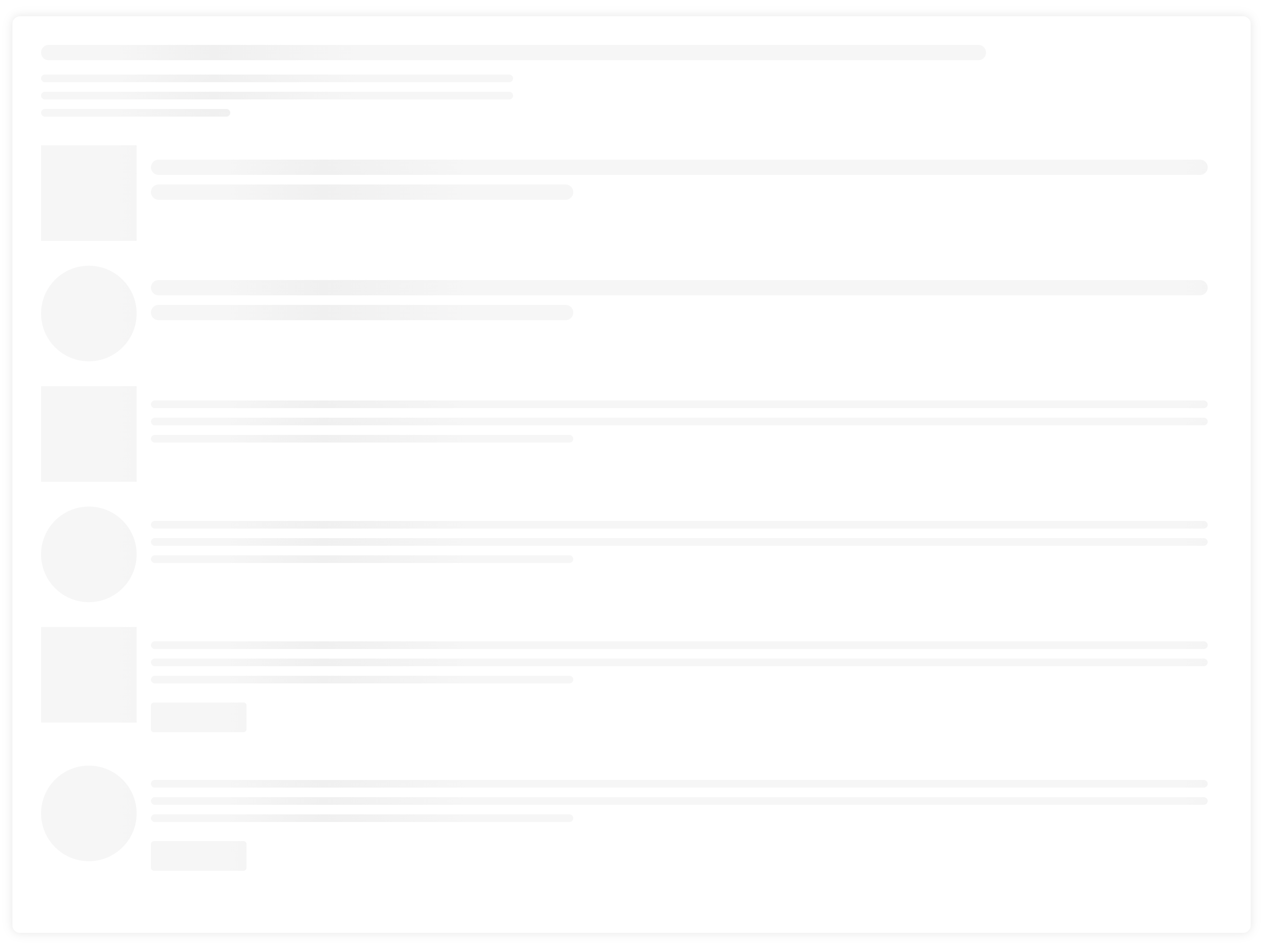
### Category Item
```jsx
import React from "react";
import { ShimmerCategoryItem } from "react-shimmer-effects";
class Example extends Component {
render() {
return (
<>
<ShimmerCategoryItem />
<ShimmerCategoryItem
hasImage
imageType="thumbnail"
imageWidth={100}
imageHeight={100}
title
/>
<ShimmerCategoryItem
hasImage
imageType="circular"
imageWidth={100}
imageHeight={100}
title
/>
<ShimmerCategoryItem
hasImage
imageType="thumbnail"
imageWidth={100}
imageHeight={100}
text
/>
<ShimmerCategoryItem
hasImage
imageType="circular"
imageWidth={100}
imageHeight={100}
text
/>
<ShimmerCategoryItem
hasImage
imageType="thumbnail"
imageWidth={100}
imageHeight={100}
text
cta
/>
<ShimmerCategoryItem
hasImage
imageType="circular"
imageWidth={100}
imageHeight={100}
text
cta
/>
</>
);
}
}
```
#### Properties
| Property | Type | Required | Default value | Description |
| :-------------- | :----- | :------- | :------------ | :----------------------------------------------------- |
| `hasImage` | bool | no | false | Thumbnail Image |
| `imageType` | string | yes | thumbnail | Image Type. Two options only ["thumbnail", "circular"] |
| `imageWidth` | number | yes | | Width of the image |
| `imageHeight` | number | yes | | Height of the image |
| `title` | bool | no | false | Title |
| `text` | bool | no | false | Content Text |
| `cta` | bool | no | false | Call to Action |
| `contentCenter` | bool | no | false | Content Alignment |
---
### Category List
```jsx
import React from "react";
import { ShimmerCategoryList } from "react-shimmer-effects";
class Example extends Component {
render() {
return <ShimmerCategoryList title items={6} categoryStyle="STYLE_SEVEN" />;
}
}
```

#### Properties
| Property | Type | Required | Default value | Description |
| :-------------- | :----- | :------- | :------------ | :--------------------------------------------------------------------------------------------------------------------------------------- |
| `title` | bool | no | false | Title |
| `items` | number | yes | 5 | Number of items in the list |
| `categoryStyle` | string | yes | STYLE_ONE | Category style . Seven variation available `STYLE_ONE`, `STYLE_TWO`,`STYLE_THREE`,`STYLE_FOUR`, `STYLE_FIVE`, `STYLE_SIX`, `STYLE_SEVEN` |
---
## Post
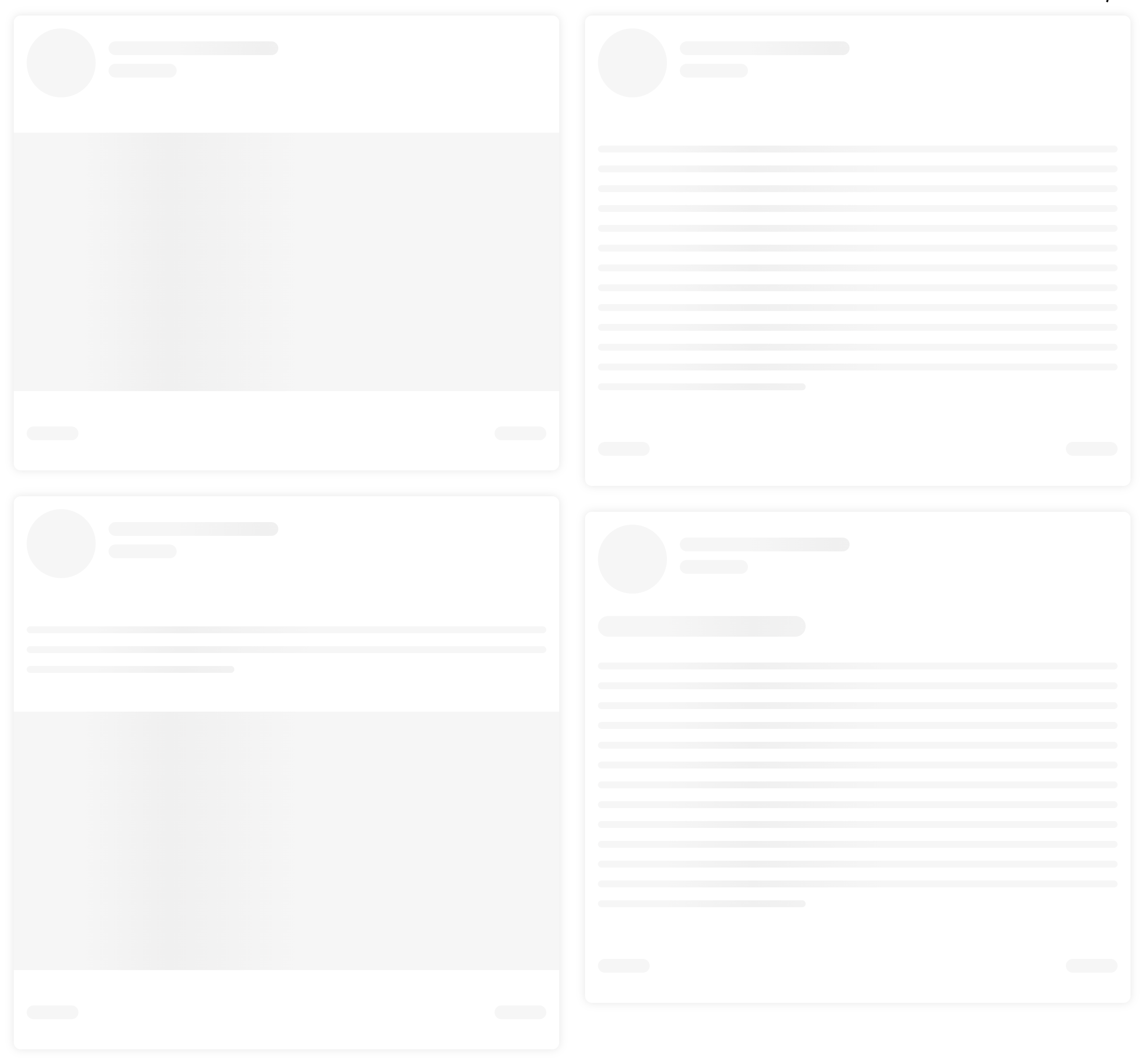
### Social Post Item
```jsx
import React from "react";
import { ShimmerSocialPost } from "react-shimmer-effects";
class Example extends Component {
render() {
return (
<>
<ShimmerSocialPost type="image" />
<ShimmerSocialPost type="both" />
<ShimmerSocialPost type="text" />
<ShimmerSocialPost type="text" title />
</>
);
}
}
```
#### Properties
| Property | Type | Required | Default value | Description |
| :------- | :----- | :------- | :------------ | :-------------------------------------------------------------------------------- |
| `title` | bool | no | false | Title |
| `type` | string | yes | image | Style type of the Social post. Three variations available `image`, `text`, `both` |
---
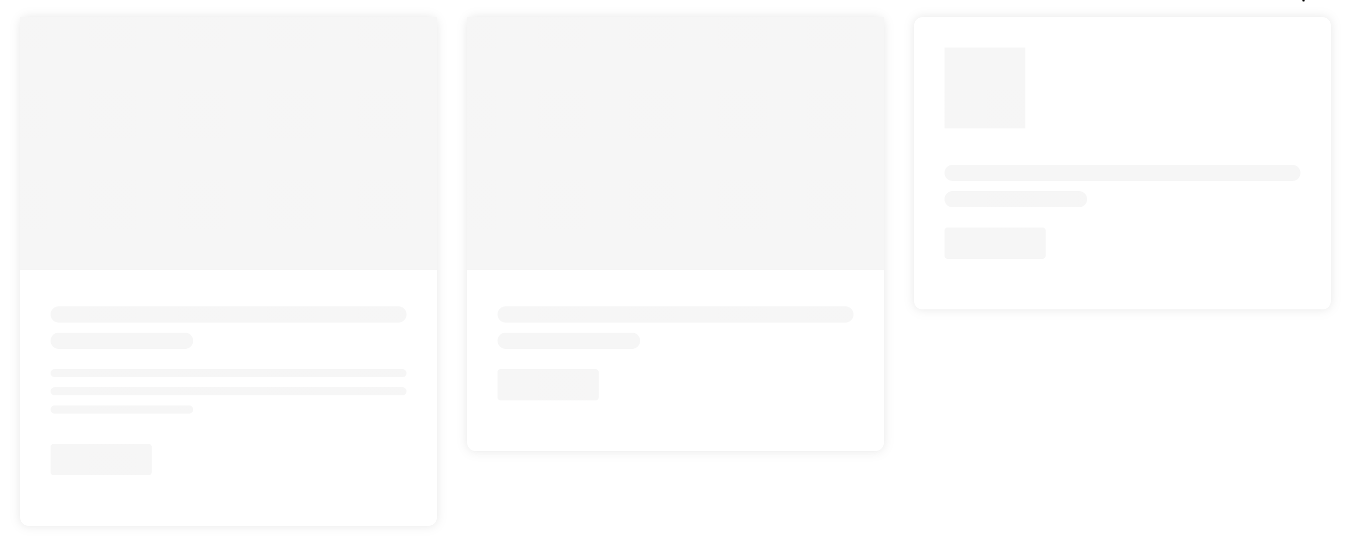
### Post Item
```jsx
import React from "react";
import { ShimmerPostItem } from "react-shimmer-effects";
class Example extends Component {
render() {
return (
<>
<ShimmerPostItem card title text cta />
<ShimmerPostItem card title cta />
<ShimmerPostItem
card
title
cta
imageType="thumbnail"
imageWidth={80}
imageHeight={80}
contentCenter
/>
</>
);
}
}
```
#### Properties
| Property | Type | Required | Default value | Description |
| :------------ | :----- | :------- | :------------ | :----------------------------------------------------- |
| `imageType` | string | yes | thumbnail | Image Type. Two options only ["thumbnail", "circular"] |
| `imageWidth` | number | yes | | Width of the image |
| `imageHeight` | number | yes | | Height of the image |
| `title` | bool | no | false | Title |
| `text` | bool | no | false | Content Text |
| `cta` | bool | no | false | Call to Action |
---
### Post List
```jsx
import React from "react";
import { ShimmerPostList } from "react-shimmer-effects";
class Example extends Component {
render() {
return <ShimmerPostList postStyle="STYLE_FOUR" col={3} row={2} gap={30} />;
}
}
```

#### Properties
| Property | Type | Required | Default value | Description |
| :---------- | :----- | :------- | :------------ | :----------------------------------------------------------------------------------------------------------------------------------------------------- |
| `row` | number | yes | 2 | Number of row |
| `col` | number | yes | 2 | Number of column in a row. Three options available [2, 3, 4] |
| `gap` | number | yes | 20 | Gap between columns. Two options only [20, 30] |
| `postStyle` | string | yes | STYLE_FOUR | Category style . Eight variation available `STYLE_ONE`, `STYLE_TWO`,`STYLE_THREE`,`STYLE_FOUR`, `STYLE_FIVE`, `STYLE_SIX`, `STYLE_SEVEN`,`STYLE_EIGHT` |
---
### Post Details
```jsx
import React from "react";
import { ShimmerPostDetails } from "react-shimmer-effects";
class Example extends Component {
render() {
return (
<>
<ShimmerPostDetails card cta variant="SIMPLE" />
<ShimmerPostDetails card cta variant="EDITOR" />
</>
);
}
}
```

#### Properties
| Property | Type | Required | Default value | Description |
| :-------- | :----- | :------- | :------------ | :------------------------------------ |
| `variant` | string | yes | SIMPLE | Two options only ["SIMPLE", "EDITOR"] |
| `card` | bool | no | false | Card Style enable/disable |
| `cta` | bool | no | false | Call to Action |
## Contribute
Feel free to send PR and any suggestions. Thanks
## License
MIT © [Shafikul Islam](https://github.com/shafikulz)