react-openfin-mat-impl
Version:
Materialize UI implementation of react-openfin
455 lines (355 loc) • 15.9 kB
Markdown
# Material UI Implementation of React Openfin
[![version][version-badge]][CHANGELOG] [![license][license-badge]][LICENSE]
[](https://travis-ci.com/openfin-js-app/react-openfin-mat-impl)
[](https://coveralls.io/github/openfin-js-app/react-openfin-mat-impl?branch=master)
Reusable openfin react components implemented via React Material UI
[LICENSE]: ./LICENSE.md
[CHANGELOG]: ./CHANGELOG.md
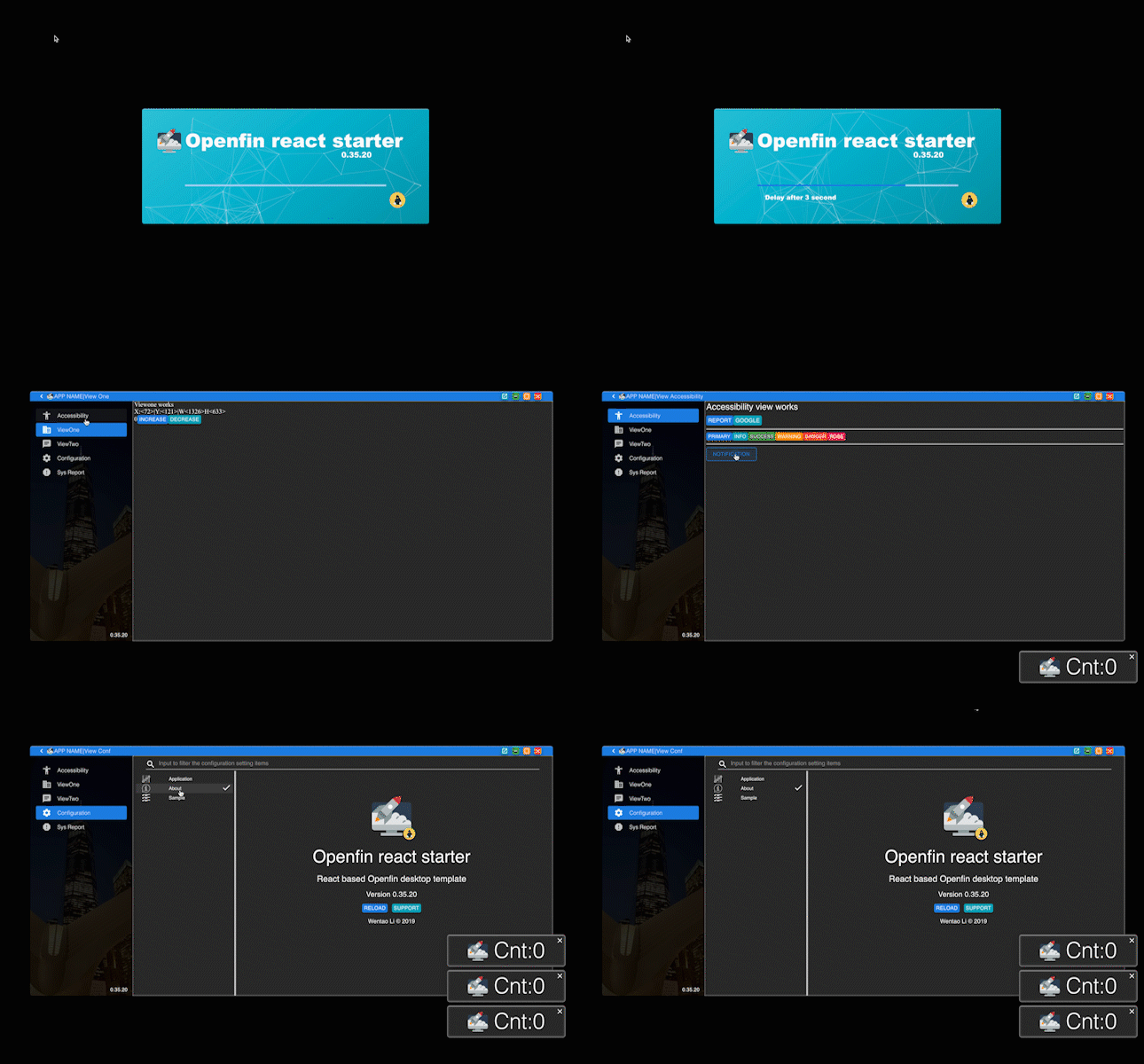
## Installation
```text
npm i react-openfin-mat-impl
or
yarn add react-openfin-mat-impl
```
react-openfin-mat-impl in details
---------
*This section, we will cover all reusable components provided by [react-openfin-mat-impl]*
> Now, react-openfin has be initialized, route naming pattern has been specified. It is time to render something in
> Openfin, like headers drawer sidebar, tabs, theme switcher etc. Should we build it ? Do not worry, [react-openfin-mat-impl]
> provided a set reusable components already. It is very easy to use and powerful.
### Categories of Components - lyt view & comp
_Everything is a component, but it doesn't means we could design components at freely._
For code readability, we split components into three categories.
- Layout components - lyt
- View components - view
- Components - comp
There is a hierarchy of these three types of components. Lyt can contain anything it want, view can only contain views or comps.
Comp can only include comps.
Besides that, from style maintaining perspective, lyt can be an entry comp, it should take whole space of the body
element or the screen and provide a complete set of buzi logics. However view might not be an entry comp, view component
should only at most take whole space of its parent and provide part of the buzi logics. Comp should the smallest or smaller
reusable components provides.
[react-openfin-mat-impl] will follow this category and provide reusable components of different categories.
#### Summary of component categories
| Category | Entry components | Set of logics provided | Reusable |
| --- | --- | --- | --- |
| Layout | Yes | Complete | No |
| View | No | Partial | Yes |
| Comp | No | Smallest or smaller | Yes |
### Layout components
- Loading Layout
- Dashboard Layout
- Child Window Layout
- Notification Layout
- LaunchBar Layout
#### LoadingLyt
> `LoadingLyt` is a layout component that will be rendered at screen center while the application starting.
> Inside it, name, description, app logo, company logo will be rendered. Thus most of these variables need to be specified on it props.
> Name and description will be loaded via fields `appName` or `appDesc` of
> [`public/locales/(language)/langding.json`](https://github.com/openfin-js-app/openfin-react-concise/blob/master/public/locales/en-US/landing.json)
##### Sample Usage
```typescript jsx
import * as React from 'react';
import { LoadingLyt } from 'react-openfin-mat-impl';
import appLogo from '../assets/svg/app.svg';
import companyLogo from '../assets/svg/company.svg';
const Loading:React.FunctionComponent<{}> = ({})=>(
<LoadingLyt appLogo={appLogo} companyLogo={companyLogo} version={process.env.REACT_APP_VERSION}/>
)
```
##### Props
| Name | Type | Description |
| --- | --- | --- |
| appLogo | string | app img base url |
| companyLogo | string | company img base url |
| version | string | version string to be renderred on the loading layout |
#### DashboardLyt
> `DashboardLyt` is a layout component that serves as the container on main view with a header, sidebar.
> Therefore, among props will contain the fields relating to the header and sidebar comp.
```typescript jsx
import * as React from 'react';
import { useContext } from 'react';
import { DashboardLyt } from 'react-openfin-mat-impl';
import appLogo from '../assets/svg/app.svg';
export const Dashboard:React.FunctionComponent<{}> = ({...rest}) => {
const {
actions:{
onNewSnackBar
}
} = useContext(ApplicationContext);
const handleLogoutBtnClick = ()=>{
onNewSnackBar({
variant:'rose',
message:'User clicked the logout btn',
// README
// vertical and horizontal fields are optional
vertical:'top',
horizontal:'right',
})
}
return (<DashboardLyt
appLogo={appLogo}
routes={dashboardRoutes}
menuItems={[{
icon:<ExitToAppIcon/>,
label:'staticMenu.logout',
onClick: handleLogoutBtnClick,
}]}
headerPrefixElements={<ClientPrefix {...rest} />}
{...rest}
/>)
}
```
##### Props
| Name | Type | Description |
| --- | --- | --- |
| appLogo | string | app img base url |
| routes | RouteItem[] | sub routes of dashboard path, an [sample](https://github.com/openfin-js-app/openfin-react-concise/blob/master/src/routes/Dashboard.ts) will be provided |
| sidebarBgUrl | optional string | the url of the sidebar background image if you wanna override |
| menuItems | optional ISideBarMenuItem[] | static sidebar item besides route items, a sample is also provided |
| hideSwitchToLaunchbar | optional boolean | will hide the button to switch to launchbar if set to true |
| headerPrefixElements | optional ReactNode | prefix nodes upon headers, an [example](https://github.com/openfin-js-app/openfin-react-concise/blob/master/src/components/sample-name/ClientPrefix.tsx) also provided |
| headerSuffixElements | optional ReactNode | suffix nodes upon headers, similar to prefix nodes |
#### ChildWindowLyt
> `ChildWindowLyt` is a layout component that serves as the container on each child window with a header.
> Therefore, among props will contain the fields relating to the header comp.
```typescript jsx
import * as React from 'react';
import { ChildWindowLyt } from 'react-openfin-mat-impl';
import appLogo from '../assets/svg/app.svg';
export const ChildWindow:React.FunctionComponent<{}> = ({...rest}) => {
return (<ChildWindowLyt appLogo={appLogo} routes={childrenRoutes} {...rest}/>)
}
```
##### Props
| Name | Type | Description |
| --- | --- | --- |
| appLogo | string | app img base url |
| routes | RouteItem[] | sub routes of child path, an [sample](https://github.com/openfin-js-app/openfin-react-concise/blob/master/src/routes/ChildWindow.ts) will be provided |
| headerPrefixElements | optional ReactNode | prefix nodes upon headers, an [example](https://github.com/openfin-js-app/openfin-react-concise/blob/master/src/components/sample-name/ClientPrefix.tsx) also provided |
| headerSuffixElements | optional ReactNode | suffix nodes upon headers, similar to prefix nodes |
#### NotificationLyt
> `NotificationLyt` is a layout component that serves as the container of each notification window.
```typescript jsx
import * as React from 'react';
import { NotificationLyt } from 'react-openfin-mat-impl';
export const Notification:React.FunctionComponent<{}> = ({})=>{
return (<NotificationLyt routes={notificationRoutes}/>)
}
```
##### Props
| Name | Type | Description |
| --- | --- | --- |
| routes | RouteItem[] | sub routes of notification path, an [sample](https://github.com/openfin-js-app/openfin-react-concise/blob/master/src/routes/notification.ts) will be provided |
#### LaunchBarLyt
> LaunchBarLyt provides a scroller bar from which a new child window could be opened. The launchBar could be collapsed
> into a smaller size for better user experiences. And the first item on the bar is a place holder like header of the
> launchBar, like user can drag upon it to move the bar. Moreover there is a prop called firstAppBar via which app
> developer could customize the launch bar item.
```typescript jsx
import * as React from 'react';
import { LaunchBarLyt } from 'react-openfin-mat-impl';
import appLogo from '../assets/svg/app.svg';
import launchBarItems from '../constants/launchBarItems';
export const LaunchBar:React.FunctionComponent<{}> = ({})=>{
return (<LaunchBarLyt appLogo={appLogo} items={launchBarItems}/>)
}
```
##### Props
| Name | Type | Description |
| --- | --- | --- |
| appLogo | string | app img base url |
| items | ILaunchBarItem[] | the constant items for launchBar, [sample](https://github.com/openfin-js-app/openfin-react-concise/blob/master/src/constants/launchBarItems.tsx) |
| firstAppBar | optional ReactNode | app img base url |
_The schema and details of ILaunchBarItem will be covered in the next section._
### View components
- Config View
- Report View
#### ConfigView
> A config view which render the all items of the config service provided by [react-openfin]. And its item should be
> configured via the constants introduced in next constant section.
```typescript jsx
import * as React from 'react';
import { IConfigTab, MuiTheme, FieldType } from 'react-openfin';
import SettingIcon from '@material-ui/icons/Settings';
import listCheckedSvg from'../assets/svg/other/check-box.svg';
import listCheckedDarkSvg from'../assets/svg/other/list-checked-dark.svg';
const configTabs:IConfigTab[]=[
{
_order: 2,
_label: 'sample.label',
_name:'sample',
_svgUrl: listCheckedSvg,
_svgUrl_dark: listCheckedDarkSvg,
_icon: SettingIcon,
_fields:[
{
_type:FieldType.SUBHEADING,
_label:'sample.vals.label',
_cols: 12,
},
{
_type:FieldType.SUBHEADING,
_label:'sample.vals.string.label',
_cols: 4,
},
{
_type:FieldType.STRING,
_label:'sample.vals.string.field',
_name:'strValue',
_defaultValue:"",
_cols: 8,
},
{
_type:FieldType.SUBHEADING,
_label:'sample.vals.currency.label',
_cols: 4,
},
{
_type:FieldType.CURRENCY,
_label:'sample.vals.currency.field',
_name:'crrValue',
_defaultValue:123456789,
_cols: 8,
},
{
_type:FieldType.SUBHEADING,
_label:'sample.vals.date.label',
_cols: 4,
},
{
_type:FieldType.DATE,
_label:'sample.vals.date.field',
_name:'dateValue',
_defaultValue:new Date(),
_cols: 8,
},
{
_type:FieldType.SUBHEADING,
_label:'sample.vals.time.label',
_cols: 4,
},
{
_type:FieldType.TIME,
_label:'sample.vals.time.field',
_name:'timeValue',
_defaultValue:new Date(),
_cols: 8,
},
{
_type:FieldType.SUBHEADING,
_label:'sample.vals.dateTime.label',
_cols: 4,
},
{
_type:FieldType.DATETIME,
_label:'sample.vals.dateTime.field',
_name:'datetimeValue',
_defaultValue:new Date(),
_cols: 8,
},
{
_type:FieldType.SUBHEADING,
_label:'sample.vals.customField.label',
_cols: 12,
},
{
_type:FieldType.CUSTOM_FIELD,
_label:'sample.vals.customField.field',
_custom:<ConfigJsonField/>,
_cols:12,
_rows:6,
}
]
}
];
export const MyConfigView:React.FunctionComponent<{}> = ({})=>{
return (<ConfigView tabs={configTabs}/>)
}
```
##### Props
| Name | Type | Description |
| --- | --- | --- |
| tabs | IConfigTab[] | the constant items for launchBar, [sample](https://github.com/openfin-js-app/openfin-react-concise/blob/master/src/constants/configTabs.tsx) |
_The schema and details of IConfigTab will be covered in the next section._
#### ReportView
> Report View is a reusable view to render essentials variables seized from [Openfin], like openfin runtime version,
username, machineName, hardware infos and etc.s
```typescript jsx
import { ReportView } from 'react-openfin-mat-impl';
```
##### Props
_Not props required_
| Name | Type | Description |
| --- | --- | --- |
| n/a | n/a | n/a |
### Comp components
> Basically, [react-openfin-mat-impl] provides two sets of components, one for app developer to directly use. And
> another set of components internal used to build other components like layout components.
- Exported reusable components
- ConfigAboutField - A about view of the infos relating to the app
- ConfigJsonField - A json view of config state maintained by [react-openfin], generally for debuing purpose
- ConfigLangField - A switcher to change language maintained by [react-openfin]
- ConfigThemeField - A theme switcher to change theme between light and dark.
- Internal use components
- ConfigField
- Header
- HeaderLinks
- HeaderThemeSwitcher
- Sidebar
- SnackbarContent
- OfflineOverlay
#### ConfigAboutField
> A about view of the infos relating to the app
```typescript jsx
import * as React from 'react';
import { IConfigTab } from 'react-openfin';
import { ConfigAboutField, FieldType } from 'react-openfin-mat-impl';
import SettingIcon from '@material-ui/icons/Settings';
import appSvg from '../assets/svg/app.svg';
import companySvg from '../assets/svg/company.svg';
import infomationSvg from '../assets/svg/support/information.svg';
import infomationDarkSvg from '../assets/svg/support/information-dark.svg';
const configTabs:IConfigTab[]=[
{
_order: 1 ,
_label: 'about.label',
_name:'about',
_svgUrl: infomationSvg,
_svgUrl_dark: infomationDarkSvg,
_icon: SettingIcon,
_fields:[
{
_type:FieldType.CUSTOM_FIELD,
_label:'About openfin starter',
_custom:
<ConfigAboutField
appLogo={appSvg}
companyLogo={companySvg}
/>
,
_cols:12,
_rows:12,
}
]
},
];
```
##### Props
| Name | Type | Description |
| --- | --- | --- |
| appLogo | string | app img base url |
| companyLogo | string | company img base url |
#### ConfigJsonField, ConfigLangField, ConfigThemeField
These three components can build directly used and no required props needed at all. And they are designed to render the
config item of [react-openfin].
For instance, please refer [src/constants/configTabs.tsx](https://github.com/openfin-js-app/openfin-react-concise/blob/master/src/constants/configTabs.tsx)
for details.
#### Internal use components
_TODO: provide the documentation of this part in next release_
[Openfin]: https://openfin.co/
[react-openfin]:https://www.npmjs.com/package/react-openfin
[react-openfin-mat-impl]:https://www.npmjs.com/package/react-openfin-mat-impl
[version-badge]: https://img.shields.io/badge/version-1.1.0-green.svg
[license-badge]: https://img.shields.io/badge/license-MIT-green.svg