react-number-pin-keypad
Version:
A customizable React keypad component
104 lines (74 loc) • 3.29 kB
Markdown
# React Number Pin Keypad
A customizable React keypad component styled with Tailwind CSS. This package provides a simple and flexible keypad that can be easily integrated into your React applications.
## Features
- Responsive design
- Customizable styling with Tailwind CSS
- Support for numbers and decimal point
- Backspace functionality
- Pin input mode with a hidden input display
- Easy to integrate and use
## Demo
```bash
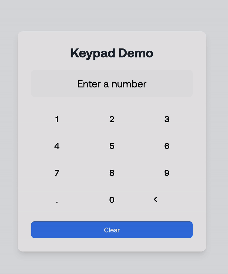
Keypad demo
```
```bash
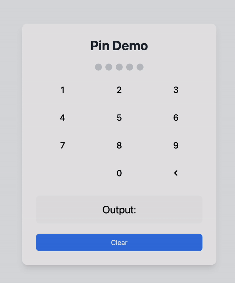
Pin demo
```
You can find a demo in the example folder of the GitHub repository. A redirect link is provided at the bottom of this README.
Here's a quick demonstration of how the React Number Pin Keypad works:
## Installation
To install the package, run the following command in your project directory:
```bash
npm install react-number-pin-keypad
```
## Usage
Here's an example of how to use the **react-number-pin-keypad** in a React application:
### Example Code
```tsx
import React, { useState } from 'react';
import { Keypad } from 'react-number-pin-keypad';
const KeypadDemo: React.FC = () => {
const [input, setInput] = useState<string>('');
const handleKeyPress = (key: string) => {
setInput((prevInput) => prevInput + key);
};
const handleBackspace = () => {
setInput((prevInput) => prevInput.slice(0, -1));
};
return (
<div>
<div className="mb-4 text-center">
<input
type="text"
value={input}
readOnly
className="border px-4 py-2 text-center"
/>
</div>
<Keypad
onKeyPress={handleKeyPress}
onBackspace={handleBackspace}
className="mx-auto"
/>
</div>
);
};
export default KeypadDemo;
```
### Explanation of Props
- **`onKeyPress`**: A callback function triggered when a numeric or decimal key is pressed. Receives the pressed key as an argument.
- **`onBackspace`**: A callback function triggered when the backspace key is pressed.
- **`className`**: Optional. Additional CSS classes for custom styling.
- **`type`**: Determines the mode of the keypad.
- `'default'`: Standard keypad with numbers and a decimal point.
- `'pin'`: Pin input mode with a hidden input display. The decimal point is hidden in this mode.
- **`maxLength`**: (Optional) The maximum number of characters for pin input. Default is 4.
- **`hiddenInputClassName`**: (Optional) Additional CSS classes for customizing the hidden input container in pin mode.
- **`hiddenInputDotClassName`**: (Optional) Additional CSS classes for customizing the dots displayed in the hidden input for pin mode.
### Customization
You can use Tailwind CSS classes to customize the appearance of the keypad. Add your own classes to the `Keypad` component using the `className` prop for flexibility. You can also style the hidden input and its dots when using the `pin` type by leveraging the `hiddenInputClassName` and `hiddenInputDotClassName` props.
## GitHub Repository
Find the source code and contribute to this project on GitHub:
[React Number Pin Keypad GitHub Repository](https://github.com/iyiolaosuagwu/react-number-pin-keypad)