react-notify-bootstrap
Version:
Simple Boostrap notification for React app
128 lines (100 loc) • 2.44 kB
Markdown
# react-notify-bootstrap
> Simple Bootstrap notification for React app
[](https://www.npmjs.com/package/react-notify-bootstrap) [](https://standardjs.com)
> react-notify-bootstrap allow you to add bootstrap notification to your app with ease.
## Install
```bash
npm install --save react-notify-bootstrap
```
## Usage
```jsx
import React, { Component } from 'react'
import Notification, { notify } from 'react-notify-bootstrap'
class App extends Component {
sendNotification = () => {
notify({ text: "Notification was sent successfully", variant: "success" });
};
render() {
return (
<React.Fragment>
<button className="btn" onClick={this.sendNotification}>Notify!</button>
<Notification />
</React.Fragment>
)
}
}
```
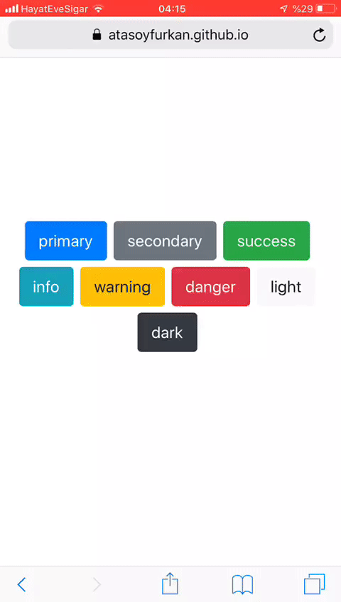
## Demo
[Demo](https://atasoyfurkan.github.io/react-notify-bootstrap/)
## Example Code
[Example-github](https://github.com/atasoyfurkan/react-notify-bootstrap/tree/master/example)
## API
### Notification
<table>
<tr>
<th>Props</th>
<th>Type</th>
<th>Default</th>
<th>Description</th>
</tr>
<tr>
<td>options</td>
<td>object</td>
<td>-</td>
<td>-</td>
</tr>
<tr>
<td>options.position</td>
<td>string</td>
<td>bottom</td>
<td>-</td>
</tr>
<tr>
<td>options.animation</td>
<td>bool</td>
<td>false</td>
<td>Apply a CSS fade transition to the toast</td>
</tr>
<tr>
<td>options.delay</td>
<td>number</td>
<td>4000</td>
<td>Delay hiding the toast (ms)</td>
</tr>
<tr>
<td>options.autohide</td>
<td>bool</td>
<td>true</td>
<td>Auto hide the toast</td>
</tr>
</table>
### notify
<table>
<tr>
<th>Arguments</th>
<th>Type</th>
<th>Default</th>
<th>Description</th>
</tr>
<tr>
<td>text</td>
<td>string</td>
<td>""</td>
<td>-</td>
</tr>
<tr>
<td>variant</td>
<td>string</td>
<td>"primary"</td>
<td>-</td>
</tr>
<tr>
<td>onClose</td>
<td>function</td>
<td>-</td>
<td>A Callback fired when the close button is clicked</td>
</tr>
</table>
## License
MIT © [atasoyfurkan](https://github.com/atasoyfurkan)