react-nav-bar
Version:
Simple yet very coustomizable navigation bar for react
104 lines (85 loc) • 3.76 kB
Markdown
React Navigation Bar
=========================
Can be used to create customizable navigation bar for your react project.
## Examples:
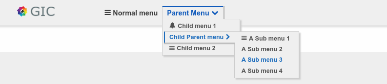
### Full size:
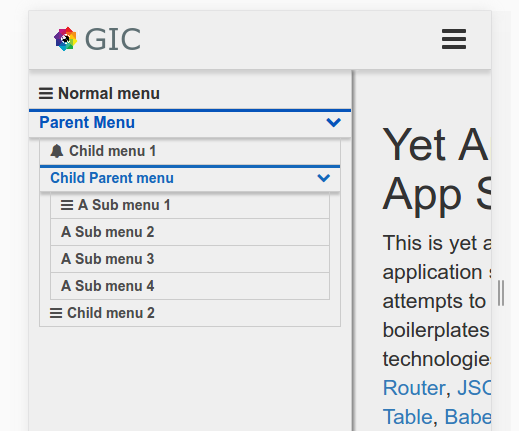
### Mobile size
## Installation
```javascript
npm install --save react-nav-bar
```
### Usage and options:
```javascript
var reactNavBar = require('react-nav-bar');
var NavBar = reactNavBar.NavBar;
var Menu = reactNavBar.Menu;
// Define your menu:
// Menu can be any valid component form within react or objects with the listed properties.
var menus = [
{ path:'menu1', label:'Menu 1', icon:'bell'},
<div>jsx element</div>,
{ path:'menu3', label:'Menu 3', icon:'bars', subMenus: [
{ path:'menu4', label:'Menu 4'},
{ path:'menu5', label:'Menu 5', subMenus: [
{ path:'menu6', label:'Menu 6' },
{ path:'menu7', label:'Menu 7'},
React.createClass({ render: function() { return <li>can do that TOO</li>; } }),
{ path:'menu9', label:'Menu 9'}
]},
{ path:'menu10', label: <div> You can do that too</div>, icon:'bars'}
]}
]
// Then use NavBar to place the menus where you want.
<div className="menu">
<NavBar menus={menus} theme={'hoverLakeBright'} location={this.props.location} />
</div>
```
## Options
NavBar and Menu have different options
### NavBar
* location {Object} - react-router location object.
* menus {Array} - required - An array of instantiated menus .
* theme {String} - Name of the theme you want to use.
* spring {Object} - An object with details on how menus will open E.G: `spring={{ opened:100, closed:0, style: function(x) { return { height: `${x}%`} } }}`
* toggle {Object} - An object that determines how will the toggle button look
* openOnHover {Boolean} - Determines if menus will open or close on hover(for mobiles false is recommended).
// icons used are font-awesome icons so: use https://github.com/danawoodman/react-fontawesome for icons reference.
toggle object example:
```javascript
var toggle = {
display: false,
default: 'pied-piper',
parent: {
opened: 'bars',
closed: 'pied-piper'
},
child: {
opened: 'bus',
closed: 'coffee'
},
};
```
### Menu
* path {String} - required - route to redirect on click.
* label {String|component} - what will be the menu's text Or component instead.
* active {Boolean|Function|Undefined|String} - Determines if the menu is active currently.
* - If String or Undefined will check if that string is in pathname to determine if is active.
* - If Boolean will do nothing and use the given value.
* - If Function will invoke the function and assign the returned value to active.
* action {Function} - Will get invoked when a menu item is clicked and prevent default
* opened {Boolean} - Flag to indicate if submenu is opened or closed.
* permission {Function|Boolean} - determines whether or not to show this menu - can be use for access control.
* - If Function Will invoke the function and assign the returned value to visible
* - If Boolean will be assigned to visible
* subMenus {Array} - an array of submenus with the same signature.
* className {String} - class name to be used for that menu(in the li)
* icon {String} - specify an icon for menu.
## Themes:
Using custom theme is very simple:
* copy one of the included themes
* change the selector theme name to your new theme E.G: `.hoverLakeBright_isOpened` to `.YouThemeName_isOpened`
* set theme option to your theme name
* include the theme file somewhere in your site
And your done.