react-native-ui-lib
Version:
[](https://travis-ci.org/wix/react-native-ui-lib) [](https://www.npmjs.com/package/react-native-ui-lib) [](https://travis-ci.org/wix/react-native-ui-lib)
[](https://www.npmjs.com/package/react-native-ui-lib)
[](https://www.npmjs.com/package/react-native-ui-lib)
UI Toolset & Components Library for React Native
Check out our [Docs Site](https://wix.github.io/react-native-ui-lib/)
###### Latest version support RN44
* [Style](https://github.com/wix/react-native-ui-lib#style)
* [Modifiers](https://github.com/wix/react-native-ui-lib#modifiers)
* [Assets](https://github.com/wix/react-native-ui-lib#assets)
* [Components](https://github.com/wix/react-native-ui-lib#components-wip)
* [Helpers](https://github.com/wix/react-native-ui-lib#helpers)
# Getting Started
## Installation
`yarn add react-native-ui-lib`
or
`npm i --save react-native-ui-lib`
## Native Dependencies
Some of the components are using these native dependencies, they are not a requirement but will allow you to create
better lookings apps (:
* react-native-animatable
* react-native-blur
## Usage
This is a quick example of how to use our basic components, modifiers and presets to generate a good looking screen.
<img style="float: right; margin-top: -70px" src="https://cloud.githubusercontent.com/assets/1780255/24791489/f5db80f4-1b82-11e7-8538-5a3388fb4345.png" width=300 />
```jsx
import React, {Component} from 'react';
import {View, TextInput, Text, Button} from 'react-native-ui-lib';
export default class Example extends Component {
render() {
return (
<View flex paddingH-25 paddingT-120>
<Text blue50 text20>Welcome</Text>
<TextInput text50 placeholder="username" dark10/>
<TextInput text50 placeholder="password" secureTextEntry dark10/>
<View marginT-100 center>
<Button text70 white background-orange30 label="Login"/>
<Button link text70 orange30 label="Sign Up" marginT-20/>
</View>
</View>
);
}
}
```
# Style
The base foundation of each UI component is its style.
We use basic style presets to define the rules and the style guide we follow.
Our presetes includes: **Colors**, **Typography**, **Shadows**, **Border Radius** and more..
The UILib already comes with a set of predefined constants and [presets](./src/style).
You can easily use it anywhere in your code as you would have used any other constant value, or as a component modifier.
It's also very easy to define your own presets..
```jsx
import {Typography, Colors} from 'react-native-ui-lib';
Colors.loadColors({
pink: '#FF69B4',
gold: '#FFD700',
});
Typography.loadTypographies({
h1: {fontSize: 58, fontWeight: '300', lineHeight: 80},
h2: {fontSize: 46, fontWeight: '300', lineHeight: 64},
});
```
and so for example, the following line
```jsx
<Text h1 pink>Hello World</Text>
```
Will generate this text
<img src="https://cloud.githubusercontent.com/assets/1780255/24792314/296b7ebc-1b86-11e7-8580-9252d1ddf5d9.png" width="250"/>
It will use the _h1_ preset for typography and the _pink_ color value we set to style the Text element.
# Modifiers
As you probably noticed already, we translate our style presets into modifiers.
**Modifiers** will help you create a stunning UI easily and quickly.
### Align Faster
Use our alignment props to quickly position your content without getting confused calculating all these flex rules.
**left**, **top**, **right**, **bottom**, **row**, **center**, **centerH (Horizontal Center)**, **centerV (Vertical Center)**, **spread**
```jsx
<View left>
<Button label="Button">
</View>
<View right>
<Button label="Button">
</View>
<View top>
<Button label="Button">
</View>
<View bottom>
<Button label="Button">
</View>
<View center>
<Button label="Button">
</View>
```
<img src="https://cloud.githubusercontent.com/assets/1780255/24798566/4de91efc-1b9f-11e7-9974-e06e3daa7c63.png" width="160"/> <img src="https://cloud.githubusercontent.com/assets/1780255/24798569/50dc99a4-1b9f-11e7-8231-fbcbb139a010.png" width="160"/> <img src="https://cloud.githubusercontent.com/assets/1780255/24798571/52766d08-1b9f-11e7-95a3-b2b262e81170.png" width="160"/> <img src="https://cloud.githubusercontent.com/assets/1780255/24798572/545b7abe-1b9f-11e7-9098-409ceee6ff22.png" width="160"/> <img src="https://cloud.githubusercontent.com/assets/1780255/24798575/55e3c4f4-1b9f-11e7-998d-7986a038abb6.png" width="160"/>
### Spacing & Styling
Same goes here... space, stretch and color in a more readable way.
- **[colorKey]** (text color), **background-[colorKey]**
`<Text pink>...</Text>`
`<View bg-pink>...</View>`
- **[typographyPresetKey]** (text components)
`<Text h1>...</Text>`
- **flex**, **flex-[value]**
```jsx
<View flex> // be default is flex=1
<View flex-2/>
<View flex-3/>
<View flex-4/>
</View>
```
- **padding-[value]**, **paddingL-[value]**, **paddingT-[value]**, **paddingR-[value]**, **paddingB-[value]**, **paddingH-[value]**, **paddingV-[value]**
`<View paddingV-20 paddingH-30>...</View>`
- **margin-[value]**, **marginL-[value]**, **marginT-[value]**, **marginR-[value]**, **marginB-[value]**, **marginH-[value]**, **marginV-[value]**
`<View marginT-5 marginB-10>...</View>`
Check out [this example](https://github.com/wix/react-native-ui-lib#usage) where we use most of these props
# Assets
Assets are big part of the whole UI system, whether it's an icon, placeholder or an illustration, we use them everywhere. <br>
Load assets groups and easily render them with the _Image_ component.
```jsx
import {Assets, Image} from 'react-native-ui-lib';
Assets.loadAssetsGroup('icons', {
icon1: require('icon1.png'),
icon2: require('icon2.png'),
icon3: require('icon3.png'),
});
// or as a nested group to create your own hierarchy
Assets.loadAssetsGroup('illustrations.placeholders', {
emptyCart: require('emptyCart.png'),
emptyProduct: require('emptyProduct.png'),
});
Assets.loadAssetsGroup('illustrations.emptyStates.', {
noMessages: require('noMessages.png'),
noContacts: require('noContacts.png'),
});
// Use them with the Image component (our Image component)
<Image assetName="icon1"/> // default assetGroup is "icons"
<Image assetName="emptyCart" assetGroup="illustrations.placeholders"/>
// The old fashion way will work as well
<Image source={Assets.icons.icon1}/>
```
## Components (WIP)
- Action Bar
- Action Sheet (cross-platform)
- Avatar
- Badge
- Basic List
- Button
- [Card](https://github.com/wix/react-native-ui-lib#card)
- Connection Status Bar
- List Item
- State Screen
- Loader Screen
- Page Control
- Picker
- Stepper
- Text
- TextInput
- [MaskedInput](https://github.com/wix/react-native-ui-lib#masked-input)
- [TagsInput](https://github.com/wix/react-native-ui-lib#tags-input)
#### Card
```jsx
import {Card} from 'react-native-ui-lib';
<Card
row // control the children flow direction
borderRadius={12}
height={150}
containerStyle={{marginRight: 20}}
onPress={...}
enableShadow={true/false}
>
<Card.Image width={80} imageSource={cardImage} />
<View>
...
</View>
</Card>
```
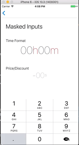
#### Masked Input
```jsx
import {MaskedInput} from 'react-native-ui-lib';
<MaskedInput
renderMaskedText={this.renderTimeText}
caretHidden
keyboardType={'numeric'}
maxLength={4}
/>
renderTimeText(value) {
const paddedValue = _.padStart(value, 4, '0');
const hours = paddedValue.substr(0, 2);
const minutes = paddedValue.substr(2, 2);
return (
<Text text20 dark20 center>
{hours}
<Text red10>h</Text>
{minutes}
<Text red10>m</Text>
</Text>
);
}
```
#### Tags Input
```jsx
import {TagsInput} from 'react-native-ui-lib';
<TagsInput
containerStyle={{marginBottom: 20}}
placeholder="Enter Tags"
tags={this.state.tags} // array of strings/objects
onChangeTags={(tags) => this.setState({tags})}
getLabel={(tag) => tag.label}
inputStyle={{fontSize: 22, color: 'blue'}}
renderTag={(tag, index, shouldMarkTagToRemove) => <View>...</View>}
hideUnderline={true/false}
/>
```
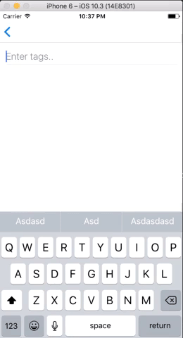
Since Android does not support TextInput _onKeyPress_ callback, the feature that removes tags on Backspace won't work.
In Order to fix it, follow these instructions:
Update your dependencies in `android/app/build.gradle`:
```gradle
dependencies {
// Add this dependency:
compile project(":react-native-ui-lib")
}
```
Update your `android/settings.gradle`:
```gradle
include ':react-native-ui-lib'
project(':react-native-ui-lib').projectDir = new File(rootProject.projectDir, '../node_modules/react-native-ui-lib/lib/android')
```
In your `MainApplication.java`, add to the `getPackages()` list:
```java
import com.wix.reactnativeuilib.textinput.TextInputDelKeyHandlerPackage;
@Override
protected List<ReactPackage> getPackages() {
return Arrays.<ReactPackage>asList(
// Add this package:
new TextInputDelKeyHandlerPackage()
);
}
```
## Helpers
### AvatarHelpers
#### getInitials
usage:
```jsx
import {AvatarHelper} from 'react-native-ui-lib';
AvatarHelper.getInitials('Lilly Wheeler'); // LW
AvatarHelper.getInitials('Russell Lloyd'); // RL
AvatarHelper.getInitials('Andrew'); // A
```
### Colors
#### rgba
usage:
```jsx
import {Colors} from 'react-native-ui-lib';
Colors.rgba('#ff2442', 0.05); // 'rgb(255, 36, 66, 0.05)'
Colors.rgba(44, 224, 112, 0.2); // 'rgb(44, 224, 112, 0.2)'
```