react-native-tabbar-bottom
Version:
Tabbar component for react native apps
123 lines (107 loc) • 4.35 kB
Markdown
# react-native-tabbar-bottom
Support: Android / iOS
This package provides a bottom tabbar for your react native app.
### Install
1) Make sure that you have [NativeBase](https://github.com/GeekyAnts/NativeBase) installed
2) `npm install react-native-tabbar-bottom --save`
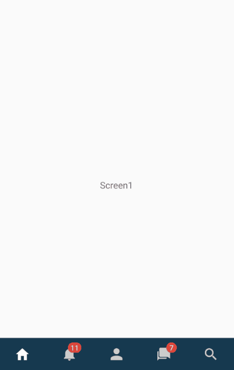
### Demo
Demo1:
Demo2:

### Props
| Prop | Type | Options | Default | Info
| ------------- |:-------------:| -----:| -----:| -----:|
| type | PropTypes.string | "button", "ripple" | "button"
| rippleEffect | PropTypes.bool | | true | only for type === "ripple"
| rippleColor | PropTypes.string | | "green" | only for type === "ripple"
| rippleDuration | PropTypes.number | | 280 | only for type === "ripple"
| tabbarBgColor | PropTypes.string | | "#16394f" |
| tabbarBorderTopColor | PropTypes.string | | null |
| iconColor | PropTypes.string | | "#ccc" |
| selectedIconColor | PropTypes.string | | "#fff" |
| labelSize | PropTypes.number | | 12 |
| labelColor | PropTypes.string | | "#ccc" |
| selectedLabelColor | PropTypes.string | | "#fff" |
| badgeColor | PropTypes.string | | "#dd463b" |
| badgeLabelColor | PropTypes.string | | "#fff" |
| badgeLabelSize | PropTypes.number | | 11 |
| badgeColor | PropTypes.string | | "#dd463b" |
| stateFunc | PropTypes.func.isRequired | | | Required. Pass in function to update state. Format: (tab) => {..}
| activePage | PropTypes.string.isRequired | | | Required. Pass in active page.
| tabs | PropTypes.arrayOf | | | Required. Pass in tab data
### Props of tabs prop
| Prop | Type | Info
| ------------- |:-------------:| -----:|
| page | PropTypes.string | Page name, e.g. "HomeScreen"
| title | PropTypes.string | Can e.g. be shown in navbar
| icon | PropTypes.string | Icon name of the Icon (Ionicons names)
| iconText | PropTypes.string | Text of the icon (shown below the icon)
| badgeColor | PropTypes.string | Other badge color for tab
| badgeLabelColor | PropTypes.string | Other badge label color for tab
| badgeNumber | PropTypes.number | Badge number (number shown in badge)
### Example code
You can also find this example in the example folder.
```
[...]
import Tabbar from 'react-native-tabbar-bottom'
export default class exampleTabs extends Component {
constructor() {
super()
this.state = {
page: "HomeScreen",
}
}
render() {
return (
<View style={styles.container}>
{
// if you are using react-navigation just pass the navigation object in your components like this:
// {this.state.page === "HomeScreen" && <MyComp navigation={this.props.navigation}>Screen1</MyComp>}
}
{this.state.page === "HomeScreen" && <Text>Screen1</Text>}
{this.state.page === "NotificationScreen" && <Text>Screen2</Text>}
{this.state.page === "ProfileScreen" && <Text>Screen3</Text>}
{this.state.page === "ChatScreen" && <Text>Screen4</Text>}
{this.state.page === "SearchScreen" && <Text>Screen5</Text>}
<Tabbar
stateFunc={(tab) => {
this.setState({page: tab.page})
//this.props.navigation.setParams({tabTitle: tab.title})
}}
activePage={this.state.page}
tabs={[
{
page: "HomeScreen",
icon: "home",
},
{
page: "NotificationScreen",
icon: "notifications",
badgeNumber: 11,
},
{
page: "ProfileScreen",
icon: "person",
},
{
page: "ChatScreen",
icon: "chatbubbles",
badgeNumber: 7,
},
{
page: "SearchScreen",
icon: "search",
},
]}
/>
</View>
);
}
}
const styles = StyleSheet.create({
container: {
flex: 1
}
});
```