react-native-sms-verifycode-fix
Version:
A component for entering a set of SMS verification codes for react-native, Compatible for Android and iOS
169 lines (135 loc) • 7.49 kB
Markdown
### [Englsih Version](https://github.com/shixiaoquan/react-native-sms-verifycode/blob/develop/README.md)
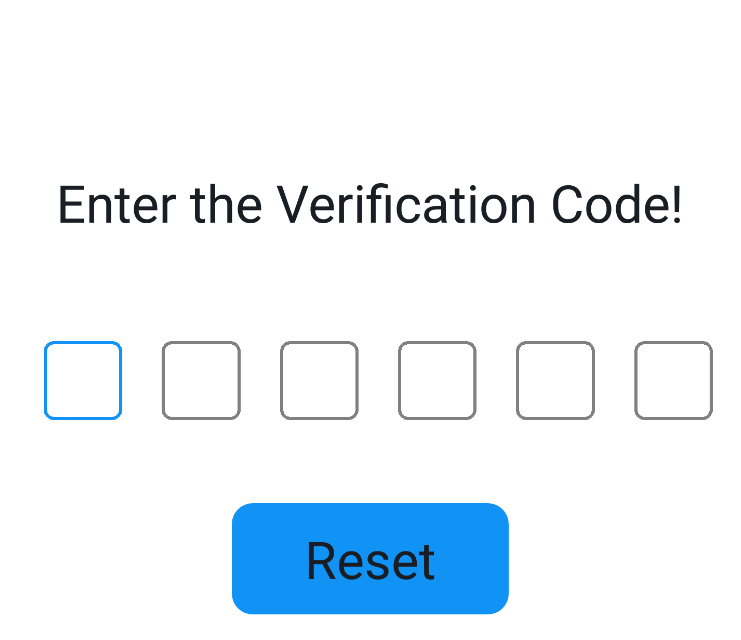
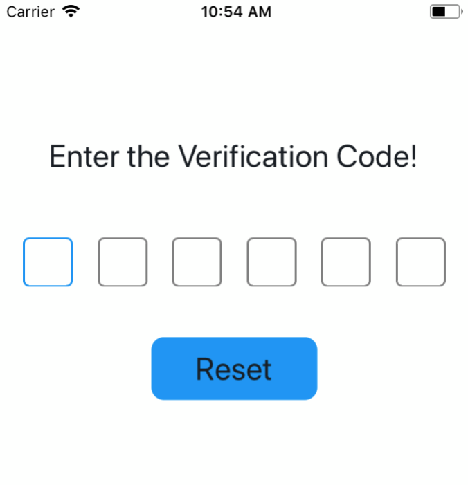
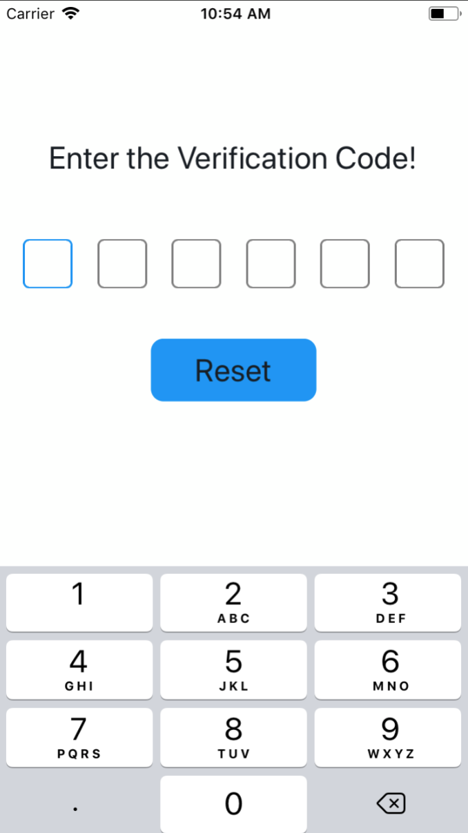
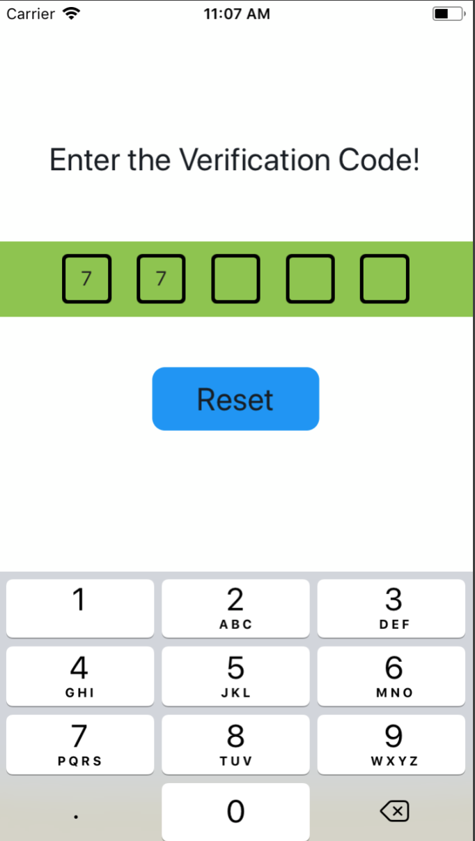
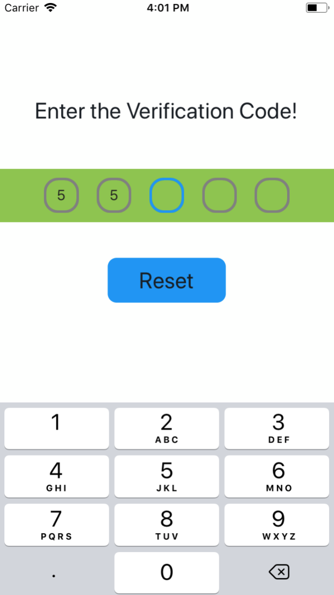
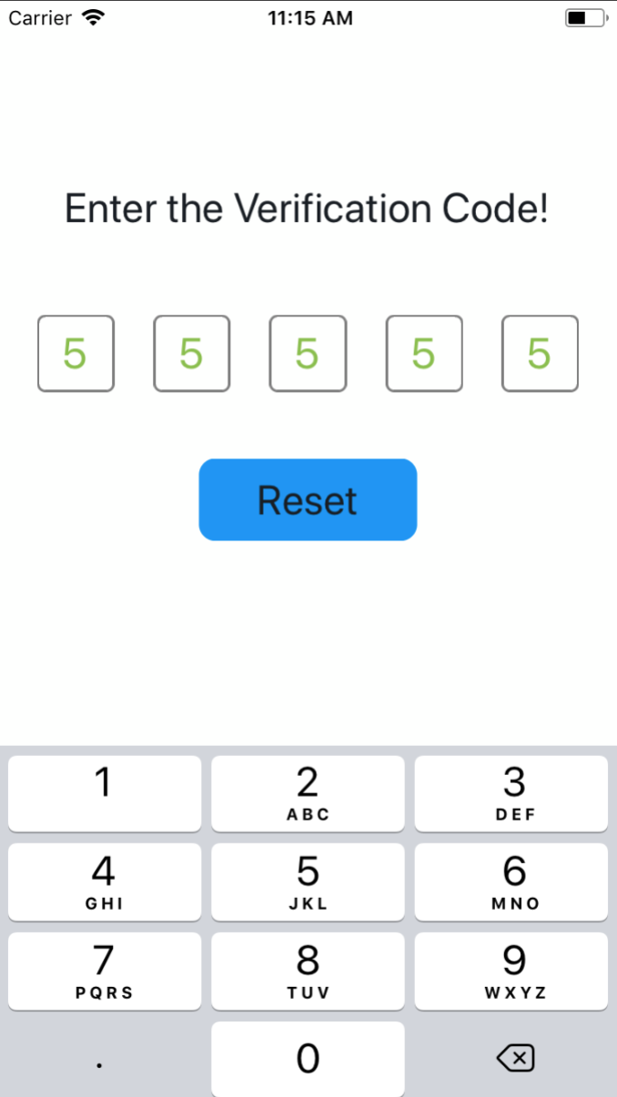
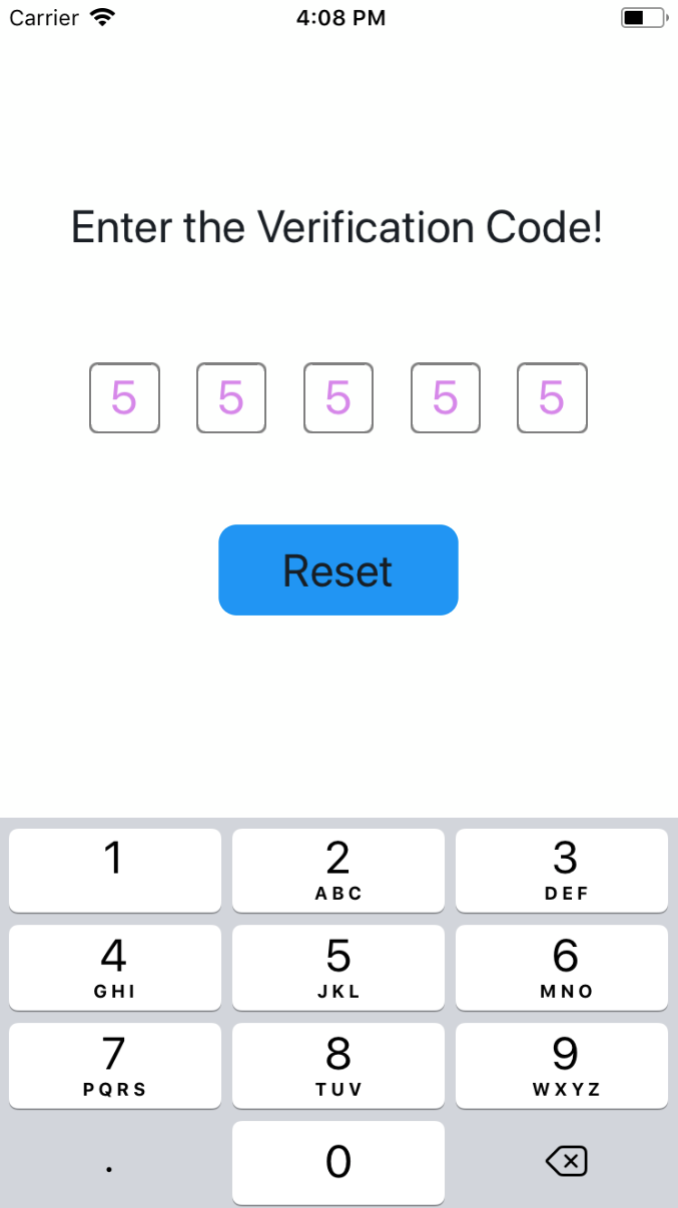
## 效果图
### 支持输入密码,兼容了 iOS 和 Android
|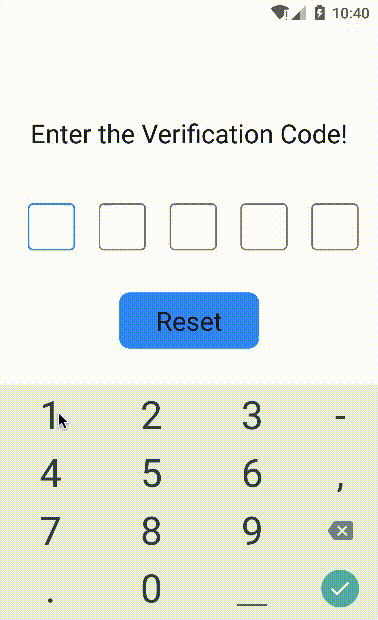|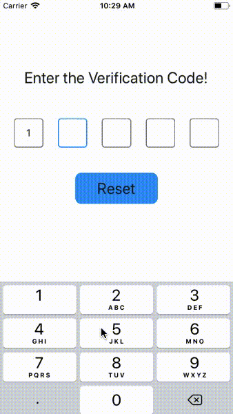|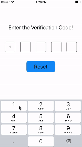|
|:-:|:-:|:-:|
| on Android | on iOS | use Password |
在线Demo查看地址 [Expo](https://snack.expo.io/@shixiaoquan/-react-native-sms-verifycode-example)
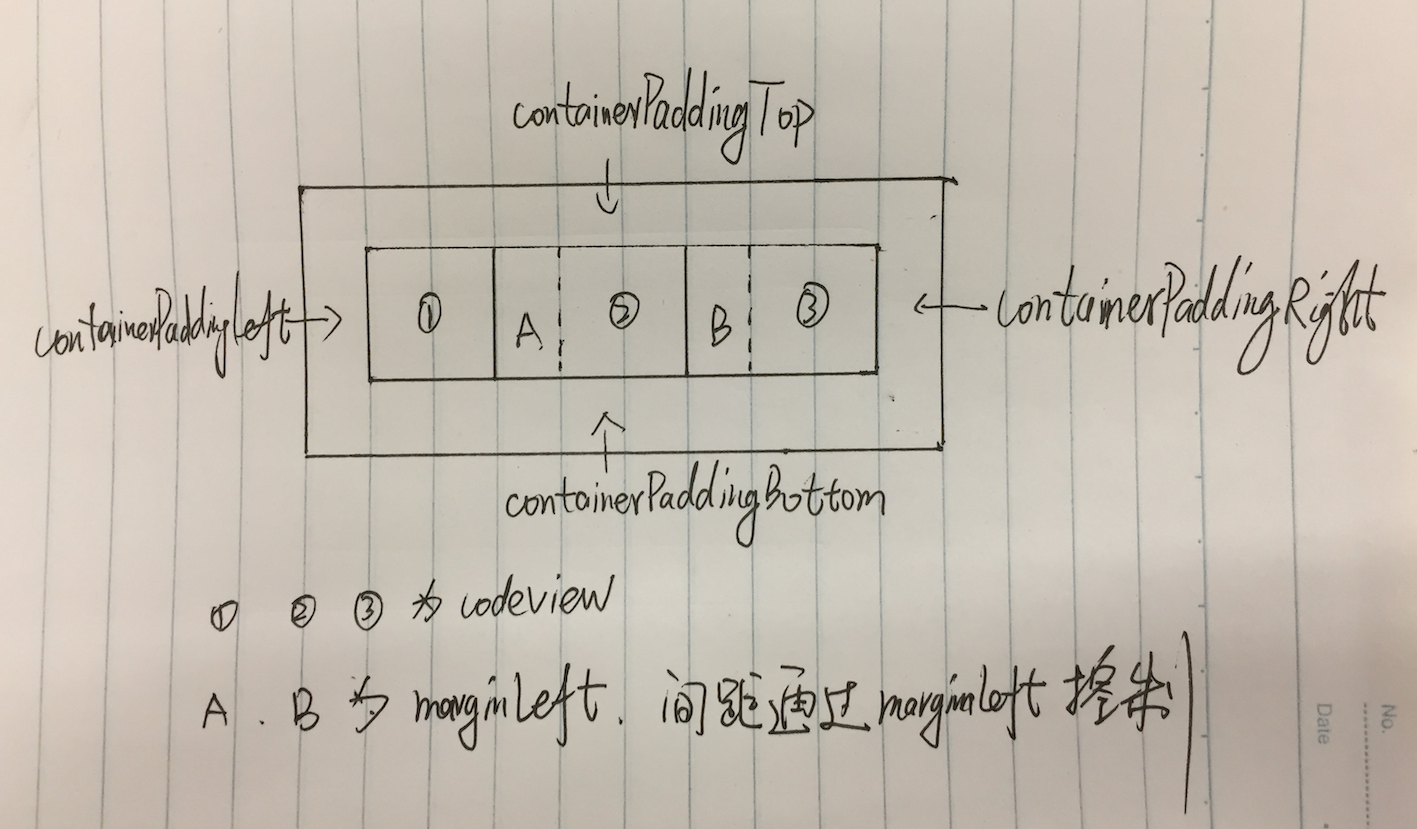
## 整体的思路大概是这样的,上个优秀的手绘图 🙈 🙈 🙈
## 安装
```bash
$ npm install react-native-sms-verifycode --save
```
## 用法
### 基本用法
设置输入完成时的回调函数,即可获取用户输入的内容
```javascript
import SMSVerifyCode from 'react-native-sms-verifycode'
...
<SMSVerifyCode
ref={ref => (this.verifycode = ref)}
onInputCompleted={this.onInputCompleted}
containerPaddingHorizontal={30}
/>
onInputCompleted = (text) => {
Alert.alert(
text,
'本次输入的验证码',
[
{
text: '确定',
},
]
)
}
reset = () => {
this.verifycode.reset()
this.setState({codeText: ''})
}
...
```
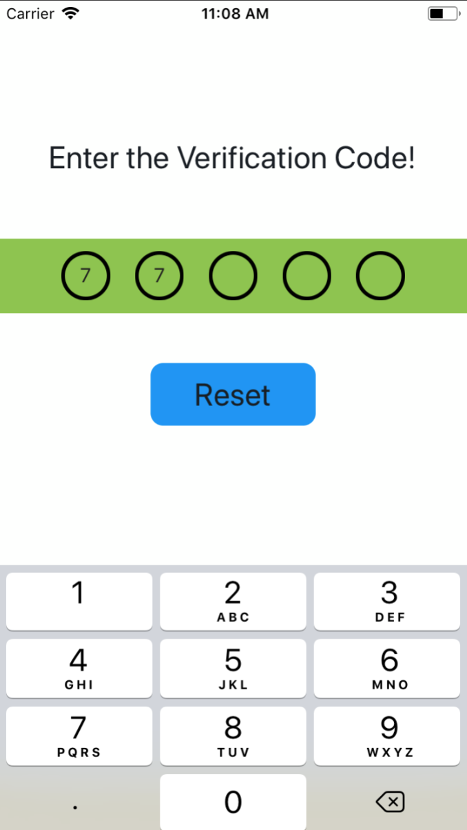
||||
|:-:|:-:|:-:|
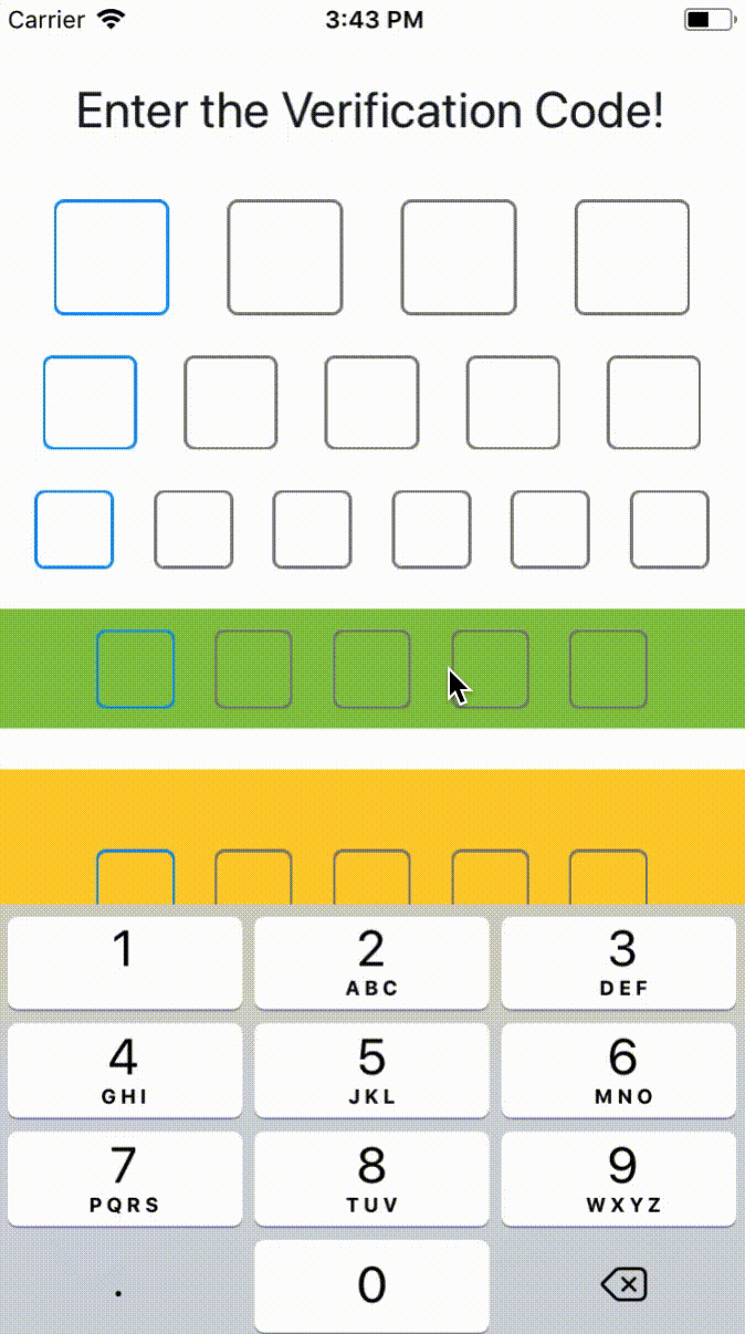
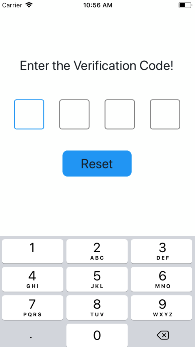
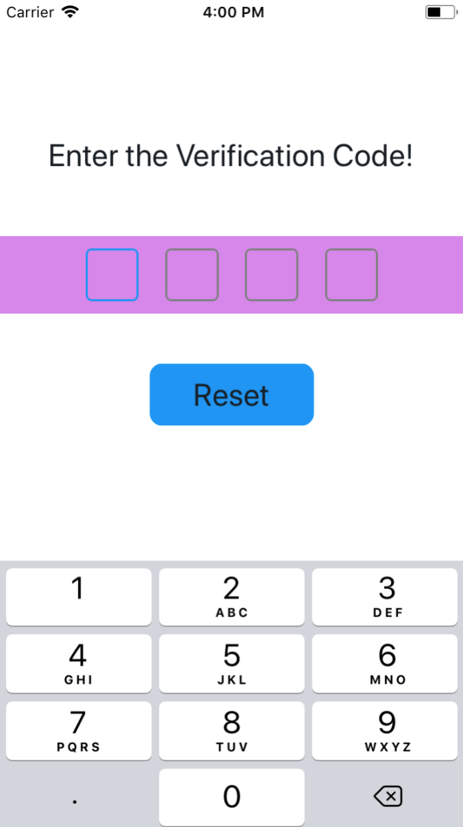
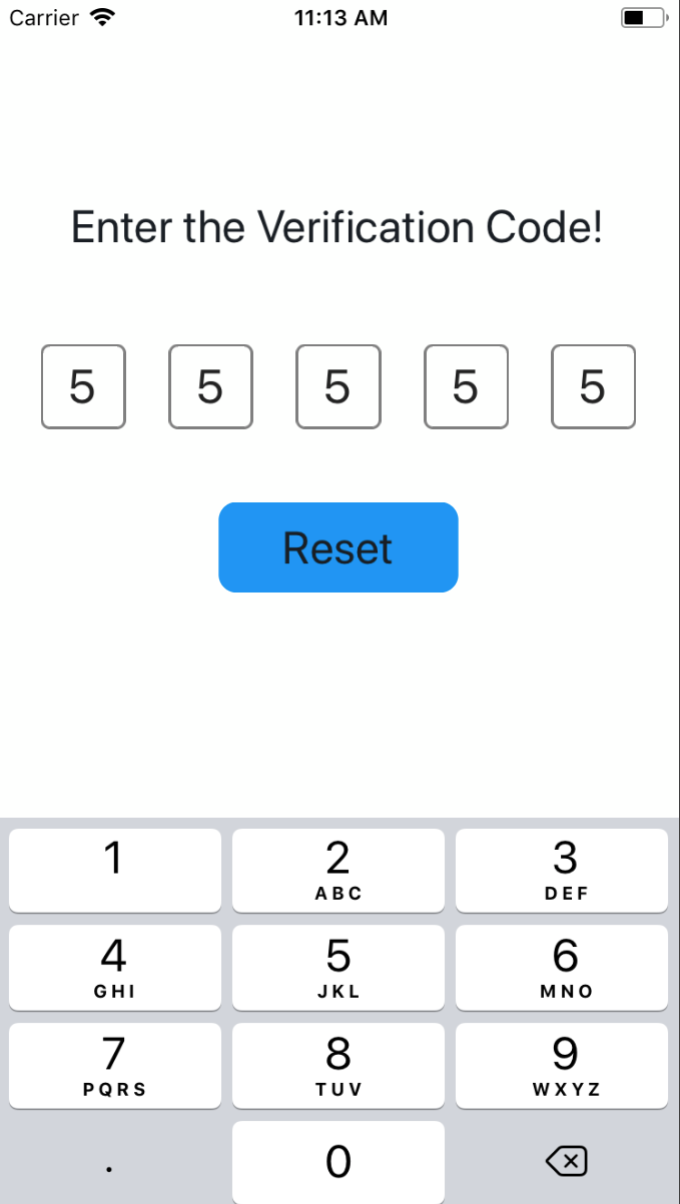
### 高级用法
#### 设置验证码的个数
```javascript
import SMSVerifyCode from 'react-native-sms-verifycode'
...
<SMSVerifyCode
verifyCodeLength={4} // 根据需要设置任意数,类型必须时number
/>
```
||||
|:-:|:-:|:-:|
#### 设置Container样式
```javascript
import SMSVerifyCode from 'react-native-sms-verifycode'
...
<SMSVerifyCode
verifyCodeLength={5}
containerPaddingVertical={10}
containerPaddingHorizontal={50}
containerBackgroundColor={'#8DC647'}
/>
...
```
||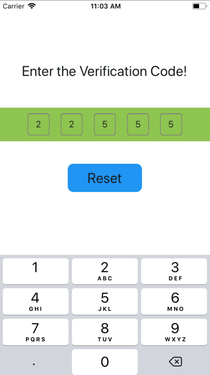||
|:-:|:-:|:-:|
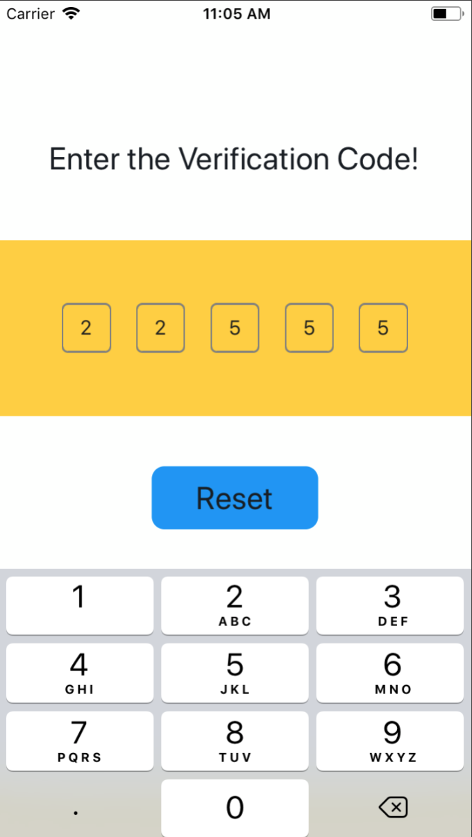
#### 设置文本框的样式
```javascript
import SMSVerifyCode from 'react-native-sms-verifycode'
...
<SMSVerifyCode
verifyCodeLength={6}
containerPaddingVertical={10}
containerPaddingHorizontal={50}
containerBackgroundColor="#8DC647"
codeViewBorderColor="#000000"
focusedCodeViewBorderColor="#0000FF"
codeViewBorderWidth={3}
codeViewBorderRadius={16}
/>
...
```
||||
|:-:|:-:|:-:|
#### 设置文本的样式
```javascript
import SMSVerifyCode from 'react-native-sms-verifycode'
...
<SMSVerifyCode
verifyCodeLength={5}
codeFontSize={26}
// codeColor={'#89C047'}
/>
...
```
||||
|:-:|:-:|:-:|
## **可设置的属性**
| Prop | PropType | Default Value |isRequired| Description |
|:-:|:-:|:-:|:-:|:-:|
| autoFocus | bool | false | NO | 默认是否自动获取焦点 |
| verifyCodeLength | number | 6 | NO | 验证码的个数 |
| containerStyle | object | null | NO | 设置container的样式,改属性设置的级别低于后面3个,如果重复会被覆盖,该样式和 View 支持的样式一样 |
| containerPaddingVertical | number | 0 | NO | 外层容器的paddingVertical |
| containerPaddingLeft | number | 0 | NO | 外层容器的paddingLeft |
| containerPaddingRight | number | 0 | NO | 外层容器的paddingRight |
| containerPaddingHorizontal | number | 根据验证码个数自动计算 | NO | 外层容器的paddingHorizontal |
| containerPaddingLeft | number | 0 | NO | 外层容器的paddingLeft |
| containerPaddingRight | number | 0 | NO | 外层容器的paddingRight |
| containerBackgroundColor | string | #FDFFFD | NO | 外层容器的backgroundColor |
| codeViewStyle | object | null | NO | 设置数字框的样式,(等同于 View 的样式设置,本质上是个 View) |
| codeViewWidth | number | 根据验证码个数自动计算 | NO | 文本框的宽度 |
| codeViewBorderColor | string | grey | NO | 文本框的颜色 |
| focusedCodeViewBorderColor | string | #1192F6 | NO | 当前获得焦点的文本框的颜色 |
| codeViewBorderWidth | number | 1 | NO | 文本框的粗细 |
| codeViewBorderRadius | number | 5 | NO | 文本框的圆角大小 |
| codeViewBackgroundColor | string | default | NO | 设置数字框的背景色 |
| codeFontSize | number | default | NO | 文本的大小 |
| codeColor | string | #222222 | NO | 文本的颜色 |
| secureTextEntry | boolean | false | NO | 默认为false,需要设置为true时,只要secureTextEntry即可,不需要secureTextEntry={true} |
| coverStyle | object | null | NO | 遮挡层的样式,(等同于 View 的样式设置,本质上是个 View) |
| coverRadius | number | codeFontSize / 2 | NO | 遮挡层的半径,默认是个圆点(只在 secureTextEntry 为 true 时生效) |
| coverColor | string | black | NO | 遮挡层的颜色,(只在 secureTextEntry 为 true 时生效) |
| warningTitle | string | black | NO | 输入内容非数字时的,提示框的标题 |
| warningContent | string | black | NO | 输入内容非数字时的,提示框的正文内容 |
| warningButtonText | string | black | NO | 输入内容非数字时的,提示框的按钮文本 |
## **可调用的方法**
| Name | isRequired | Description |
|:-:|:-:|:-:|
| onInputCompleted | NO | 输入完成时,回调的方法 |
| reset | NO | 清空输入的内容,并将焦点设置在第一个输入框,**使用ref调用** |
| blur | NO | 隐藏键盘,**使用ref调用** |
| focus | NO | 显示键盘,**使用ref调用** |