react-native-smart-tip
Version:
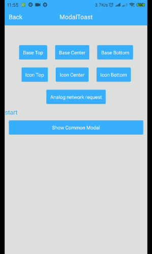
react-native smart tip, including Toast、Modal、SnackBar
198 lines (155 loc) • 5.87 kB
Markdown
# react-native-smart-tip
React-native smart tip, including Toast、Modal、SnackBar

[](https://npmjs.com/package/react-native-smart-tip)
### 2021.4
In react native >= 0.62, the new LogBox component would impact this component's initialization. To make it work we have to explicitly insert a mount point in your app like this
```
import { WRootToastApp } from 'react-native-smart-tip'
// in your entry file like `App.js`
return (
<WRootToastApp> // <- use WRootToastApp to wrap your root component
<App />
</WRootToastApp>
);
```
### 2020.5
1. Add property isShowShadow to WSnackBar and WToast
2. Add sliding hide function for WSnackBar
### 2020.3 Show Toast above Modal (Compatible with Android and iOS)

```
import { ModalShowToastView } from 'react-native-smart-tip'
getToastInstance = (toastInstance) => {
this.toastInstance = toastInstance;
}
<Modal>
<View>
<ModalShowToastView toastInstance={this.getToastInstance} />
</View>
</Modal>
this.toastInstance({data: 'toast'})
```
### 2019.7 Remove the method in the componentWillMount method. Compatible with future React 17 versions, React-Native@0.6 version.
### Installation
```bash
yarn add react-native-smart-tip
or
npm i react-native-smart-tip --save
```
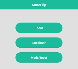
### Features
##### Toast
##### SnackBar
##### Modal
##### Show tips on Modal
> Tip: Modal shows that modal can only be used on Android [issue](https://github.com/facebook/react-native/issues/3445)
### Usage
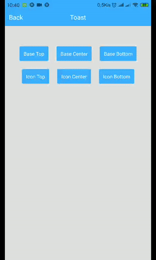
##### WToast
```
import {WToast} from 'react-native-smart-tip'
// Base
show = () => {
WToast.show({data: 'hello world'})
}
// Other
show = () => {
const toastOpts = {
data: 'Success',
textColor: '#ffffff',
backgroundColor: '#444444',
duration: WToast.duration.LONG, //1.SHORT 2.LONG
position: WToast.position.TOP, // 1.TOP 2.CENTER 3.BOTTOM
icon: <Image source={require('../data/img/success.png')} style={{width: 32,height: 32,resizeMode: 'contain'}}/>
}
WToast.show(toastOpts)
}
```
##### WToast API
Props | Type | Required | Default | Description
-------| -------- | -------- | ----------- | -----------
data | String | true | ' '| Displayed content
duration | Number | false | WToast.duration.SHORT | The duration of the toast
position | Number | false | WToast.position.BOTTOM | Displayed position
inEasing | Easing | false | Easing.elastic(1)| Admission animation
textColor| String | false |'white'| font color
backgroundColor| String | false | 'black' | background color
icon | Component | fasse | undefined | Image to be displayed
isShowShadow | boolean | false | true | Shadow effect
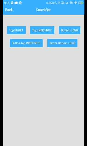
##### WSnackBar
```
import {WSnackBar} from 'react-native-smart-tip'
// Base
show = () => {
WSnackBar.show({data: 'hello world'})
}
// Other
show = () => {
const snackBarOpts = {
data: 'Please check the network first.',
position: WSnackBar.position.BOTTOM, // 1.TOP 2.CENTER 3.BOTTOM
duration: WSnackBar.duration.LONG, //1.SHORT 2.LONG 3.INDEFINITE
textColor: '#ff490b',
backgroundColor: '#050405',
actionText: 'Sure',
actionTextColor: '#ff490b',
onActionHide: (isSlideHide)=>{
// Click Action
},
}
WSnackBar.show(snackBarOpts)
}
```
##### WSnackBar API
Props | Type | Required | Default | Description
-------| -------- | -------- | ----------- | -----------
data | String | true | ' '| Displayed content
statusBarHeight | Number | false | -1 | Prevent Android statusBar
height | Number | false | 44 | Height to display
duration | Number | false | WSnackBar.duration.SHORT | The duration of the toast
position | Number | false | WSnackBar.position.BOTTOM | Displayed position
inEasing | Easing | false | Easing.linear| Admission animation
textColor| String | false |'white'| font color
backgroundColor| String | false | 'black' | background color
actionText | String | false | undefined | action text
actionTextColor | String | false | 'white' | action text color
isAllowSlideExit|boolean | false | true | Whether to run sliding hide
onActionHide | Function | false | undefined | listener click
isShowShadow | boolean | false | true | Shadow effect
numberOfLines|number| false | 1 | Maximum number of rows
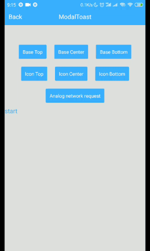
##### WModal
```
import {WModal} from 'react-native-smart-tip'
// Base
show = () => {
WModal.show({data: 'hello world'})
}
// Other
show = () => {
const modalOpts = {
data: 'Loading',
textColor: '#fff',
backgroundColor: '#444444',
position: WModal.position.CENTER,
icon: <ActivityIndicator color='#fff' size={'large'}/>
}
WModal.show(modalOpts)
}
```
##### WToast API
Props | Type | Required | Default | Description
-------| -------- | -------- | ----------- | -----------
data | String | true | ' '| Displayed content
position | Number | false | WToast.position.BOTTOM | Displayed position
inEasing | Easing | false | Easing.elastic(1)| Admission animation
textColor| String | false |'white'| font color
backgroundColor| String | false | 'black' | background color
icon | Component | fasse | undefined | Image to be displayed
onRequestClose|Function|false| undefined| Android Back
##### MIT Licensed