react-native-responsive-image
Version:
Image component, that resizes itself appropriately on various screensizes.
90 lines (54 loc) • 3.28 kB
Markdown
# React Native Responsive Image
[](https://david-dm.org/dharmoslap/react-native-responsive-image)
[](https://www.npmjs.com/package/react-native-responsive-image)
[]()
[](https://www.npmjs.com/package/react-native-responsive-image)
## Why?
React Native's Image size is rendered the same regardless of device screen size and screen resolution.
This component scales itself seemlesly on all iOS and Android devices.
## Installation
`npm install react-native-responsive-image --save`
## Usage
`<ResponsiveImage>` is expecting `initWidth` and `initHeight` props.
These values are used to set image size on any device that has screen size iPhone Plus, or larger.
Image is then scaled down for any smaller device.
Optional prop `component` is used to pass down either an `Image` or `ImageBackground` imported react-native (defaults to `Image` if not provided)
## Example
```javascript
import React, { Component } from 'react';
import { AppRegistry, StyleSheet, View } from 'react-native';
import ResponsiveImage from 'react-native-responsive-image';
class App extends Component {
render() {
return (
<View style={{ flexGrow: 1, justifyContent: 'center', alignItems: 'center', flexDirection: 'row' }}>
<ResponsiveImage source={{uri: 'https://reactjs.org/logo-og.png'}} initWidth="138" initHeight="138"/>
<ResponsiveImage source={{uri: 'https://reactjs.org/logo-og.png'}} initWidth="138" initHeight="138"/>
<ResponsiveImage source={{uri: 'https://reactjs.org/logo-og.png'}} initWidth="138" initHeight="138"/>
</View>
);
}
}
AppRegistry.registerComponent('ResponsiveImageExample', () => App);
```
For `initWidth=138` it looks like this:
| Device | Screen width | Scale | `<Image>` width |
|----------------------|--------------|-------|---------------|
| iPhone SE | 320 | 0.77 | 106 |
| iPhone X | 375 | 0.902 | 117 |
| iPhone8 Plus | 414 | 1 | 138 |
| Nokia 5 | 360 | 0.87 | 120 |
| iPad (or any tablet) | - | 1 | 138 |
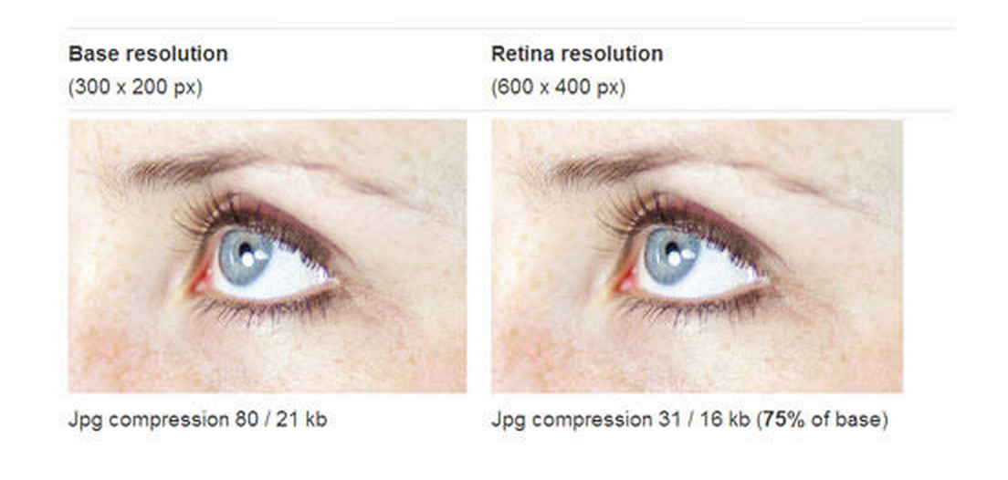
## Just one image?
It sounds like you could save some loading by delivering low resolution images to screens with lower resolution. The best way is to serve just one high-resolution (retina) well compressed image. It’s surprising how well they can be compressed, and the result looks the same.
## Example project
### Create project
`create-react-native-app ResponsiveImageExample`
`cp ./example/App.js ./ResponsiveImageExample/App.js`
`cp -R ./src ./ResponsiveImageExample`
`cd ResponsiveImageExample`
`yarn start`
## Development
1. Modify any files in ./src directory
2. Propagate changes by `cp -R ./src ./ResponsiveImageExample/src`