react-native-range-datepicker
Version:
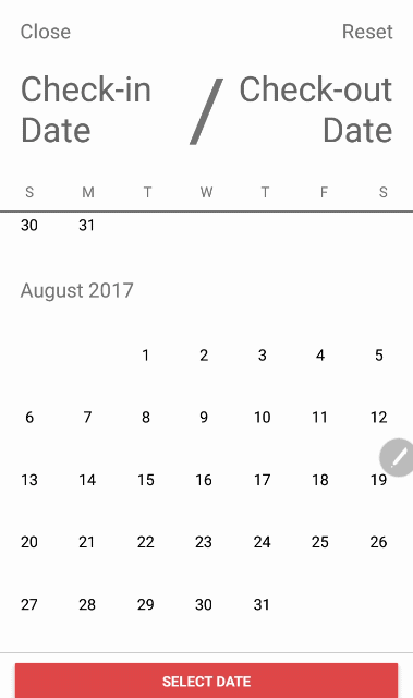
React native range datepicker (inspired by Airbnb Datepicker)
211 lines (188 loc) • 5.75 kB
Markdown
# react-native-range-datepicker
This is my first npm package, inspired by Airbnb datepicker.
### Install
```sh
$ npm i react-native-range-datepicker --save
```
### How to use
```jsx
import DatepickerRange from 'react-native-range-datepicker';
<DatepickerRange
startDate="13052017"
untilDate="26062017"
onConfirm={( startDate, untilDate ) => this.setState({ startDate, untilDate })}
/>
```
### Default props RangeDatepicker
```jsx
static defaultProps = {
monthProps: {
titleFormat: 'MMMM YYYY',
titleStyle: { fontSize: 20, padding: 20 },
dayHeaderProps: {},
showDaysHeader: false,
capitalizeTitle: false,
},
buttonText: 'Select Date',
flatListProps: {},
closeButtonText: 'Close',
chosenDateTextColor: '#666',
monthProps: {},
dayHeaderDividerColor: "#000000",
initialMonth: '',
dayHeadings: ['S', 'M', 'T', 'W', 'T', 'F', 'S'],
dayHeaderStyle: {},
dayHeaderContainerStyle: {},
maxMonth: 12,
buttonColor: 'green',
buttonContainerStyle: {},
flatListProps: {},
monthProps: {},
showReset: true,
showClose: true,
showConfirmButton: true,
showSelectedRange: true,
showsVerticalScrollIndicator: false,
showDaysHeader: true,
ignoreMinDate: false,
isHistorical: false,
dayContainerOffset: 0,
onClose: () => {},
onSelect: () => {},
onConfirm: () => {},
placeHolderStart: 'Start Date',
placeHolderUntil: 'Until Date',
selectedBackgroundColor: 'green',
selectedTextColor: 'white',
dayBackgroundColor: '',
dayTextColor: '',
pointBackgroundColor: '',
pointTextColor: '',
todayColor: 'green',
textColor: '#000000',
resetButtonText: "Reset",
startDate: '',
untilDate: '',
minDate: '',
maxDate: '',
infoText: '',
showSelectionInfo: true,
showButton: true,
infoStyle: {color: '#fff', fontSize: 13},
infoContainerStyle: {marginRight: 20, paddingHorizontal: 20, paddingVertical: 5, backgroundColor: 'green', borderRadius: 20, alignSelf: 'flex-end'}
};
```
### Proptypes RangeDatepicker
```jsx
static propTypes = {
monthProps: PropTypes.shape({
titleFormat: PropTypes.string,
titleStyle: PropTypes.object,
}),
initialMonth: PropTypes.string,
dayHeadings: PropTypes.arrayOf(PropTypes.string),
availableDates: PropTypes.arrayOf(PropTypes.string),
maxMonth: PropTypes.number,
buttonColor: PropTypes.string,
buttonText: PropTypes.string,
dayHeaderDividerColor: PropTypes.string,
closeButtonText: PropTypes.string,
chosenDateTextColor: PropTypes.string,
flatListProps: PropTypes.object,
dayHeaderStyle: PropTypes.object,
dayHeaderContainerStyle: PropTypes.object,
buttonContainerStyle: PropTypes.object,
monthProps: PropTypes.object,
startDate: PropTypes.string,
untilDate: PropTypes.string,
minDate: PropTypes.string,
maxDate: PropTypes.string,
showReset: PropTypes.bool,
showClose: PropTypes.bool,
dayContainerOffset: PropTypes.number,
showConfirmButton: PropTypes.bool,
showSelectedRange: PropTypes.bool,
showsVerticalScrollIndicator: PropTypes.bool,
ignoreMinDate: PropTypes.bool,
isHistorical: PropTypes.bool,
onClose: PropTypes.func,
onSelect: PropTypes.func,
onConfirm: PropTypes.func,
placeHolderStart: PropTypes.string,
placeHolderUntil: PropTypes.string,
selectedBackgroundColor: PropTypes.string,
resetButtonText: PropTypes.string,
selectedTextColor: PropTypes.string,
dayBackgroundColor: PropTypes.string,
dayTextColor: PropTypes.string,
pointBackgroundColor: PropTypes.string,
pointTextColor: PropTypes.string,
todayColor: PropTypes.string,
infoText: PropTypes.string,
infoStyle: PropTypes.object,
showSelectionInfo: PropTypes.bool,
showButton: PropTypes.bool,
infoContainerStyle: PropTypes.object
}
```
```jsx
import {SingleDatepicker} from 'react-native-range-datepicker';
<SingleDatepicker
onConfirm={( date ) => this.setState({ date })}
/>
```
### How to set fist day of week
```js
import 'moment/locale/en-gb';
moment.locale("en-gb");
```
### How to set days heades
```js
const dayHeadings =
[...Array(7).keys()]
.map(day => moment().weekday(day).format('dd'))
.map(_capitalize);
```
### Default props SingleDatepicker
```jsx
static defaultProps = {
initialMonth: '',
dayHeadings: ['S', 'M', 'T', 'W', 'T', 'F', 'S'],
maxMonth: 12,
showClose: true,
onClose: () => {},
onSelect: () => {},
selectedBackgroundColor: 'green',
selectedTextColor: 'white',
todayColor: 'green',
minDate: '',
maxDate: '',
infoText: '',
infoStyle: {color: '#fff', fontSize: 13},
infoContainerStyle: {marginRight: 20, paddingHorizontal: 20, paddingVertical: 5, backgroundColor: 'green', borderRadius: 20, alignSelf: 'flex-end'},
};
```
### Proptypes SingleDatepicker
```jsx
static propTypes = {
initialMonth: PropTypes.string,
dayHeadings: PropTypes.arrayOf(React.PropTypes.string),
availableDates: PropTypes.arrayOf(React.PropTypes.string),
maxMonth: PropTypes.number,
minDate: PropTypes.string,
maxDate: PropTypes.string,
showClose: PropTypes.bool,
onClose: PropTypes.func,
onSelect: PropTypes.func,
selectedBackgroundColor: PropTypes.string,
selectedTextColor: PropTypes.string,
todayColor: PropTypes.string,
infoText: PropTypes.string,
infoStyle: PropTypes.object,
infoContainerStyle: PropTypes.object,
}
```
### Update 23/07/2019
* RN 0.6 compatibility: replaced ListView by FlatList
* added more flexible width based on actual container size