react-native-nepali-picker
Version:
Minimalist and modern Nepali-date picker with customization.🌟
336 lines (241 loc) • 9.04 kB
Markdown
[](https://www.npmjs.com/package/react-native-nepali-picker) [](https://www.npmjs.com/package/react-native-nepali-picker) [](https://www.npmjs.com/package/react-native-nepali-picker) [](https://www.npmjs.com/package/react-native-nepali-picker)
As a Nepali-date picker it will help you on your `react native` project to integrate the Nepali date picker.Addition to that it also have functions for date conversion.
- Support all platforms (IOS, android, web and expo).
- Minimalist design.
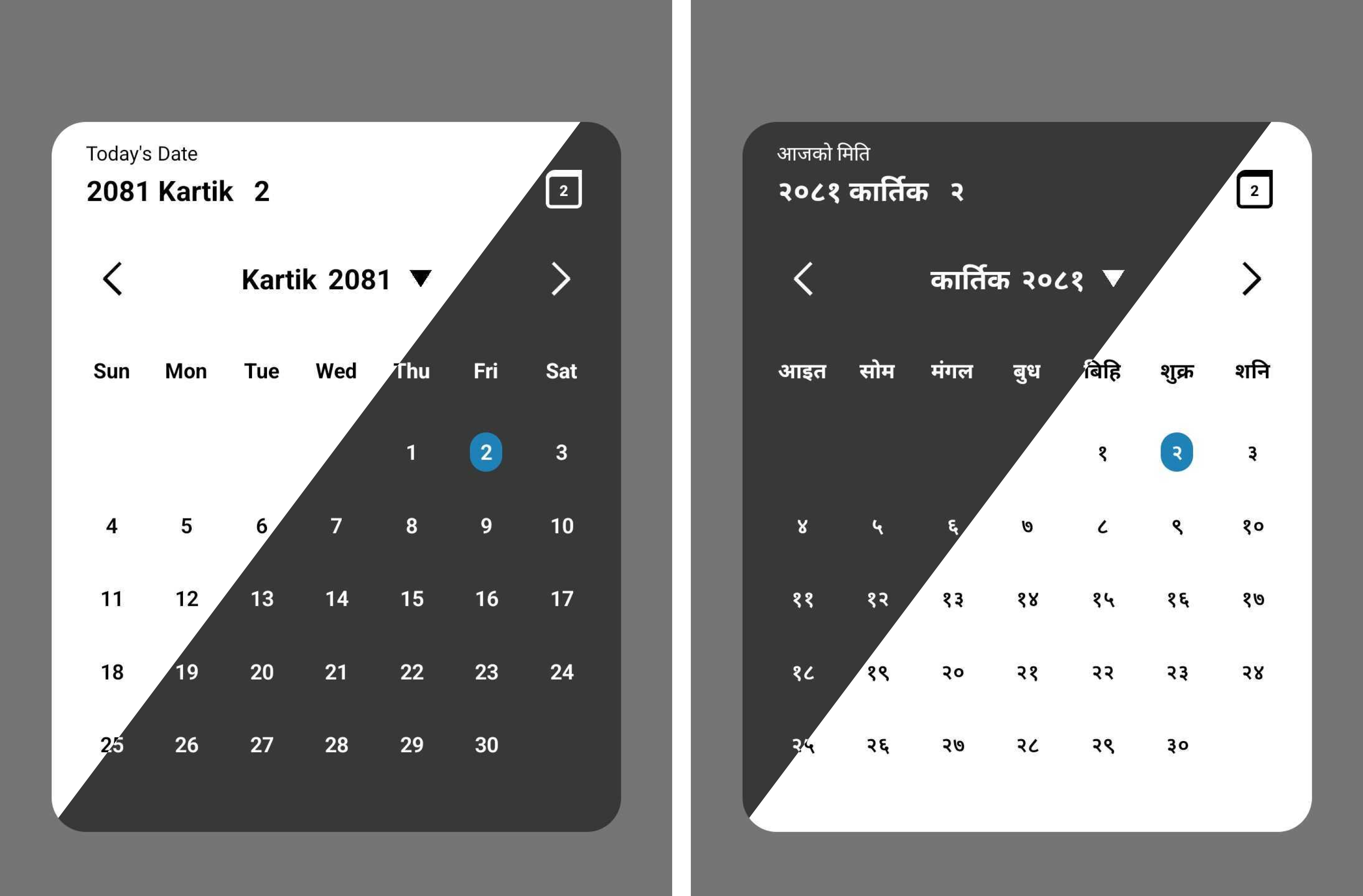
- Support Nepali and English language.
- Support dark theme.
- Support Date conversion form BS to Ad and vice-versa.
# Installation
```sh
# Install with npm
npm install react-native-nepali-picker
# For installation with yarn
yarn add react-native-nepali-picker
```
<!--Images here-->
# Usage
Example uses of `<CalendarPicker/>` component, which is the actual picker component. For more info
```jsx
import { useState } from 'react';
import {View, Text, TouchableOpacity } from 'react-native';
//import calendar picker component
import {
CalendarPicker,
} from 'react-native-nepali-picker';
export default function App() {
const [visible, setVisible] = useState<boolean>(false);
const [date, setDate] = useState<string>();
const onDateSelect = (PickedDate: string) => {
setDate(PickedDate);
};
return (
<View style={styles.container}>
<View>
{/* actual picker component */}
<CalendarPicker
visible={visible}
onClose={() => setVisible(false)}
onDateSelect={onDateSelect}
//these are optional
//language="np"
//theme="light"
//brandColor="#420420"
/>
</View>
{/* Button to open calendar picker*/}
<TouchableOpacity onPress={() => setVisible(true)}>
<Text>Open Calendar</Text>
</TouchableOpacity>
</View>
);
}
```
Boolean value to control whether to show the picker modal or not.
| type | default | required |
|-------|-------|-------|
| boolean | none | yes |
Function that execute on picker modal closed.
You have to set the visible props to false , in addition to that you can execute others customs function too.
| type | default | required |
|-------|-------|-------|
| ()=>void | none | yes |
Function that execute on select the date
The string parameter is the selected date in Nepali format.
| type | default | required |
|-------|-------|-------|
| (string)=>void | none | yes |
Preferred theme for picker modal.
| type | default | required |
|-------|-------|-------|
| "dark" \| "light" | light| no|
Preferred language for picker modal.
| type | default | required |
|-------|-------|-------|
| "en" \| "np"| "en"| no |
Color that represent your brand or organization. This color only applied to highlight today date on calendar.
> [!Note]
> Provide the string of color in hex code.
| type | default | required |
|-------|-------|-------|
| "string"| "#2081b9"| no |
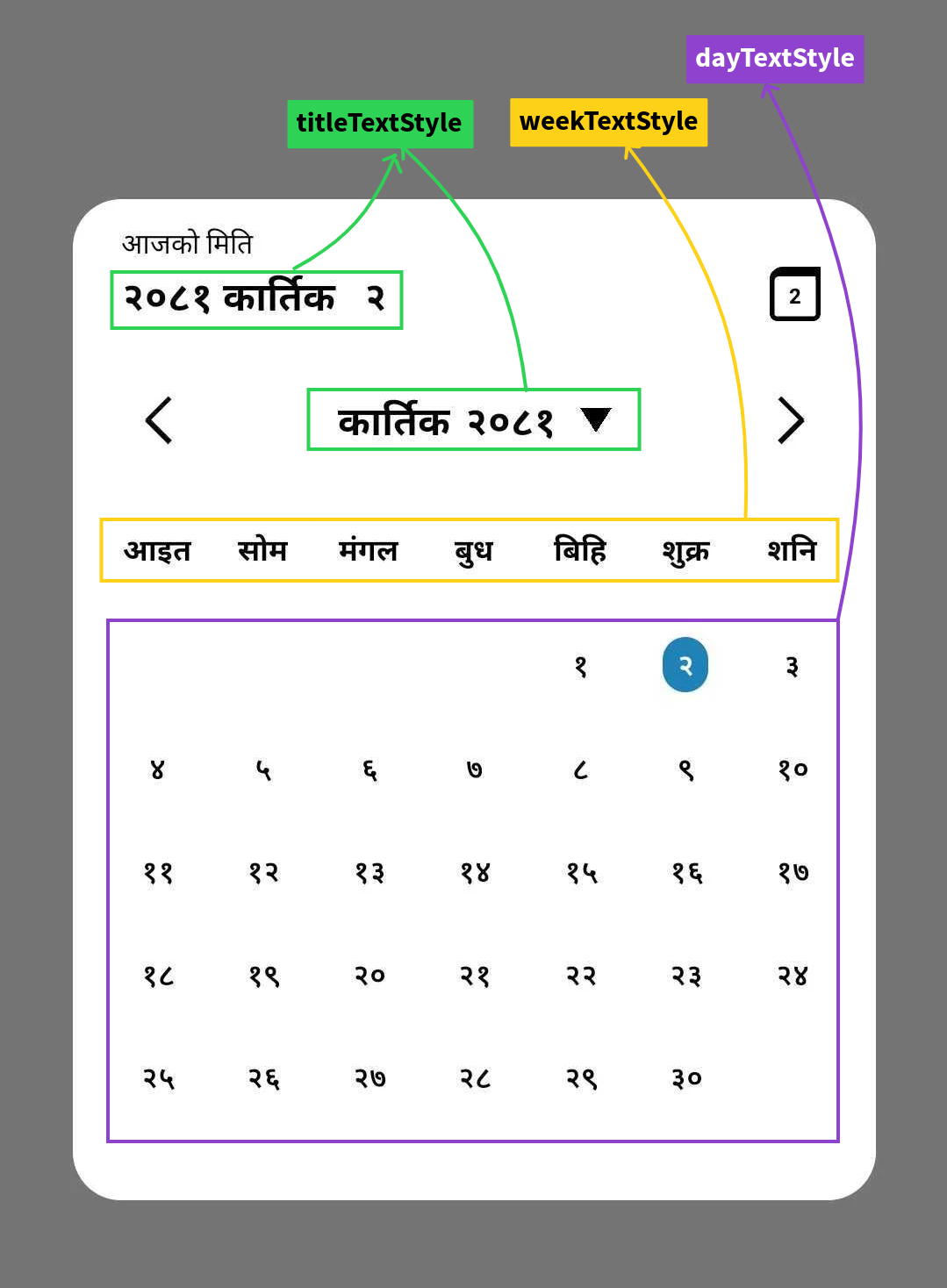
Props that help you to apply custom style on date title of picker modal.
>[!> [!WARNING]
> Color of text can't be changed,it's explicitly defined according to the theme you choose default to `black`.]
| type | default | required |
|-------|-------|-------|
| TextStyle |{fontSize:20,fontWeight:'bold' } | no |
Props that help you to apply custom style on week text of picker modal.
>[!> [!WARNING]
> Color of text can't be changed,it's explicitly defined according to the theme you choose default to `black`.]
| type | default | required |
|-------|-------|-------|
| TextStyle |{fontSize:15,fontWeight:'bold' } | no |
Props that help you to apply custom style on day text of picker modal.
>[!> [!WARNING]
> Color of text can't be changed,it's explicitly defined according to the theme you choose default to `black`.]
| type | default | required |
|-------|-------|-------|
| TextStyle |{fontSize:15,fontWeight:'600' } | no |
**uses**
```jsx
<CalendarPicker
visible={visible}
onClose={() => setVisible(false)}
onDateSelect={onDateSelect}
language="np"
theme="dark"
//dayTextStyle={{ fontSize: 14, }}
//weekTextStyle={{ fontSize: 15, }}
//titleTextStyle={{ fontSize: 20, }}
/>
```
This package provides three main functions:
Convert a date from Anno Domini (AD) to Bikram Sambat (BS):
Function return the BS date in string type with format `yyyy-mm-dd`
>[!Note]
> Please update to version `1.0.1` at least, which fixes the date conversion bug (sometime if the converted BS date is first day of month , It increases the previous month last day by 1).
>[!Note]
> Supported date range is `1943-04-14` AD to `2042-04-14` AD.
#### **uses**
```js
import {AdToBs} form 'react-native-nepali-picker'
const adDate = '2000-09-21';
const bsDate = AdToBs(adDate);
console.log(bsDate); // Output: 2057-06-05
```
Convert date from Bikram Sambat (BS) to Anno Domini (AD).
Function return the AD date in string type with format `yyyy-mm-dd`.
>[!Note]
> Supported date range is `2000-01-01` BS to `2099-01-01` BS.
#### **uses**
```js
import {BsToAd} form 'react-native-nepali-picker'
const bsDate = '2057-06-05';
const adDate = BsToAd(bsDate);
console.log(adDate); // Output: 2000-09-21
```
Get the current date in Nepali calendar (BS)
Function return the BS date in string type with format `yyyy-mm-dd`.
#### **uses**
```js
import {NepaliToday} form 'react-native-nepali-picker'
const today = NepaliToday();
console.log(today); // Output: Current date in BS format (e.g., 2080-07-15)
```
```jsx
import { useState } from 'react';
import { StyleSheet, View, Text, TouchableOpacity } from 'react-native';
import {
AdToBs,
BsToAd,
CalendarPicker,
NepaliToday,
} from 'react-native-nepali-picker';
export default function App() {
const [visible, setVisible] = useState<boolean>(false);
const [date, setDate] = useState<string>();
const onDateSelect = (PickedDate: string) => {
setDate(PickedDate);
};
return (
<View style={styles.container}>
<View>
{/* actual picker component */}
<CalendarPicker
visible={visible}
onClose={() => setVisible(false)}
onDateSelect={onDateSelect}
language="np"
theme="light"
/>
</View>
<TouchableOpacity style={styles.button} onPress={() => setVisible(true)}>
<Text style={styles.text}>Open Calendar</Text>
</TouchableOpacity>
<View>
<Text>{date}</Text>
{/* convert date on AD to BS equivalent date: required format is (YYYY-MM-DD) */}
<Text>{AdToBs('2000-09-21')}</Text>
{/* convert date on BS to AD equivalent date: required format is (YYYY-MM-DD) */}
<Text>{BsToAd('2056-01-01')}</Text>
{/* This function will return the current nepali date: return value is string and format is (YYYY-MM-DD) */}
<Text>{NepaliToday()}</Text>
</View>
</View>
);
}
const styles = StyleSheet.create({
container: {
flex: 1,
alignItems: 'center',
justifyContent: 'center',
},
button: {
paddingHorizontal: 10,
paddingVertical: 20,
borderRadius: 5,
backgroundColor: '#fe6684',
marginBottom: 10,
},
text: {
color: '#000',
fontSize: 20,
},
box: {
width: 60,
height: 60,
marginVertical: 20,
},
});
```
If you noticed something that need improvement or have additional feature request or just want to chat, feel free to reach out or you can create pull request for feature request, I will try my best to help you.
( *You will get instant response on Linkedin than Email.* )
[](https://www.linkedin.com/in/kushal-chapagain-1aa66419a/)
[](mailto:chapagainkushal74@gmail.com)
See the [contributing guide](CONTRIBUTING.md) to learn how to contribute to the repository and the development workflow.
MIT
---
Made with [create-react-native-library](https://github.com/callstack/react-native-builder-bob)