react-native-multiple-select-list
Version:
react-native-multiple-select-list
64 lines (56 loc) • 2.45 kB
Markdown
Multiple select list with search bar
```sh
npm install --save react-native-multiple-select-list
```
```javascript
import CustomMultiPicker from "react-native-multiple-select-list";
const userList = {
"123":"Tom",
"124":"Michael",
"125":"Christin"
}
<CustomMultiPicker
options={userList}
search={true} // should show search bar?
multiple={true} //
placeholder={"Search"}
placeholderTextColor={'#757575'}
returnValue={"label"} // label or value
callback={(res)=>{ console.log(res) }} // callback, array of selected items
rowBackgroundColor={"#eee"}
rowHeight={40}
rowRadius={5}
iconColor={"#00a2dd"}
iconSize={30}
selectedIconName={"ios-checkmark-circle-outline"}
unselectedIconName={"ios-radio-button-off-outline"}
scrollViewHeight={130}
selected={[1,2]} // list of options which are selected by default
/>
```
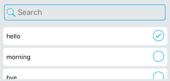
| Prop | Type | Description |
| ------ | ------ | ------ |
| options | Object | list of options/items |
| search | Boolean | if the search bar should be shown or not |
| multiple | Boolean | if user can select multiple options or not. if you select an item which is already selected, it will be unselected. if multiple is disabled, it will work like radio buttons. |
| placeholder | String | placeholder text for search bar |
| placeholderTextColor | String | placeholder text color for search bar |
| returnValue | String | should it return keys of selected options or values? |
| callback | Function | whenever user selects or changes selections it will be called. |
| rowBackgroundColor | String | background color for each row in list |
| rowHeight | Integer | row height |
| rowRadius | Integer | row border radius |
| iconColor | String | icon color for checked/unchecked icons and search icon also border color of search bar |
| iconSize | Integer | icon size for checked/unchecked icons |
| selectedIconName | String | selected/checked icon name (react-native-vector-icons/Ionicon) |
| unselectedIconName | String | unselected/unchecked icon name (react-native-vector-icons/Ionicon) |
| scrollViewHeight | Integer |scrollview height (list of items) |
| selected | Object | list of options which are selected by default |
### Author:
Ata S.Mohammadi.
ataomega@gmail.com