react-native-maps
Version:
React Native Mapview component for iOS + Android
117 lines (49 loc) • 3.06 kB
Markdown
# react-native-mapview
React Native MapView component for iOS + Android
## Examples
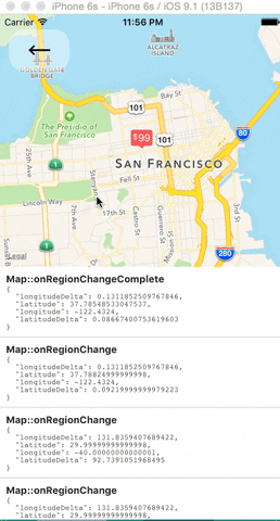
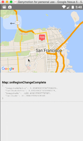
### MapView Events
The `<MapView />` component and its child components have several events that you can subscribe to.
This example displays some of them in a log as a demonstration.
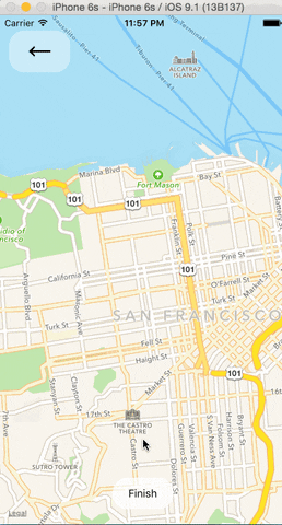
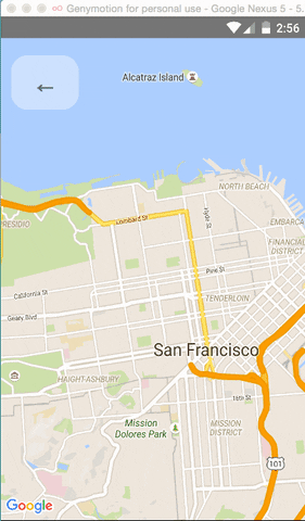
### Tracking Region / Location
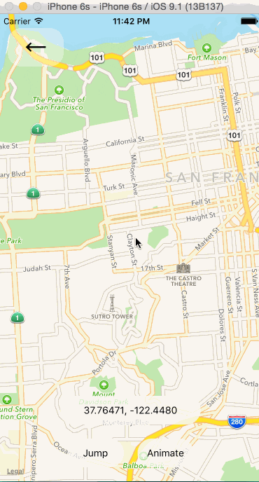 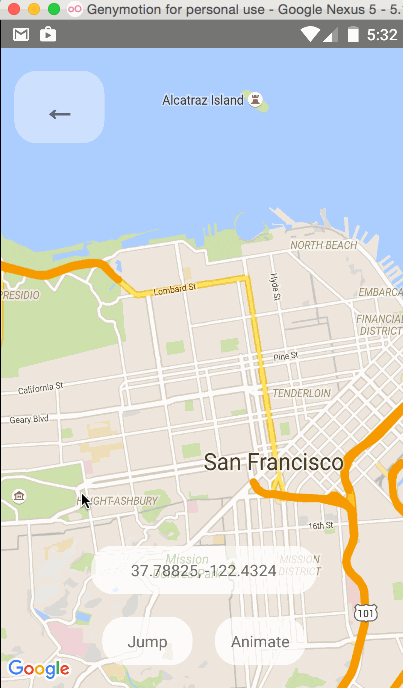
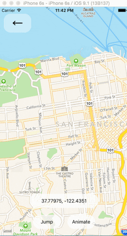
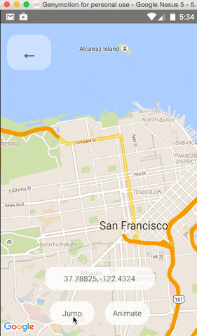
### Programmatically Changing Region
One can change the mapview's position using refs and component methods, or by passing in an updated
`region` prop. The component methods will allow one to animate to a given position like the native
API could.
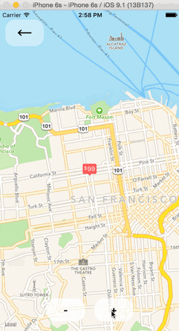
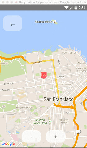
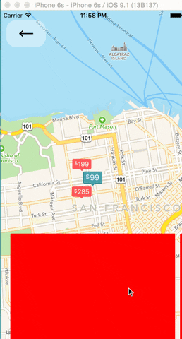
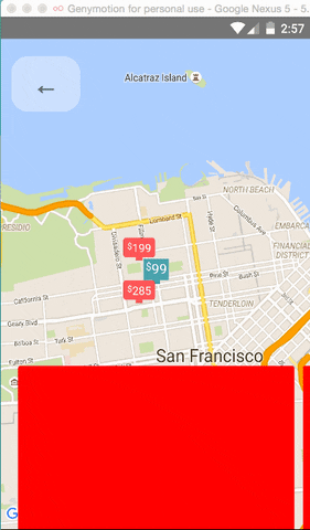
### Arbitrary React Views as Markers
### Using the MapView with the Animated API
The `<MapView />` component can be made to work with the Animated API, having the entire `region` prop
be declared as an animated value. This allows one to animate the zoom and position of the MapView along
with other gestures, giving a nice feel.
Further, Marker views can use the animated API to enhance the effect.
Issue: Since android needs to render its marker views as a bitmap, the animations APIs may not be
compatible with the Marker views. Not sure if this can be worked around yet or not.
### Polygon Creator
### Other Overlays
So far, `<Circle />`, `<Polygon />`, and `<Polyline />` are available to pass in as children to the
`<MapView />` component.
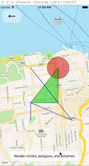 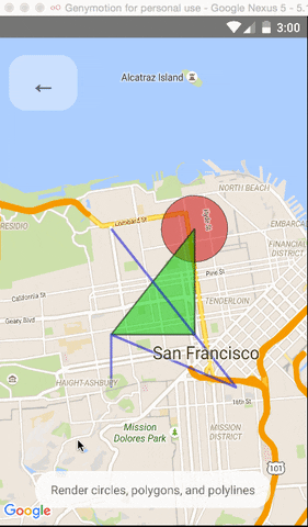
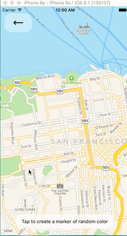
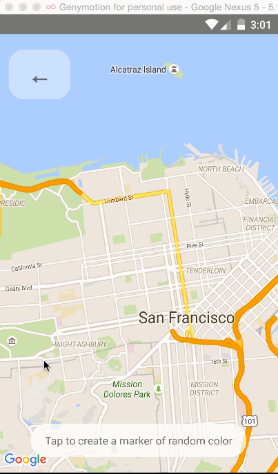
### Default Markers
Default markers will be rendered unless a custom marker is specified. One can optionally adjust the
color of the default marker by using the `pinColor` prop.
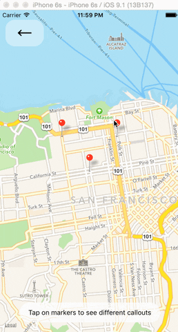
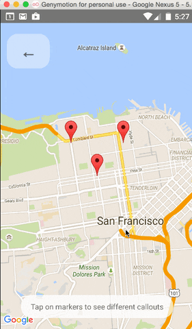
### Custom Callouts
Callouts to markers can be completely arbitrary react views, similar to markers. As a result, they
can be interacted with like any other view.
Additionally, you can fall back to the standard behavior of just having a title/description through
the `<Marker />`'s `title` and `description` props.
Custom callout views can be the entire tooltip bubble, or just the content inside of the system
default bubble.
### Image-based Markers
Markers can be customized by just using images, and specified using the `image` prop.
NOTE: this isn't implemented properly yet.
## Component API
## Using with the Animated API
## Remaining Issues
## Discussion Points